Download presentation
Presentation is loading. Please wait.

2
Categorical vs. Quantitative…

3
Discrete vs. Continuous Variables
Quantitative variables can be further classified as discrete or continuous. If a variable can take on any value between two specified values, it is called a continuous variable; otherwise, it is called a discrete variable. Some examples will clarify the difference between discrete and continuous variables.

4
Suppose the fire department mandates that all fire fighters must weigh between and 250 pounds. The weight of a fire fighter would be an example of a continuous variable; since a fire fighter's weight could take on any value between 150 and 250 pounds. Suppose we flip a coin and count the number of heads. The number of heads could be any integer value between 0 and plus infinity. However, it could not be any number between 0 and plus infinity. We could not, for example, get 2.5 heads. Therefore, the number of heads must be a discrete variable.

5
Statistical data is often classified according to the number of variables being studied.
Univariate data. When we conduct a study that looks at only one variable, we say that we are working with univariate data. Suppose, for example, that we conducted a survey to estimate the average weight of high school students. Since we are only working with one variable (weight), we would be working with univariate data. Bivariate data. When we conduct a study that examines the relationship between two variables, we are working with bivariate data. Suppose we conducted a study to see if there were a relationship between the height and weight of high school students. Since we are working with two variables (height and weight), we would be working with bivariate data
, we would be working with univariate data. Bivariate data. When we conduct a study that examines the relationship between two variables, we are working with bivariate data. Suppose we conducted a study to see if there were a relationship between the height and weight of high school students. Since we are working with two variables (height and weight), we would be working with bivariate data.")
6
Fundamentals… Every Graph should have:

7
PIE CHARTS What it is: A pie chart is used to show visually the proportions of parts of something being studied. The area of each slice of the pie shows the slice’s proportion to the entire category being studied and to the other slices. A pie chart shows data at one point in time, like a snapshot; it does not show change in data over time like a line chart does.

8
Bar Charts A bar chart is made up of columns plotted on a graph. Here is how to read a bar chart.

9
DOTPLOTS

10
HISTOGRAMS Like a bar chart, a histogram is made up of columns plotted on a graph. Usually, there is no space between adjacent columns. Here is how to read a histogram. The columns are positioned over a label that represents a quantitative variable. The column label can be a single value or a range of values. The height of the column indicates the size of the group defined by the column label.

13
S O C Our Heights… What about if we use numbers…

14
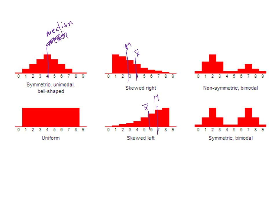
SHAPE The shape of a distribution is described by the following characteristics. Symmetry. When it is graphed, a symmetric distribution can be divided at the center so that each half is a mirror image of the other. Number of peaks. Distributions can have few or many peaks. Distributions with one clear peak are called unimodal, and distributions with two clear peaks are called bimodal. When a symmetric distribution has a single peak at the center, it is referred to as bell-shaped. Skewness. When they are displayed graphically, some distributions have many more observations on one side of the graph than the other. Distributions with most of their observations on the left (toward lower values) are said to be skewed right; and distributions with most of their observations on the right (toward higher values) are said to be skewed left. Uniform. When the observations in a set of data are equally spread across the range of the distribution, the distribution is called a uniform distribution. A uniform distribution has no clear peaks.
 are said to be skewed right; and distributions with most of their observations on the right (toward higher values) are said to be skewed left. Uniform. When the observations in a set of data are equally spread across the range of the distribution, the distribution is called a uniform distribution. A uniform distribution has no clear peaks.")
16
OUTLIERS Gaps. Gaps refer to areas of a distribution where there are no observations. The first figure below has a gap; there are no observations in the middle of the distribution. Outliers. Sometimes, distributions are characterized by extreme values that differ greatly from the other observations. These extreme values are called outliers. The second figure below illustrates a distribution with an outlier. Except for one lonely observation (the outlier on the extreme right), all of the observations fall between 0 and 4. As a "rule of thumb", an extreme value is often considered to be an outlier if it is at least 1.5 interquartile ranges below the first quartile (Q1), or at least 1.5 interquartile ranges above the third quartile (Q3).
, all of the observations fall between 0 and 4. As a rule of thumb , an extreme value is often considered to be an outlier if it is at least 1.5 interquartile ranges below the first quartile (Q1), or at least 1.5 interquartile ranges above the third quartile (Q3).")
17
CENTER Graphically, the of a distribution is located at the median of the distribution. This is the point in a graphic display where about half of the observations are on either side. In the chart to the right, the height of each column indicates the frequency of observations.

18
Statisticians use summary measures to describe patterns of data
Statisticians use summary measures to describe patterns of data. Measures of central tendency refer to the summary measures used to describe the most "typical" value in a set of values. The most common of these is the MEDIAN and the MEAN

19
As measures of central tendency, the mean and the median each have advantages and disadvantages. Some pros and cons of each measure are summarized below. To illustrate these points, consider the following example... Suppose we examine a sample of 10 households to estimate the typical family income. Nine of the households have incomes between $20,000 and $100,000; but the tenth household has an annual income of $1,000,000,000. That tenth household is an outlier. If we choose a measure to estimate the income of a typical household, the mean will greatly over-estimate family income (because of the outlier); while the median will not. Thus, we say the Median is RESISTANT and the Mean is NOT RESISTANT…
; while the median will not. Thus, we say the Median is RESISTANT and the Mean is NOT RESISTANT…")
20
SPREAD The spread of a distribution refers to the variability of the data. If the observations cover a wide range, the spread is larger. If the observations are clustered around a single value, the spread is smaller.

21
The range is the difference between the largest and smallest values in a set of values.
For example, consider the following numbers: 1, 3, 4, 5, 5, 6, 7, 11. For this set of numbers, the range would be or 10.

22
The interquartile range (IQR) is the difference between the largest and smallest values in the middle 50% of a set of data. For example, consider the following numbers: 1, 3, 4, 5, 5, 6, 7, 11.

23
In a sample, variance is the average squared deviation from the population mean, as defined by the following formula: where s2 is the sample variance, x is the sample mean, xi is the ith element from the sample, and n is the number of elements in the sample. Using this formula, the sample variance can be considered an unbiased estimate of the true population variance. Therefore, if you need to estimate an unknown population variance, based on data from a sample, this is the formula to use.

24
The standard deviation is the square root of the variance…

25
5-Number Summary and Boxplots…
Boxplot splits the data set into quartiles. The body of the boxplot consists of a "box" (hence, the name), which goes from the first quartile (Q1) to the third quartile (Q3). Within the box, a vertical line is drawn at the Q2, the median of the data set. Two horizontal lines, called whiskers, extend from the front and back of the box. The front whisker goes from Q1 to the smallest non-outlier in the data set, and the back whisker goes from Q3 to the largest non-outlier. How do we determine the outliers?
, which goes from the first quartile (Q1) to the third quartile (Q3). Within the box, a vertical line is drawn at the Q2, the median of the data set. Two horizontal lines, called whiskers, extend from the front and back of the box. The front whisker goes from Q1 to the smallest non-outlier in the data set, and the back whisker goes from Q3 to the largest non-outlier. How do we determine the outliers")
26
Our Heights… The distribution of heights is unimodal, skewed right with no outliers, a minimum of 60 and a maximum of 78. The center is at 66 (median), with the mean being at The data has a range of 18. Also, it has no outstanding or unusual characteristics.
, with the mean. being at The data has a range of 18. Also, it has no outstanding or. unusual characteristics.")
28
Choosing a summary of your data…
When choosing a summary, consider whether the summary will be representative of your group. Often this has to deal with the shape and outliers of the distribution. Here is a general rule: Use the mean and standard deviation to summarize your data if it is fairly symmetric and has no outliers. If there are outliers or heavy skewdness, use a five number summary. In this situation, the skewdness and/or outliers will greatly affect the mean and standard deviation so they should not be used!

Similar presentations


>")


