Download presentation
Presentation is loading. Please wait.

1
Statistics 100 Lecture Set 6

2
Re-cap Last day, looked at a variety of plots For categorical variables, most useful plots were bar charts and pie charts Looked at time plots for quantitative variables Key thing is to be able to quickly make a point using graphical techniques

3
Re-cap Recall: –A distribution of a variable tells us what values it takes on and how often it takes these values.

4
Histograms Similar to a bar chart, would like to display main features of an empirical distribution (or data set) Histogram –Essentially a bar chart of values of data –Usually grouped to reduce “jitteriness” of picture –Groups are sometimes called “bins”
 Histogram –Essentially a bar chart of values of data –Usually grouped to reduce jitteriness of picture –Groups are sometimes called bins")
5
Histogram Uses rectangles to show number (or percentage) of values in intervals Y-axis usually displays counts or percentages X-Axis usually shows intervals Rectangles are all the same width
 of values in intervals Y-axis usually displays counts or percentages X-Axis usually shows intervals Rectangles are all the same width")
6
Example (discrete data) In a study of productivity, a large number of authors were classified according to the number of articles they published during a particular period of time.
 In a study of productivity, a large number of authors were classified according to the number of articles they published during a particular period of time.")
7
Example (discrete data)
")
8
Example (continuous data) Experiment was conducted to investigate the muzzle velocity of a anti-personnel weapon (King, 1992) Sample of size 16 was taken and the muzzle velocity (MPH) recorded
 Experiment was conducted to investigate the muzzle velocity of a anti-personnel weapon (King, 1992) Sample of size 16 was taken and the muzzle velocity (MPH) recorded")
9
Constructing a Histogram – continuous data Find minimum and maximum values of the data Divide range of data into non-overlapping intervals of equal length Count number of observations in each interval Height of rectangle is number (or percentage) of observations falling in the interval How many categories?
 of observations falling in the interval How many categories")
10
Example Experiment was conducted to investigate the muzzle velocity of a anti-personnel weapon (King, 1992) Sample of size 16 was taken and the muzzle velocity (MPH) recorded
 Sample of size 16 was taken and the muzzle velocity (MPH) recorded")
11
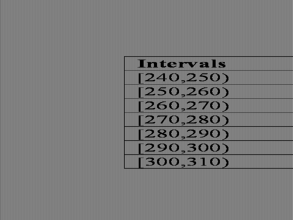
What are the minimum and maximum values? How do we divide up the range of data? What happens if have too many intervals? Too Few intervals? Suppose have intervals from 240-250 and 250-260. In which interval is the data point 250 included?

13
Histogram of Muzzle Velocity

14
Interpreting histograms Gives an idea of: –Location of centre of the distribution –How spread are the data –Shape of the distribution Symmetric Skewed left Skewed right Unimodal Bimodal Multimodal –Outliers Striking deviations from the overall pattern

15
Example – mid-term 1 grades (2011) Was out of 34 + a bonus question (n=344)
 Was out of 34 + a bonus question (n=344)")
16
Example – mid-term 1 grades (2011) Too many bins?
 Too many bins")
17
Example – mid-term 1 grades (2011) Too few bins
 Too few bins")
18
Example – mid-term 1 grades (2011) Potential outlier?
 Potential outlier")
20
Example

21
Example

22
Numerical Summaries (Chapter 12) Graphic procedures visually describe data Numerical summaries can quickly capture main features
 Graphic procedures visually describe data Numerical summaries can quickly capture main features")
23
Measures of Center Have sample of size n from some population, An important feature of a sample is its central value Most common measures of center - Mean & Median

24
Sample Mean The sample mean is the average of a set of measurements The sample mean:

25
Sample Median Have a set of n measurements, Median (M) is point in the data that divides the data in half Viewed as the mid-point of the data To compute the median: 1.For sample size “n”, compute position = (n+1)/2 1.If position is a whole number, then M is the value at this position of the sorted data 2.If position falls between two numbers, then M is the value halfway between those two positions in the sorted data
 is point in the data that divides the data in half Viewed as the mid-point of the data To compute the median: 1.For sample size n , compute position = (n+1)/2 1.If position is a whole number, then M is the value at this position of the sorted data 2.If position falls between two numbers, then M is the value halfway between those two positions in the sorted data")
26
Example Finding the Median, M, when n is odd Example: Data = 7, 19, 4, 23, 18

27
Muzzle Velocity Example Data (n=16)
")
28
Muzzle Velocity Example Mean:

29
Muzzle Velocity Example Median:

30
Sample Mean vs. Sample Median Sometimes sample median is better measure of center Sample median less sensitive to unusually large or small values called For symmetric distributions the relative location of the sample mean and median is For skewed distributions the relative locations are

31
Other Measures of interest Maximum Minimum

32
Percentiles –A percentile of a distribution is a value that cuts off the stated part of the distribution at or below that value, with the rest at or above that value. 5 th percentile: 5% of distribution is at or below this value and 95% is at or above this value. 25 th percentile: 25% at or below, 75% at or above 50 th percentile: 50% at or below, 50% at or above 75 th percentile: 75% at or below, 25% at or above 90 th percentile: 90% at or below, 10% at or above 99 th percentile: ___% at or below, ___% at or above

33
Percentiles –Can be applied to a population or to a sample Usually don’t know population –Use sample percentiles to estimate pop. percentiles –Standardized tests often measured in percentiles –Birth statistics often measured in percentiles First daughter –10 th percentile weight –25 th percentile length –95 th percentile head circumference

34
Important Percentiles First Quartile Second Quartile Third Quartile

35
Computing the quartiles You know how to compute the median Q 1 = Q 3 =

36
Example Finding the other quartiles 1.For Q 1, find the median of all values below M. 2.For Q 3, find the median of all values above M. Example: 4, 7, 18, 19, 23, M=18 –Q 1 : –Q 3 : Example: 4, 7, 12, 18, 19, 23, M=15 –Q 1 : –Q 3 :

37
5 number summary often reported: –Min, Q 1, Q 2 (Median), Q 3, and Max –Summarizes both center and spread –What proportion of data lie between Q 1 and Q 3 ?
, Q 3, and Max –Summarizes both center and spread –What proportion of data lie between Q 1 and Q 3")
38
Box-Plot Displays 5-number summary graphically Box drawn spanning quartiles Line drawn in box for median Lines extend from box to max. and min values. Some programs draw whiskers only to 1.5*IQR above and below the quartiles

39
Can compare distributions using side-by-side box-plots What can you see from the plot?

40
Example - Moisture Uptake There is a need to understand degradation of 3013 containers during long term storage Moisture uptake is considered a key factor in degradation due to corrosion Calcination removes moisture Calcination temperature requirements were written with very pure materials in mind, but the situation has evolved to include less pure materials, e.g. high in salts (Cl salts of particular concern) Calcination temperature may need to be reduced to accommodate salts. An experiment is to be conducted to see how the calcination temperature impacts the mean moisture uptake
 Calcination temperature may need to be reduced to accommodate salts. An experiment is to be conducted to see how the calcination temperature impacts the mean moisture uptake.")
41
Working Example - Moisture Uptake Experiment Procedure: –Two calcination temperatures…wish to compare the mean uptake for each temperature –Have 10 measurements per temperature treatment –The temperature treatments are randomly assigned to canisters Response: Rate of change in moisture uptake in a 48 hour period (maximum time to complete packaging)
")
42
Box-Plot

43
Other Common Measure of Spread: Sample Variance Sample variance of n observations: Units are in squared units of data

44
Sample Standard Deviation Sample standard deviation of n observations: Has same units as data

45
Exercise Compute the sample standard deviation and variance for the Muzzle Velocity Example

46
Comments Variance and standard deviation are most useful when measure of center is As observations become more spread out, s : increases or decreases? Both measures sensitive to outliers 5 number summary is better than the mean and standard deviation for describing (i) skewed distributions; (ii) distributions with outliers
 skewed distributions; (ii) distributions with outliers.")
47
Comments Standard deviation is zero when Measures spread relative to

48
Empirical Rule –If a distribution is bell-shaped and roughly symmetric, then About 2/3 of data will lie within ±1s of About 95% of data will lie within ±2s of Usually all data will lie within ±3s of –So you can reconstruct a rough picture of the histogram from just two numbers More interpretation of s

49
Example Mid-term:

50
Example Empirical rule tells us

Similar presentations


 Introduced main types of data: Quantitative and Qualitative (or Categorical) Discussed.>")


