Download presentation
Presentation is loading. Please wait.

1
Data Tables and Graphs

2
A data table is a good way to collect data as well as share data with others In a data table your IV goes on the left side and your DV goes on the right column(s) *this is different from graphs* Example: What’s the IV, What’s the DV? Type of RestTest 1 Test 2 Test 3 Well-rested Students959091 Tired Students757782

3
Graphs allow you to share information in a way that is easy to understand The graphs you will use most often in Biology are bar graphs, line graphs and double line graphs

4
- A TITLE that explains what is being shown on the graph - Ex: Student Test Scores A title is NOT a question! A title should be descriptive

5
EQUAL INTERVALS! Depending on your data you may count by 1,.5, 100, 10,000, etc…MUST BE EQUAL! Start with 0 and end above your last data point! For example, if your data went from 23 to 96 you would probably start with ___ and end with ____ Find your range by subtracting the lowest from highest numbers (after you decide where you want to start and end) Divide by 10 to find your intervals
 Divide by 10 to find your intervals.")
6
LABELED X AND Y AXES You must tell what is being show on each axis, as well as what units where used to measure Remember the DV must be on the y axis and the IV must be on the x axis

7
Bar graphs are used when COMPARING data Each bar should be the same width Bars can touch when grouping data

8
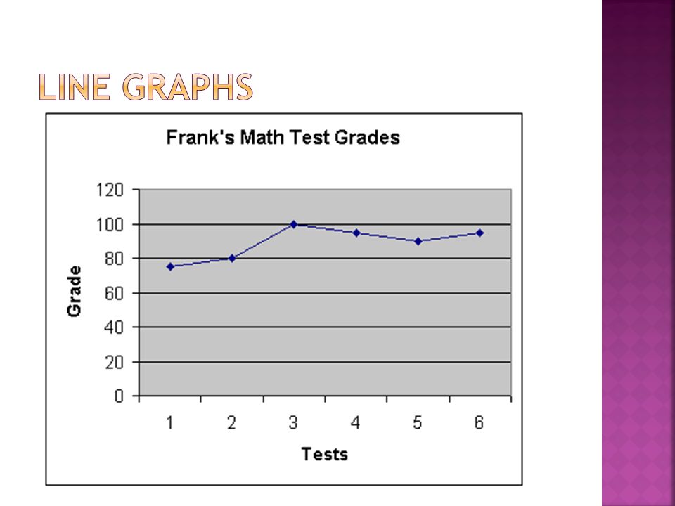
You will use these graphs the most in Biology These graphs show change over TIME (minutes, seconds, days, years, etc.) Intervals (spaces) on both the x and y axis must be equal! Plot your data using dots, then NEATLY connect the dots to create a line

10
This kind of graph is always on the EOC! I’ve even heard rumor of three line graphs. It is just like a line graph, except you add another line showing another set of data Plot one line completely, then plot the next Your second line should have a different color, point shapes, etc. Make a key showing what each line represents

Similar presentations