Download presentation
Presentation is loading. Please wait.

1
CTS130 Spreadsheet Lesson 9 - Building Charts

2
What is a Chart? A chart is a visual display of information in a worksheet. Charts can help you make comparisons, identify patterns, and recognize trends. You can create a chart on its own sheet or within a worksheet. Either way, a chart is linked to worksheet data that is used to create that chart. Because a chart is linked, it is updated when you edit worksheet data. An embedded chart is a chart that appears on the same sheet as the data. It is a graphic object and can be selected, moved, and edited. An object is a separate element or part of a worksheet or chart.

3
Chart Objects Chart area – the background for the chart. Category axis – describes what is shown in the chart. Value axis – show the values on the chart. Plot area – the rectangular area bounded by the category and value axis. Data series – a collection of related values from the worksheet. Data point – a single value or piece of data from the data series. Data marker – the object that represents individual values; can be a bar, a column, a symbol, an image, etc.

4
Value axis Data Marker Gridlines Chart title Data series Axis title Chart area category axis Tick mark

5
To edit a chart object, select it by pointing and clicking. When an object is selected, 3 items should appear: 1.Selection handles appear around the object. 2.The object’s name in the Name box. 3.The Chart toolbar for that object. Name box Plotted data Selection handles

6
Formatting Toolbar For all the objects, the formatting toolbar has some of the same tools available. What displays here is dependent on the type of object selected. Displays or hides the legend Displays by row or column Angles the text Displays or hides the data table Changes the chart type NOTE: If toolbar doesn’t appear, you can double-click the object to display it.

7
Chart Toolbar

8
Formatting Chart Title

9
Format the Data Series

10
Format Category and Value Axes

11
Creating Charts Before you build a chart, you should answer two questions: 1.What data should you use to create the chart? 2.What type of chart is best for your data? You can create basic chart types such as column charts, bar charts, pie charts, and line charts. You can also create specialized charts such as doughnut and radar charts.

12
Chart Types in Excel

13
Chart Types in Excel (cont’d)
")
14
Create an Automatic Chart Highlight the range of cells. Here it would be A3:B7 Click the [F11] function key. A column chart is created on its own sheet.

15
Create an Embedded Chart An embedded chart appears on the same sheet as the data. You create it using the Chart Wizard. Do this by: –Clicking the Chart Wizard button “or” –Choosing Chart from the Insert menu.

16
Chart Wizard – Step 1 of 4

17
Chart Wizard – Step 2 of 4

18
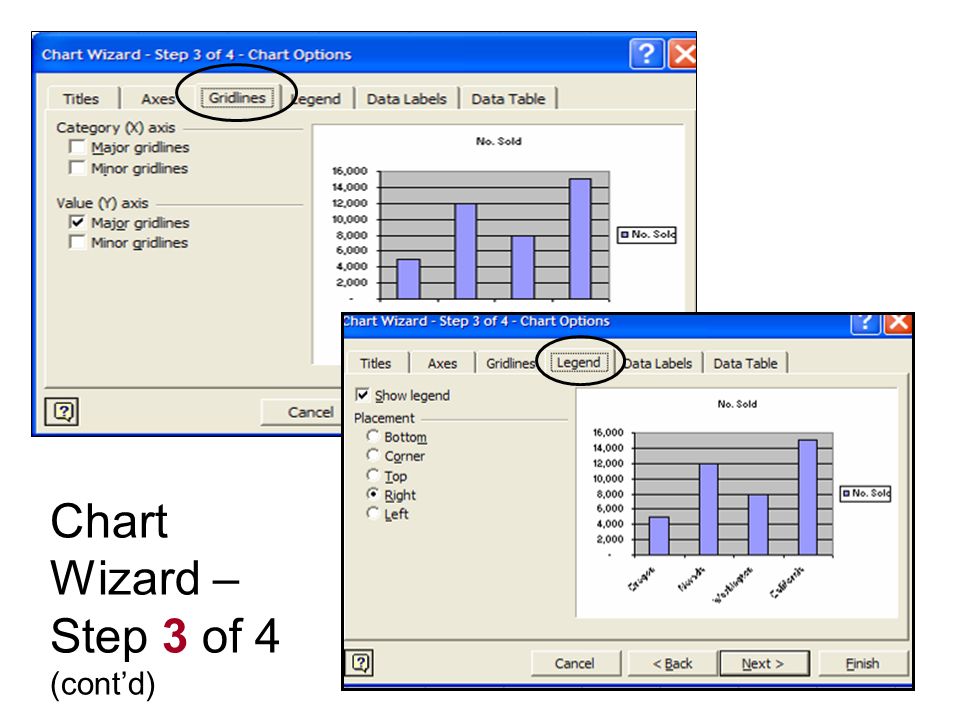
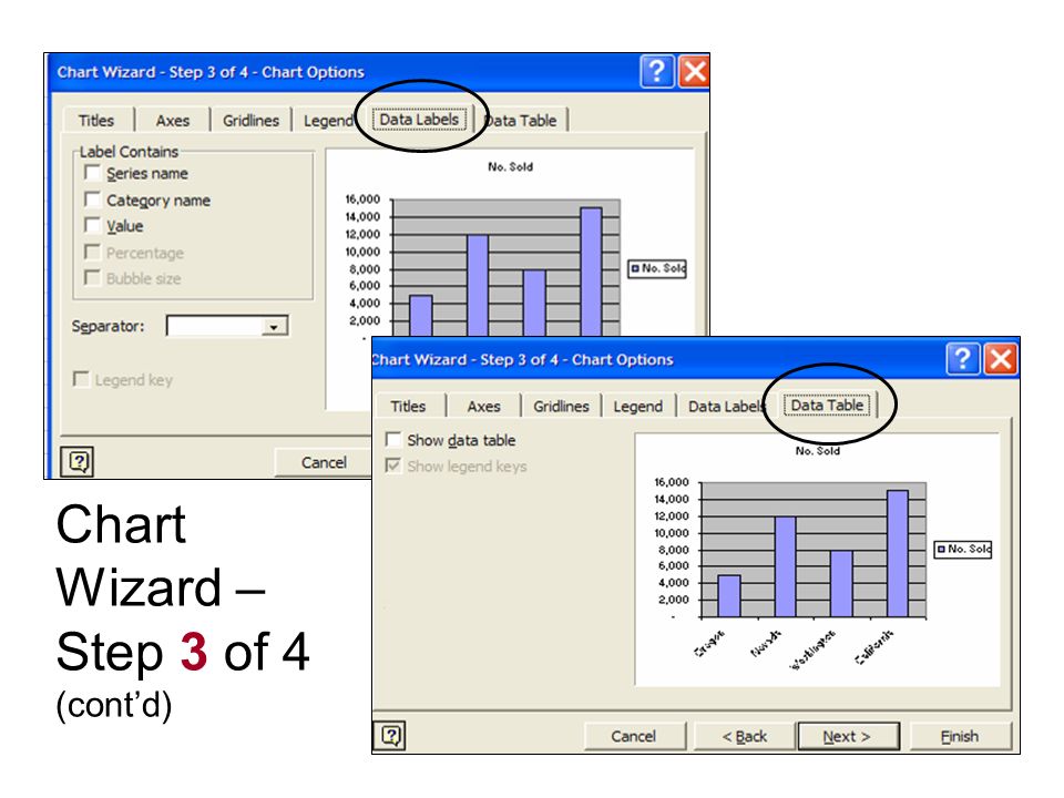
Chart Wizard – Step 3 of 4

19
Chart Wizard – Step 3 of 4 (cont’d)
")
22
Chart Wizard – Step 4 of 4

23
Format a Legend You can also: Change the border size, color, style, etc. Add a shadow. Fill the legend area with color, pattern, etc. Change font size, type, color, etc.

24
Format Pie Slices Category and Percentage checked. Category and Value checked.

25
Adding a Data Point You can insert a new data point within the chart’s range so that it automatically appears in all charts linked to the data. If you add new data below or above the chart’s original source data range, you need to reset the data range for each chart. You do this by right-clicking the background and selecting Source Data. The dialog box opens. In the Data range entry box, edit the address to include the new data point.

26
Adding a Data Series If you add another column of values to the worksheet, you add another series. Right-click the background and select Source Data. Drag through to select the correct series.

27
Using an Image for a Data Series Click the Patterns Tab. Click the Fill Effects. Click the Picture tab. Locate the picture. Change format. Click a data series and then double click to open Format Data Series dialog box. This is what an image would appear like in a data series.

28
Other FILLS for a Data Series Pattern Gradient Texture

29
Create a Combination Chart A combination chart is a single chart that uses more than one chart type of different number scales. A combination chart usually has at least two series or sets of values. Some combination charts use the same chart type for each series, but a secondary number scale. A secondary scale is a set of axis values that is different from the first (primary) set.
 set..")
30
Creating a Chart With Two Chart Types To create a second chart type, right click the data series and select choose Chart Type. Here the purple data series was right clicked and then changed to a line chart type.

31
Right-click the background for the chart; select SOURCE DATA option to open the Source Data dialog box. Note that the Data Range currently covers only A1 through B5…but we want it to cover through C5. Building a Chart with Two Series

32
While still in the Source Data dialog box, click in A1 and drag through C5. This window will temporarily pop up showing you what you are selecting. It disappears when you let go of the mouse. The chart now plots two sales values. Building a Chart with Two Series (cont’d)
.")
33
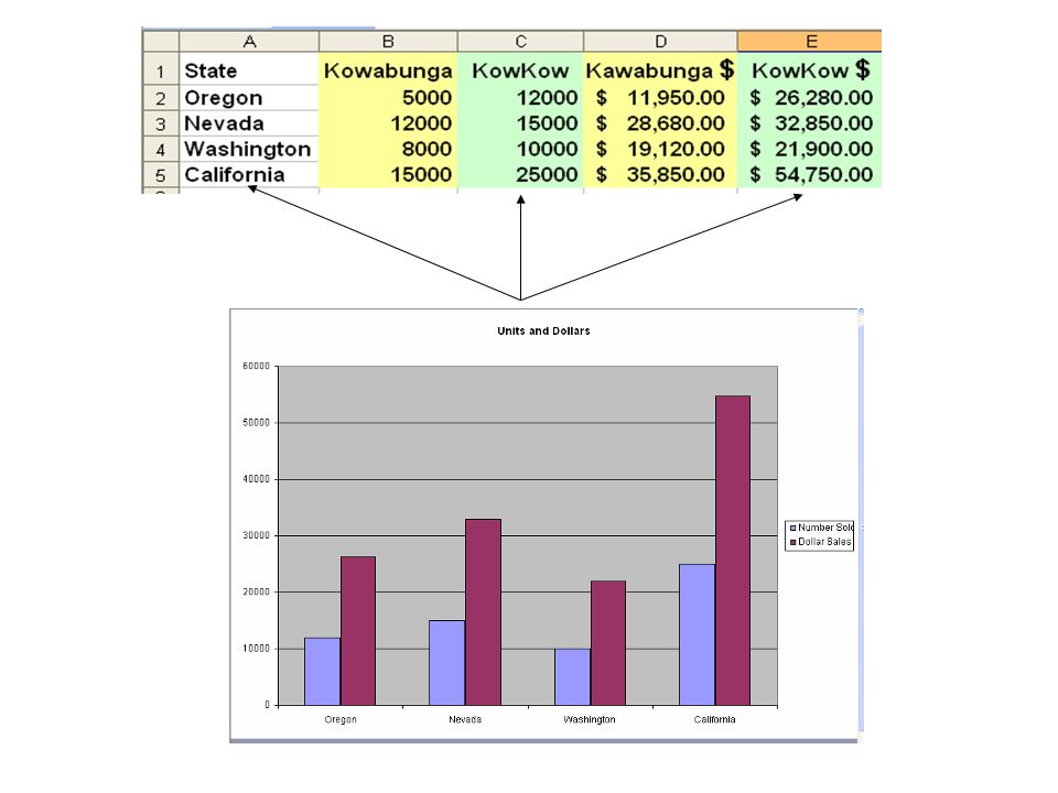
You can show the “dollar sales” series and the “number of items sold” series on the same chart. These values will be two different series on the chart. You want the first series to show the number of items sold for Kawabunga and KowKow (B2-C5). You want the second series to show the dollar sales for Kawabunga and KowKow (D2-E5).
. You want the second series to show the dollar sales for Kawabunga and KowKow (D2-E5)..")
34
While holding down the CTRL key, highlight A1-A5, C1-C5, and E1-E5. Click the Chart Wizard to create a column chart. On step 2, click the SERIES tab. There are two series, one for the product and one for the dollars. Excel uses the label at the top of the column for the name of each series. In the series list, choose KowKow. In the name box, key the text Number Sold. In the Series list, choose KowKow $. In the name box, key the text Dollar Sales. This is what the Series names appear as now.

36
Add a Secondary Axis Right click on one of the data series and select the “Chart Type” option to change that data series to the type of chart on the primary axis. Right click on the second data series and select the “Format Data Series” option. Click on the AXIS tab. Select the SECONDARY axis. Note the second set of numbers.

Similar presentations
 Excel Lessons 4 – 8 Press space bar to Advance Frame.>")


