Download presentation
Presentation is loading. Please wait.

1
Newspaper Design

2
Creating Pages Designers work with four elements: copy, art, headlines and white space - Copy: the actual text - Art: Photos, illustrations, maps, graphs, lines, etc; anything that is not text - Headlines: Any header for an article - White Space: Any space that is not covered by one of the three components mentioned above

3
Copy Type is the most basic component of any article
Keep target audience in mind when choosing type Generally, set body type in 9,10,or 11 point type, use 8 point type for captions, and set headlines in bold Headlines should be in a type most appropriate for the style of document Bigger type for younger or older audiences

4
Art Graphics must have a specific reason or purpose when used in a printed piece Graphics usually serve one of three purposes: -Unify elements -Separate elements -Call attention to elements - A well-designed page is at least 1/3 art

5
White Space Publications need white space so that page does not become overwhelming to the reader Think of white space as breathing room for the page Do not overuse white space, but be sure every page has some

6
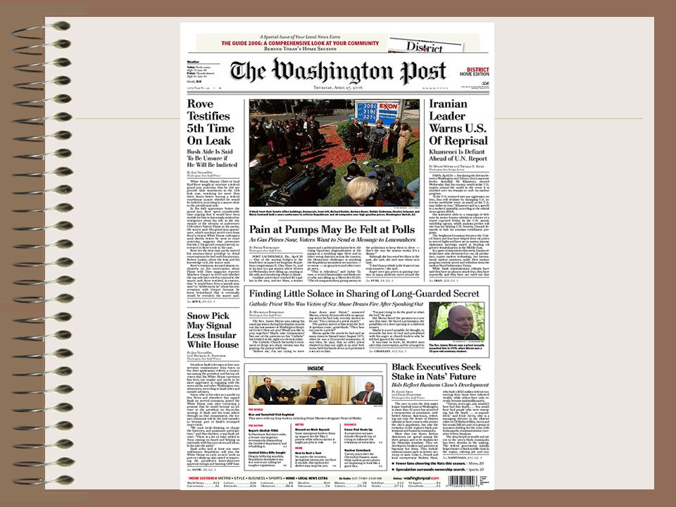
Dominance Every single page should have one dominant element that is at least 2 ½ times as large as any other element on the spread The dominant element serves as a port of entry for the reader; if there is no dominant element, the reader’s eye will bounce around or they will go on to the next page Dominant element is usually a large, well-composed photo that ties into the headline Need to think of principles of design when creating a piece

10
Unity Use consistent external and internal margins
Other graphics can create unity, even simple rules (lines)
")
11
Contrast Contrast: the use of opposites in size, shape and weight
Different size and shapes of photos, as well as different typefaces, can create contrast

12
Creating Contrast with Headlines
Headlines with primary and secondary components can create contrast The primary headline should be at least twice the size of the secondary Try to stay in the same type family

13
Rhythm and Balance Rhythm is the use of a repeated color, graphic, or typographic element to hold a design together Balance is designing your paper so that graphical elements are spread throughout the page and do not seem to all be on one side or the other

14
Organization of Pages Most important story goes at the top; should also have biggest headline and biggest picture Include dominant photo and dominant headline Don’t jump stories unless you have to; always use jump-lines if you do Juxtapose stories, headlines, and art Anchor bottom corners with photos or headlines -Juxtaposition: don’t place 2 stories with the same size headlines next to each other; put a story with photo next to that headline or change one headline size -Don’t let pictures from different stories appear in adjoining columns; put a column of copy between them

15
Page Design Basics Readers start at the upper left hand corner, read from left to right, and turn the page when they reach bottom right hand corner This pattern is called the “reader diagonal”

16
Headline, copy, and photo and caption form a unit, called a story block.
Need to group these elements so that the readers does not get lost A headline can be placed over pictures if it also covers the story Only if a photo is placed on the right of a story, the story may continue under the picture

17
OK OK XXXXXXXXX XXXXXXXXX

18
Other tips Don’t put a picture at the end of a story; put pictures level with or above the story beginning XXXXXXXXX No

19
No The middle of a column is not a good place for a picture
It is a physical block; readers may not jump it XXXXXXXXX No

20
If you do put a picture in the middle column, it should be at the top
XXXXXXXXX OK

21
Pictures from different stories should NOT be placed right next to each other
XXXXX XX OK

22
Front Page Design Create a nameplate/flag that reflects the personality of the publication Nameplate should folio lines: name of the publication, date, school’s name, address, volume, and issue number It should be legible, distinctive and appropriate Can “float” the flag and put skyboxes above it Skyboxes are teasers; tell readers what stories are inside Could also give flag “ears”: elements at the side of the nameplate Masthead includes names of editors, etc.

Similar presentations


 and cool (blue background and dancers) colors.>")


