Download presentation
Presentation is loading. Please wait.

1
Design in Context 1920-1930

2
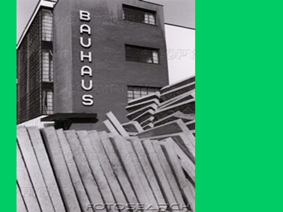
The Bauhaus A radically new kind of art and design school founded in Weirmar, Germany in 1919 by Walter Gropius. Art, architecture, graphic design and typography were taught at the school. Central to the emergence of new typography and graphic design. A radically new kind of art and design school founded in Weirmar, Germany in 1919 by Walter Gropius. Art, architecture, graphic design and typography were taught at the school. Central to the emergence of new typography and graphic design.

10
Innovators in Design Laslo Moholy- Nagy Herbert Bayer Alekandre Rodchenko El Lissitsky Jan Tschichold Laslo Moholy- Nagy Herbert Bayer Alekandre Rodchenko El Lissitsky Jan Tschichold

11
Laslo Moholy-Nagy Arrived at the Bauhaus in 1923 and this is when graphic design at the school began to make a significant statement. His views on typography and graphic design were strict. Emphasis was on function and clarity of design. The sans serif dominated along with the creative use of bold abstract images to lead the eye through the message. Arrived at the Bauhaus in 1923 and this is when graphic design at the school began to make a significant statement. His views on typography and graphic design were strict. Emphasis was on function and clarity of design. The sans serif dominated along with the creative use of bold abstract images to lead the eye through the message.

17
Herbert Bayer Former student of Moholy- Nagy. Appointed head of the typographic workshop at the Bauhaus up until 1928. Continued in the same vein as Moholy- Nagy, designing banknotes, a new alphabet entirely based on lower case letters. Strongly influenced the look of Bauhaus publications (asymmetric design,rectangular grid patterns,abstract forms and a total lack of decoration. Former student of Moholy- Nagy. Appointed head of the typographic workshop at the Bauhaus up until 1928. Continued in the same vein as Moholy- Nagy, designing banknotes, a new alphabet entirely based on lower case letters. Strongly influenced the look of Bauhaus publications (asymmetric design,rectangular grid patterns,abstract forms and a total lack of decoration.

18
Form follows Function Bayer’s work at the Bauhaus reflected a search for fitness of form to function. This basic concept was crucially important to Bauhaus typographic design. They began dropping the use of capital letters (they perceived capitals as not functional,they wasted time in setting and typing) Bayer’s work at the Bauhaus reflected a search for fitness of form to function. This basic concept was crucially important to Bauhaus typographic design. They began dropping the use of capital letters (they perceived capitals as not functional,they wasted time in setting and typing)
 Bayer’s work at the Bauhaus reflected a search for fitness of form to function. This basic concept was crucially important to Bauhaus typographic design. They began dropping the use of capital letters (they perceived capitals as not functional,they wasted time in setting and typing).")
20
Form follows Function It was thought that capital letters added to the complexity of the written language which further complicated typographic communication. Bayer was very influential in emphazising the importance of balancing symbolic elements with type,using contrasting sizes of type to create emphasis and using the power of white space for strong visual effect. It was thought that capital letters added to the complexity of the written language which further complicated typographic communication. Bayer was very influential in emphazising the importance of balancing symbolic elements with type,using contrasting sizes of type to create emphasis and using the power of white space for strong visual effect.

21
A. Rodchenko & El Lissitsky Both designers were central to the Russian Constructivist movement. Rodchenko designed a series of advertisements,propaganda posters and photo- montage which reflected the expressive quality of typography (bold areas of colour and abstract geometric forms) El Lissitsky was to become even more influential than Rodchenko. He acted as a link between the art movements of the time and was responsible for creating the term Constructivist or new typography along with Moholy- -Nagy, Rodchenko and Bayer. Both designers were central to the Russian Constructivist movement. Rodchenko designed a series of advertisements,propaganda posters and photo- montage which reflected the expressive quality of typography (bold areas of colour and abstract geometric forms) El Lissitsky was to become even more influential than Rodchenko. He acted as a link between the art movements of the time and was responsible for creating the term Constructivist or new typography along with Moholy- -Nagy, Rodchenko and Bayer.
 El Lissitsky was to become even more influential than Rodchenko. He acted as a link between the art movements of the time and was responsible for creating the term Constructivist or new typography along with Moholy- -Nagy, Rodchenko and Bayer. Both designers were central to the Russian Constructivist movement. Rodchenko designed a series of advertisements,propaganda posters and photo- montage which reflected the expressive quality of typography (bold areas of colour and abstract geometric forms) El Lissitsky was to become even more influential than Rodchenko. He acted as a link between the art movements of the time and was responsible for creating the term Constructivist or new typography along with Moholy- -Nagy, Rodchenko and Bayer..")
25
Jan Tschichold Designer and typographer who did the most to communicate more widely the philosophy of Constructivist typography. His book ‘The New Typography’ published in 1928 laid down the principles of typographic design. These principles were in accord with those expresses by Moholy-Nagy,El Lissitsky,and Herbert Bayer reflecting the design criteria now associated with Modernism. Designer and typographer who did the most to communicate more widely the philosophy of Constructivist typography. His book ‘The New Typography’ published in 1928 laid down the principles of typographic design. These principles were in accord with those expresses by Moholy-Nagy,El Lissitsky,and Herbert Bayer reflecting the design criteria now associated with Modernism.

26
Futura designed by Paul Renner 1927-28

27
Swiss Style Also known as International Typographic Style. Tschichold outlined this style in ‘The New Typography’ and the style was characterized by the use of rigorous grid system to organize page layout. Also known as International Typographic Style. Tschichold outlined this style in ‘The New Typography’ and the style was characterized by the use of rigorous grid system to organize page layout.

28
British Typographic Design Despite all the radical design developments in Europe, in Britain traditional values remained important. The publication ‘The Fleuron’ edited by Stanley Morison was responsible for recording these values. It gave no mention to Modernism. Morison was responsible for introducing Eric Gill to the Monotype Corporation and in due course Gill created two very distinctive typefaces. Despite all the radical design developments in Europe, in Britain traditional values remained important. The publication ‘The Fleuron’ edited by Stanley Morison was responsible for recording these values. It gave no mention to Modernism. Morison was responsible for introducing Eric Gill to the Monotype Corporation and in due course Gill created two very distinctive typefaces.

29
Gill Sans Perpetua

30
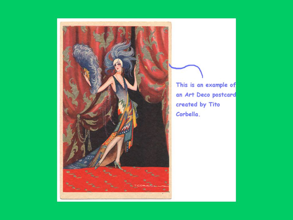
Art Deco A design style of a very different nature thrived during the 1920s and lasted well into the 1930s. Art Deco as a style was widely applied from architecture to advertising. Characterized by lavish decoration. The Empire State Building, the Rockefeller Centre and the Chrysler building all in New York epitomized Art Deco style. Art Deco was the complete opposite of Modernism in both architecture and graphic design. A design style of a very different nature thrived during the 1920s and lasted well into the 1930s. Art Deco as a style was widely applied from architecture to advertising. Characterized by lavish decoration. The Empire State Building, the Rockefeller Centre and the Chrysler building all in New York epitomized Art Deco style. Art Deco was the complete opposite of Modernism in both architecture and graphic design.

31
Chrysler Building Empire State Building

43
Art Deco continued Possibly due to its decorative nature and popularity Art Deco as a style spread rapidly in advertising,especially poster design and in graphic communication. Broadway is one of Art Deco’s most popular fonts. Possibly due to its decorative nature and popularity Art Deco as a style spread rapidly in advertising,especially poster design and in graphic communication. Broadway is one of Art Deco’s most popular fonts.

45
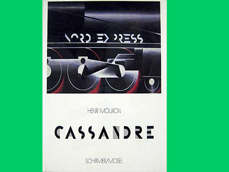
A M Cassandre Most notable poster designer of this period. Only partially influenced by Art Deco. Influenced more by Modernism. It was the power and originality of his imagery that was most striking and influenced poster design and advertising for decades. Most notable poster designer of this period. Only partially influenced by Art Deco. Influenced more by Modernism. It was the power and originality of his imagery that was most striking and influenced poster design and advertising for decades.

Similar presentations


 and lettering (words). You see graphic designs in books, magazines,>")


