Download presentation
Presentation is loading. Please wait.

1
Good and Bad Design

2
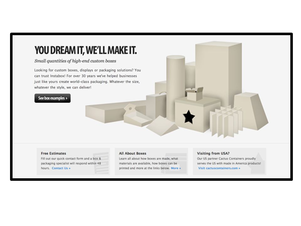
Contrast Contrast with color Contrast with images Contrast with fonts Contrast with size Contrast is one of the best ways to add visual interest to your document. Contrast draws in your reader's attention and creates a visual hierarchy. Create contrast by using type, textures, and elements like lines, boxes, or graphics, that are very different from one another. To get started, determine what you want the focus to be. Use contrast to create that focus. Remember, do as R.Williams says- "Don't be a wimp!" Robin Williams' book Robin Williams' book.

10
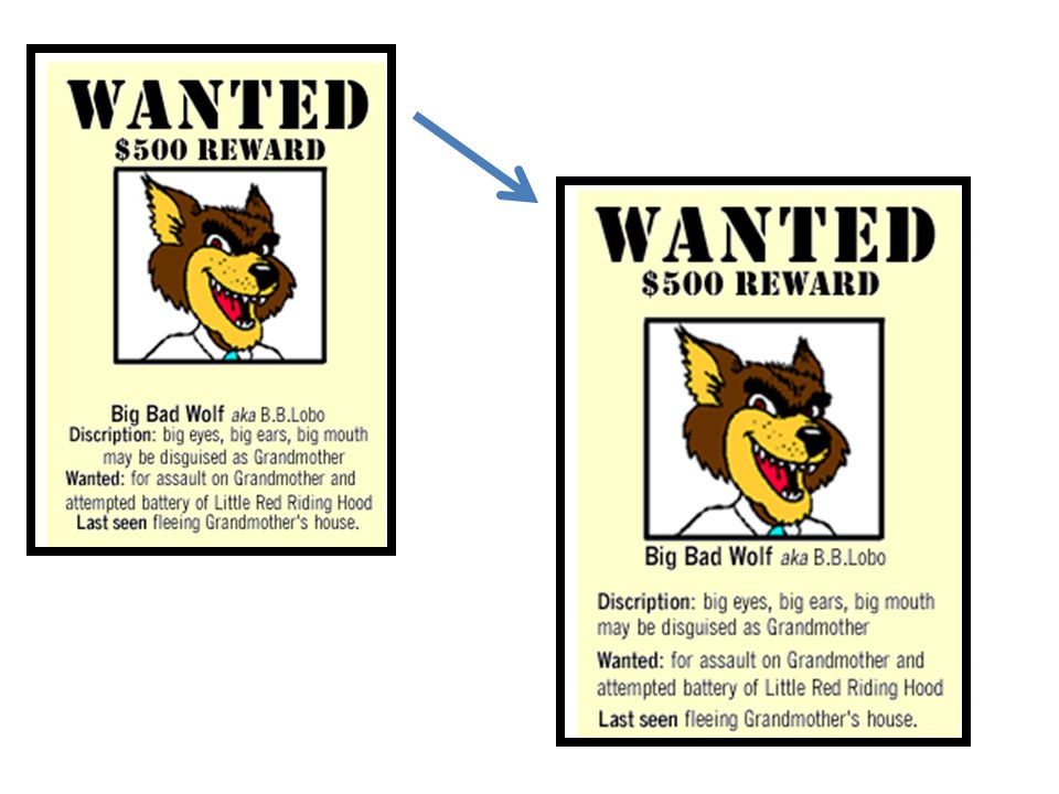
Repetition Repetition, or consistency, means that you should repeat some aspect of the design throughout the entire document. Repetition acts as a visual key that ties your piece together--in other words, it unifies it. Repetition controls the reader's eye and helps you keep their attention on the piece as long as possible. Repeat elements such as a graphic, font style or size. To get started, repeat elements that you're already using.

14
Alignment The principle of alignment tells us that every item on a page must be aligned with another item. The alignment of items creates cohesion.One way to align material is through the center. When continuous text is aligned down the center, it is difficult to read. One problem is difference in the length of lines. This is confusing because the lengths are neither exactly the same nor are they really different.

21
Proximity The Principle of Proximity tells you to put related items close together physically. Things that aren't related should be farther apart. The amount of separation between items or groups tells your reader how the material is organized.

26
References Digg http://www.myinkblog.com/2009/03/21/4- principles-of-good-design-for-websites/http://www.myinkblog.com/2009/03/21/4- principles-of-good-design-for-websites/ Allison McMorris http://coe.sdsu.edu/eet/Articles/designprin2/st art.htm

Similar presentations


? Why is it important for teachers and.>")


