Download presentation
Presentation is loading. Please wait.

2
VISUAL MERCHANDISING Display Building

3
OBJECTIVE Be able to define “Visual Merchandising” & provide examples from 6 businesses *In this day & age of self service stores, displays are absolutely essential as they serve as the “salesperson.” Your display MUST sell the product or service. How do you sell - satisfy the customer’s want or need & solve their problems.

4
VISUAL MERCHANDISING Putting Merchandise and/or its supporting materials out at the “Point of Purchase” (P.O.P.) to communicate a message FOR EXAMPLE: –Apparel & Accessories –Restaurants –Grocery Stores –CD Stores
 to communicate a message FOR EXAMPLE: –Apparel & Accessories –Restaurants –Grocery Stores –CD Stores")
5
OBJECTIVE Be able to identify the four different functions (purposes) of displays and provide an example that you have seen.
 of displays and provide an example that you have seen.")
6
DISPLAY FUNCTIONS & Examples From Work Reinforce the store’s image Generate a promotional atmosphere Speeding up a sales transaction Protecting the store’s merchandise _________________

7
OBJECTIVE Be able to define each type of display

8
Types of Displays Window: –Displays seen from the outside of the store Full Background Partial Background Open Background Interior: –Displays seen from inside the store Open Closed Built-up Shadow Box Ledge (Counter) P.O.P.
 P.O.P.")
9
WINDOW DISPLAYS Full Background –Completely closed background, offers no distractions Partial Background –partially blocked background, people inside can be seen, encourages shoppers to join the crowd Open Background –No background, indicates spaciousness & blends w/ the store

10
INTERIOR DISPLAYS Open –Display that can be touched, often on a counter, prop, or rack Closed –You can’t touch, used for high value or fragile merchandise Built-up –Placed on platforms or on props, used in high traffic areas or endcaps

11
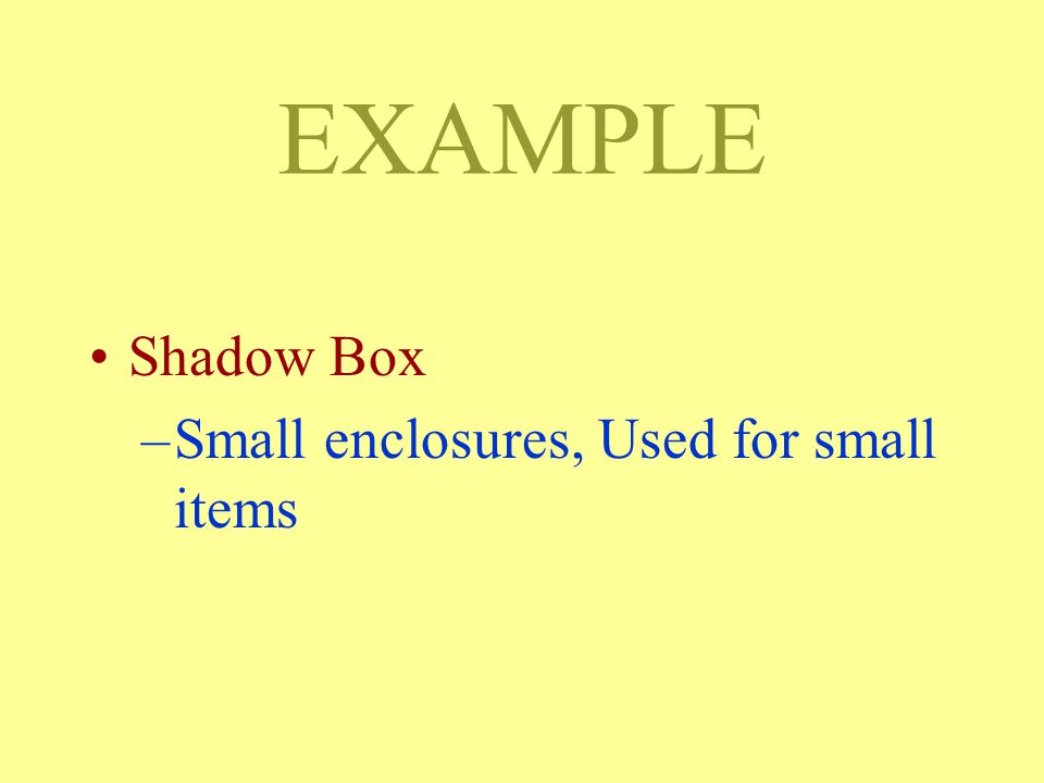
INTERIOR DISPLAYS Shadow Box –Small enclosures, Used for small items Ledge (Counter) –Includes counters, walls, or other partitions “Point of Purchase” (P.O.P.) –Display built to hold and sell merchandise (ex. cardboard setups)
.")
13
EXAMPLE Shadow Box –Small enclosures, Used for small items

15
EXAMPLE Ledge (Counter) –Includes counters, walls, or other partitions
 –Includes counters, walls, or other partitions")
17
OBJECTIVE Be able to define the terms associated with the “art” of visual merchandising (display building)
")
18
THE “ART” OF VISUAL MERCHANDISING COMPOSITION - Think of your store as a blank canvas. Your completed work is a composition. Composition is the overall effect UNITY - Refers to the main theme or idea being conveyed by the displays. ORDER - All the parts of the display(s) are arranged in a easy to understand plan
 are arranged in a easy to understand plan.")
19
EXAMPLE UNITY - Refers to the main theme or idea being conveyed by the displays.

21
EXAMPLE ORDER - All the parts of the display(s) are arranged in a easy to understand plan
 are arranged in a easy to understand plan")
22
????????!!!

23
ADDITIONAL “ART” TERMS Emphasis - the point of the display that is dominant (The first thing people notice) –Optical Center - is located just above “dead-center” or the display’s mid-point & is usually the point of emphasis. –“Points of emphasis” can be created elsewhere in the display using “art” techniques (movement, use of color, contrast, relative size, etc.).
..")
24
EXAMPLE Optical Center - is located just above “dead-center” or the display’s mid-point & is usually the point of emphasis.

25
“Emphasis” Optical Center Dead Center Optical Ctr.

28
“Points of Emphasis”

31
Here Here

32
ADDITIONAL “ART” TERMS Balance - Refers to the relative “weight” given each side of a display –Formal Balance - One side is a duplicate of the other –Informal Balance - One side has more weight than the other or different sized items are used to off-set the large item on the other side

33
BALANCE FormalInformal

35
ADDITIONAL “ART” TERMS Harmony - The display’s lines, shapes, sizes, & textures are arranged in a pleasing manner: –Texture refers to the look or “feel” of the display –Proportion refers to the relationship between items w/ respect to their size –Rhythm refers to a sense of movement created by repitition, graduation, etc. –Lines refer to the direction of the display

36
ADDITIONAL “ART” TERMS vs. TEXTUREPROPORTIONRHYTHM vs.

37
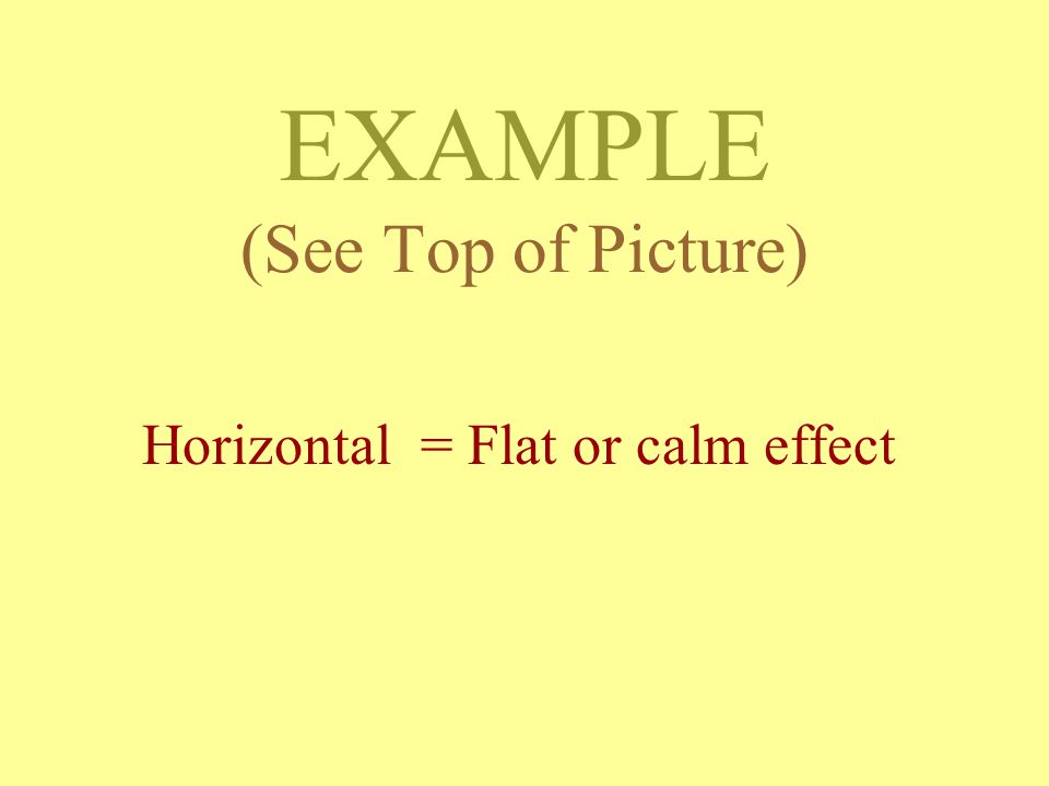
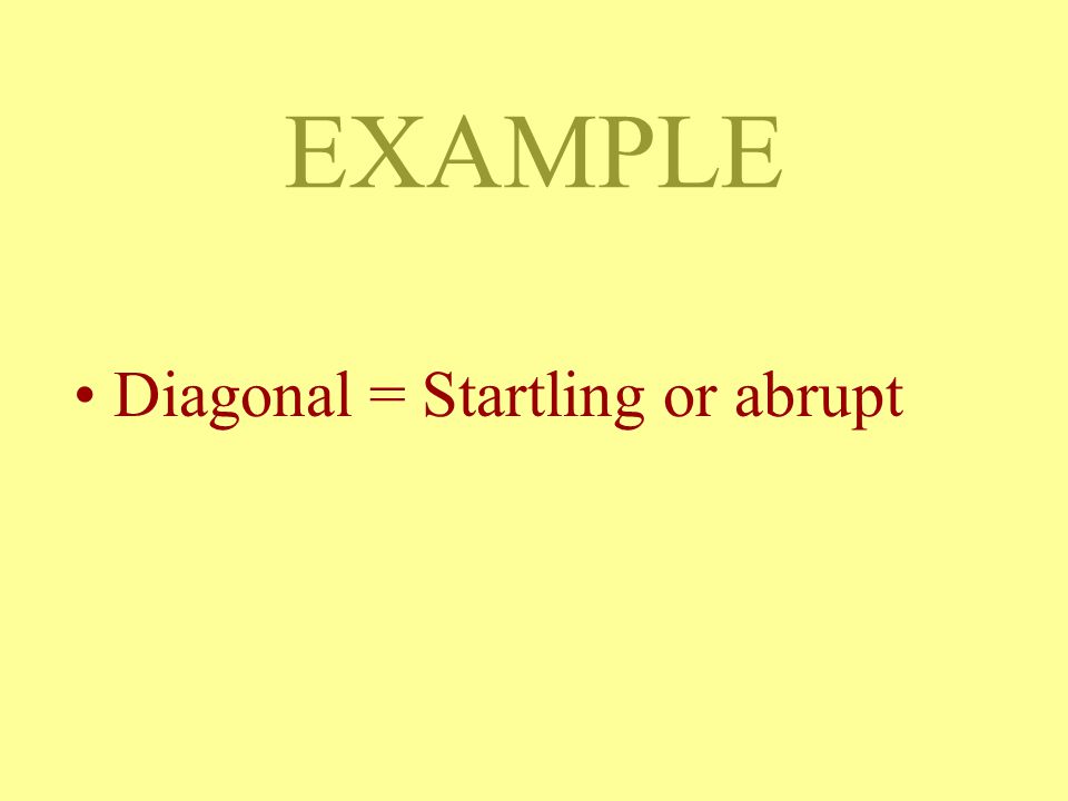
ADDITIONAL “ART” TERMS Lines refer to the direction of the display: –Vertical = Drama or arresting effect –Horizontal = Flat or calm effect –Curves = Soft or gentle effect –Diagonal = Startling or abrupt

38
LINES Dramatic/Arresting Flat or calm Soft or Gentle Abrupt or Startling

39
EXAMPLE (See Top of Picture) Vertical = Drama or arresting effect
 Vertical = Drama or arresting effect")
41
EXAMPLE (See Top of Picture) Horizontal = Flat or calm effect
 Horizontal = Flat or calm effect")
43
EXAMPLE Curves = Soft or gentle effect

45
EXAMPLE Diagonal = Startling or abrupt

47
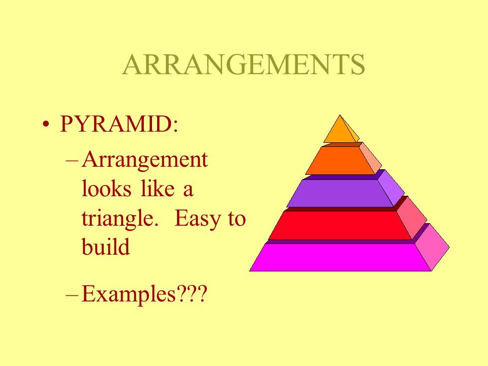
ARRANGEMENTS RADIATION REPITITION PYRAMID STEP ZIG-ZAG

48
ARRANGEMENTS RADIATION: –Like rays from a central point. Creates a dominant center –Examples???

50
ARRANGEMENTS PYRAMID: –Arrangement looks like a triangle. Easy to build –Examples???

53
ARRANGEMENTS STEP: –Merchandise arranged to look like steps in a house. Gives the feeling of motion. Customer eyes will follow steps –Examples???

55
ARRANGEMENTS REPITITION : –Using items of the same nature & align them in the same manner –Examples???

57
ARRANGEMENTS ZIG-ZAG: –Merchandise is not built directly to the top of the display. Follows different directions –Examples???

59
OBJECTIVE Be able to describe the psychological effects color has on people & discuss how you can use this in a display

60
Use of Color Warm Colors: –Yellow, Orange, & Red –Called “advancing colors” meaning they make things seem bigger & closer Cool Colors: –Blue, Green, & Purple –Called “receding colors” meaning they make things look smaller & farther away

61
RED Highly visible suggests strong emotions used to accent (emphasis)
")
62
BLUE Suggests quiet & calm Peaceful Dark blue is somber

63
YELLOW Cheerful Stands out clearly

64
ORANGE Warm Reminds us of Harvest Looks good w/ food

65
GREEN Suggests calm Fresh & new Relaxing

66
PURPLE Suggests Royalty Mysterious Serious

67
BROWN Earthy

68
BLACK WHITE Neutral

69
OBJECTIVE Be able to use lights to create different effects

70
DISPLAY LIGHTING Primary - General Lighting. Illuminates the store. Usually bright but not always Secondary - Used to show merchandise. Examples include floods, track, & spot lighting Atmosphere - Special lighting. Creates a mood. Examples include strobs, bottom lights, twinkling lights, etc.

71
EXAMPLE Primary - General Lighting. Illuminates the store. Usually bright but not always

73
EXAMPLE Secondary - Used to show merchandise. Examples include floods, track, & spot lighting

75
EXAMPLE Atmosphere - Special lighting. Creates a mood. Examples include strobs, bottom lights, twinkling lights, etc.

Similar presentations


 and cool (blue background and dancers) colors.>")


