Download presentation
Presentation is loading. Please wait.

1
© 2004 by David T. Olson Sample - Not for Public Use1 A Sample Presentation of The State of the Church in Oregon and the Portland Metro Area 1990-2000 Dave Olson www.TheAmericanChurch.org

2
© 2004 by David T. Olson Sample - Not for Public Use2 The first 18 slides are from the “State of the Church in Oregon” Powerpoint. The Complete Powerpoint is 43 slides in length, and is available at http://www.theamericanchurch.org/state/UOR20.htm. It includes maps of church attendance in every county, as well as denominational charts, average size charts, church planting charts, ethnicity charts and population growth information. http://www.theamericanchurch.org/state/UOR20.htm

3
© 2004 by David T. Olson Sample - Not for Public Use3 In 1996, polls taken immediately after the Presidential election revealed that 58% of people claimed they had voted, when in reality only 49% actually did. This is called the Halo Effect. People tend to over-inflate their participation in activities that create acceptability within their social group. For many decades, pollsters such as Gallup and Barna have reported that around 45% of Americans attend church every Sunday. But there is a religious Halo Effect. Actual attendance counts have shown that the percentage of people attending church on any given weekend is much lower than was previously thought.

4
© 2004 by David T. Olson Sample - Not for Public Use4 The Intent of this presentation is to answer and then expand on two key questions: “How Many People Really Attend Church in Oregon Every Week?” “Is the Christian Church Going Forwards or Backwards in Influence in Oregon?” As the data is analyzed county by county assessing a number of factors, a comprehensive picture of the State of the Church in Oregon will begin to take shape.

5
© 2004 by David T. Olson Sample - Not for Public Use5 This study uses weekend church attendance as a more reliable and more immediate snapshot of Christian influence than membership. The following map shows the percentage of the population attending a Christian church on any given weekend in all 50 states in 2000. Oregon has an attendance percentage (14.5%) that is lower than the average for the nation (18.7%).
 that is lower than the average for the nation (18.7%)..")
6
© 2004 by David T. Olson Sample - Not for Public Use6

7
7 The Next Map shows the percentage of the population attending a Christian church on any given weekend in 2000 for each county in Oregon.

8
10.5% Morrow 10.7% Josephine 11.3% Harney 11.5% Crook 11.6% Jefferson 11.7% Benton 12.1% Lane 12.1% Curry 12.3% Jackson 13.0% Clatsop 13.0% Douglas 13.3% Baker 13.4% Polk 13.4% Columbia 13.4% Grant 13.5% Lincoln 13.6% Clackamas 13.7% Coos 14.2% Washington 14.2% Deschutes 14.9% Hood River 14.9% Klamath 15.0% Lake 15.1% Yamhill 15.6% Tillamook 15.9% Gilliam 16.0% Sherman 16.0% Malheur 16.1% Linn 16.2% Umatilla 16.5% Wasco 16.5% Union 17.3% Multnomah 17.3% Wheeler 18.7% Marion 19.5% Wallowa 10.5% to 13.4% 13.4% to 15.6% 15.6% to 20.5% Oregon Counties 2000 Percentage of Population at Christian Worship on any Given Sunday.

9
© 2004 by David T. Olson Sample - Not for Public Use9 The Next 2 Maps show the population numbers for each county in Oregon. The first map shows the population of each county. Nine counties have a population of over 100,000 people. The second map shows the growth or decline in population for each county from 1990 - 2000.

10
1,547 Wheeler 1,915 Gilliam 1,934 Sherman 7,226 Wallowa 7,422 Lake 7,609 Harney 7,935 Grant 10,995 Morrow 16,741 Baker 19,009 Jefferson 19,182 Crook 20,411 Hood River 21,137 Curry 23,791 Wasco 24,262 Tillamook 24,530 Union 31,615 Malheur 35,630 Clatsop 43,560 Columbia 44,479 Lincoln 62,380 Polk 62,779 Coos 63,775 Klamath 70,548 Umatilla 75,726 Josephine 78,153 Benton 84,992 Yamhill 100,399 Douglas 103,069 Linn 115,367 Deschutes 181,269 Jackson 284,834 Marion 322,959 Lane 338,391 Clackamas 445,342 Washington 660,486 Multnomah 0 to 20,000 20,000 to 100,000 100,000 to 660,487 Oregon Counties 2000 Population

11
16 Sherman 82 Grant 151 Wheeler 198 Gilliam 236 Lake 315 Wallowa 549 Harney 932 Union 1,424 Baker 1,810 Curry 2,108 Wasco 2,329 Clatsop 2,506 Coos 2,692 Tillamook 3,370 Morrow 3,508 Hood River 5,071 Crook 5,333 Jefferson 5,577 Malheur 5,590 Lincoln 5,750 Douglas 6,003 Columbia 6,073 Klamath 7,342 Benton 11,299 Umatilla 11,842 Linn 12,839 Polk 13,077 Josephine 19,441 Yamhill 34,880 Jackson 40,047 Lane 40,409 Deschutes 56,351 Marion 59,541 Clackamas 76,599 Multnomah 133,788 Washington 0 to 5,000 5,000 to 20,000 20,000 to 133,789 Oregon Counties 1990 - 2000 Population Increase

12
© 2004 by David T. Olson Sample - Not for Public Use12 The Next 2 Slides show the ethnicity of Oregon in 1990 and 2000. The third slide shows the growth or decline in the percentage of the population for each ethnic group.

13
© 2004 by David T. Olson Sample - Not for Public Use13

14
© 2004 by David T. Olson Sample - Not for Public Use14

15
© 2004 by David T. Olson Sample - Not for Public Use15

16
© 2004 by David T. Olson Sample - Not for Public Use16 The Next Graph shows the attendance numbers for the churches in Oregon in 1990 and 2000. Most noteworthy is the growth of Evangelical and Catholic churches and the slight decline of Mainline churches. Unfortunately, as overall worship attendance has remained quite stable, the population has grown. A more reliable standard for evaluating increasing or declining influence is the percentage of the population attending church on any given weekend, shown in the second graph.

17
© 2004 by David T. Olson

19
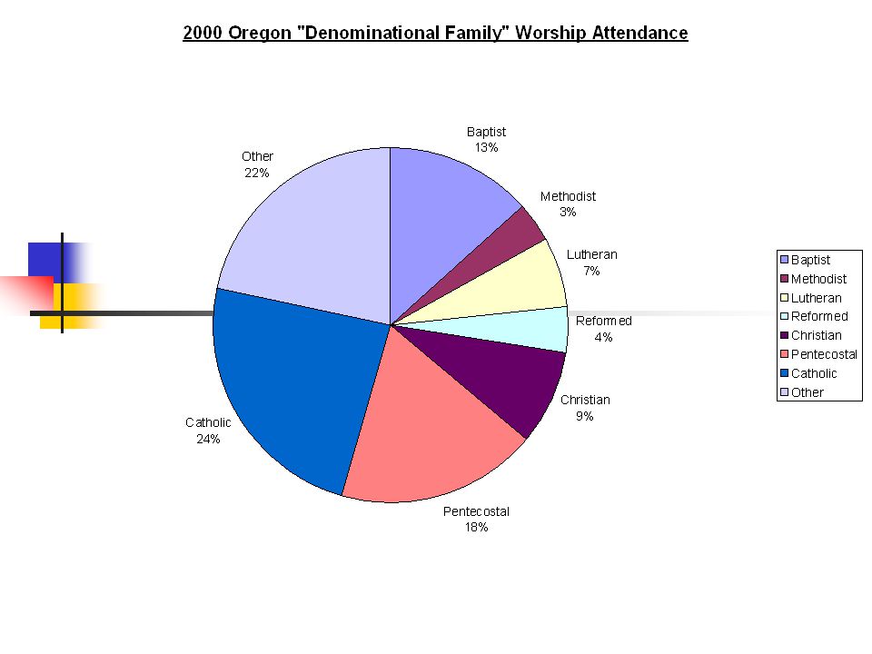
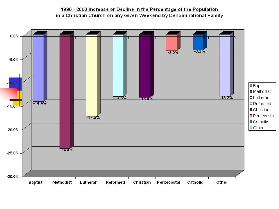
© 2004 by David T. Olson Sample - Not for Public Use19 The 3 Next Charts show the relative strength of the 8 major denominational groups in Oregon. The Pie Chart shows how no group predominates in Oregon. The second and third charts show that all groups have declined in the percentage of the population from 1990 - 2000.

23
© 2004 by David T. Olson Sample - Not for Public Use23 The Complete Oregon Powerpoint is 43 slides in length, and is available at http://www.theamericanchurch.org/state/OR20.htm. It includes maps of church attendance in every county in the metro area, as well as denominational charts, average size charts, church planting charts, ethnicity charts and population growth information. http://www.theamericanchurch.org/state/OR20.htm

24
© 2004 by David T. Olson Sample - Not for Public Use24 The next 7 slides are from the “State of the Church in Portland” Powerpoint. The Complete Powerpoint is 41 slides in length, and is available at http://www.theamericanchurch.org/metro/Portland.htm. It includes maps of church attendance in every county in the metro area, as well as denominational charts, average size charts, church planting charts, ethnicity charts and population growth information. http://www.theamericanchurch.org/metro/Portland.htm

25
© 2004 by David T. Olson Sample - Not for Public Use25 The Next Graph shows the attendance numbers for the churches in the Portland metro in 1990 and 2000. Evangelical and Catholic churches have grown numerically, while Mainline churches have stayed the same. As population fluctuates, a more reliable standard for evaluating increasing or declining influence is the percentage of the population attending church on any given weekend, shown in the second graph. Because of strong population growth, all groups have declined as a percentage of the population over the last decade.

26
© 2004 by David T. Olson

29
© 2004 by David T. Olson Sample - Not for Public Use29 Portland Metro Area 2000 Evangelical Church Attendance

30
© 2004 by David T. Olson Sample - Not for Public Use30 Portland Metro Counties 1990 - 2000 Growth or Decline in Percentage of the Population at Worship in All Mainline Churches on a Given Weekend Blue = Decline Rose = Growth -15.8% Clackamas -32.0% Washington -27.1% Columbia -28.0% Clark -14.7% Multnomah -37.2% Yamhill

31
© 2004 by David T. Olson Sample - Not for Public Use31 Portland Metro Counties 1990 - 2000 Growth or Decline in Percentage of the Population at Worship in All Catholic Churches on a Given Weekend Blue = Decline Rose = Growth -12.8% Clackamas 2.7% Washington 0.3% Columbia -1.3% Clark 0.0% Multnomah -4.1% Yamhill

32
© 2004 by David T. Olson Sample - Not for Public Use32 The Complete Portland Powerpoint is 49 slides in length, and is available at http://www.theamericanchurch.org/metro/Portland.htm. It includes maps of church attendance in every county in the metro area, as well as denominational charts, average size charts, church planting charts, ethnicity charts and population growth information.

33
© 2004 by David T. Olson Sample - Not for Public Use33 This Presentation is based on a nationwide study of American church attendance, as reported by churches and denominations. The database currently has average worship attendances for each of the last 10 years for over 200,000 individual churches. It also uses supplementary information (actual membership numbers correlated with accurate membership to attendance ratios) to project the attendances of all other denominational and independent churches. All told, accurate information is provided for over 300,000 orthodox Christian churches. 1 1 This presentation looks only at people attending orthodox Christian churches. Approximately 3 million people attend non-orthodox Christian churches, and perhaps 3 million attend a religious service of another religion. Those ‘houses of worship’ would add another 35,000 churches in the United States and increase the 2000 percentage to 20.5%.
 to project the attendances of all other denominational and independent churches. All told, accurate information is provided for over 300,000 orthodox Christian churches. 1 1 This presentation looks only at people attending orthodox Christian churches. Approximately 3 million people attend non-orthodox Christian churches, and perhaps 3 million attend a religious service of another religion. Those ‘houses of worship’ would add another 35,000 churches in the United States and increase the 2000 percentage to 20.5%..")
34
© 2004 by David T. Olson Sample - Not for Public Use34 For More Information... Please go to www.theamericanchurch.org for additional information on the American Church.www.theamericanchurch.org 12 Surprising Facts about the American Church is available at http://www.theamericanchurch.org/ 12supm. htm http://www.theamericanchurch.org/ 12supm. htm The complete Oregon Powerpoint presentation is available at http://www.theamericanchurch.org/state/UOR20.htm http://www.theamericanchurch.org/state/UOR20.htm The Complete Portland Powerpoint presentation is available at http://www.theamericanchurch.org/metro/Portland.htm http://www.theamericanchurch.org/metro/Portland.htm A Combo Pack (12 Surprising Facts, Oregon & Portland Powerpoints) is available at http://www.theamericanchurch.org/combo/OR0.htm http://www.theamericanchurch.org/combo/OR0.htm
 is available at")
Similar presentations