Download presentation
Presentation is loading. Please wait.

1
Mini Lesson 4 (Instruction) Identify meaningful relationships using a scatter plot Data Literacy Project Do light cars go farther on a gallon of gas than heavy cars do?
 Identify meaningful relationships using a scatter plot Data Literacy Project Do light cars go farther on a gallon of gas than heavy cars do")
2
Background: Miles per gallon (mpg) is one way of measuring the fuel-efficiency of a car or truck. A car with high mpg goes more miles on one gallon of gas than a car with low mpg does. It costs less to run and releases less CO2 into the atmosphere. The US Environmental Protection Agency (EPA) rates the fuel efficiency (mpg) of every car model sold in the US. An interesting question: Do lighter cars go farther on a gallon of gas than heavier cars do? In other words: Is fuel efficiency (mpg) correlated with vehicle weight?
 rates the fuel efficiency (mpg) of every car model sold in the US. An interesting question: Do lighter cars go farther on a gallon of gas than heavier cars do. In other words: Is fuel efficiency (mpg) correlated with vehicle weight .")
3
Here are some data about 15 different 2011car models. To see if mileage rating is correlated with vehicle weight, you can plot the two values for each car on a graph with two axes.

4
Draw two axes. Each of the two variables gets an axis. For now, lets give Vehicle weight the X axis and EPA mileage rating the Y axis Vehicle weight (lbs)EPA mileage rating (mpg)
EPA mileage rating (mpg).")
5
Put a scale on each axis using the range of points for each variable in the data set. (The scale doesn’t have to start at 0)
.")
6
Put a point for each car in the space on the graph where the two values intersect. 5527 18

7
All of the points are plotted Chevy suburban Corvette Each car is represented by one dot

8
Do heavier cars generally have lower mileage? OR Do heavier cars tend to have higher mileage? OR Is there no correlation between mileage and weight?

9
Does there seem to be a correlation between mileage rating and vehicle weight? Draw a line that goes near most of the points. (This is called the “Line of best fit”)
.")
10
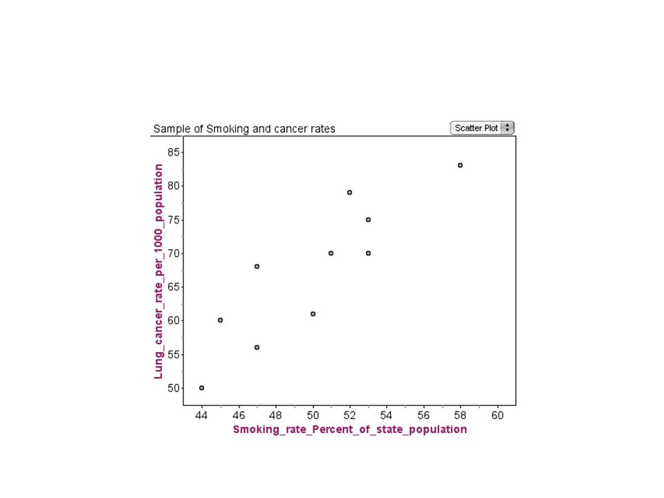
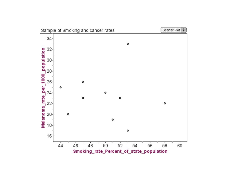
For practice: 1. Is lung cancer rate correlated with smoking rate? 2. Is melanoma (skin cancer) rate correlated with smoking rate?
 rate correlated with smoking rate .")
13
Strong positive correlationNo correlation The higher the smoking rate, the higher incidence of lung cancer The points don’t fall close to a line. Skin cancer seems unrelated to smoking rates.

14
The arrangement of the points shows How strong the correlation is Whether the correlation is positive or negative ________________ Positive correlation: one variable is HIGH and the other is also HIGH “The water temperatures at high and low tides are positively correlated” Water temperature at low tide Water temperature at high tide

15
Negative correlation: one variable is HIGH and the other is LOW The maximum wind speed of a hurricane is negatively correlated with its minimum barometric pressure. Minimum barometric pressureMaximum wind speed Hurricanes

16
No correlation: Data points are scattered and don’t form an obvious line. The rate of skin cancer (melanoma) is not correlated with smoking rate.
 is not correlated with smoking rate..")
Similar presentations


 to solve problems. Approximate a line of best fit.>")


>")


