Download presentation
Presentation is loading. Please wait.

1
Advancing Assessment Literacy Data Analysis I: Summarizing, Representing, and Sharing Data

2
2 The Value of Data “Quantitative information – the numbers – takes us out of the realm of assumption, feeling, guesswork, gut instinct, intuition, and bias, into the realm of reliable fact based on measurable evidence.” –Stephen Few, 2004 Take a stand: Few, S. C. (2004). Show me the numbers: Designing tables and graphs to enlighten. Oakland, CA: Analytics Press. Strongly Agree Strongly Disagree
. Show me the numbers: Designing tables and graphs to enlighten. Oakland, CA: Analytics Press. Strongly Agree Strongly Disagree.")
3
Advancing Assessment Literacy Modules: Data Analysis I (February 2008) 3 Poor Design Obscures the Message “Poor documents are so commonplace that deciphering bad writing and bad visual design have become part of the coping skills needed to navigate the so-called information age.” –Karen A. Schriver, 1997

4
Advancing Assessment Literacy Modules: Data Analysis I (February 2008) 4 Poor Design Obscures the Message While the use of tables and graphs is commonplace their effective design is not. The next two slides present some data – look carefully at each and be prepared to provide some interpretation. Few, S. C. (2004). Show me the numbers: Designing tables and graphs to enlighten. Oakland, CA: Analytics Press.
. Show me the numbers: Designing tables and graphs to enlighten. Oakland, CA: Analytics Press..")
5
Division

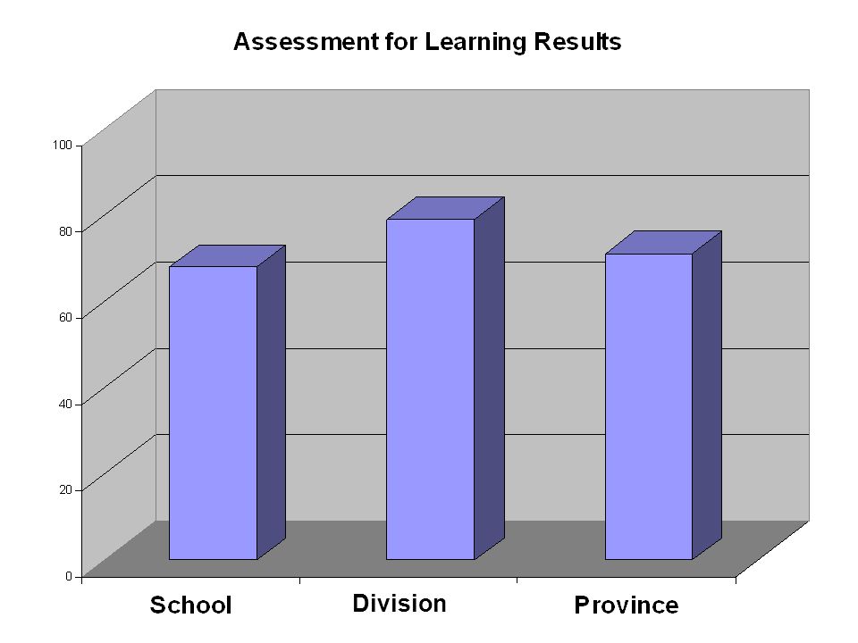
7
Advancing Assessment Literacy Modules: Data Analysis I (February 2008) 7 Interpretation What do each of the graphs tell us? What information is missing? What do these graphs have in common? Both graphs used the same data. Not setting the Y axis (vertical) at zero makes the difference seem bigger than it is. Setting the scale of the Y axis (vertical) in intervals of 20 makes the results look similar.
 at zero makes the difference seem bigger than it is. Setting the scale of the Y axis (vertical) in intervals of 20 makes the results look similar..")
8
8 Manipulative Design Student Marks are Skyrocketing!

9
9 Manipulative Design Student Marks are Rising Slightly

10
Advancing Assessment Literacy Modules: Data Analysis I (February 2008) 10 Manipulative Design Again, both graphs used the same data. For the first, omitting the scale, which was 0.1%, and not setting the Y axis (vertical) to zero produced a graph with amazing results. A more accurate representation of results is displayed in the second graph. The scale is set in 10% intervals and the Y axis begins at zero.
 to zero produced a graph with amazing results. A more accurate representation of results is displayed in the second graph. The scale is set in 10% intervals and the Y axis begins at zero..")
11
Advancing Assessment Literacy Modules: Data Analysis I (February 2008) 11 Purpose Data displays must present data that is: Important Meaningful Useful Few, S. C. (2004). Show me the numbers: Designing tables and graphs to enlighten. Oakland, CA: Analytics Press.
. Show me the numbers: Designing tables and graphs to enlighten. Oakland, CA: Analytics Press..")
12
Advancing Assessment Literacy Modules: Data Analysis I (February 2008) 12 Quantitative Information Displaying quantitative information describes relationships within data. For example: Quantitative InformationRelationship Numbers of boys and girls taking industrial arts. Number of students achieving the proficient level on a standardized assessment. Gender compared to course type. Student counts related to performance standard. Few, S. C. (2004). Show me the numbers: Designing tables and graphs to enlighten. Oakland, CA: Analytics Press.
. Show me the numbers: Designing tables and graphs to enlighten. Oakland, CA: Analytics Press..")
13
Advancing Assessment Literacy Modules: Data Analysis I (February 2008) 13 Two Types of Data Quantitative information consists of two types of data: –Quantitative – measures things –Categorical – subdivides the things measured into useful groups The relationships within quantitative data can either be simple associations between quantitative values and categorical subdivisions or more complex associations among multiple sets of quantitative values. Few, S. C. (2004). Show me the numbers: Designing tables and graphs to enlighten. Oakland, CA: Analytics Press.
. Show me the numbers: Designing tables and graphs to enlighten. Oakland, CA: Analytics Press..")
14
Advancing Assessment Literacy Modules: Data Analysis I (February 2008) 14 Two Types of Data Simple relationships:Complex associations among multiple sets of quantitative values: GradeAverage Marks 782% 880% GradeAverage Marks 7 o Boys o Girls 80% o 76% o 84% 8 o Boys o Girls 83% o 86% o 80%
 14 Two Types of Data Simple relationships:Complex associations among multiple sets of quantitative values: GradeAverage Marks 782% 880% GradeAverage Marks 7 o Boys o Girls 80% o 76% o 84% 8 o Boys o Girls 83% o 86% o 80%")
15
Advancing Assessment Literacy Modules: Data Analysis I (February 2008) 15 Practical Considerations When Displaying Relationships When comparing size of one part to another, use percentages so that the audience can quickly make meaning of the relationship. When calculating and displaying averages, carefully choose between Mean, Median, Mode and Midrange. The numbers in the data set will indicate which method is best.

16
Advancing Assessment Literacy Modules: Data Analysis I (February 2008) 16 Measures of Central Tendency Mean – sum all values and divide by the number of values. Median – sort values in order (high to low or low to high), locate the value in the center of the list. Mode – the value that appears most often in a set of values
, locate the value in the center of the list. Mode – the value that appears most often in a set of values.")
17
Advancing Assessment Literacy Modules: Data Analysis I (February 2008) 17 Examples Class A 100% 98% 93%22% 90%100% 35%50% 35%100% Class B 68%35% 48%87% 55%62% 74%80% 87% 90% Calculate the mean, median and mode for each set of marks.
 17 Examples Class A 100% 98% 93%22% 90%100% 35%50% 35%100% Class B 68%35% 48%87% 55%62% 74%80% 87% 90% Calculate the mean, median and mode for each set of marks.")
18
Advancing Assessment Literacy Modules: Data Analysis I (February 2008) 18 Examples Class A Mean72% Median91.5% Mode100% Midrange61% Class B Mean69% Median71% Mode87% Midrange62.5% What do you notice about your results? Why is this significant? How do extreme scores affect measures of central tendency? What are the implications regarding which number you choose to display? How might this information affect the way to interpret and/or represent data?

19
Advancing Assessment Literacy Modules: Data Analysis I (February 2008) 19 Measures of Distribution It is often of interest to show the range across which student data is distributed. In education we generally want to see which students fall outside the normal range of what is being measured so that the causes can be investigated.

20
Advancing Assessment Literacy Modules: Data Analysis I (February 2008) 20 Two Measures of Distribution Range –Subtract the lowest value from the highest value. –For example in Class A the range is 78 and Class B is 55. –A lower range would indicate greater homogeneity of results.

21
Advancing Assessment Literacy Modules: Data Analysis I (February 2008) 21 Two Measures of Distribution Standard Deviation –A measure of the distribution of a set of values in relation to their mean. –The greater the standard deviation, the greater the range of distribution relative to the mean.

22
While we don’t (and shouldn’t) mark on a Bell Curve, this type of display can give us useful information. A larger standard deviation (shown in light pink) indicates more scatter in the results – the results are widely varied. A smaller standard deviation (shown in light blue) indicates less scatter – the results are more consistent across the population. Both sets of results have the same mean (the green line). http://www.carlton.srsd119.ca/chemical/Sigfigs/standard_deviation.htm
 indicates more scatter in the results – the results are widely varied. A smaller standard deviation (shown in light blue) indicates less scatter – the results are more consistent across the population. Both sets of results have the same mean (the green line).")
23
Advancing Assessment Literacy Modules: Data Analysis I (February 2008) 23 Tables and Graphs Tables make it easy to look up values by displaying simple relationships between quantitative values and their categorical subdivisions. Graphs are visual displays of quantitative information. Few, S. C. (2004). Show me the numbers: Designing tables and graphs to enlighten. Oakland, CA: Analytics Press.
. Show me the numbers: Designing tables and graphs to enlighten. Oakland, CA: Analytics Press..")
24
Advancing Assessment Literacy Modules: Data Analysis I (February 2008) 24 When to Use Tables or Graphs Use Tables When The document will be used to look up individual values. The document will be used to compare individual values. Precise values are required. The quantitative information to be communicated involves more than one unit of measure. Use Graphs When The message is contained in the shape of the values. The document will be used to reveal relationships among values. Few, S. C. (2004). Show me the numbers: Designing tables and graphs to enlighten. Oakland, CA: Analytics Press.
. Show me the numbers: Designing tables and graphs to enlighten. Oakland, CA: Analytics Press..")
25
Advancing Assessment Literacy Modules: Data Analysis I (February 2008) 25 Design Considerations Bars in graphs should always start at zero. –The lack of clarity in the obscure and manipulative graphs was because both Y axes did not start at zero. Remove everything that is peripheral to your message: –Subtract unnecessary data. –Emphasize the most important data. Few, S. C. (2004). Show me the numbers: Designing tables and graphs to enlighten. Oakland, CA: Analytics Press.
. Show me the numbers: Designing tables and graphs to enlighten. Oakland, CA: Analytics Press..")
26
Advancing Assessment Literacy Modules: Data Analysis I (February 2008) 26 Design Considerations Organize information in a way that enhances the clarity of your message. –Group the data –Prioritize the data –Sequence the data Simple displays are always best. Few, S. C. (2004). Show me the numbers: Designing tables and graphs to enlighten. Oakland, CA: Analytics Press.
. Show me the numbers: Designing tables and graphs to enlighten. Oakland, CA: Analytics Press..")
27
Advancing Assessment Literacy Modules: Data Analysis I (February 2008) 27 Representing Data Data must often be re-represented prior to sharing it with an audience. Many reports contain a variety of information. It is important to decide which parts of the report best serve the purposes of the dialogue regarding the goals you have set.

28
Advancing Assessment Literacy Modules: Data Analysis I (February 2008) 28 Representing Data Using the supplied AFL report, are there any sections that might need to be re-represented before sharing them with the following audiences? –Teachers –Parents –Students –Community Members –School Board –Central Office Staff –School Community Councils If yes, how might this data be represented?

29
Advancing Assessment Literacy Modules: Data Analysis I (February 2008) 29 3 - 2 -1 To conclude, write down the following: 3 areas where your thinking has been crystallized regarding representing data. 2 areas where further study and work needs to occur in understanding and representing data. 1 point to ponder.

Similar presentations


: Analysing data.>")


