Download presentation
Presentation is loading. Please wait.

1
Tips & Techniques for Designing & Using Visuals To move forward, backward or to a specific slide, move your cursor over the hidden arrows/menu in the bottom left corner of each slide and make a selection. You can also use your space bar (forward); or your Page Up/Page Dn keys (backward/forward). “Wait to design your visuals until AFTER you have pinned down your presentation content.”
; or your Page Up/Page Dn keys (backward/forward). Wait to design your visuals until AFTER you have pinned down your presentation content. .")
2
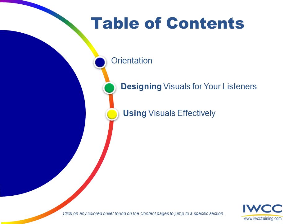
Orientation Using Visuals Effectively Designing Visuals for Your Listeners Table of Contents Click on any colored bullet found on the Content pages to jump to a specific section. www.iwcctraining.com
3
Orientation This material was developed to help you use visuals to enhance your presentation. As you work through the slides, you will gain tips and techniques for designing and using visuals. You will learn how to help your listeners understand your message and remember your key points. Why Use Visuals? Return to main Table of Contents www.iwcctraining.com The Art of PowerPoint

4
www.iwcctraining.com Why Use Visuals? Orientation Visuals have been a powerful means of communication for thousands of years – from simple drawings on cave walls to today’s elaborate electronic presentations. When used correctly, visuals will strengthen any message. Effective visuals are, therefore, vital to the success of your presentation. You need to master these two skills: know when to use visuals to engage your audience know how to design visuals that support your message.

5
www.iwcctraining.com 10% Straight Lecture 50% Lecture + Visuals How much people remember… Orientation When a presenter adds clear, well-designed visuals to a presentation the audience takes away more of the message. If you add effective visuals to your talk, your audience’s retention rate will go up significantly – to 50%. Statistics tell us that when audiences simply listen to a presenter talk their retention rate is dismal! People remember 10% of a straight lecture.

6
www.iwcctraining.com The ART of PowerPoint 1. Announce each slide – tell the audience what they are about to see 2. Reveal the slide & remain silent for 8-10 seconds – let them read the slide 3. Talk about the points on your slide – don’t simply read the words You can look polished and professional by using a three-step process we call the ART of PowerPoint. Orientation

7
www.iwcctraining.com 3 More Tips Orientation In addition to the ART, try these 3 suggestions to look more professional: 1. Open without a slide 2. Maintain eye contact with your audience 3. Blank the screen when you are interacting with your audience or moving to another topic.

8
Designing Visuals for your Listeners In this section, you will explore some principles for designing visuals. You will gain tips and techniques for preparing visuals to support – and help your listeners understand and remember – your message. Return to main Table of Contents www.iwcctraining.com General Design Principles Examples of Visuals

9
www.iwcctraining.com General Design Principles Designing Visuals for your Listeners By following these 8 key design rules, you will be on your way to creating visuals that will help your listeners understand your message. 1.Communicate only one or two key concepts per visual. 2.Keep it simple; don’t overcrowd your visual (maximum 36 words – up to 6 words across and up to 6 lines down). 3.Use pictures and numbers, when possible, rather than words. 4.Only use images you have permissions to use (check copyright). 5.Use color (where possible).
. 3.Use pictures and numbers, when possible, rather than words. 4.Only use images you have permissions to use (check copyright). 5.Use color (where possible)..")
10
www.iwcctraining.com Designing Visuals for your Listeners 6.Use a font size and style that is easy to read from a distance. 7.Use descriptive headings that explain the main point of the slide. 8.Maintain consistency throughout a set of visuals. Now, let’s take a look at a few of these key areas in a little more detail...

11
www.iwcctraining.com Typography We have been thrown into a world of fonts and typefaces that can be overwhelming. Follow these guidelines and you will not go wrong: Use UPPER and lower case letters (CAPS are harder to read) Choose an easy-to-read sans serif or hybrid font for your text or bullets (serif fonts are more difficult to read on screen) Choose an easy-to-read font size (Hint: To check your font size, look at your laptop screen from 12 feet away; then try a distance of 6 feet. Can you read your screen easily from both distances? If yes, the font size will work well; if no, try a larger size – or a different font style.) Use no more than two different fonts in a presentation Designing Visuals for your Listeners
 Choose an easy-to-read sans serif or hybrid font for your text or bullets (serif fonts are more difficult to read on screen) Choose an easy-to-read font size (Hint: To check your font size, look at your laptop screen from 12 feet away; then try a distance of 6 feet. Can you read your screen easily from both distances. If yes, the font size will work well; if no, try a larger size – or a different font style.) Use no more than two different fonts in a presentation Designing Visuals for your Listeners.")
12
www.iwcctraining.com Headings When you are writing headings for your slides, here are a few tips to keep in mind: Use appropriate, descriptive, reader-focused headings that clearly explain the main point of your slide Keep your headings short Do not underline your headings…if needed, use a graphic line to separate them from your text or picture Use the same font size and style for all same level headings Be consistent throughout your slide deck Designing Visuals for your Listeners

13
www.iwcctraining.com Color Color works wonders for visuals. Use it to create interest and highlight or differentiate information. Here are some general tips to help you get started with color: Presenting in a light room? Use a light background for your slides Presenting in a dim or low light room? Choose a darker background for your slides Don’t let the background (color, design or picture) dominate your message – keep it simple Choose a color template – or customized color scheme – that is appropriate for your topic, audience and objective TIP:About 15% of people are unable to differentiate between reds and greens so avoid using reds and greens together (e.g. adjoining segments of a pie.) Designing Visuals for your Listeners
 dominate your message – keep it simple Choose a color template – or customized color scheme – that is appropriate for your topic, audience and objective TIP:About 15% of people are unable to differentiate between reds and greens so avoid using reds and greens together (e.g. adjoining segments of a pie.) Designing Visuals for your Listeners.")
14
www.iwcctraining.com Charts, tables & graphs If you are designing charts, table or graphs for your presentation visuals, these general guidelines will help you: Make your visuals audience-friendly — Organize information so that it flows logically and your purpose is clear — Keep text to a minimum; use plenty of white space around text/numbers — Align columns of text and numbers — Make headings large, bold and descriptive — Use thin lines or shading to separate columns and rows — Identify your data source in a small font at the bottom right or left of your visual Communicate numerical data clearly — Round off numbers whenever possible — Use the same unit of measurement when comparing data — Keep charts, table & graphs simple — Include essential data only Designing Visuals for your Listeners

15
www.iwcctraining.com A few more tips… Here are a few more tips for designing effective visuals.. Use effects minimally Today’s software gives us access to a wide range of transition, animation and sound effects. Before you add an effect to a slide, ask yourself: How will this effect help the audience understand my message more clearly? Does this effect signal a significant topic change to the audience? Is it necessary? Don’t overwhelm your audience; keep presentation effects to a minimum. Use audio clips for quotes Audio clips are a great tool to use for your quotes. They add interest to your presentation and enhance the credibility of the quote. Designing Visuals for your Listeners

16
www.iwcctraining.com When using an audio clip, here are a few things to keep in mind: Incorporate high quality audio clips into your slides…but first check that the format is compatible with your system and software Keep it short – no more than 45 seconds – or you will risk loosing the listeners’ attention Introduce the audio clip and support it with a picture (and text) so that the listeners can more easily absorb the information Check that the sound is loud enough for everyone in your audience to hear the clip. Use video clips for demonstrations Video clips will help you demonstrate movement or action and increase audience retention. They are extremely helpful when you are presenting “how to” topics. Here are a few tips for working with video clips: Select a high resolution video clip and check that the format is compatible with your system and software Designing Visuals for your Listeners

17
www.iwcctraining.com Keep it short – no more than two minutes Save the video clip in the same folder as your presentation to keep the link short and movement between the files easier (most video clips are too large to embed in your presentation) Use full screen mode for showing your video clip and ensure the volume is loud enough for your audience to hear it Introduce the video clip: let your audience know exactly what they should be watching for in the clip. Use hyperlinks for easy access Hyperlinks can connect a presentation to other files or applications. They enable you to jump between slides, display web pages, share documents and more. Here are two tips to keep in mind: Review the options in your software for adding and using hyperlinks Attach a hyperlink to a graphic or text on a slide and ensure the hyperlink target is available on the laptop you are using to deliver your presentation Designing Visuals for your Listeners

18
www.iwcctraining.com Examples of Visuals Now, let’s take a look at a few basic good versus bad slide examples of text, table and graph visuals. The following examples will provide you with some ideas for creating audience-focused visuals that will help your listeners remember your key points. Designing Visuals for your Listeners

19
www.iwcctraining.com Example #1 Original What’s wrong with this text slide? What could you do to make it more audience- focused and better support the presenter’s message? Makeover Here’s how one presenter recreated the slide to better support the audience and the presenter’s key points. Designing Visuals for your Listeners

20
www.iwcctraining.com Example #2 – Option 1 Original What’s wrong with this text slide? What could you do to make it more audience- focused and better support the presenter’s message? Makeover #1 Here’s how one presenter recreated the slide. (On the next page, you will find another sample makeover that also works well.) Designing Visuals for your Listeners
 Designing Visuals for your Listeners.")
21
www.iwcctraining.com Makeover #2 Slide #1 (start with a question to capture audience interest) Slide #5 (finish with all four points showing on the slide) Slide #2 (add first key point) Slide #3 (add second key point) Slide #4 (add third key point) For this option, you can: 1. Create five consecutive slides; or 2. Use slide effects to build the content on one slide. Example #2 – Option 2 Original Can you think of any other ways you could make this slide more audience- focused and better support the presenter’s message? Designing Visuals for your Listeners

22
www.iwcctraining.com Example #3 – Option 1 Original What’s wrong with this text slide? What could you do to make it more audience- focused and better support the presenter’s message? Makeover #1 Here’s how one presenter recreated the slide. (On the next page, you will find an example how to use simple effects to focus the audience on the key points.) Designing Visuals for your Listeners
 Designing Visuals for your Listeners.")
23
www.iwcctraining.com Example #3 – Option 2 Original Can you think of any other ways you could make this slide more audience- focused and better support the presenter’s message? Makeover #2 Here’s how one presenter used effects to capture audience attention and helped them focus on the point as she guided them through the information. Designing Visuals for your Listeners

24
www.iwcctraining.com Example #4 – Option 1 Original What’s wrong with this table slide? What could you do to make it more audience- focused and better support the presenter’s message? Makeover #1 Here’s how one presenter recreated the slide. (On the next page, you will find another sample makeover that, while not as effective, also works.) Designing Visuals for your Listeners
 Designing Visuals for your Listeners.")
25
www.iwcctraining.com Makeover #2 Slide #1 (start with the first key point and corresponding text highlighted) For this option, you can: 1. Create two consecutive slides; or 2. Use slide effects to build the content on one slide. Example #4 – Option 2 Original Can you think of any other ways you could make this table slide more audience-focused and better support the presenter’s message? Slide #2 (fade the first key point, bring in the second key point and highlight the corresponding text) Designing Visuals for your Listeners
 Designing Visuals for your Listeners.")
26
www.iwcctraining.com Example #5 Original What’s wrong with this graph slide? What could you do to make it more audience-focused and better support the presenter’s message? Makeover Here’s how one presenter recreated the slide to better support the audience and the presenters key points. Designing Visuals for your Listeners

27
Using Visuals Effectively In this section, you will review some of the ways good presenters help their audiences as well as some of the traps ineffective presenters often fall in to when using visuals. Return to main Table of Contents www.iwcctraining.com Major Do’s and Don’ts Tips for Using Presentation Equipment Tips for Web-Based Presentations

28
www.iwcctraining.com Major Do’s and Don’ts Major Do’s Whether you are using a low-tech visual medium or one of the more high- tech options available, here are some general tips for making a smooth presentation: Do keep the number of slides reasonable (approx. 2-3 slides per 5 minutes of talking is a good guideline for most presentations). Do keep your visual simple by focusing on the key point. Do test your visuals and links on the equipment you plan to use before your presentation. Do rehearse your presentation with the visuals and equipment you plan to use. Designing Visuals for your Listeners
. Do keep your visual simple by focusing on the key point. Do test your visuals and links on the equipment you plan to use before your presentation. Do rehearse your presentation with the visuals and equipment you plan to use. Designing Visuals for your Listeners.")
29
www.iwcctraining.com Do keep your shoulders square to your audience. Do keep eye contact with your audience. Do give the audience time to absorb the information on your visual before speaking (8-10 seconds). Do remove the visual from view once you have used it. Major Don’ts Ineffective presenters often fall into a number of well-known traps. Here are some general pitfalls to avoid during your presentation: Don’t use visuals as a substitute for a well-prepared and well-delivered presentation. Don’t confuse your audience with an overload of information. Don’t overcomplicated your visuals with too much detail. Designing Visuals for your Listeners
. Do remove the visual from view once you have used it. Major Don’ts Ineffective presenters often fall into a number of well-known traps. Here are some general pitfalls to avoid during your presentation: Don’t use visuals as a substitute for a well-prepared and well-delivered presentation. Don’t confuse your audience with an overload of information. Don’t overcomplicated your visuals with too much detail. Designing Visuals for your Listeners.")
30
www.iwcctraining.com Don’t use full sentences instead of bullet points. Don’t use too small a type size or too fancy a font style. Don’t use too many unnecessary or distracting effects. Don’t leave your audience to guess what message your visual is intended to portray. Don’t read from your slides or talk to your charts or slides. Don’t lower your head or turn your back on your audience. Don’t allow leftover visuals to distract your audience. Don’t wing it! Designing Visuals for your Listeners

31
www.iwcctraining.com Tips for Using Presentation Equipment Before you begin… On your desktop, create a shortcut to your presentation for easy access Turn off the power-saver function on your laptop and projection unit Turn off the screen saver on your laptop Check the volume – if you are not using audio or video clips, mute your laptop; if you are using them, set the volume on your equipment a little higher than usual Arrange your equipment on a table so that your laptop is on the side you are presenting from (ensure you can easily see the laptop screen from where you will present); also, if you are not using a remote, position your laptop so that you don’t have to reach in front of the projection unit to change slides Designing Visuals for your Listeners
; also, if you are not using a remote, position your laptop so that you don’t have to reach in front of the projection unit to change slides Designing Visuals for your Listeners")
32
www.iwcctraining.com Tips for Web-Based Presentations Web presentations are different in many ways from standard business presentation. For example, if you use a full screen graphic, you may not need a title on the slide. You will however need to be clear when you verbally introduce the slide to the audience. Another difference is that you do not need to blank the screen when you are speaking. Your slide may be the only visual that connects you with your audience. Designing Visuals for your Listeners

33
www.iwcctraining.com Here are a few basic tips to help you prepare: Before you begin… Remove any animation effects that use movement from your visuals Practice using the web conferencing tools and be prepared for any technical glitches that may occur when you go live Use a headset with a mike capable of eliminating outside noise Connect a second laptop – set up as a participant so that you can see what your audience is seeing During your presentation… Be animated, be honest, be “human” …and be prepared to handle glitches Let the audience know upfront if they are muted and why or why not; when you will take questions; and how you will handle the Q&A session Use formal and informal polls to keep the audience engaged Use lots of visuals Designing Visuals for your Listeners

34
www.iwcctraining.com Watch out for typos Don’t allow a few careless errors to destroy your credibility. Audiences can be merciless if your visuals have errors. Always spell check, proofread and check for inconsistencies in your visuals. If you are presenting numerical or financial data, make sure the math is correct. Using Visuals Effectively

35
By applying the tips and techniques you have learned in this slideshow, you will be well on your way to: Designing visuals that help the audience understand your message and remember your key points Using visuals to enhance your message Looking professional “Wait to design your visuals until AFTER you have pinned down your presentation content.”

Similar presentations


 How to use PowerPoint effectively.>")


