Download presentation
Presentation is loading. Please wait.

1
Chart Deception Main Source: How to Lie with Charts, by Gerald E. Jones
Dr. Michael R. Hyman, NMSU

2
Information Information = Data + Labels 5056465238 = data

3
Summaries Can Hide Needed Detail

5
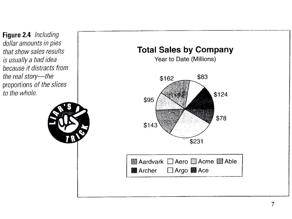
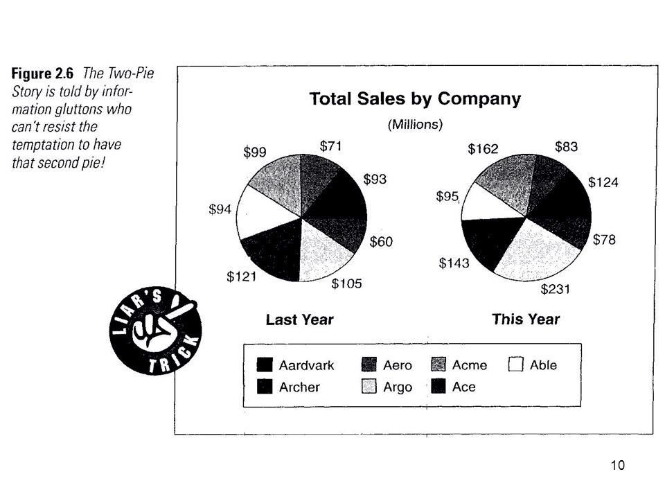
Pie Charts Pie charts denote percentages
Label slices with percentages, not raw values True of two pie figures Most important slice Right-hand slice Exploded slice Bottom slice of 3-D pie seems overly important

9
Pie Charts Pie charts denote percentages
Label slices with percentages, not raw values True of two pie figures Most important slice Right-hand slice Exploded slice Bottom slice of 3-D pie seems overly important

11
Pie Charts Pie charts denote percentages
Label slices with percentages, not raw values True of two pie figures Most important slice Right-hand slice Exploded slice Bottom slice of 3-D pie seems overly important

13
Pie Charts Pie charts denote percentages
Label slices with percentages, not raw values True of two pie figures Most important slice Right-hand slice Exploded slice Bottom slice of 3-D pie seems overly important

15
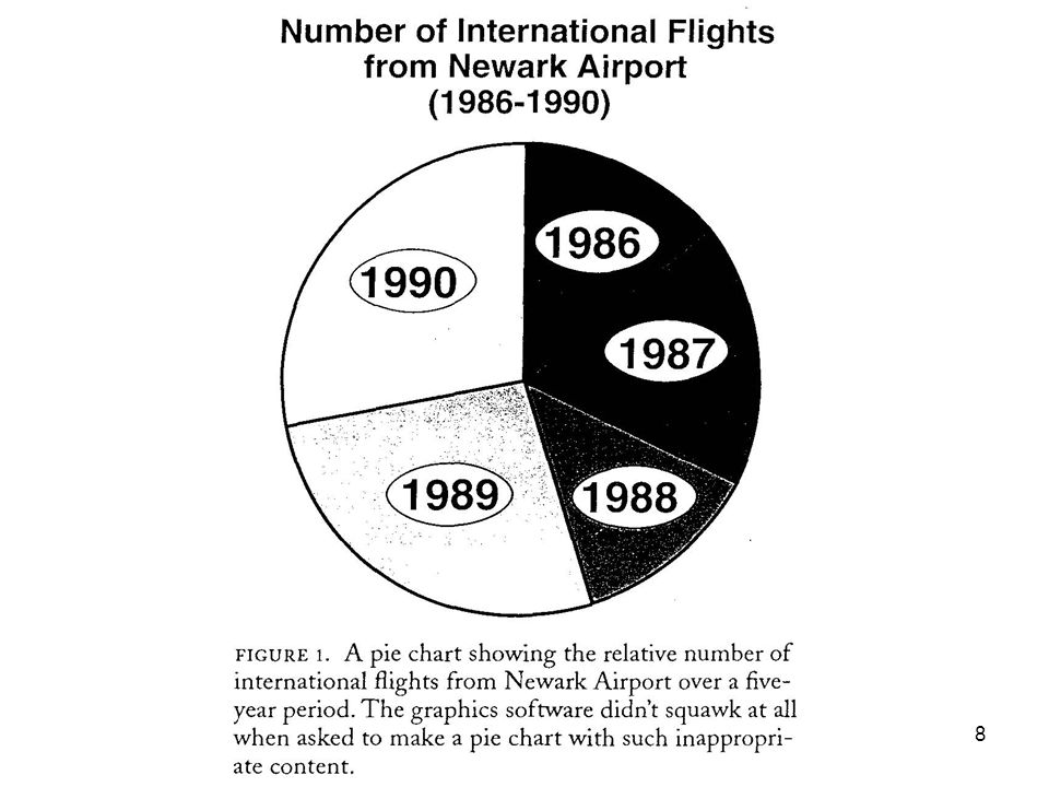
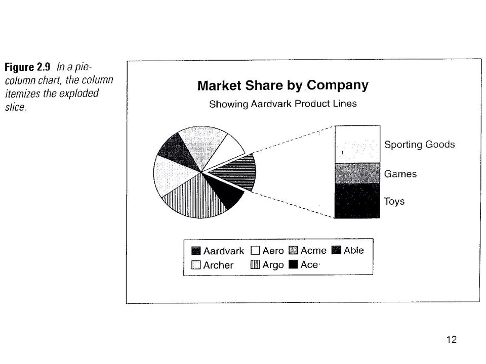
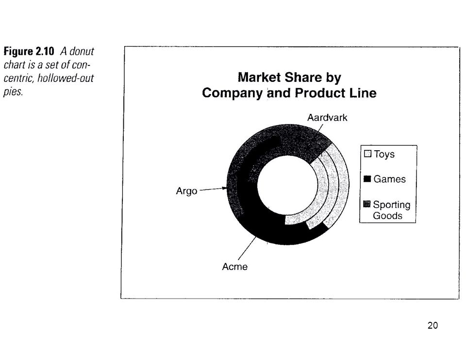
Pie Charts Multi-sized pies on same figure (to denote trend) biased by dissimilar diameter-area rates of growth Large ‘Other’ slice can hide needed detail Use pie-column chart for more detail on a slice Donut charts confusing Omitting missing data increases relate size of all slices

17
Pie Charts Multi-sized pies on same figure (to denote trend) biased by dissimilar diameter-area rates of growth Large ‘Other’ slice can hide needed detail Use pie-column chart for more detail on a slice Donut charts confusing Omitting missing data increases relate size of all slices

19
Pie Charts Multi-sized pies on same figure (to denote trend) biased by dissimilar diameter-area rates of growth Large ‘Other’ slice can hide needed detail Use pie-column chart for more detail on a slice Donut charts confusing Omitting missing data increases relate size of all slices

21
Pie Charts Multi-sized pies on same figure (to denote trend) biased by dissimilar diameter-area rates of growth Large ‘Other’ slice can hide needed detail Use pie-column chart for more detail on a slice Donut charts confusing Omitting missing data increases relate size of all slices

23
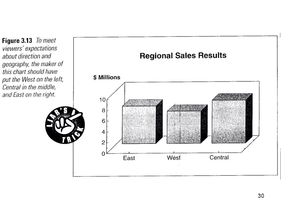
Attend to Cultural Bias in Orienting Charts

26
Argo Sales Increase Sales, in units or dollars, listed along the y axis Avoid 3D effects

28
Bar Chart—Avoid 3D and Sideways

33
Bar and Area Charts Stacked vs. clustered bar charts
Mixing cumulative and clustered bars can confuse viewers When stacking, place least variable component on bottom Avoid paired-bar charts Viewers can misread 3-D bars

37
Bar and Area Charts Stacked vs. clustered bar charts
Mixing cumulative and clustered bars can confuse viewers When stacking, place least variable component on bottom Avoid paired-bar charts Viewers can misread 3-D bars

39
Bar and Area Charts Stacked vs. clustered bar charts
Mixing cumulative and clustered bars can confuse viewers When stacking, place least variable component on bottom Avoid paired-bar charts Viewers can misread 3-D bars

41
Bar and Area Charts Stacked vs. clustered bar charts
Mixing cumulative and clustered bars can confuse viewers When stacking, place least variable component on bottom Avoid paired-bar charts Viewers can misread 3-D bars

43
Bar Graph—Avoid 3D

44
Avoid 3-D Effects

46
Line Graph—Avoid 3D

48
XY (or Scatter) Charts Label data points
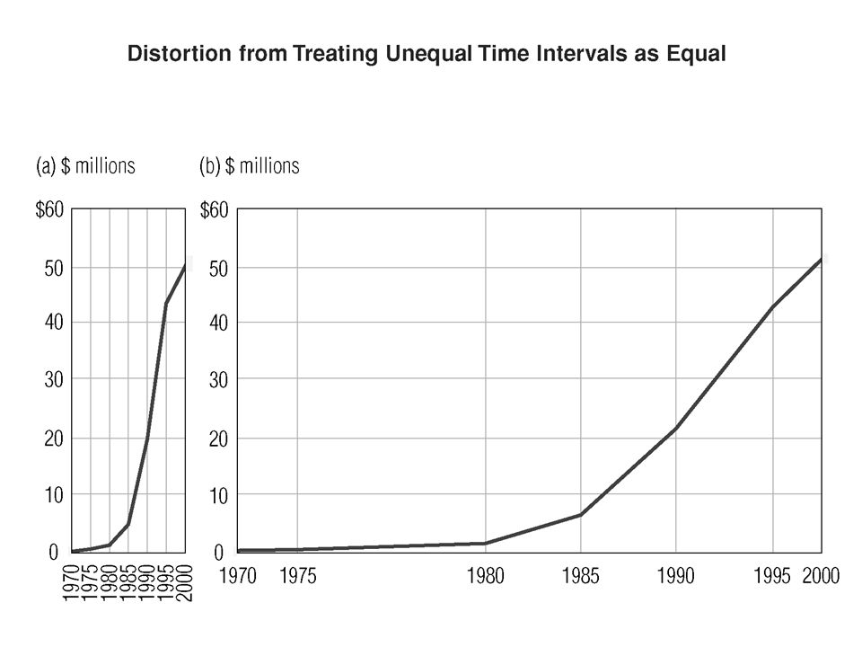
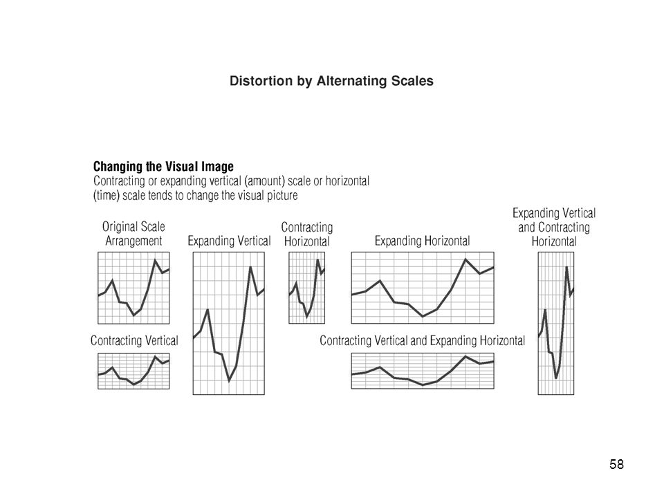
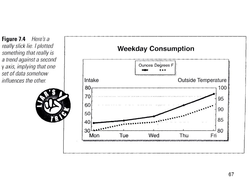
Start axes at coordinates (0,0) Avoid distorting axes Avoid broken axes Cumulative charts seem optimistic because upward sloping Avoid dissimilar data on same chart Semi-log charts can minimize trends If x axis isn’t time axis, connecting dots can mistakenly suggest a trend Interpolation and extrapolation are subjective
 Avoid distorting axes. Avoid broken axes. Cumulative charts seem optimistic because upward sloping. Avoid dissimilar data on same chart. Semi-log charts can minimize trends. If x axis isn’t time axis, connecting dots can mistakenly suggest a trend. Interpolation and extrapolation are subjective.")
51
XY (or Scatter) Charts Label data points
Start axes at coordinates (0,0) Avoid distorting axes Avoid broken axes Cumulative charts seem optimistic because upward sloping Avoid dissimilar data on same chart Semi-log charts can minimize trends If x axis isn’t time axis, connecting dots can mistakenly suggest a trend Interpolation and extrapolation are subjective
 Avoid distorting axes. Avoid broken axes. Cumulative charts seem optimistic because upward sloping. Avoid dissimilar data on same chart. Semi-log charts can minimize trends. If x axis isn’t time axis, connecting dots can mistakenly suggest a trend. Interpolation and extrapolation are subjective.")
56
XY (or Scatter) Charts Label data points
Start axes at coordinates (0,0) Avoid distorting axes Avoid broken axes Cumulative charts seem optimistic because upward sloping Avoid dissimilar data on same chart Semi-log charts can minimize trends If x axis isn’t time axis, connecting dots can mistakenly suggest a trend Interpolation and extrapolation are subjective
 Avoid distorting axes. Avoid broken axes. Cumulative charts seem optimistic because upward sloping. Avoid dissimilar data on same chart. Semi-log charts can minimize trends. If x axis isn’t time axis, connecting dots can mistakenly suggest a trend. Interpolation and extrapolation are subjective.")
59
XY (or Scatter) Charts Label data points
Start axes at coordinates (0,0) Avoid distorting axes Avoid broken axes Cumulative charts seem optimistic because upward sloping Avoid dissimilar data on same chart Semi-log charts can minimize trends If x axis isn’t time axis, connecting dots can mistakenly suggest a trend Interpolation and extrapolation are subjective
 Avoid distorting axes. Avoid broken axes. Cumulative charts seem optimistic because upward sloping. Avoid dissimilar data on same chart. Semi-log charts can minimize trends. If x axis isn’t time axis, connecting dots can mistakenly suggest a trend. Interpolation and extrapolation are subjective.")
62
XY (or Scatter) Charts Label data points
Start axes at coordinates (0,0) Avoid distorting axes Avoid broken axes Cumulative charts seem optimistic because upward sloping Avoid dissimilar data on same chart Semi-log charts can minimize trends If x axis isn’t time axis, connecting dots can mistakenly suggest a trend Interpolation and extrapolation are subjective
 Avoid distorting axes. Avoid broken axes. Cumulative charts seem optimistic because upward sloping. Avoid dissimilar data on same chart. Semi-log charts can minimize trends. If x axis isn’t time axis, connecting dots can mistakenly suggest a trend. Interpolation and extrapolation are subjective.")
65
XY (or Scatter) Charts Label data points
Start axes at coordinates (0,0) Avoid distorting axes Avoid broken axes Cumulative charts seem optimistic because upward sloping Avoid dissimilar data on same chart Semi-log charts can minimize trends If x axis isn’t time axis, connecting dots can mistakenly suggest a trend Interpolation and extrapolation are subjective
 Avoid distorting axes. Avoid broken axes. Cumulative charts seem optimistic because upward sloping. Avoid dissimilar data on same chart. Semi-log charts can minimize trends. If x axis isn’t time axis, connecting dots can mistakenly suggest a trend. Interpolation and extrapolation are subjective.")
69
XY (or Scatter) Charts Label data points
Start axes at coordinates (0,0) Avoid distorting axes Avoid broken axes Cumulative charts seem optimistic because upward sloping Avoid dissimilar data on same chart Semi-log charts can minimize trends If x axis isn’t time axis, connecting dots can mistakenly suggest a trend Interpolation and extrapolation are subjective
 Avoid distorting axes. Avoid broken axes. Cumulative charts seem optimistic because upward sloping. Avoid dissimilar data on same chart. Semi-log charts can minimize trends. If x axis isn’t time axis, connecting dots can mistakenly suggest a trend. Interpolation and extrapolation are subjective.")
71
XY (or Scatter) Charts Label data points
Start axes at coordinates (0,0) Avoid distorting axes Avoid broken axes Cumulative charts seem optimistic because upward sloping Avoid dissimilar data on same chart Semi-log charts can minimize trends If x axis isn’t time axis, connecting dots can mistakenly suggest a trend Interpolation and extrapolation are subjective
 Avoid distorting axes. Avoid broken axes. Cumulative charts seem optimistic because upward sloping. Avoid dissimilar data on same chart. Semi-log charts can minimize trends. If x axis isn’t time axis, connecting dots can mistakenly suggest a trend. Interpolation and extrapolation are subjective.")
73
XY (or Scatter) Charts Label data points
Start axes at coordinates (0,0) Avoid distorting axes Avoid broken axes Cumulative charts seem optimistic because upward sloping Avoid dissimilar data on same chart Semi-log charts can minimize trends If x axis isn’t time axis, connecting dots can mistakenly suggest a trend Interpolation and extrapolation are subjective
 Avoid distorting axes. Avoid broken axes. Cumulative charts seem optimistic because upward sloping. Avoid dissimilar data on same chart. Semi-log charts can minimize trends. If x axis isn’t time axis, connecting dots can mistakenly suggest a trend. Interpolation and extrapolation are subjective.")
74
Radar Charts Beware non-uniform scales on axes

76
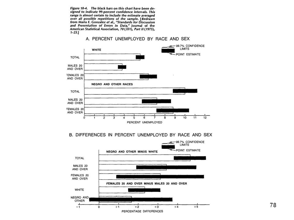
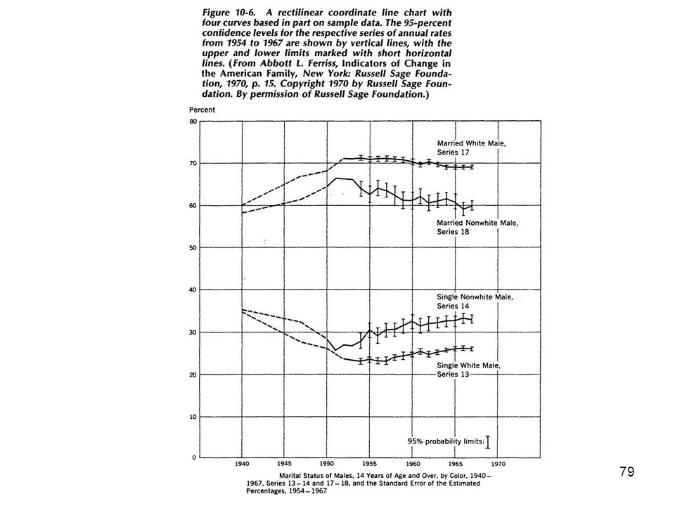
Depicting Confidence Intervals

80
Headers and Footers Use footnotes to source table (avoid plagiarism charge) Font rules Use proportional font Don’t mix fonts in a chart Use upper and lower case letters Spell out numbers 1 through 9 unless a measure

82
Examples of Bad Graphics

87
Examples of Bad and Better Graphics

88
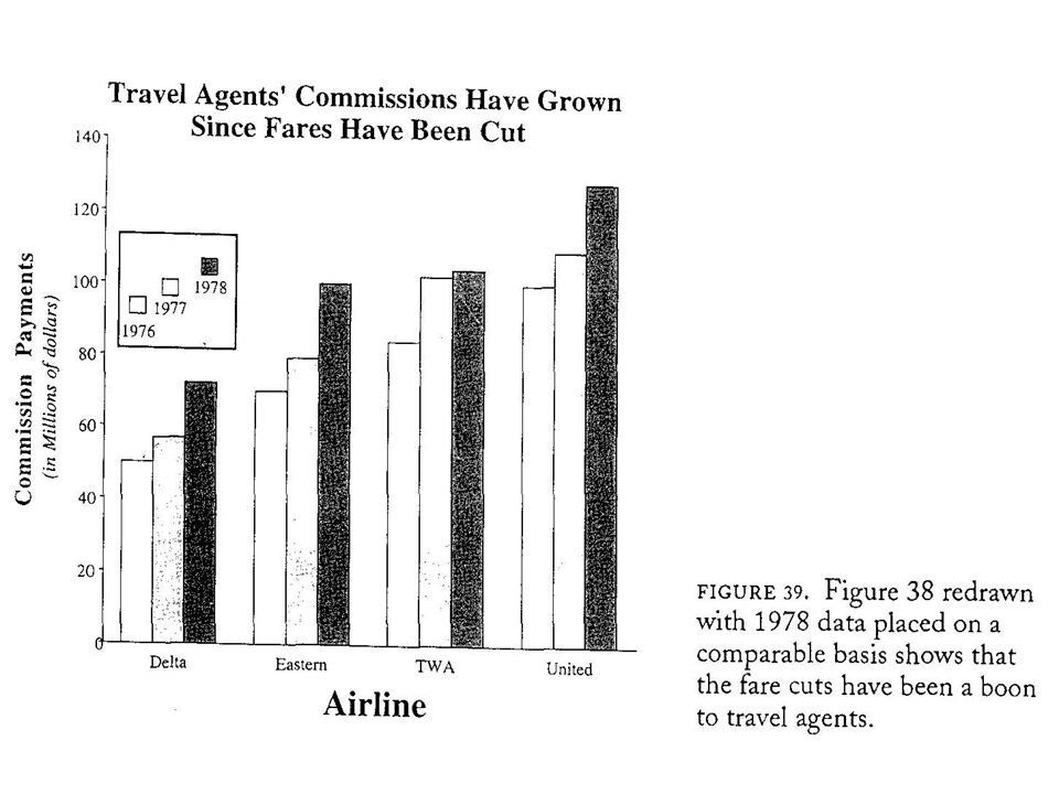
Example #1

90
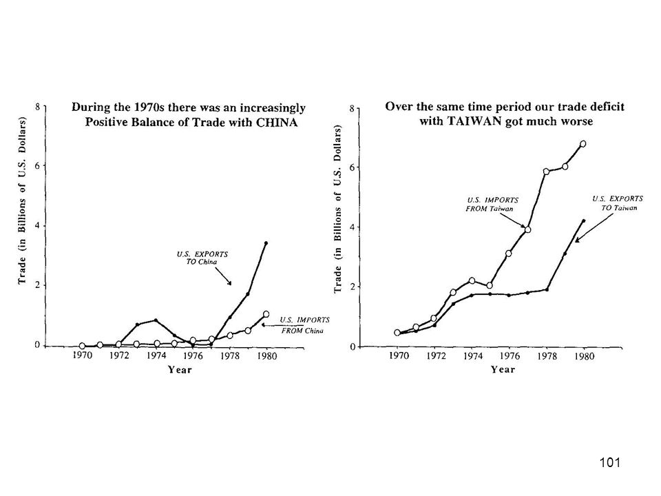
Example #2

92
Example #3

94
Example #4

96
Example #5

98
Example #6

100
Example #7

102
Example #8

Similar presentations


 Grants Chapter 6.>")