Download presentation
Presentation is loading. Please wait.

1
Describing Tables, Charts and Graphs
BEC Writing Describing Tables, Charts and Graphs

2
How to approach BEC Writing Test Part One
This part tests your ability to write a short report expressing information which you are given in graphic form, such as bar charts, pie charts and graphs. Read the instructions carefully so that you know what you are required to do: this is usually to describe or compare the information in the graphic input. Underline the keywords in the instructions. Make an outline plan of the report. Start with a brief description of what the report is about. You can use suitable headings if you wish. Try to use a wide range of appropriate vocabulary and grammatical structures. You should not invent any information for this part.

3
How to approach BEC Writing Test Part One
Check that you have written your answer in words (multiply the number of lines by the average number of words per line: don't waste time counting every word). After writing, read what you have written, correct mistakes and make improvements. If you want to add anything, use a sign. Put a line through anything you want to omit. You should not rewrite your answer. Make sure the examiner will be able to read your answer. Use a pen and your normal handwriting (do not write in capital letters). You should spend about minutes on this part.
. After writing, read what you have written, correct mistakes and make improvements. If you want to add anything, use a sign. Put a line through anything you want to omit. You should not rewrite your answer. Make sure the examiner will be able to read your answer. Use a pen and your normal handwriting (do not write in capital letters). You should spend about minutes on this part.")
4
A table is a set of facts and figures arranged in columns and rows
A table is a set of facts and figures arranged in columns and rows. A table is a very useful way of organising numerical information.

5
There are two common types of chart, a pie chart and a bar chart.
What is a chart? A chart is a diagram that makes information easier to understand by showing how two or more sets of data are related. There are two common types of chart, a pie chart and a bar chart.

6
A pie chart is a circle divided into segments
A pie chart is a circle divided into segments. It is usually used to show percentages.

7
A bar chart is a diagram containing bars or columns that makes information easier to understand by showing the difference between two or more sets of numbers or measurements.

8
A graph is a diagram containing lines or curves, which shows the trends of two or more sets of numbers or measurements.

9
Describing Trends in Graphs

10
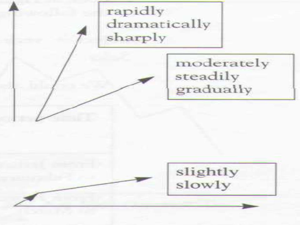
What is a trend? Trends are the changes or movements in facts and figures over a period of time. There may be upward and downward trends. Trends may happen at different pace and with different momentum. Trends can be described by verbs, nouns, adjectives and adverbs.

13
迅速增长地,迅猛发展地

14
Verbs to describe downward movement
decline decrease drop fall slide weaken lose ground dive plummet plunge crash collapse take a fall

15
Verbs to describe upward movement
jump soar rocket go through the roof grow rise increase climb gain strengthen surge

16
Verbs to describe stability
flatten out hold steady level off even off bottom out stabilise recover bounce back rally

17
Adjectives to specify the pace or degree of changes
slow gradual steady slight moderate marginal rapid fast Sharp dramatic exponential heavy massive enormous remarkable nervous perilous(危险的) disastrous
 disastrous.")
18
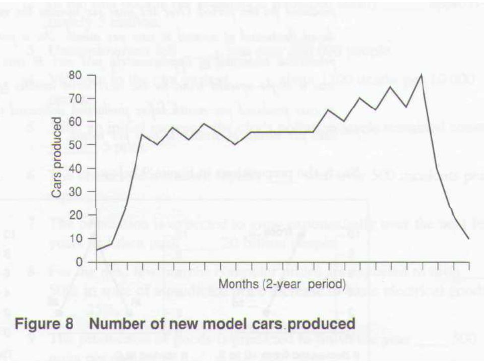
Quarterly change of production

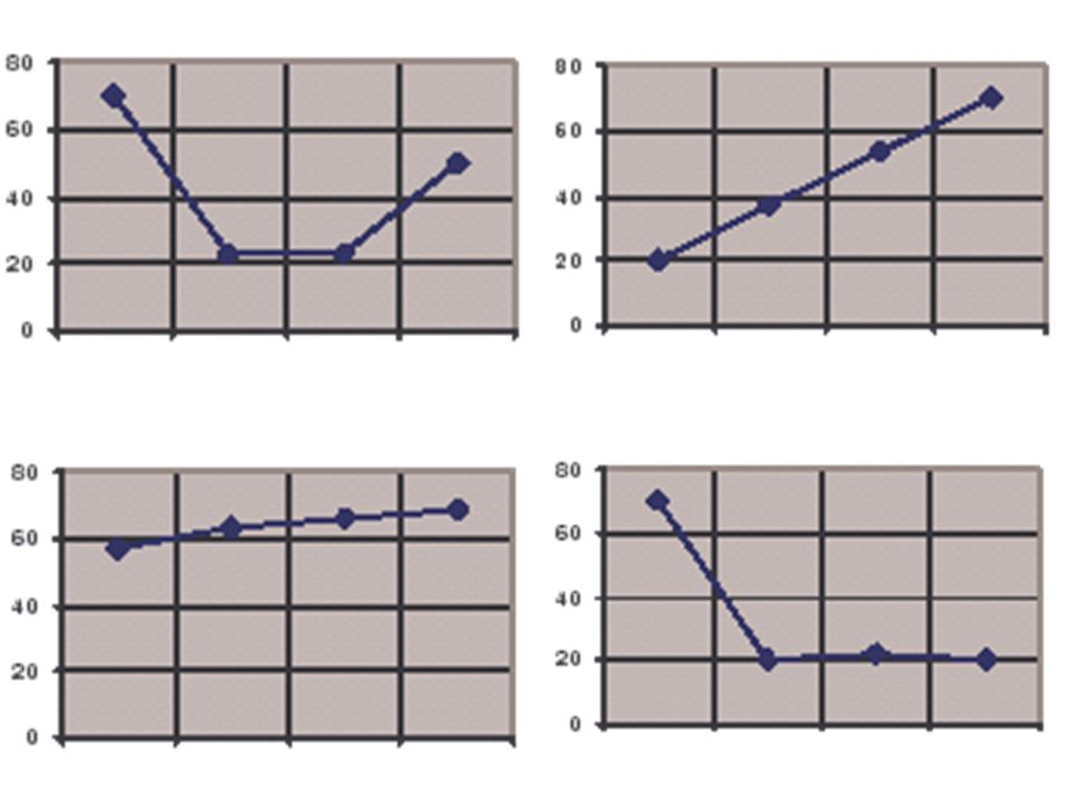
21
Example 1: The production started from 20 in the first quarter. It then climbed sharply but flattened off in the next two quarters at a level of around 70. Since then, it has plummeted back to 20 again toward the end of the year.

22
Example 2: Production grew more and more rapidly over the first three quarters and then reached a peak of 70 in the third quarter. Since then, it has quickly dropped to reach 20 in the last quarter .

23
Example 3: Production grew dramatically in the first quarter, but reached a plateau of about 70 in the second. Since then it has remained more or less stable.

24
Example 4: Production peaked at 70 in the first quarter, and then slid slowly but steadily over the year to 40.

25
Example 5: Production started the year in a stable position of 70, but then plunged in the third quarter to 20. Since then it has flattened out at that level.

26
Example 6: Starting the year at 70, production fell considerably over the first three quarters, reaching a low of 20. Since then it has staged a partial recovery by ending the year at 40.

27
Example 7: Production has been fluctuating from 30 to 50 all year around.

28
Example 8: Production held steady at the level of 70 in the first three quarters, but fell sharply in the last to reach a low of 20.

29
Example 9: After a considerable drop in the first two quarters, production bottomed out at 20. Since then it has started to bounce back, reaching 50 in the last quarter.

30
Example 10: Production has experienced a strong, steady growth over the whole year, climbing from 20 to the peak of 70.

31
Example 11: There has been a slight increase in production over the year, rising from 60 to 70.

32
Example 12: There was a rapid drop in production (from 70 to 20) in the first quarter, but it bottomed out at about 20 in the remainder of the year.
 in the first quarter, but it bottomed out at about 20 in the remainder of the year.")
Similar presentations


 Objectives: to understand kinds of illustrated information to familiarize with tables, graphs or charts to read.>")


 investments (things they need to buy in order to help the company, e.g. Machines) Bank and businesses.>")


>")
. a downward trend (a falling trend)>")


