Download presentation
Presentation is loading. Please wait.

1
Chapter 12.2A More About Regression—Transforming to Achieve Linearity

2
Objectives: USE transformations involving powers and roots to achieve linearity for a relationship between two variables MAKE predictions from a least-squares regression line involving transformed data USE transformations involving logarithms to achieve linearity for a relationship between two variables DETERMINE which of several transformations does a better job of producing a linear relationship

3
In this INTRODUCTORY class, analyzing bivariate data which shows a non-linear pattern will be done in an INTRODUCTORY way…. Applying a function such as the logarithm or square root to a quantitative variable is called transforming the data. We will see in this section that understanding how simple functions work helps us choose and use transformations to straighten nonlinear patterns.

4
This is a power model of the form y = axp with a = π/4 and p = 2.
Transforming with Powers and Roots When you visit a pizza parlor, you order a pizza by its diameter—say, 10 inches, 12 inches, or 14 inches. But the amount you get to eat depends on the area of the pizza. The area of a circle is π times the square of its radius r. So the area of a round pizza with diameter x is This is a power model of the form y = axp with a = π/4 and p = 2.

5
Although a power model of the form y = axp describes a NON-linear relationship between x and y, there is a linear relationship between xp and y. If we transform the values of the explanatory variable x by raising them to the p power, and graph the points (xp, y), the scatterplot should have a linear form.
, the scatterplot should have a linear form.")
6
Example: Go Fish! Data on the length (in centimeters) and weight (in grams) for Atlantic Ocean rockfish is plotted. Note the clear curved shape:
 and weight (in grams) for Atlantic Ocean rockfish is plotted. Note the clear curved shape: .")
7
Because length is one-dimensional and weight (like volume) is three-dimensional, a power model of the form weight = a (length)3 should describe the relationship. This transformation of the explanatory variable helps us produce a graph that is quite linear.

8
Another way to transform the data to achieve linearity is to take the cube root of the weight values and graph the cube root of weight versus length. Note that the resulting scatterplot also has a linear form.

9
Once we straighten out the curved pattern in the original scatterplot, we fit a least-squares line to the transformed data. This linear model can then be used to predict values of the response variable.

10
Here is Minitab output from separate regression analyses of the two sets of transformed Atlantic Ocean rockfish data.

13
A) Give the equation of the least-squares regression line
A) Give the equation of the least-squares regression line. Define any variables you use.
 Give the equation of the least-squares regression line. Define any variables you use.")
14
A) Give the equation of the least-squares regression line
A) Give the equation of the least-squares regression line. Define any variables you use.
 Give the equation of the least-squares regression line. Define any variables you use.")
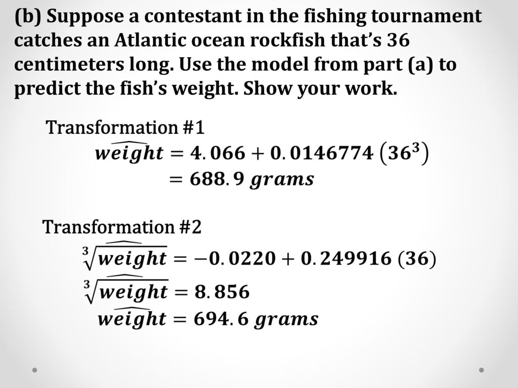
15
(b) Suppose a contestant in the fishing tournament catches an Atlantic ocean rockfish that’s 36 centimeters long. Use the model from part (a) to predict the fish’s weight. Show your work.
16
(c) Interpret the value of s in context.
For transformation 1, the standard deviation of the residuals is s = grams. Predictions of fish weight using this model will be off by an average of about 19 grams.

17
(c) Interpret the value of s in context.
For transformation 2, s = that is, predictions of the cube root of fish weight using this model will be off by an average of about 0.12.

18
Oh, my goodness! Do I have to do this by myself?
Transforming with Powers and Roots Oh, my goodness! Do I have to do this by myself? Generally, at the introductory level, no. However, some technology comes with built-in sliders that allow you to dynamically adjust the power and watch the scatterplot change shape as you do.

19
Chapter 12.2B More About Regression—Transforming to Achieve Linearity using Logarithms

20
It turns out that there is a much more efficient method for linearizing a curved pattern in a scatterplot. Instead of transforming with powers and roots, we use logarithms. This more general method works when the data follow an unknown power model or any of several other common mathematical models.

21
Example: Moore’s Law and Computer Chips
Gordon Moore, one of the founders of Intel Corporation, predicted in 1965 that the number of transistors on an integrated circuit chip would double every 18 months. This is Moore’s law, one way to measure the revolution in computing. Here are data on the dates and number of transistors for Intel microprocessors:

23
(a) A scatterplot of the natural logarithm of the number of transistors on a computer chip versus years since 1970 is shown. Based on this graph, explain why it would be reasonable to use an exponential model to describe the relationship between number of transistors and years since 1970.

24
If an exponential model describes the relationship between two variables x and y, then we expect a scatterplot of (x, ln y) to be roughly linear. the scatterplot of ln(transistors) versus years since 1970 has a fairly linear pattern, especially through the year So an exponential model seems reasonable.
 versus years since 1970 has a fairly linear pattern, especially through the year So an exponential model seems reasonable..")
25
(b) Minitab output from a linear regression analysis on the transformed data is shown below. Give the equation of the least-squares regression line. Be sure to define any variables you use.

26
(c) Use your model from part (b) to predict the number of transistors on an Intel computer chip in Show your work.

27
(d) A residual plot for the linear regression in part (b) is shown below. Discuss what this graph tells you about the appropriateness of the model.

28
The residual plot shows a distinct pattern, with the residuals going from positive to negative to positive as we move from left to right. But the residuals are small in size relative to the transformed y-values. Also, the scatterplot of the transformed data is much more linear than the original scatterplot. We feel somewhat comfortable using this model to make predictions about the number of transistors on a computer chip

29
Example: What’s a Planet, Anyway?
On July 31, 2005, a team of astronomers announced that they had discovered what appeared to be a new planet in our solar system. Originally named UB313, the potential planet is bigger than Pluto and has an average distance of about 9.5 billion miles from the sun. Could this new astronomical body, now called Eris, be a new planet? At the time of the discovery, there were nine known planets in our solar system. Here are data on the distance from the sun (in astronomical units, AU) and period of revolution of those planets.
 and period of revolution of those planets.")
30
Describe the relationship between distance from the sun and period of revolution.
There appears to be a strong, positive, non-linear relationship between distance from the sun (AU) and period of revolution (years).
 and period of revolution (years).")
31
(a) Based on the scatterplots, explain why a power model would provide a more appropriate description of the relationship between period of revolution and distance from the sun than an exponential model.
 Based on the scatterplots, explain why a power model would provide a more appropriate description of the relationship between period of revolution and distance from the sun than an exponential model.")
32
The scatterplot of ln(period) versus distance is clearly curved, so an exponential model would not be appropriate. However, the graph of ln(period) versus ln(distance) has a strong linear pattern, indicating that a power model would be more appropriate.
 versus ln(distance) has a strong linear pattern, indicating that a power model would be more appropriate..")
33
(b) Minitab output from a linear regression analysis on the transformed data (ln(distance), ln(period)) is shown below. Give the equation of the least-squares regression line. Be sure to define any variables you use.

34
(c) Use your model from part (b) to predict the period of revolution for Eris, which is 9,500,000,000/93,000,000 = AU from the sun. Show your work.

35
(d) A residual plot for the linear regression in part (b) is shown below. Do you expect your prediction in part (c) to be too high, too low, or just right? Justify your answer.
 to be too high, too low, or just right. Justify your answer..")
36
Eris’s value for ln(distance) is 6
Eris’s value for ln(distance) is 6.939, which would fall at the far right of the residual plot, where all the residuals are positive. Because residual = actual y - predicted y seems likely to be positive, we would expect our prediction to be too low.
 is 6.939, which would fall at the far right of the residual plot, where all the residuals are positive. Because residual = actual y - predicted y seems likely to be positive, we would expect our prediction to be too low.")
Similar presentations


