Download presentation
Presentation is loading. Please wait.

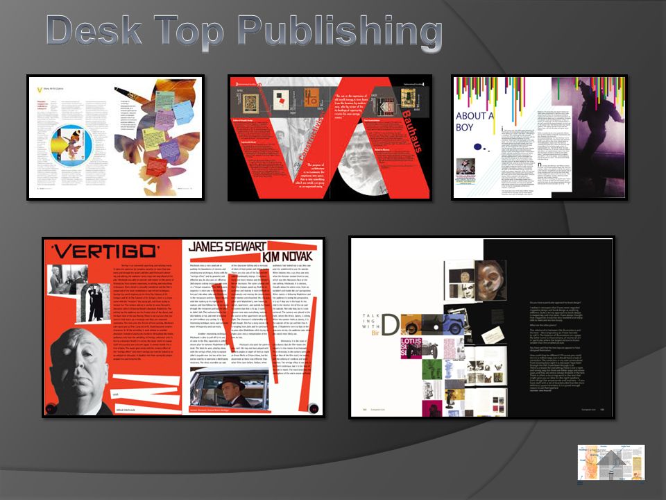
3
It can also be used to create emphasis. White space is when blank space is left on a layout deliberately. It gives the reader breathing space if the publication is quite busy. Leaving white space around a heading or an image can also make stand out. It doesn't have to be white!

4
We can manipulate images to enhance the visual impact of a publication. We can do this through Cropping. Partial/Square Cropping Full/Cut Out Cropping Images can be used to create a tone for the publication and can help to sell an idea of product. Transparency – making fills and images partially see through.

5
Drop Capital – the first letter (upper case) in an article or paragraph that is enlarged and dropped below the line. It identifies the start of an article. Caption– A brief description that accompanies a photograph, graphic or table. Could often be a description of a product, name of subject or the photographer. Its easy to see how effective a Drop Cap can be when compared to articles without one.

6
Body Text – the main block of text of a page. Gutter – the narrow space between the columns of text Column – the width of the frame of the body text. It shortens the line length making the text easier to read. Left Margin – the white space or border at the left side of the article. Right Margin – the white space or border at the right side of the article. Text Alignment/Justification – The way the text lines are arranged i.e. left, right, centred, fully justified.

7
Alignment – when the heading, subheading and text are all positioned and lined up together. Sub Heading – An intermediate level of heading. It is sized between the heading and body of text. Heading/Headline/Title – the text that introduces the article or subject. Normally a large font As it is normally a different font from the body text it can give the reader an instant idea as to what the document is about

8
Text Wrap – when text flows along the outline of a graphic or image Publications can use text wrap to sell products and create a more of a tone for articles. Here we see the text wrapping around rocks in a national park.

9
Header – the information that appears at the top of the page in a publication. Normally a title or category. Footer – the information in the footer space at the bottom of a publication page. Often a page number or website address.

10
Bleed – The extension of a graphic or image beyond the trimmed edge of a page Image bleeds can be used to make a publication appear larger than they actually are. Designers use them to emphasise a point or create a narrative to go along with the body text. Strength Design Structure Reliability Forward thinking

Similar presentations