Download presentation
Presentation is loading. Please wait.

1
Presenting census results Session 8 Subregional Workshop on Dissemination and Use of Population and Housing Census Results with a Gender Focus

3
Guidelines for tables, graphs and maps

4
Checklist: what makes a good map? Presents the information simply, clearly and accurately Title – what, where and when Legend and data labels Source Footnotes

5
Men and cancer in the United Kingdom Source: Office for National Statistics, United Kingdom

8
Tables Presentation tables Reference tables databases

9
What, where and when e.g. Tourist arrivals, Samoa, March 2006 e.g. Statistics Samoa (2008) Remember: user-friendly language! explanations, special notes, definitions, etc
 Remember: user-friendly language. explanations, special notes, definitions, etc.")
10
Checklist: what makes a good table? Title describing what, where and when the data refers to Source clearly identified Headings and row labels are clear Numbers aligned on the decimal point (or right-aligned in the absence of decimal places) Titles, labels, notes, etc are in language that is easy for a broad audience to understand Footnotes are used to explain any special differences in the data and for definitions where necessary Use thousand separators
 Titles, labels, notes, etc are in language that is easy for a broad audience to understand Footnotes are used to explain any special differences in the data and for definitions where necessary Use thousand separators.")
11
Thousands 1 320 1 670 1 830 1324567 1673985 1829456 1 320 000 1 670 000 1 830 000

12
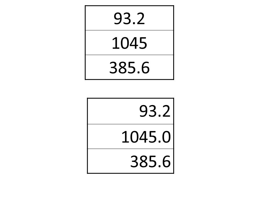
93.2 1045.0 385.6 93.2 1045 385.6
14
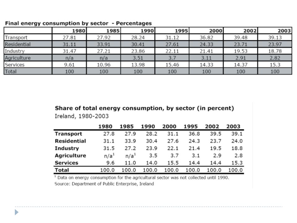
Activity: what is wrong with this table? We do not know which geographic area the data refer to. The data source is not identified. The values are centered rather than right-aligned. The values should not be displayed with two decimal places (too much information). The total values should have the same number of decimal places as the other values. The abbreviation “n/a” is not explained. The grey shading and the lines of the same size between each row and each column do not help to understand the different data presented in the table. The table is unnecessarily spread across the width of the page.
. The total values should have the same number of decimal places as the other values. The abbreviation n/a is not explained. The grey shading and the lines of the same size between each row and each column do not help to understand the different data presented in the table. The table is unnecessarily spread across the width of the page..")
19
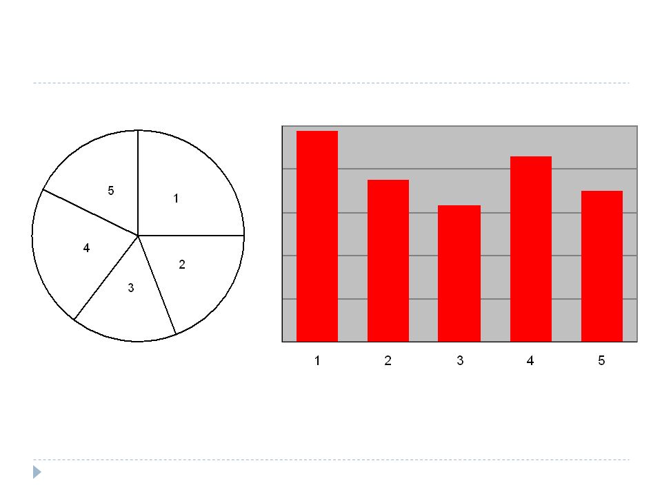
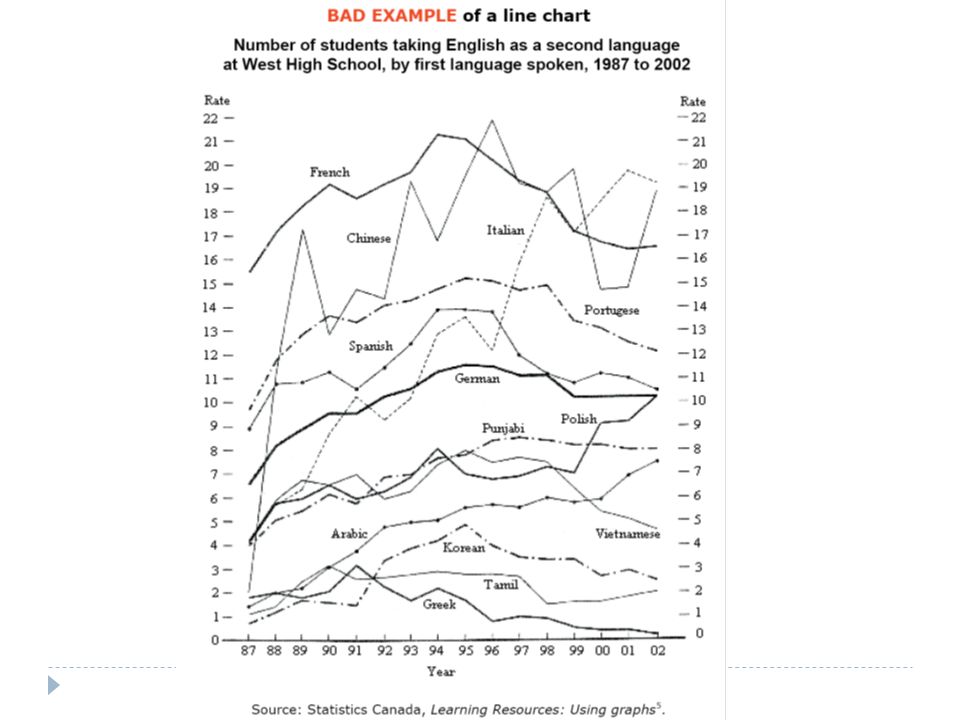
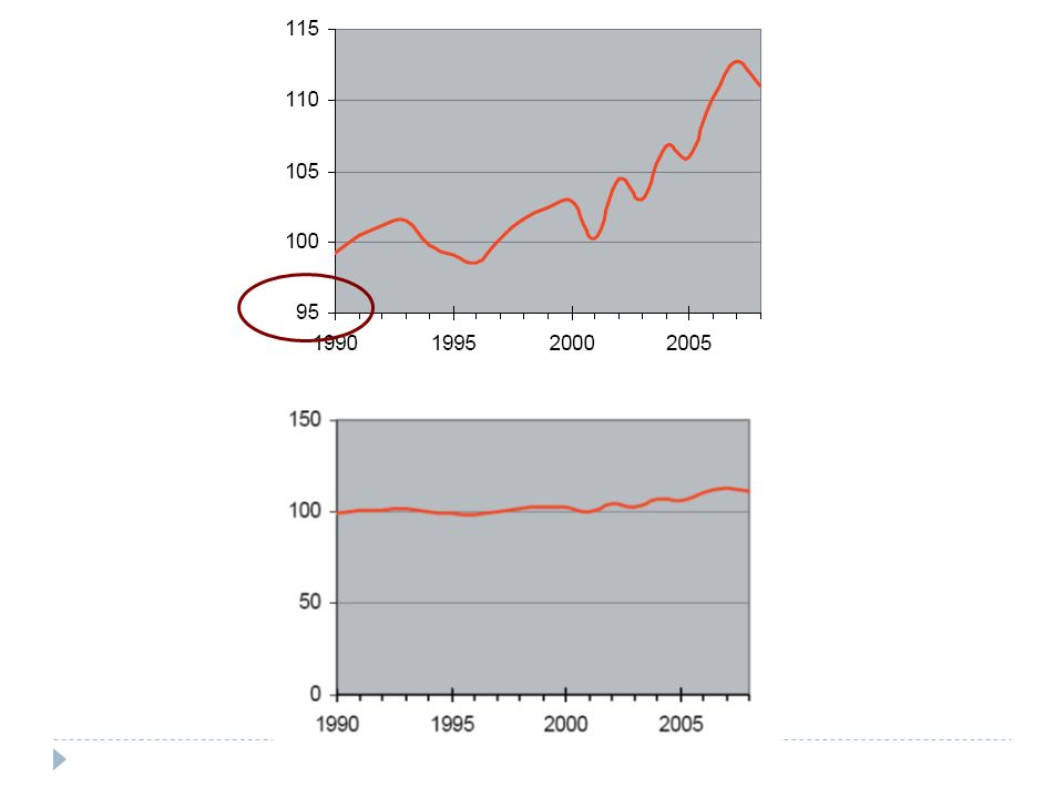
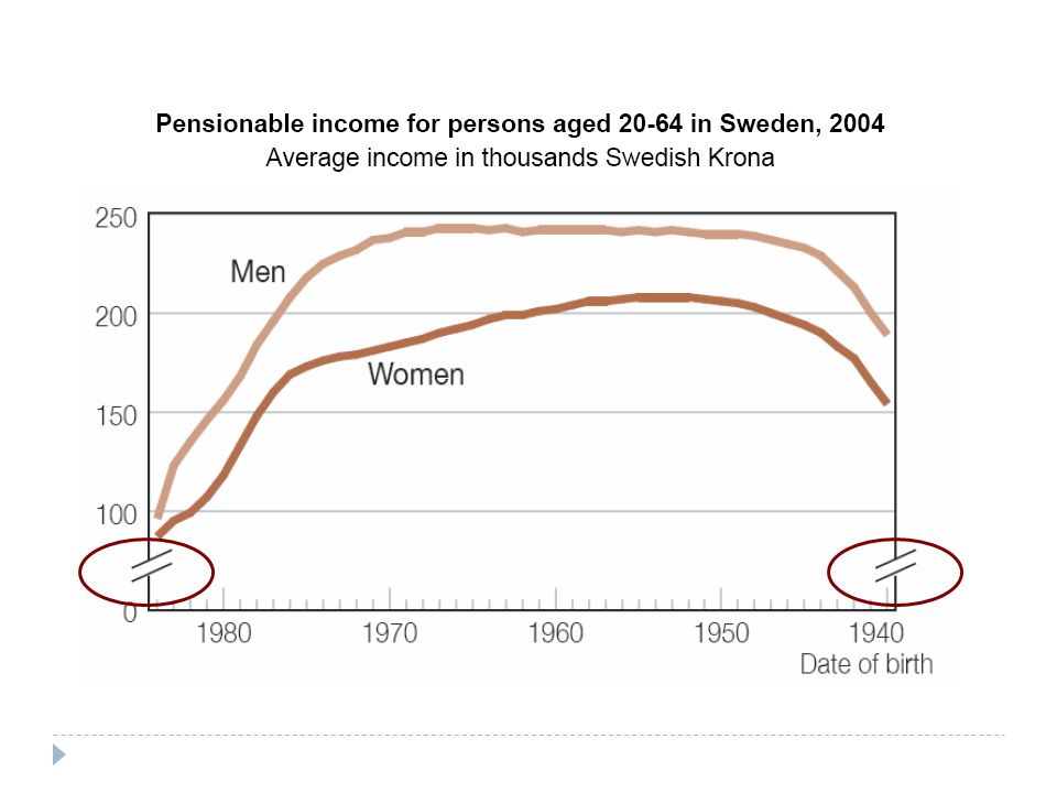
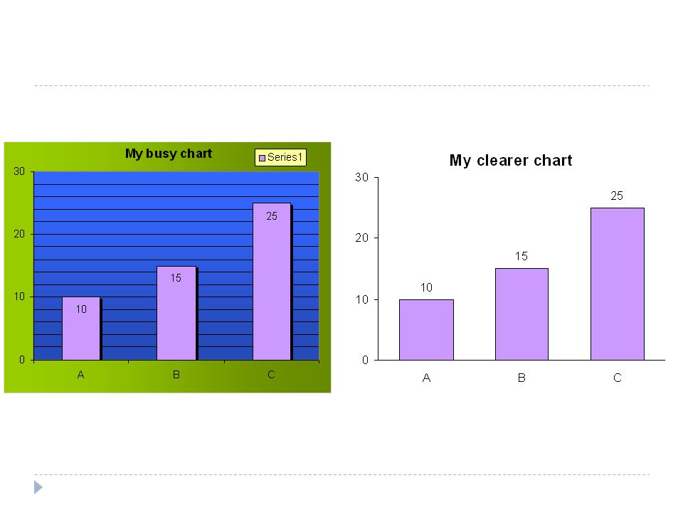
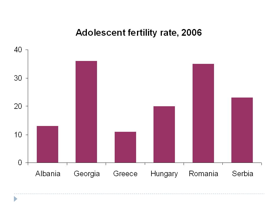
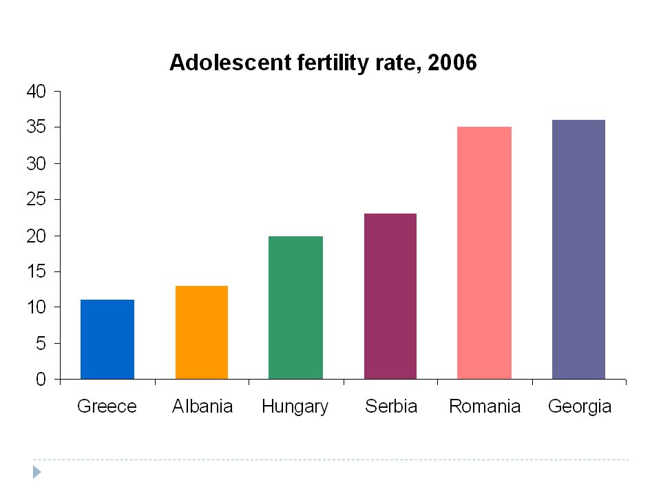
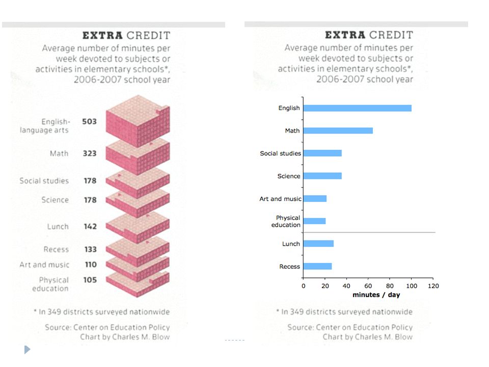
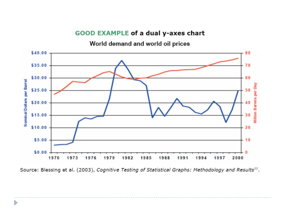
Checklist: what makes a good graph? Grabs the reader’s attention Presents the information simply, clearly and accurately Does not mislead Title Axis labels and titles Legend and data labels Footnote Source

25
http://chartchooser.juiceanalytics.com/

39
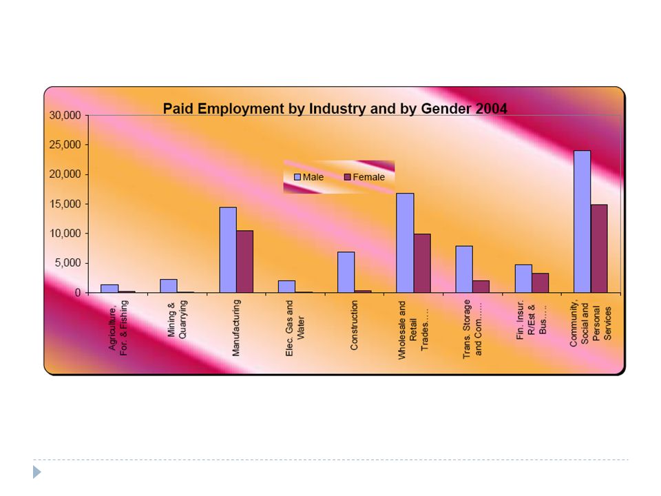
Men hold most paid jobs Paid employment by industry and sex, Fiji, 2004 Source: Fiji Islands Bureau of Statistics (2008)
")
40
Importance of metadata

41
What is metadata? Labels, headings Source Footnotes Dates Methodological information etc

42
Source: Michael Beahan, Australian Bureau of Statistics

Similar presentations


. Do not use a table.>")


 in rows and columns. Tables range in complexity from those with only two columns and a title to.>")


