Download presentation
Presentation is loading. Please wait.

1
Wednesday 9th December 2015 & Wednesday 9th March 2016
‘Kick Start Your Quality Improvement Project’ Learn how to undertake and deliver quality improvement projects Training for Registrars Wednesday 9th December 2015 & Wednesday 9th March 2016

2
Programme this morning
What is Quality Care? Problem Hunting 360 Patient Safety Appraisal Process Mapping What to change? Driver Diagrams How to change things? PDSA cycle Measurement for change QI Resources

3
What is Quality Care? Safe Timely Effective Efficient Equitable Patient - Centered

4
What is Quality Care? Timely Effective Efficient Patient - Centered Equitable Educational Safe

5
At the core of any model is influence over clinical behaviour to improve quality and minimise waste. Most of the solutions lie within the hearts and minds of our frontline clinical/care staff. The perfect model of care does not exist, and we need to create the capacity to piece together all the learning from other systems.

6
Problem Hunting….

7
What Needs Improving? Write you own niggle list, but be careful
Or analyse one aspect of patient care Safe – where are patients being harmed? Timely – how are we wasting time? Effective – what are we doing that does not work? Efficient – how are we wasting NHS resources? Equitable – what’s not fair? Patient-focused – where are patients being forgotten?

8
Example 1 – Analysing Safety

9
We want a comprehensive picture – include every threat to patient safety, so we can assure patients we’re aware of all that’s going on, and prioritise the areas for action more rationally 9

10
There are likely to be several different sources of information which could add to our overall picture 10

11
These are the information sources we could use in primary care
These are the information sources we could use in primary care. Some are already in widespread use, some are not used at all, and some are in between. Each source has a particular perspective, with attendant strengths & limitations. If we’re not aware of these, we may under-use / overuse / misuse information about safety .. leading to limited or even inaccurate views about what’s happening. 11

12
These are the information sources we could use in primary care
These are the information sources we could use in primary care. Some are already in widespread use, some are not used at all, and some are in between. Each source has a particular perspective, with attendant strengths & limitations. If we’re not aware of these, we may under-use / overuse / misuse information about safety .. leading to limited or even inaccurate views about what’s happening. 12

13
These are the information sources we could use in primary care
These are the information sources we could use in primary care. Some are already in widespread use, some are not used at all, and some are in between. Each source has a particular perspective, with attendant strengths & limitations. If we’re not aware of these, we may under-use / overuse / misuse information about safety .. leading to limited or even inaccurate views about what’s happening. 13

14
These are the information sources we could use in primary care
These are the information sources we could use in primary care. Some are already in widespread use, some are not used at all, and some are in between. Each source has a particular perspective, with attendant strengths & limitations. If we’re not aware of these, we may under-use / overuse / misuse information about safety .. leading to limited or even inaccurate views about what’s happening. 14

15
These are the information sources we could use in primary care
These are the information sources we could use in primary care. Some are already in widespread use, some are not used at all, and some are in between. Each source has a particular perspective, with attendant strengths & limitations. If we’re not aware of these, we may under-use / overuse / misuse information about safety .. leading to limited or even inaccurate views about what’s happening. 15

16
These are the information sources we could use in primary care
These are the information sources we could use in primary care. Some are already in widespread use, some are not used at all, and some are in between. Each source has a particular perspective, with attendant strengths & limitations. If we’re not aware of these, we may under-use / overuse / misuse information about safety .. leading to limited or even inaccurate views about what’s happening. 16

17
These are the information sources we could use in primary care
These are the information sources we could use in primary care. Some are already in widespread use, some are not used at all, and some are in between. Each source has a particular perspective, with attendant strengths & limitations. If we’re not aware of these, we may under-use / overuse / misuse information about safety .. leading to limited or even inaccurate views about what’s happening. 17

18
These are the information sources we could use in primary care
These are the information sources we could use in primary care. Some are already in widespread use, some are not used at all, and some are in between. Each source has a particular perspective, with attendant strengths & limitations. If we’re not aware of these, we may under-use / overuse / misuse information about safety .. leading to limited or even inaccurate views about what’s happening. 18

19
Example 2 – Analysing Processes

20
Process Mapping Process Mapping is the visual representation of a Patient journey What ACTUALLY happens, not what should be happening, or you think is happening. Any process should be possible to map

21
Process Mapping The box represents the task or activities of the process. The arrows represent the direction of flow of the process. If you need to, you can also use a diamond shape to indicate a question, or decision point.

22
Why Map a Process? “If you can’t describe what you are doing as a process, you don’t know what you’re doing.” – William Edwards Deming “It is not enough to do your best; you must know what to do, and then do your best.” Also a quote from Demming

23
Stages in PM Map the process Prioritise
Know exactly what’s happening Map the process Prioritise Make it easier to do the right thing Make it harder to do the wrong thing Spot & stop errors

24
Deliberate reliable design
What’s happening? What’s the priority? Segment? What’s going on?

25
Deliberate Reliable Design
Processes should be… Standardised for Testing Training Reliability Simple – the less steps the less error Safe – sometimes redundant steps needed

26
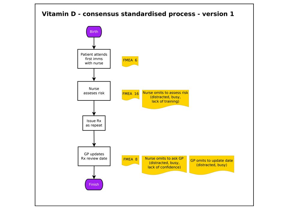
Deliberate reliable design – ???
eg How do at-risk infants get Vitamin D? What are the risks of this?

28
Process Mapping - 2 Stages
Stage 1 - Understand what actually happens to the Patient, where it happens and who is involved. Stage 2 - Use the map to identify steps that could be changed.

29
PM Stage 1 – What actually happens?
How many times is the Patient passed from one person to another (Hand offs)? Approximate task time Approximate time between tasks (wait times) Total time taken Number of steps
 Approximate task time. Approximate time between tasks (wait times) Total time taken. Number of steps.")
30
PM Stage 2 – Identify problems
Look for any… Bottle necks or constraints (Queues) Delays? (Wait for clinician/consent/results/parking) Repetition? (e.g. Patient identity check) Unnecessary travel or movement in the department. (Patient, staff, kit or notes) Unnecessary steps? Inefficient order of events?
 Delays (Wait for clinician/consent/results/parking) Repetition (e.g. Patient identity check) Unnecessary travel or movement in the department. (Patient, staff, kit or notes) Unnecessary steps Inefficient order of events")
31
Look at the whole process, not just the individual steps.
We often give more attention to individual steps than the process overall Mind the gap !

32
The top line is a high level overview process map
The top line is a high level overview process map. Useful to do before filling in the detail. Use the detailed map to identify bottlenecks, repetitive steps. Looking at the detailed map, how many times does the Patient have to confirm their identity? Where could changes be made? Trial these with a PDSA cycle.

33
Have a go! Look at the anticoagulant clinic process map and see if you can come up with improvements OR Try and draw a process map. Choose something you think you know well. Swap with neighbour and look for possible improvements.

34
Helpful resources NHS Institute Innovation and Improvement
– An Overview of Process Mapping Scottish Health Council – Process Mapping NHS Institute for Innovation and Improvement – Improvement Leaders Guide (Capability)
")
35
Problem Found! But what to do about it?

36
What should we tackle first?
Introducing driver diagrams A driver diagram is an immensely powerful tool that helps you to translate a high level improvement goal into a logical set of underpinning goals (‘drivers’) and projects. It captures an entire change programme in a single diagram and also provides a measurement framework for monitoring progress. The layout of a driver diagram is most easily explained via a simple example (next slide)
 and projects. It captures an. entire change programme in a single. diagram and also provides a measurement. framework for monitoring progress. The layout of a driver diagram is most. easily explained via a simple example (next slide)")
37
Driver Diagrams Help plan group action Bring the team together AIM
PRIMARY DRIVERS SECONDARY DRIVERS CHANGE PROJECTS Secondary driver 1 CP1 Primary driver 1 CP2 AIM – an improved system Secondary driver 2 CP3 Secondary driver 3 CP4 Driver diagrams are a type of structured logic chart with three or more levels (see example below). These would include: 1. a high level aim or vision
2. the factors that you need to influence in order to achieve this goal (called ‘primary drivers’)
3. specific projects and activities that would act upon these factors For more complex goals the number of levels in a driver diagram can be expanded so that each primary driver has its own set of underpinning factors (i.e. ‘secondary drivers’ etc.). It is these secondary drivers (or lower level drivers) that would then be linked to projects and activities. 1. The Aim The driver diagram starts with a clearly defined and measurable goal. This is the focal point for your change efforts. Primary Drivers The overall goal is linked here to a number of high level factors that are believed to have a direct impact on it . We will explain and look at an example shortly. This first set of underpinning goals are referred to as primary drivers because they ‘drive’ the achievement of your main goal. These drivers may act independently or in concert to achieve the overall goal. 3. Secondary drivers The process of breaking down a goal can continue to lower levels to create secondary or tertiary drivers (and even further if required). 4. Projects or actions The ultimate aim of a driver diagram is to define the range of projects (i.e. actual change initiatives) that you may want to undertake. These can appear anywhere in the hierarchy of the driver diagram – wherever makes most sense. Driver diagrams therefore help to break down an overall improvement goal into underpinning goals (i.e. ‘drivers’) to the point where you can easily define the changes that you need to undertake. Primary driver 2 CP5 Secondary driver 4 CP6 CP7 Secondary driver 5
. These would include: 1. a high level aim or vision 2. the factors that you need to influence in order to achieve this goal (called ‘primary drivers’) 3. specific projects and activities that would act upon these factors. For more complex goals the number of levels in a driver diagram can be expanded so that each primary driver has its own set of underpinning factors (i.e. ‘secondary drivers’ etc.). It is these secondary drivers (or lower level drivers) that would then be linked to projects and activities. 1. The Aim. The driver diagram starts. with a clearly defined and. measurable goal. This is the. focal point for your change. efforts. Primary Drivers. The overall goal is linked here to a number of high level factors that. are believed to have a direct impact on it . We will explain and look at an example shortly. This first set of underpinning goals are referred to as. primary drivers because they ‘drive’ the achievement. of your main goal. These drivers may act independently or in concert to. achieve the overall goal. 3. Secondary drivers. The process of breaking down a goal can continue to lower. levels to create secondary or tertiary drivers (and even further. if required). 4. Projects or actions. The ultimate aim of a driver. diagram is to define the. range of projects (i.e. actual. change initiatives) that you. may want to undertake. These can appear anywhere. in the hierarchy of the driver. diagram – wherever makes. most sense. Driver diagrams therefore. help to break down an. overall improvement goal. into underpinning goals (i.e. ‘drivers’) to the point where. you can easily define the. changes that you need to. undertake. Primary driver 2. CP5. Secondary driver 4. CP6. CP7. Secondary driver 5.")
38
Avoid silver bullet thinking
Complex problems require complex solutions. And yet we often seem to assume that one particular solution holds the answer (e.g. another NHS reorganisation). A silver bullet is more likely to be fired by a heroic leader! Recently we hear talk about a post-heroic leadership model for the NHS which may help to alleviate this problem. However, CCGs are small organisations and this may be difficult. The post it note is tremendously democratic – a top executive’s ideas hold only the same weight as those of the caretaker or receptionist when they are up on the wall. Avoid silver bullet thinking
. A silver bullet is more likely to be fired by a heroic leader! Recently we hear talk about a post-heroic leadership model for the NHS which may help to alleviate this problem. However, CCGs are small organisations and this may be difficult. The post it note is tremendously democratic – a top executive’s ideas hold only the same weight as those of the caretaker or receptionist when they are up on the wall. Avoid silver bullet thinking.")
39
Avoid blindspots Driver diagrams can help avoid blind spots because they force participants to confront all possibilities. The logic of the diagram means that we must consider options that may initially seem unlikely or risky. They also reduce the risk of group think – a considerable potential risk for CCGs: By definition a group of local GPs and commissioners Only limited external oversight May lead to groupthink, where a group talks itself into a decision without properly considering the alternatives DDs force you to look at the alternatives

40
innovate AND improve 2012, 13 & 15 – Tour de France winners
Cycling is one of the UK’s great sporting success stories. In 2012 they won 7/10 [check] track golds available plus Bradley Wiggins won the Olympic time trial and the Tour De France. The cycling success story demonstrates the benefits of both innovation – for example transferring revolutionary training methods from track cycling to the road, and using sports physiologists to plot out exact training plans for stage races such as the Tour de France leading to Bradley Wiggins winning the UK’s first ever yellow jersey, followed up by a second win in two years with Chris Froome leading the team. At the same time, they employed a ‘Head of Marginal Gains’, Mat Parker, whose job was to find a thousand areas where a 1% improvement was possible and when added up these could make the difference between silver and gold medals. Examples included battery powered heated shorts to be removed seconds before the race which keep the muscles warm ready for a huge push off and cleaning the tyres with alcohol solution before the race to remove any specks of dust which could increase energy loss due to friction. You may remember that the French team accused the British of having rounder wheels than everyone else, such was the success of this strategy. We don’t know whether Mat Parker uses driver diagrams but they certainly would have been a good way to come up with solutions such as these. 2012, 13 & 15 – Tour de France winners 2008 & 12 – 8 Olympic Golds 2004 – 2 Olympic Golds

41
Philosophy of ‘Marginal Gains’
The whole principle came from the idea that if you broke down everything you could think of that goes into riding a bike, and then improved it by 1%, you will get a significant increase when you put them all together“ David Brailsford, 2012 e.g. take your own pillow (change project; secondary driver, sleep better)
")
42
Everything you can think of?
AIM Waiting room info, list clinician interests/languages, web info, Rx access (Feel Better Faster), signpost more (WIC/HV/minor inj/Secs/DNs/A&E), Chronic disease training, care planning, review periods, get it right first time, test results processing, teamworking/multiskilling, results line hours, protocols for test results, widen skill mix, BP machine in watiting room, update rpt Rx, pharmacist planning, streamline processes, streamline recalls, education & reflection, up-to-date pt contact details, know what appt is for, pt registration management, Triage, Care planning / pathways, more TelC, C, clinical buddies/teams, test results, repeat Rx, forwarding tasks + results, check + update usual GP, results actioned by right person, advance appt booking, reserve list, ask pt who they want, rota in advance, notekeeping w plan + pt info, Consult skills, comp skills, speed reading/typing, forms + equipment, multi-skilling, longer appts, No emerg appts, Test results, Care planning, High risk processes, Referral chase-up, results continuity, streamline processes, streamline recalls, clear up alerts, handling of normal results, self-checkin, fast-track queue Improve access Sometimes, the problem is too many change ideas, everyone clamouring to get theirs implemented immediately, as the silver bullet to cure all. Work from right to left if you need to group and organise change projects … and identify where there are similarities / overlaps / gaps / better ways to achieve the same thing
, signpost more (WIC/HV/minor inj/Secs/DNs/A&E), Chronic disease training, care planning, review periods, get it right first time, test results processing, teamworking/multiskilling, results line hours, protocols for test results, widen skill mix, BP machine in watiting room, update rpt Rx, pharmacist planning, streamline processes, streamline recalls, education & reflection, up-to-date pt contact details, know what appt is for, pt registration management, Triage, Care planning / pathways, more TelC, C, clinical buddies/teams, test results, repeat Rx, forwarding tasks + results, check + update usual GP, results actioned by right person, advance appt booking, reserve list, ask pt who they want, rota in advance, notekeeping w plan + pt info, Consult skills, comp skills, speed reading/typing, forms + equipment, multi-skilling, longer appts, No emerg appts, Test results, Care planning, High risk processes, Referral chase-up, results continuity, streamline processes, streamline recalls, clear up alerts, handling of normal results, self-checkin, fast-track queue. Improve. access. Sometimes, the problem is too many change ideas, everyone clamouring to get theirs implemented immediately, as the silver bullet to cure all. Work from right to left if you need to group and organise change projects … and identify where there are similarities / overlaps / gaps / better ways to achieve the same thing.")
43
AIM PRIMARY DRIVERS CHANGE PROJECTS Improve access SECONDARY DRIVERS
Work from right to left if you need to group and organise change projects … and identify where there are similarities / overlaps / gaps / better ways to achieve the same thing

44
AIM PRIMARY DRIVERS CHANGE PROJECTS Improve access SECONDARY DRIVERS
GP rota change project Supply of GP time Community education Doctors (capacity) Waiting room TV Organisation of GP time PILS & CDs & DVDs Feel better faster Pt help-seeking Improve access Student sick notes Demand Reception signposting Deflecting demand Test results Consulting skills Creating our own workload Longer appts Dealing (efficiency) Guaranteed interpreters Work from right to left if you need to group and organise change projects … and identify where there are similarities / overlaps / gaps / better ways to achieve the same thing Planning care Dealing w failed referrals Chronic disease pathways Continuity Review periods Appt system More TelC’s Appt system project appts
 Waiting room TV. Organisation of GP time. PILS & CDs & DVDs. Feel better faster. Pt help-seeking. Improve. access. Student sick notes. Demand. Reception signposting. Deflecting demand. Test results. Consulting skills. Creating our own workload. Longer appts. Dealing (efficiency) Guaranteed interpreters. Work from right to left if you need to group and organise change projects … and identify where there are similarities / overlaps / gaps / better ways to achieve the same thing. Planning care. Dealing w failed referrals. Chronic disease pathways. Continuity. Review periods. Appt system. More TelC’s. Appt system project. appts.")
45
How To Make A Driver Diagram

46
X Equipment Needed Time Team meeting
Problem to solve/improvement to make Post-it notes Pens & paper

47
Generate Change Ideas Buy only 1 sandwich Gym work out 3 days
Take stairs 2 stone weight loss in 6/12 No pub weekdays Low fat meals Squash weekends Take packed lunch Cycling kit out night before Put away large wine glasses Put cycling days in diary If we have agreed our aim (and this takes time and effort) then we can go on to throw out as many ideas as possible that might lead us to the aim. Some of these will end up as drivers but the majority will be change projects Pedometer Fruit for dessert Water bottle for work bag Get rid of Oyster card
 then we can go on to throw out as many ideas as possible that might lead us to the aim. Some of these will end up as drivers but the majority will be change projects. Pedometer. Fruit for dessert. Water bottle for work bag. Get rid of Oyster card.")
48
Look for patterns Buy only 1 sandwich Gym work out 3 days Take stairs
2 stone weight loss in 6/12 No pub weekdays Low fat meals Squash weekends Take packed lunch Cycling kit out night before Put away large wine glasses Put cycling days in diary One click – we are looking for ideas that seem to be linked Pedometer Fruit for dessert Water bottle for work bag Get rid of Oyster card

49
Marshall the mass of ideas
Take packed lunch Eat less Drink less alcohol Low fat meals Buy only 1 sandwich Water bottle for work bag No pub weekdays Substitute lower calorie foods Fruit for dessert Put away large wine glasses 2 stone weight loss in 6/12 Put cycling days in diary Cycling kit out night before Linking the ideas gives you a new level of drivers (in this case secondary drivers) Pedometer Do sport Be more active during the day Take stairs Gym work out 3 days Get rid of Oyster card Squash weekends
 Pedometer. Do sport. Be more active during the day. Take stairs. Gym work out 3 days. Get rid of Oyster card. Squash weekends.")
50
Driver Diagrams Weight loss example Substitute lower calorie foods
Low fat meals Driver Diagrams Weight loss example Substitute lower calorie foods Take packed lunch Buy only 1 sandwich Reduce calories in Eat less Fruit for dessert Water bottle for work bag 2 stone weight loss in 6/12 Put away the large glasses Drink less alcohol No pub weekdays Gym work out 3 days Squash weekends Increase calories out Do sport Put cycling days in diary Here is a specific example of a driver diagram. It is not exhaustive. The key point is the simple way in which it is possible to divide the drivers into reduce input / increase output. Life is not always this simple but it helps us to understand the principles. We’ll look at a more complex example later. Now lets have a look at how we might actually generate the driver diagram in a big group Cycling kit out night before Be more active during the day Get rid of Oyster card Pedometer Take stairs

51
What Do You Want to Change?
In your practice you could… Identify an aim Come up with lots of ideas – think small Through team meeting Or suggestion box Group them Remove duplications/Expand other ideas Identify idea(s) to implement
 to implement.")
52
Sometimes you might work from left to right…
AIM PRIMARY DRIVERS SECONDARY DRIVERS CHANGE PROJECTS Choice of insulin CP1 Prescribing CP2 How much? By when? Adjust for hot weather CP3 CP4 Adjust for time zone Reduce hypos in insulin treated patients Self adjustment CP5 Adjust for exercise How much? By when? CP6 CP7 Adjust for food Monitoring CP8 Work from left to right if you know what you want to achieve, but not how. Get the theory right, and change ideas often begin to present themselves … or you can ask other members of the team / external staff / patients for ideas How much? By when? How much? By when? At every appointment CP9 CP10 By family / friends Dealing with early hypo CP11 CP12 How much? By when? Recognition Taking action

54
Any Questions?

55
NHS Model For Improvement
Model for improvements…….. Is a road map- SC

56
The Model for Improvement
What are we trying to accomplish? How will we know that change is an improvement? What change can we make that will result in improvement? The model for improvement is like a road map for how to do an improvement project. PDSA approach is key to this improvement methodology . Many of us hear about PDSA and think it makes sense but then when confronted with a situation where we need to make changes we slip into traditional methods of doing it…. Testing using PDSA is integral part of the model for improvement - A PDSA template can help you apply some structure to the testing process (handout the template) Measures: the testing cycle can also be a test of how good your measure is – not just the change you are trying out. Is it telling you what you need to know ie how close to your aim did the test get you? Changes: what are the ideas? What could you try out to help to get you to your aim? Important to document the tests so you have a record of what did and didn’t work. Model adapted from - Langley, Nolan, Norman and Provost (1996). A practical approach to enhancing organisational performance. Can also use PDSA to check measuring right things. Langley, G., Nolan, K., and Nolan, T., The Foundation of Improvement, Quality Progress, June 1994
 Measures: the testing cycle can also be a test of how good your measure is – not just the change you are trying out. Is it telling you what you need to know ie how close to your aim did the test get you Changes: what are the ideas What could you try out to help to get you to your aim Important to document the tests so you have a record of what did and didn’t work. Model adapted from - Langley, Nolan, Norman and Provost (1996). A practical approach to enhancing organisational performance. Can also use PDSA to check measuring right things. Langley, G., Nolan, K., and Nolan, T., The Foundation of Improvement, Quality Progress, June")
57
What are we trying to accomplish?
The Model for Improvement What are we trying to accomplish? Setting the aim: What are we trying to do? State the aim in SMART terms: Specific Measurable Achievable Realistic Time Scale Example: We aim to reduce the number of prescribing errors that occur by 20% in our GP surgery over the next 4 months. The model for improvement is like a road map for how to do an improvement project. PDSA approach is key to this improvement methodology . Many of us hear about PDSA and think it makes sense but then when confronted with a situation where we need to make changes we slip into traditional methods of doing it…. Testing using PDSA is integral part of the model for improvement - A PDSA template can help you apply some structure to the testing process (handout the template) Measures: the testing cycle can also be a test of how good your measure is – not just the change you are trying out. Is it telling you what you need to know ie how close to your aim did the test get you? Changes: what are the ideas? What could you try out to help to get you to your aim? Important to document the tests so you have a record of what did and didn’t work. Model adapted from - Langley, Nolan, Norman and Provost (1996). A practical approach to enhancing organisational performance. Can also use PDSA to check measuring right things.
 Measures: the testing cycle can also be a test of how good your measure is – not just the change you are trying out. Is it telling you what you need to know ie how close to your aim did the test get you Changes: what are the ideas What could you try out to help to get you to your aim Important to document the tests so you have a record of what did and didn’t work. Model adapted from - Langley, Nolan, Norman and Provost (1996). A practical approach to enhancing organisational performance. Can also use PDSA to check measuring right things.")
58
The Model for Improvement
Be prepared to refocus the aim For example a system level aim of "reducing adverse drug events in critical care by 30% within 12 months" could be refocused to "reducing adverse drug events for critical care patients on the cardiac service by 30% within 12 months".

59
How will we know that change is an improvement?
The Model for Improvement How will we know that change is an improvement? All improvement requires change, but not all change is an improvement! Measure a base line Ensure that everyone is measuring the same thing Measure after the change Plot the changes on a Statistical Process Control Chart (discussed later) The model for improvement is like a road map for how to do an improvement project. PDSA approach is key to this improvement methodology . Many of us hear about PDSA and think it makes sense but then when confronted with a situation where we need to make changes we slip into traditional methods of doing it…. Testing using PDSA is integral part of the model for improvement - A PDSA template can help you apply some structure to the testing process (handout the template) Measures: the testing cycle can also be a test of how good your measure is – not just the change you are trying out. Is it telling you what you need to know ie how close to your aim did the test get you? Changes: what are the ideas? What could you try out to help to get you to your aim? Important to document the tests so you have a record of what did and didn’t work. Model adapted from - Langley, Nolan, Norman and Provost (1996). A practical approach to enhancing organisational performance. Can also use PDSA to check measuring right things.
 The model for improvement is like a road map for how to do an improvement project. PDSA approach is key to this improvement methodology . Many of us hear about PDSA and think it makes sense but then when confronted with a situation where we need to make changes we slip into traditional methods of doing it…. Testing using PDSA is integral part of the model for improvement - A PDSA template can help you apply some structure to the testing process (handout the template) Measures: the testing cycle can also be a test of how good your measure is – not just the change you are trying out. Is it telling you what you need to know ie how close to your aim did the test get you Changes: what are the ideas What could you try out to help to get you to your aim Important to document the tests so you have a record of what did and didn’t work. Model adapted from - Langley, Nolan, Norman and Provost (1996). A practical approach to enhancing organisational performance. Can also use PDSA to check measuring right things.")
60
What change can we make that will result in improvement?
The Model for Improvement What change can we make that will result in improvement? Whole team involvement Brainstorming Ideas on post its Process Mapping Driver Diagrams Search for Precedents The model for improvement is like a road map for how to do an improvement project. PDSA approach is key to this improvement methodology . Many of us hear about PDSA and think it makes sense but then when confronted with a situation where we need to make changes we slip into traditional methods of doing it…. Testing using PDSA is integral part of the model for improvement - A PDSA template can help you apply some structure to the testing process (handout the template) Measures: the testing cycle can also be a test of how good your measure is – not just the change you are trying out. Is it telling you what you need to know ie how close to your aim did the test get you? Changes: what are the ideas? What could you try out to help to get you to your aim? Important to document the tests so you have a record of what did and didn’t work. Model adapted from - Langley, Nolan, Norman and Provost (1996). A practical approach to enhancing organisational performance. Can also use PDSA to check measuring right things.
 Measures: the testing cycle can also be a test of how good your measure is – not just the change you are trying out. Is it telling you what you need to know ie how close to your aim did the test get you Changes: what are the ideas What could you try out to help to get you to your aim Important to document the tests so you have a record of what did and didn’t work. Model adapted from - Langley, Nolan, Norman and Provost (1996). A practical approach to enhancing organisational performance. Can also use PDSA to check measuring right things.")
61
Act Plan Study Do Model for Improvement What are we trying to
Understanding the problem. Knowing what you’re trying to do - clear and desirable aims and objectives Model for Improvement What are we trying to accomplish? How will we know that a Measuring processes and outcomes change is an improvement? What change can we make that will result in improvement? Change ideas: What have others done? What hunches do we have? What can we learn as we go along? Act Plan Study Do Langley G, Moen R, Nolan K, Nolan T, Norman C, Provost L, (2009), The improvement guide: A practical approach to enhancing organisational performance 2nd ed, Jossey Bass Publishers, San Francisco 61
, The improvement guide: A practical approach to enhancing organisational performance 2nd ed, Jossey Bass Publishers, San Francisco. 61.")
62
Spending more time on the WHAT than the HOW!
© NHS Institute for Innovation and Improvement All rights reserved. Meeting rooms Design Design Design Design Approve Implement ! !! ANIMATED SLIDE !! 1 x brings in the red text at the bottom Sometimes all the Doing is done by the wrong people and/or in the wrong place. How many policies have you seen that are overly bulky, completely unworkable? Or A change has been implemented after it has been designed by a committee after lots of meetings and discussion – only to find it is unpopular and disregarded? Real world Spending more time on the WHAT than the HOW! Courtesy of Patient Safety First

63
Which is typical of your organisation?
© NHS Institute for Innovation and Improvement All rights reserved. Meeting rooms Design Approve Measurement Test & refine Test & refine Test & refine Implement !! ANIMATED SLIDE !! 1 x to bring in question at the bottom Relate back to Kotter here. How small scale changes can help change the perspective for creating short terms wins which are more certain. Real world Which is typical of your organisation? Courtesy of Patient Safety First

64
S A P D P D S A PDSA Cycles Traditional Approach to Activities
64 © NHS Institute for Innovation and Improvement All rights reserved. PDSA Cycles Traditional Approach to Activities S A P D Time Suggested Approach !! ANIMATED SLIDE !! 1 x to bring in question at the bottom Traditionally – minimal planning, lots of doing, and doing it again (due to a lack of plan). Typically no S & A – but another cycle of PD, PD etc Suggested – loads of P-ing! Typically 3-4 times more time spent in (effective) planning This can be really frustrating for those not used to it (give an example?) but the joy is that the doing is quicker because the planning was more detailed and thought through. Consider though that the Planning still does not guarantee success if it’s all done locked away in meeting rooms without involvement of the key people who will be doing the Doing. Key difference is inclusion of the S and A stages. Gives us a feedback loop and the opportunity for learning and continual improvement Ask the final question and allow a minute for discussion. If nothing forthcoming can give the example provided by a hospital in the North East – when faced with setting up a project to improve yyyy they met on a monthly basis as a working group for approximately a year – planning, planning, planning – but never actually DOING anything… Optional: Draw completeness / compatibility curve on flipchart – see facilitators pack for guidance P D S A Time saved Which is typical of your organisation?
. Typically no S & A – but another cycle of PD, PD etc. Suggested – loads of P-ing! Typically 3-4 times more time spent in (effective) planning. This can be really frustrating for those not used to it (give an example ) but the joy is that the doing is quicker because the planning was more detailed and thought through. Consider though that the Planning still does not guarantee success if it’s all done locked away in meeting rooms without involvement of the key people who will be doing the Doing. Key difference is inclusion of the S and A stages. Gives us a feedback loop and the opportunity for learning and continual improvement. Ask the final question and allow a minute for discussion. If nothing forthcoming can give the example provided by a hospital in the North East – when faced with setting up a project to improve yyyy they met on a monthly basis as a working group for approximately a year – planning, planning, planning – but never actually DOING anything… Optional: Draw completeness / compatibility curve on flipchart – see facilitators pack for guidance. P. D. S. A. Time saved. Which is typical of your organisation")
65
Repeated PDSA cycles work towards the AIM
What am I trying to achieve? How will I know a change is an improvement? What changes can I make that will result in the improvement PDSA PDSA PDSA PDSA Data Driven Change PDSA Hunches Theories Ideas PDSA. Trial the change on a small scale. i.e. one GP or one Surgery. Then expand the change. Start with those who are enthusiastic. Helps to get others on board if they can see it working. Start small

66
Change through small steps
with a clear purpose you can learn from (without fear of failure) which is less exhausting with fewer unintended consequences which builds engagement and optimism
 which is less exhausting. with fewer unintended consequences. which builds engagement and optimism.")
67
Benefits of this approach
easier to start produces better solutions more quickly engages people better reduces waste easier to continue

68
Measurement for Improvement
SH – passionate about quality hope to inspire you all about qips

69
Measurement for improvement
69 Measurement for improvement “You can’t fatten a cow by weighing it” (Palestinian proverb) Improvement is not about measurement, but…….. How do we know if a change is an improvement? “If you can’t measure it, you can’t improve it” Measurement is important, but its not the whole project
 Improvement is not about measurement, but…….. How do we know if a change is an improvement If you can’t measure it, you can’t improve it Measurement is important, but its not the whole project.")
70
A P D S A P D S Model for improvement 70
Remember this model from yesterday? A P D S A P D S

71
Seven steps to measurement
71 1 Decide Aim 2 Choose Measures 3 Define Measures Seven steps to measurement 4 Collect Data 5 Analyse and Present 6 Review Measures 7 Repeat steps 4-6 7 steps to measurement Say that measurement doesn’t just happen. It requires a well defined process. The diagram shows the 7 steps necessary to get measurement to work for you. Move to next slide For reference Step 1 – Decide your aim Step 2 – Choose your measures Step 3 – Confirm how to collect and display your data Step 4 – Collect your baseline data Step 5 – Analyse and present your data Step 6 – Meet to decide what it is telling you Step 7 – Repeat steps 4 to 6 each month or more frequently

72
Step 1 – Decide Aim Make it SMART

73
Steps 2 & 3 Choose & Define Measures.
Structure, Process, Outcome & Balancing measures.

74
Structure Process Outcome What to measure?
The environment in which care occurs What care is delivered, and how The impact on patients and the population Avedis Donabedian first described the three elements of the Donabedian Model in his 1966 article, “Evaluating the Quality of Medical Care.” ‘Outcomes remain the ultimate validators of the effectiveness and quality of medical care’ but they ‘must be used with discrimination’ Avedis Donabedian

75
Structure Process Outcome What to measure? e.g. Structure indicators…
attributes relating to clinicians (such as certification, training) midwife to birth ratio Size of community nursing teams access to equipment eg, MRI scanners.
 midwife to birth ratio. Size of community nursing teams. access to equipment eg, MRI scanners.")
76
Structure Process Outcome What to measure? e.g. Process indicators…
antenatal assessment <13 weeks physical checks in people with serious mental illness structured education for people with diabetes people with stroke reviewed <6 months of leaving hospital 7 day follow up after OPMH admission

77
Structure Process Outcome What to measure? NICE quality standards…
e.g. Outcome indicators… Falls Peri natal mortality hospital admissions for ambulatory care-sensitive conditions mortality within 30 days of hospital admission for stroke emergency re-admissions within 30 days of discharge from hospital health-related quality of life for people with long-term conditions patient experience of maternity services Patient Reported Outcome Measures Unexpected deaths

78
Structure Process Outcome Outcomes are a worthy goal
What to measure? Structure Process Outcome Outcomes are a worthy goal All have pros & cons We should measure a selection of all three The epidemiologist Veena Raleigh has compiled guides for commissioners on choosing metrics relating to structures, processes and outcomes. Her work is available in two easily read publications, at the web address listed here – and in the delegate reading material. The following slides summarise some key points to bear in mind… Veena Raleigh

79
Balancing measures Unintended consequences…….. As illustrated by the introduction of the target of having to be seen by GP in 48 hours…. Balancing measures reflect what may be happening elsewhere in the system as a result of the change. This impact may be positive or negative. For example if you have implemented changes to reduce your post operative length of stay, you also want to know what is happening to your post operative readmission rate. If this has increased then you might want to question whether, on balance, you are right to continue with the changes or not. Listening to the sceptics can sometimes alert us to relevant balancing measures. When presented with change, people can be heard to say things like “If you change this, it will affect that.” Picking up on the ‘thats’ can lead to a useful balancing measure.

80
Unintended consequences?
What to measure? Is it working? system fit for use? INPUTS EXTERNAL FACTORS Is it being done? Process Measure(s) HUMAN FACTORS OUTPUTS Outcome Measure(s) INTERNAL PROCESSES & PROCECEDURES Structure Measure(s) The world of quality improvement also shows the value of including balancing measures as well Very easily overlooked REFLECT: in work you’ve recently been involved in, what, if any balancing measures were recorded? Unintended consequences? Balancing Measure(s)
 HUMAN. FACTORS. OUTPUTS. Outcome Measure(s) INTERNAL PROCESSES & PROCECEDURES. Structure Measure(s) The world of quality improvement also shows the value of including balancing measures as well. Very easily overlooked. REFLECT: in work you’ve recently been involved in, what, if any balancing measures were recorded Unintended consequences Balancing Measure(s)")
81
Collecting , analysing and presenting data.
Steps 4& 5 Collecting , analysing and presenting data.

82
I use run charts & statistical process control (SPC)
I know about run charts & statistical process control (SPC) I don’t know about run charts & statistical process control (SPC) Find out about your background & experience
 I don’t know about run charts & statistical process control (SPC) Find out about your background & experience.")
83
The distributions arising from a process hide the variation over time
Mean The distributions arising from a process hide the variation over time 1 2 3 4 5 6 7 8 9 10 11 12 12 11 10 9 3 min The summary data we see in reports is made up of detailed data points. Reacting to individual data points without recognising the inherent variation leads to an incorrect change strategy. On this slide we’ve put on the red and green traffic like bands we typically might use in a monitoring report. These are not statistically defined they are typically defined ‘arbitrarily’ based upon the levels we do or don’t want to see. Look at some of these points up in the red. If we over-react, we’re behaving as we did in the coin tossing experiment. What looked like bad performance becomes good performance later without any action from us. What we see here is something call ‘common cause’ variation. The overall outcome of the process is being buffeted around by a myriad of small changes in the underlying processes. Interestingly, the sheer randomness here actually means the process is predictable (other things being equal). It will continue to vary but we can define the level of variability. My journey to work varies between 40 and 50 minutes and, other things being equal, it would be very rare for me to manage it in 30 minutes (i.e. I’d need that perfect day when all the traffic lights happen to be on green). 8 7 6 5 4 3 2 1 TIME
. It will continue to vary but we can define the level of variability. My journey to work varies between 40 and 50 minutes and, other things being equal, it would be very rare for me to manage it in 30 minutes (i.e. I’d need that perfect day when all the traffic lights happen to be on green) TIME.")
84
The distributions arising from a process hide the variation over time
Mean The distributions arising from a process hide the variation over time 1 2 3 4 5 6 7 8 9 10 11 12 12 11 10 9 1 min However, there are times when the data can tell a different story. Here our ‘eye-ball’ test of the data would indicate something odd has happened midway along this timeline. Its the same overall distribution but the behaviour over time is very different. Statistically there are ways to prove that what we are seeing here is significant. The branch of statistics is known as Statistical Process Control (or SPC for short). If we saw this data and we had commissioned a service change at this mid point we could confidently say that our ‘improvement’ has made a difference. SPC is actually pretty straight forward. It uses the variation we see in the data to help us determine what is ‘usual’ or ‘common cause’ variation. It also allows us to pick out ‘special cause’ or unusual variation in the data. When we make a change to a process we hope to introduce special cause variation. 8 The time series data can tell a different story 7 6 5 4 3 2 1 TIME
. If we saw this data and we had commissioned a service change at this mid point we could confidently say that our ‘improvement’ has made a difference. SPC is actually pretty straight forward. It uses the variation we see in the data to help us determine what is ‘usual’ or ‘common cause’ variation. It also allows us to pick out ‘special cause’ or unusual variation in the data. When we make a change to a process we hope to introduce special cause variation. 8. The time series data. can tell a different story TIME.")
85
What does this data tell us?
85 What does this data tell us? Patients treated in April 600 550 610 540 560 570 580 590 Congratulations, Aren’t we doing well Keep up the good work 2008 2009

86
What does this data tell us?
86 What does this data tell us? Patients treated 650 600 550 500 450 400 350 300 All data needs to be put into context. April 2008 April 2009

87
What action is appropriate?
87 What does this data tell us? Given two different numbers, one will always be bigger than the other! What action is appropriate? Something Important This Month Last Month

88
Plotting the dots - example Run Chart
88 Plotting the dots - example Run Chart Number of calls to outreach team (weekly) November 2007 to June 2008 No of Calls 180 160 140 120 100 80 60 40 20 1st Nov 15th Nov 29th Nov 13th Dec 27th Dec 10th Jan 24th Jan 7th Feb 21st Feb 6th Mar 20th Mar 3rd Apr 17th Apr 1st May Week Calls per week Median !! ANIMATED SLIDE !! Slide click to add axis, axis labels, chart title, chart key and then median line Draw attention to these…
 November 2007 to June No of Calls st Nov. 15th Nov. 29th Nov. 13th Dec. 27th Dec. 10th Jan. 24th Jan. 7th Feb. 21st Feb. 6th Mar. 20th Mar. 3rd Apr. 17th Apr. 1st May. Week. Calls per week Median. !! ANIMATED SLIDE !! Slide click to add axis, axis labels, chart title, chart key and then median line. Draw attention to these…")
89
We have 2 quarterly data points - is this an improvement?
HCAI Information for Action 2010 We have 2 quarterly data points - is this an improvement? Higher is better 89

90
Are we assuming something like this?
HCAI Information for Action 2010 Are we assuming something like this? 90

91
But it could be like this ...
HCAI Information for Action 2010 But it could be like this ... 91

92
HCAI Information for Action 2010
Or this ... 92

93
HCAI Information for Action 2010
Or this! 93

94
The Myth of Trends 94 Upward trend ? Downward trend ? Downturn ?
Setback ? Turnaround ? Rebound? Given any three points we could make the following 6 types of analysis, none are valid, they are not statistically significant. Static ? Flatline ?

95
Looking for a trend Upward trend Downward trend Time Time 95
A run of 7 points is. All up, down or all above or below a centre line. 7 points all in upward direction 7 points all in downward direction

96
Looking for a trend Above centre Below centre Time Time 96
A run of 7 points is. All up, down or all above or below a centre line. 7 points above centre line 7 points below centre line

97
How they can mislead you!
Averages How they can mislead you!

98
More about averages

99
… Sample B The average of each one of these patterns is 55 secs.

100
Statistical Process Control
A taster for the serious statisticians!

101
Average line (mean/median) Lower control limit (3 SDs)
Upper control limit (3 SDs) 0.13th percentile 97.4% C.I. Frequent measures Average line (mean/median) Lower control limit (3 SDs)
 0.13th percentile. 97.4% C.I. Frequent measures. Average line (mean/median) Lower control limit (3 SDs)")
102
Variation 102102 What do people understand by the word variation?
“We live in a world filled with variation –and yet there is very little recognition or understanding of variation” William Scherkenbach Everyone knows what the word variation means, so when we are presented with information we must not forget it. Shewhart invented PDSA, ask who has used it. Then ask who has used SPC. (there will be a lot less). SPC and PDSA were designed to be used together. We will show you how later. “Data should always be presented in such a way that preserves the evidence in the data…” Walter Shewhart
. SPC and PDSA were designed to be used together. We will show you how later. Data should always be presented in such a way that preserves the evidence in the data… Walter Shewhart.")
103
Target Marksman 1 Marksman 2

104
Understanding variation
“Common Cause” inherent in the design of the process variation is predictable and the process is stable affects process most of the time many factors, some “unknowable” “noise in the system” “Special Cause” not part of the process unpredictable variation intermittently apparent “assignable” causes can usually be identified

105
What to do about variation
“Common Cause” don’t react to individual results look at the average and process limits improve the whole process if these not acceptable or continuously improve quality! “Special Cause” investigate each point outside the limits look for the special cause and do something about it almost always something to find opportunities to learn

106
Measurement for improvement recap
Measurement for improvement recap Remember variation exists Define what you are collecting clearly Only interpret data using statistically significant measures Use time series data/run charts/ SPC for all stages of your project

107
Further Training Impossible to cover everything in 30 minutes.
To learn more come to “Measurement for Improvement”- full day course on 2nd March 2016 presented by Matt Tite. To book a place contact

108
QI Resources

109
Resources Available BMJ Quality programme QI Resource website Each other HEEM staff

110
QI Educational Leads Dr Sue Cullis. APD scullis@nhs.net
Dr Susan Hadley. PD Dr Christine Johnson. Dr Graham Todd Dr David Young Dr Helen Tallantyre

111
Some of the topics discussed…
Lean technique, Six Sigma, PESTLE analysis, diffusion of innovation, audit, PDSA, SEA, RCA, process maps, fishbone or driver diagrams, logic models, variation, SPC, funnel plots, Swiss cheese model, Pareto principle Miller's pyramid.

112
Time to plan What small thing niggles you?
What tools could you start using? Why? When? What are you going to change? Where? How? How will you measure it? Over what time scale? Who will you need to liaise with? What resources might you need?

114
HEEM Quality Improvement Forum 2015
What had over 100 posters, 75 abstracts, 2 keynote speakers, 4 workshops, 9 presentations, 6 award winning improvement projects and 350 delegates? HEEM Quality Improvement Forum 2015 Happening again in 2016! Come to present you QI project…. ….and see others and get inspired!

115
Health Education East Midlands Quality Improvement Forum 2016
HEEMQIF16 SAVE THE DATE! Health Education East Midlands are pleased to announce that the next Quality Improvement Forum will take place on 29th June the Kube, Leicester Racecourse in Oadby, Leicester. Key HEEMQIF16 activities for your diary: Forum programme cascaded - w/c 14th December 2015 Call for Quality Improvement Projects Abstracts – w/c 4th January 2016 Call for bookings & workshop bookings open – w/c 4th January 2016 Abstract submissions close – w/c 28th March 2016 Bookings close – 31st May 2016 HEEMQIF16 – 29th June 2016 Join in the conversation on Twitter using @EastMidsLETB #HEEMQIF16 #loveourlearners

116
A Final Thought from Don Berwick
“The most important single change in the NHS in response to this report would be for it to become….a system devoted to continual learning and improvement of patient care, top to bottom and end to end.” Don Berwick. A promise to learn - a commitment to act. August 2013.

Similar presentations


>")


