Download presentation
Presentation is loading. Please wait.

1
Statistical Analysis Topic 1

2
Statistics 1.1.1 State that error bars are a graphical representation of the variability of data. 1.1.2 Calculate the mean and standard deviation of a set of values. 1.1.3 State that the term standard deviation is used to summarize the spread of values around the mean, and that 68% of values fall within one standard deviation of the mean. 1.1.1 State that error bars are a graphical representation of the variability of data. 1.1.2 Calculate the mean and standard deviation of a set of values. 1.1.3 State that the term standard deviation is used to summarize the spread of values around the mean, and that 68% of values fall within one standard deviation of the mean.

3
1.1.4 Explain how the standard deviation is useful for comparing the means and spread of data between two or more samples. 1.1.5 Deduce the significance of the difference between two sets of data using calculated values for t and the appropriate tables. 1.1.6 Explain that the existence of a correlation does not establish that there is a causal relationship between two variables. 1.1.4 Explain how the standard deviation is useful for comparing the means and spread of data between two or more samples. 1.1.5 Deduce the significance of the difference between two sets of data using calculated values for t and the appropriate tables. 1.1.6 Explain that the existence of a correlation does not establish that there is a causal relationship between two variables.

4
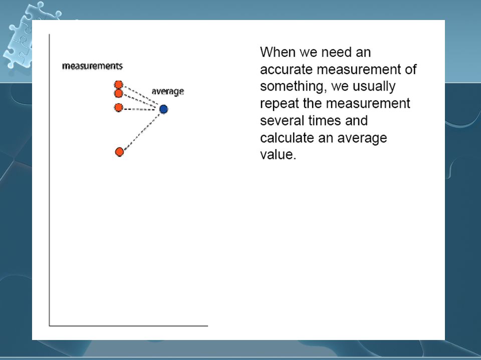
What is data? Information, in the form of facts or figures obtained from experiments or surveys, used as a basis for making calculations or drawing conclusions Encarta dictionary Information, in the form of facts or figures obtained from experiments or surveys, used as a basis for making calculations or drawing conclusions Encarta dictionary

5
2 types of Data Qualitative Quantitative Qualitative Quantitative

6
Statistics in Science Data can be collected about a population (surveys) Data can be collected about a process (experimentation) Data can be collected about a population (surveys) Data can be collected about a process (experimentation)
 Data can be collected about a process (experimentation) Data can be collected about a population (surveys) Data can be collected about a process (experimentation)")
7
Qualitative Data Information that relates to characteristics or description (observable qualities) Information is often grouped by descriptive category Examples Species of plant Type of insect Shades of color Rank of flavor in taste testing Remember: qualitative data can be “scored” and evaluated numerically Information that relates to characteristics or description (observable qualities) Information is often grouped by descriptive category Examples Species of plant Type of insect Shades of color Rank of flavor in taste testing Remember: qualitative data can be “scored” and evaluated numerically
 Information is often grouped by descriptive category Examples Species of plant Type of insect Shades of color Rank of flavor in taste testing Remember: qualitative data can be scored and evaluated numerically Information that relates to characteristics or description (observable qualities) Information is often grouped by descriptive category Examples Species of plant Type of insect Shades of color Rank of flavor in taste testing Remember: qualitative data can be scored and evaluated numerically")
8
Qualitative data, manipulated numerically Survey results, teens and need for environmental action

9
Quantitative data Quantitative – measured using a naturally occurring numerical scale Examples Chemical concentration Temperature Length Weight…etc. Quantitative – measured using a naturally occurring numerical scale Examples Chemical concentration Temperature Length Weight…etc.

10
Quantitation Measurements are often displayed graphically

11
Quantitation = Measurement In data collection for Biology, data must be measured carefully, using laboratory equipment ( ex. Timers, metersticks, pH meters, balances, pipettes, etc) The limits of the equipment used add some uncertainty to the data collected. All equipment has a certain magnitude of uncertainty. For example, is a ruler that is mass-produced a good measure of 1 cm? 1mm? 0.1mm? For quantitative testing, you must indicate the level of uncertainty of the tool that you are using for measurement!! In data collection for Biology, data must be measured carefully, using laboratory equipment ( ex. Timers, metersticks, pH meters, balances, pipettes, etc) The limits of the equipment used add some uncertainty to the data collected. All equipment has a certain magnitude of uncertainty. For example, is a ruler that is mass-produced a good measure of 1 cm? 1mm? 0.1mm? For quantitative testing, you must indicate the level of uncertainty of the tool that you are using for measurement!!
 The limits of the equipment used add some uncertainty to the data collected. All equipment has a certain magnitude of uncertainty. For example, is a ruler that is mass-produced a good measure of 1 cm. 1mm. 0.1mm. For quantitative testing, you must indicate the level of uncertainty of the tool that you are using for measurement!. In data collection for Biology, data must be measured carefully, using laboratory equipment ( ex. Timers, metersticks, pH meters, balances, pipettes, etc) The limits of the equipment used add some uncertainty to the data collected. All equipment has a certain magnitude of uncertainty. For example, is a ruler that is mass-produced a good measure of 1 cm. 1mm. 0.1mm. For quantitative testing, you must indicate the level of uncertainty of the tool that you are using for measurement!!.")
12
Finding the level of uncertainty As a “rule-of-thumb”, if not specified, use +/- 1/2 of the smallest measurement unit (ex metric ruler is lined to 1mm,so the limit of uncertainty of the ruler is +/- 0.5 mm.) If the room temperature is read as 25 degrees C, with a thermometer that is scored at 1 degree intervals – what is the range of possible temperatures for the room? (ans.s +/- 0.5 degrees Celsius - if you read 15 o C, it may in fact be 14.5 or 15.5 degrees) As a “rule-of-thumb”, if not specified, use +/- 1/2 of the smallest measurement unit (ex metric ruler is lined to 1mm,so the limit of uncertainty of the ruler is +/- 0.5 mm.) If the room temperature is read as 25 degrees C, with a thermometer that is scored at 1 degree intervals – what is the range of possible temperatures for the room? (ans.s +/- 0.5 degrees Celsius - if you read 15 o C, it may in fact be 14.5 or 15.5 degrees)
 As a rule-of-thumb , if not specified, use +/- 1/2 of the smallest measurement unit (ex metric ruler is lined to 1mm,so the limit of uncertainty of the ruler is +/- 0.5 mm.) If the room temperature is read as 25 degrees C, with a thermometer that is scored at 1 degree intervals – what is the range of possible temperatures for the room. (ans.s +/- 0.5 degrees Celsius - if you read 15 o C, it may in fact be 14.5 or 15.5 degrees).")
13
Definition of statistics Branch of mathematics which allows us to sample small portions from habitats, communities, or biological populations, and draw conclusions about the larger population. Statistics measure the differences and relationships between sets of data Nothing is 100% certain in science Branch of mathematics which allows us to sample small portions from habitats, communities, or biological populations, and draw conclusions about the larger population. Statistics measure the differences and relationships between sets of data Nothing is 100% certain in science

14
Mean An average of data points Central tendency of the data Find the mean of the given data³: Answer: 12999.4 An average of data points Central tendency of the data Find the mean of the given data³: Answer: 12999.4 Country# of reported HIV cases Argentina27517 Bahamas4548 Canada19468 Dominican Republic 7167 Ecuador6297

15
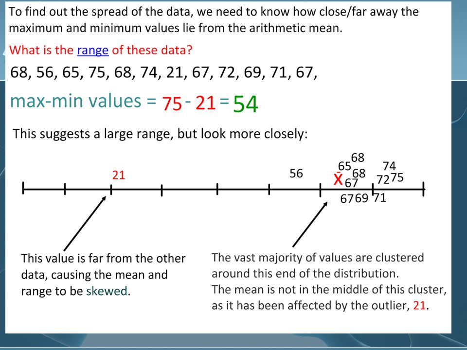
Range A measure of the spread of data Difference between the largest and the smallest observed values Find the range of the given data: Answer: 22969 If one data point were unusually large or unusually small, it would have a great effect on the range. Such points are called outliers. A measure of the spread of data Difference between the largest and the smallest observed values Find the range of the given data: Answer: 22969 If one data point were unusually large or unusually small, it would have a great effect on the range. Such points are called outliers. Country# of reported HIV cases Argentina27517 Bahamas4548 Canada19468 Dominican Republic 7167 Ecuador6297

16
Looking at Data How accurate is the data? (How close are the data to the “real” results?) This is also considered as BIAS How precise is the data? (All test systems have some uncertainty, due to limits of measurement) Estimation of the limits of the experimental uncertainty is essential. How accurate is the data? (How close are the data to the “real” results?) This is also considered as BIAS How precise is the data? (All test systems have some uncertainty, due to limits of measurement) Estimation of the limits of the experimental uncertainty is essential.
 This is also considered as BIAS How precise is the data. (All test systems have some uncertainty, due to limits of measurement) Estimation of the limits of the experimental uncertainty is essential. How accurate is the data. (How close are the data to the real results ) This is also considered as BIAS How precise is the data. (All test systems have some uncertainty, due to limits of measurement) Estimation of the limits of the experimental uncertainty is essential..")
20
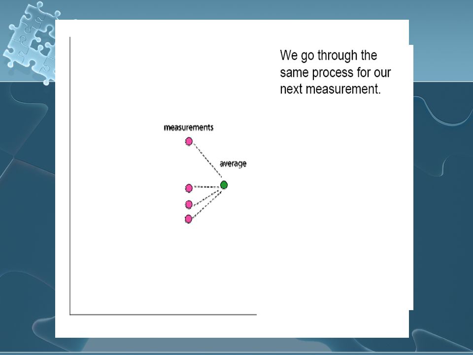
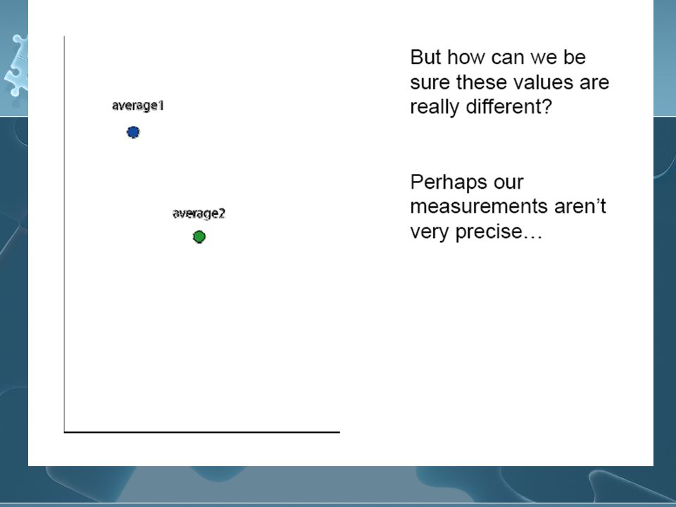
Comparing Averages Once the 2 averages are calculated for each set of data, the average values can be plotted together on a graph, to visualize the relationship between the 2

23
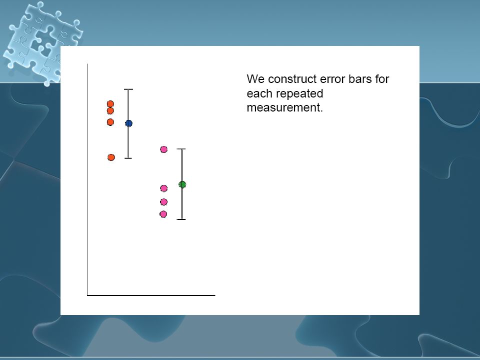
Drawing error bars The simplest way to draw an error bar is to use the mean as the central point, and to use the distance of the measurement that is furthest from the average as the endpoints of the data bar

24
Average value Value farthest from average Calculated distance

25
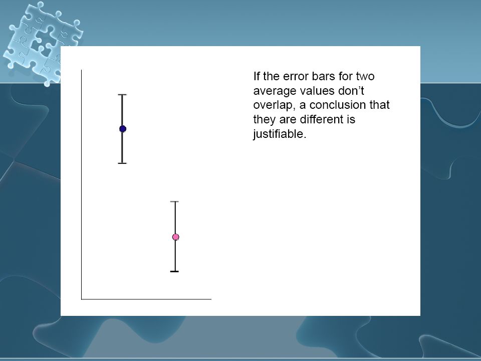
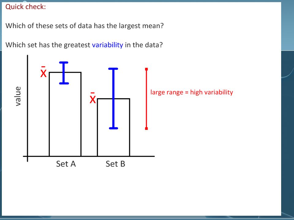
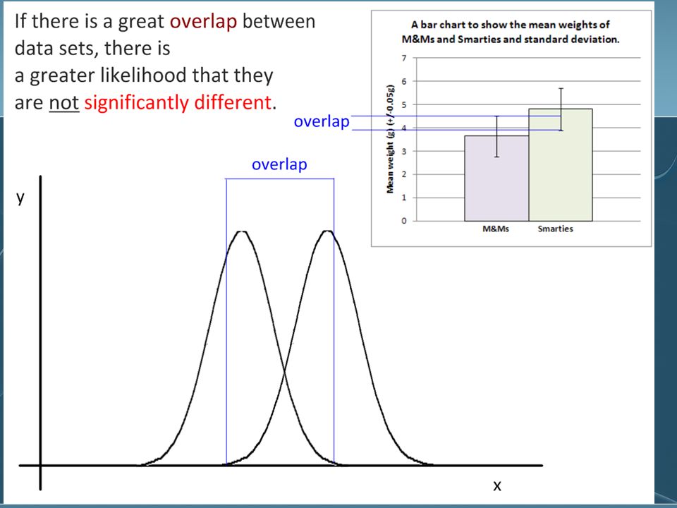
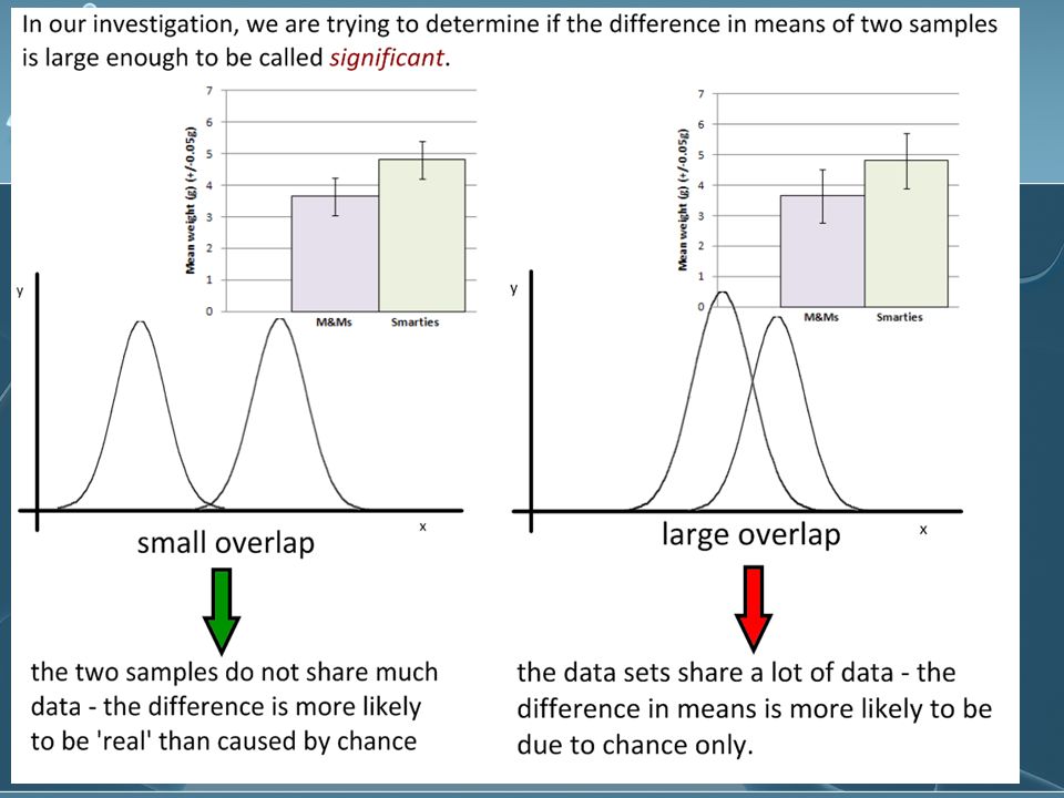
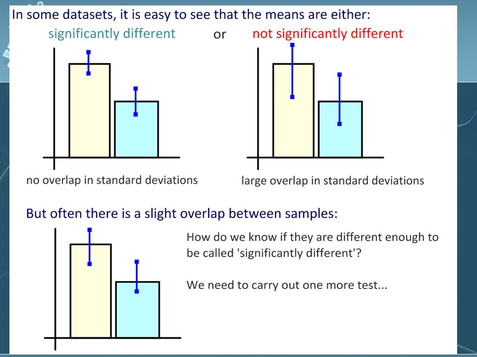
What do error bars suggest? If the bars show extensive overlap, it is likely that there is not a significant difference between those values

28
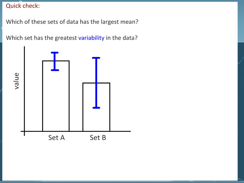
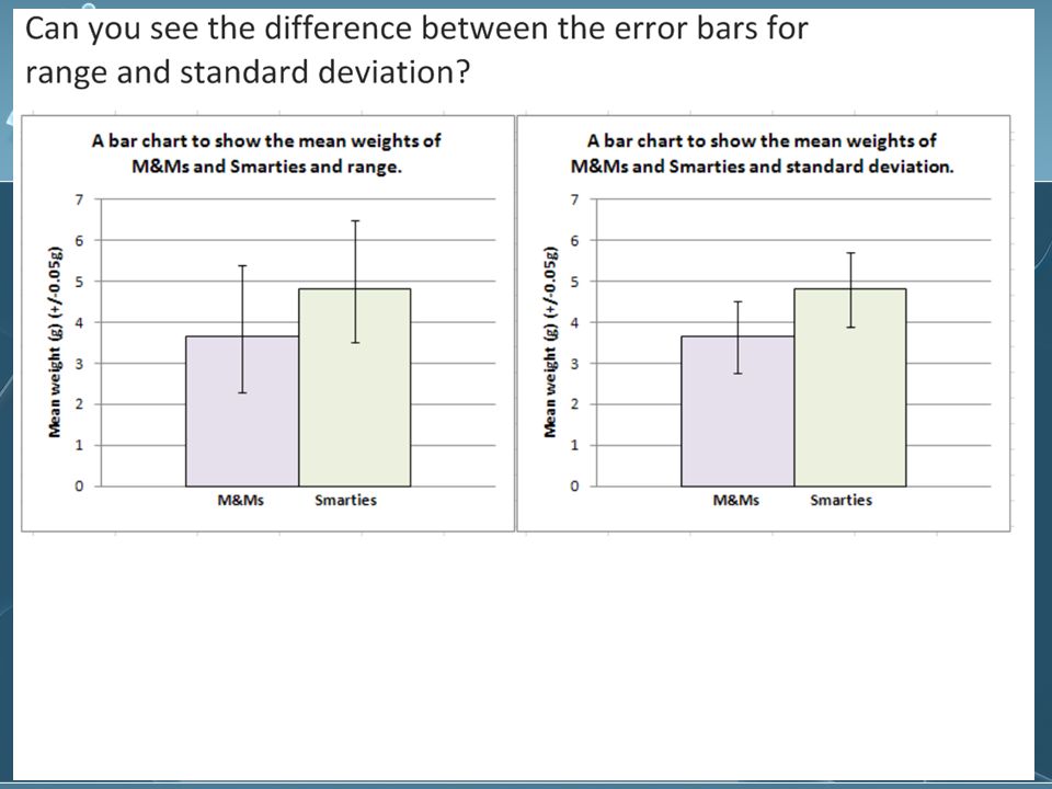
Error bars Graphical representation of the variability of data Can be used to show either the range of data or the standard deviation on a graph Graphical representation of the variability of data Can be used to show either the range of data or the standard deviation on a graph

31
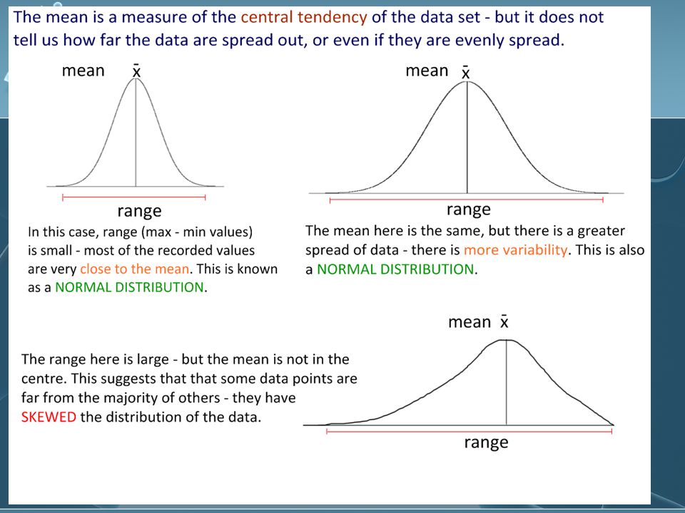
Standard deviation A measure of how the individual observations of a data set are dispersed or spread out around the mean. Determined by a mathematical formula which is programmed into your calculator In a normal distribution, about 68% of all values lie within ±1 standard deviation of the mean. This rises to about 95% for ±2 standard deviations from the mean. A measure of how the individual observations of a data set are dispersed or spread out around the mean. Determined by a mathematical formula which is programmed into your calculator In a normal distribution, about 68% of all values lie within ±1 standard deviation of the mean. This rises to about 95% for ±2 standard deviations from the mean.

32
How is Standard Deviation calculated? With this formula!

33
How to calculate SD http://www.saintmarys.edu/~cpeltier/calcfor stat/StatTI-86.html http://www.saintmarys.edu/~cpeltier/calcfor stat/StatTI-86.html TI-86 http://www.saintmarys.edu/~cpeltier/calcfor stat/StatTI-86.html http://www.saintmarys.edu/~cpeltier/calcfor stat/StatTI-86.html http://www.saintmarys.edu/~cpeltier/calcfor stat/StatTI-83.html http://www.saintmarys.edu/~cpeltier/calcfor stat/StatTI-83.html TI-83 and 84 http://www.saintmarys.edu/~cpeltier/calcfor stat/StatTI-83.html http://www.saintmarys.edu/~cpeltier/calcfor stat/StatTI-83.html In Microsoft Excel, type the following code into the cell where you want the Standard Deviation result, using the "unbiased," or "n-1" method: =STDEV(A1:A30) (substitute the cell name of the first value in your dataset for A1, and the cell name of the last value for A30.) http://www.saintmarys.edu/~cpeltier/calcfor stat/StatTI-86.html http://www.saintmarys.edu/~cpeltier/calcfor stat/StatTI-86.html TI-86 http://www.saintmarys.edu/~cpeltier/calcfor stat/StatTI-86.html http://www.saintmarys.edu/~cpeltier/calcfor stat/StatTI-86.html http://www.saintmarys.edu/~cpeltier/calcfor stat/StatTI-83.html http://www.saintmarys.edu/~cpeltier/calcfor stat/StatTI-83.html TI-83 and 84 http://www.saintmarys.edu/~cpeltier/calcfor stat/StatTI-83.html http://www.saintmarys.edu/~cpeltier/calcfor stat/StatTI-83.html In Microsoft Excel, type the following code into the cell where you want the Standard Deviation result, using the "unbiased," or "n-1" method: =STDEV(A1:A30) (substitute the cell name of the first value in your dataset for A1, and the cell name of the last value for A30.)
 (substitute the cell name of the first value in your dataset for A1, and the cell name of the last value for A30.) stat/StatTI-86.html stat/StatTI-86.html TI-86 stat/StatTI-86.html stat/StatTI-86.html stat/StatTI-83.html stat/StatTI-83.html TI-83 and 84 stat/StatTI-83.html stat/StatTI-83.html In Microsoft Excel, type the following code into the cell where you want the Standard Deviation result, using the unbiased, or n-1 method: =STDEV(A1:A30) (substitute the cell name of the first value in your dataset for A1, and the cell name of the last value for A30.)")
34
Comparing the means and standard deviation between two or more samples Height of bean plants in the sunlight in centimetres ±0.1 cm Height of bean plants in the shade in centimetres ±0.1 cm 124131 12060 153160 98212 123117 14265 156155 128160 139145 11795 Total 1300 Mean: 1300/10 = 130.0 cm

35
Answers SD for sunlight data: 17.68 cm SD for shade data: 47.02 cm Wide variation makes us question experimental design Means alone is not sufficient SD for sunlight data: 17.68 cm SD for shade data: 47.02 cm Wide variation makes us question experimental design Means alone is not sufficient

36
A typical standard distribution curve

37
According to this curve: One standard deviation away from the mean in either direction on the horizontal axis (the red area on the preceding graph) accounts for somewhere around 68 percent of the data in this group. Two standard deviations away from the mean (the red and green areas) account for roughly 95 percent of the data. One standard deviation away from the mean in either direction on the horizontal axis (the red area on the preceding graph) accounts for somewhere around 68 percent of the data in this group. Two standard deviations away from the mean (the red and green areas) account for roughly 95 percent of the data.
 account for roughly 95 percent of the data. One standard deviation away from the mean in either direction on the horizontal axis (the red area on the preceding graph) accounts for somewhere around 68 percent of the data in this group. Two standard deviations away from the mean (the red and green areas) account for roughly 95 percent of the data..")
38
Three Standard Deviations? three standard deviations (the red, green and blue areas) account for about 99 percent of the data -3sd -2sd +/-1sd 2sd +3sd
 account for about 99 percent of the data -3sd -2sd +/-1sd 2sd +3sd.")
44
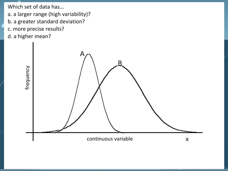
NRT Example 100 tests taken Grades plotted on a graph Graph likely to be a bell curve When data points are clustered together, the standard deviation is small; when they are spread apart, the standard deviation is large 100 tests taken Grades plotted on a graph Graph likely to be a bell curve When data points are clustered together, the standard deviation is small; when they are spread apart, the standard deviation is large

45
How is SD useful? Many extremes = large SD Few extremes = small SD Many extremes = large SD Few extremes = small SD

46
Coefficient of Variation(V) Ratio of the standard deviation to the mean expressed as a percentage V = (100 X SD)/Mean Gives the similar information about the data as the SD, but some people might find percentages easier to understand From Stats for IB Sports Medicine Ratio of the standard deviation to the mean expressed as a percentage V = (100 X SD)/Mean Gives the similar information about the data as the SD, but some people might find percentages easier to understand From Stats for IB Sports Medicine
 Ratio of the standard deviation to the mean expressed as a percentage V = (100 X SD)/Mean Gives the similar information about the data as the SD, but some people might find percentages easier to understand From Stats for IB Sports Medicine Ratio of the standard deviation to the mean expressed as a percentage V = (100 X SD)/Mean Gives the similar information about the data as the SD, but some people might find percentages easier to understand From Stats for IB Sports Medicine")
47
Coefficient of Variation Example: Comparing oxygen uptake data between individuals at rest and after 20 minutes of exercise for 12 participants and 24 measurements taken After rest: Mean = 382.92 ± 35.66, V= 9.31% Exercise: Mean = 402.5 ± 23.42, V= 5.82% T=1.194, p=0.21 Example: Comparing oxygen uptake data between individuals at rest and after 20 minutes of exercise for 12 participants and 24 measurements taken After rest: Mean = 382.92 ± 35.66, V= 9.31% Exercise: Mean = 402.5 ± 23.42, V= 5.82% T=1.194, p=0.21

48
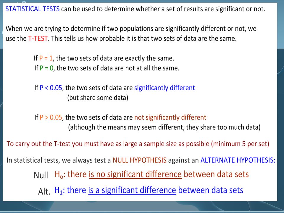
Significant difference between two data sets using the t-test T-test compares two sets of data to see if chance alone could make a difference Scientists like to be at least 95% certain of their findings before drawing conclusions Mean, SD, and sample size are used to calculate the value of t Degrees of freedom = sum of sample sizes of each of the two groups minus 2 T-test compares two sets of data to see if chance alone could make a difference Scientists like to be at least 95% certain of their findings before drawing conclusions Mean, SD, and sample size are used to calculate the value of t Degrees of freedom = sum of sample sizes of each of the two groups minus 2

50
T-test calculation http://www.graphpad.com/quickcalcs/tt est1.cfm http://www.graphpad.com/quickcalcs/tt est1.cfm For all data values: http://www.graphpad.com/quickcalcs/tt est1.cfm http://www.graphpad.com/quickcalcs/tt est1.cfm http://www.dimensionresearch.com/res ources/calculators/ttest.html http://www.dimensionresearch.com/res ources/calculators/ttest.html For means: http://www.dimensionresearch.com/res ources/calculators/ttest.html http://www.dimensionresearch.com/res ources/calculators/ttest.html http://www.graphpad.com/quickcalcs/tt est1.cfm http://www.graphpad.com/quickcalcs/tt est1.cfm For all data values: http://www.graphpad.com/quickcalcs/tt est1.cfm http://www.graphpad.com/quickcalcs/tt est1.cfm http://www.dimensionresearch.com/res ources/calculators/ttest.html http://www.dimensionresearch.com/res ources/calculators/ttest.html For means: http://www.dimensionresearch.com/res ources/calculators/ttest.html http://www.dimensionresearch.com/res ources/calculators/ttest.html

51
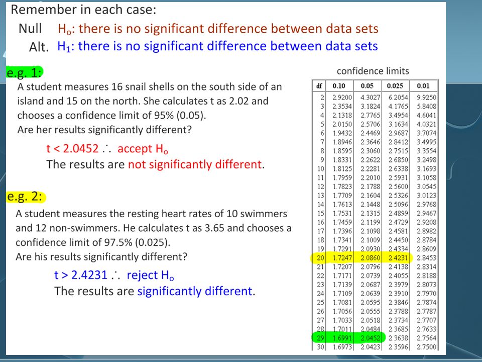
Worked example Compare two groups of barnacles living on a rocky shore. Measure the width of their shells to see if a significant size difference is found depending on how close they live to the water. One group lives between 0 and 10 metres from the water level. The second group lives between 10 and 20 metres above the water level.

52
Measurement was taken of the width of the shells in millimetres. 15 shells were measured from each group. The mean of the group closer to the water indicates that living closer to the water causes the barnacles to have a larger shell. If the value of t is 2.25, is that a significant difference?

53
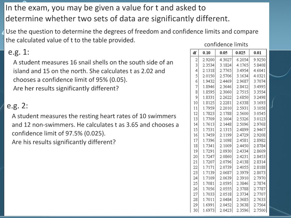
Steps to determining significant difference when given value of t Determine degree of freedom (# in each set minus 2) Ex. 15 + 15 – 2 = 28 Use given value of t Ex. 2.25 Use table of t values to determine probability (p) of chance Ex. 0.05 or 5% The confidence level is 95% Ex. We are 95% confident that the difference between barnacles is significant. Barnacles living nearer the water have a significantly larger shell than those living 10 metres or more away from the water. Determine degree of freedom (# in each set minus 2) Ex. 15 + 15 – 2 = 28 Use given value of t Ex. 2.25 Use table of t values to determine probability (p) of chance Ex. 0.05 or 5% The confidence level is 95% Ex. We are 95% confident that the difference between barnacles is significant. Barnacles living nearer the water have a significantly larger shell than those living 10 metres or more away from the water.
 of chance Ex or 5% The confidence level is 95% Ex. We are 95% confident that the difference between barnacles is significant. Barnacles living nearer the water have a significantly larger shell than those living 10 metres or more away from the water. Determine degree of freedom (# in each set minus 2) Ex – 2 = 28 Use given value of t Ex Use table of t values to determine probability (p) of chance Ex or 5% The confidence level is 95% Ex. We are 95% confident that the difference between barnacles is significant. Barnacles living nearer the water have a significantly larger shell than those living 10 metres or more away from the water..")
56
T table One-tailed t-test– if your hypothesis is that one mean is either larger or smaller than the other Two-tailed t-test – if your hypothesis is that the two means are not equal (not specifying larger or smaller) One-tailed t-test– if your hypothesis is that one mean is either larger or smaller than the other Two-tailed t-test – if your hypothesis is that the two means are not equal (not specifying larger or smaller)
 One-tailed t-test– if your hypothesis is that one mean is either larger or smaller than the other Two-tailed t-test – if your hypothesis is that the two means are not equal (not specifying larger or smaller)")
57
Website help http://graphpad.com/quickcalcs/ttest1. cfm http://graphpad.com/quickcalcs/ttest1. cfm http://graphpad.com/quickcalcs/ttest1. cfm http://graphpad.com/quickcalcs/ttest1. cfm

59
Correlation does not mean causation Experiments provide a test which shows cause Observations without an experiment can only show a correlation Experiments provide a test which shows cause Observations without an experiment can only show a correlation

60
Correlation test Correlation signified by value of r +1 (completely positive correlation) 0 (no correlation) -1 (completely negative correlation) http://www.argyll.epsb.ca/jreed/math9 /strand4/scatterplot.htm http://www.argyll.epsb.ca/jreed/math9 /strand4/scatterplot.htm http://www.argyll.epsb.ca/jreed/math9 /strand4/scatterplot.htm http://www.argyll.epsb.ca/jreed/math9 /strand4/scatterplot.htm Note that r describes linear relationships Note that r describes linear relationships Correlation signified by value of r +1 (completely positive correlation) 0 (no correlation) -1 (completely negative correlation) http://www.argyll.epsb.ca/jreed/math9 /strand4/scatterplot.htm http://www.argyll.epsb.ca/jreed/math9 /strand4/scatterplot.htm http://www.argyll.epsb.ca/jreed/math9 /strand4/scatterplot.htm http://www.argyll.epsb.ca/jreed/math9 /strand4/scatterplot.htm Note that r describes linear relationships Note that r describes linear relationships
 0 (no correlation) -1 (completely negative correlation) /strand4/scatterplot.htm /strand4/scatterplot.htm /strand4/scatterplot.htm /strand4/scatterplot.htm Note that r describes linear relationships Note that r describes linear relationships Correlation signified by value of r +1 (completely positive correlation) 0 (no correlation) -1 (completely negative correlation) /strand4/scatterplot.htm /strand4/scatterplot.htm /strand4/scatterplot.htm /strand4/scatterplot.htm Note that r describes linear relationships Note that r describes linear relationships")
61
Correlation or causation? 1. Cars with low gas mileage per gallon of fuel cause global warming. 2. Drinking red wine protects against heart disease. 3. Tanning beds can cause skin cancer. 4. UV rays increase the risk of cataracts. 5. Vitamin C cures the common cold. 1. Cars with low gas mileage per gallon of fuel cause global warming. 2. Drinking red wine protects against heart disease. 3. Tanning beds can cause skin cancer. 4. UV rays increase the risk of cataracts. 5. Vitamin C cures the common cold.

62
Resources ¹http://www.globalissues.org/TradeRel ated/Facts.asp#src1 ²http://www.globalissues.org/TradeRel ated/Consumption.asp ³http://www.who.int/globalatlas/includ eFiles/generalIncludeFiles/listInstances. asp Stephe Taylor Bandung international school ¹http://www.globalissues.org/TradeRel ated/Facts.asp#src1 ²http://www.globalissues.org/TradeRel ated/Consumption.asp ³http://www.who.int/globalatlas/includ eFiles/generalIncludeFiles/listInstances. asp Stephe Taylor Bandung international school

Similar presentations


: Analysing data.>")


