Download presentation
Presentation is loading. Please wait.

1
Reclassification Methods From important a research topic to trivial computer functions Is it to easy?

2
In the past Important cartographic process, map-makers only had one chance to do it right. R/I N/O transformation. Goal was to classify and put into categories attribute information that best preserved the distribution of the data and convey its meaning based on the objective of the map composition. Researchers developed many reclassification techniques with different advantages. Each will give a different representation. Today, within a GIS, it is easy to classify data and it is sometimes done with little thought (i.e. use default). The importance of creating meaning visualizations that convey information to stakeholders has not changed.
. The importance of creating meaning visualizations that convey information to stakeholders has not changed..")
3
Factors to Consider Distribution of the data (Uniform, Gaussian, Gamma, etc.). Audience (e.g. scientific vs. lay) Goals and Objectives –Highlight Rare –Highlight Common –Highlight areas of importance –Best preserves the distribution
 Goals and Objectives –Highlight Rare –Highlight Common –Highlight areas of importance –Best preserves the distribution.")
5
Data Distribution Always look at the distribution of your data. Histograms are useful. You can always change the representation by changing the number of classes. However, most people can not make distinctions beyond 10 categories. 2000 Census Tract Data, Tucson –Proportion of population between 18-29.

6
Data Distribution 2000 Census Data, Tucson –Average Household Size

7
Manual User Defined – You create the class breaks If there is a logical way to reclassify the data based on original research, literature, prior work, traditional values, or common sense – DO IT Importantly, you should be able to write a justification of your procedure.

8
Equal Interval Scheme divides the range of attribute values into equal-sized subranges: –Class Interval = Data Range (high – low) / # of intervals This method emphasizes the amount of an attribute value relative to other values. For example you can show that a store is part of a group of stores that make up the upper 1/3 of all sales. Best to apply on familiar data ranges such as percentages or temperature. Advantages : Easy to understand concept, compute and understand the legend. Disadvantages: Does not consider data distribution, not acceptable for ordinal data.

9
Prop_18-29

10
Ave_HH_SZ

11
Defined Interval Defined Interval—You specify an interval to divide the range of cell values, and ArcMap determines the number of classes. Similar characteristics as Equal Interval.

12
Quantile Each Class contains an equal number of features (or cells in a raster). –# Observations per class = Total Obs. / # of Classes With raster data quantile and equal area are the same. Rules must be applied to keep like values together, so classes may not be equal, and in some cases missing. Maps may be misleading since similar features may be placed in different classes. Better for uniform or normal distributed data. Advantages: Easy to understand concept and compute. Acceptable for ordinal data. Disadvantages: Does not consider data distribution, hard to understand legend.

13
Prop_18-29

14
Ave_HH_SZ

15
Standard Deviation Shows you the amount a cell’s value varies from the mean. In this method you compute the mean value and then generate class breaks by successively adding and subtracting the standard deviation from the mean. Advantages: Considers data distribution, easy to understand concept, compute and understand legend, highlight outliers. Disadvantages: Best of a Gaussian distribution, need understanding in statistics to understand results, may not be good for lay audiences.

16
Prop_18-29

17
Ave_HH_SZ

18
Jenks Natural Breaks (Optimal) Determines the best arrangement of values into classes by minimizing the within-class sum of squared differences of values from the means of their class. The “optimal” arrangement is determined through an iterative process by looking at different sets of breaks in the data. Where A = set of values that have been ordered from 1 to N. 1<=i<j<=N Mean i..j = Mean of the class bounded by i and j.

19
Jenks Natural Breaks Advantages: Considers data distribution, can be used to determine best number of classes, relatively easy to understand concept and compute. Disadvantages: Hard to understand legend, can not be use for ordinal data. Current ESRI default.

20
Prop_18-29

21
Ave_HH_SZ

22
Geometrical Interval Class breaks are based on class intervals that have a geometrical series. The geometric coefficient in this classifier can change once (to its inverse) to optimize the class ranges. The algorithm creates these geometrical intervals by minimizing the square sum of element per class. This ensures that each class range has approximately the same number of values with each class and that the change between intervals is fairly consistent. Advantages: Relatively easy to compute and understand legend, considers data distribution Disadvantages: Hard to understand concept, can not be used for ordinal data
 to optimize the class ranges. The algorithm creates these geometrical intervals by minimizing the square sum of element per class. This ensures that each class range has approximately the same number of values with each class and that the change between intervals is fairly consistent. Advantages: Relatively easy to compute and understand legend, considers data distribution Disadvantages: Hard to understand concept, can not be used for ordinal data.")
23
Prop_18-29

24
Ave_HH_SZ

25
Percentiles Uses the percentile breaks to determine class breaks. Order data (low high), each value represents 1/n percentile of the total. Must break on unique values. Advantages: Relatively easy to compute and understand legend, considers data distribution, highlight outliers Disadvantages: Relatively hard to understand concept, not in ArcGIS.
, each value represents 1/n percentile of the total. Must break on unique values. Advantages: Relatively easy to compute and understand legend, considers data distribution, highlight outliers Disadvantages: Relatively hard to understand concept, not in ArcGIS..")
26
From GEODA

27
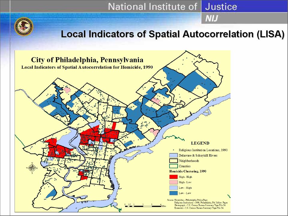
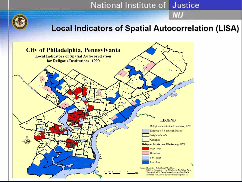
Box Map Shows outliers as the function of quartiles. IQR = Q75 – Q25 Lower Outlier = Q25 – Hinge * IQR Upper Outlier = Q75 + Hinge * IQR Hinge is commonly either 1.5 or 3 Primary used to highlight outliers. Not in ArcGIS

28
From GEODA

Similar presentations


 Animal Science.>")


÷200 = 54% of the bills are “small”, i.e. less than 30 EUR There are only a few telephone bills in the middle range.>")


 techniques requires gaining.>")


