Download presentation
Presentation is loading. Please wait.

1
© 2004 by David T. Olson Sample - Not for Public Use1 A Sample Presentation of The State of the Church in Alabama and the Birmingham Metro Area 1990-2000 Dave Olson www.TheAmericanChurch.org

2
© 2004 by David T. Olson Sample - Not for Public Use2 The first 19 slides are from the “State of the Church in Alabama” Powerpoint. The Complete Powerpoint is 42 slides in length, and is available at http://www.theamericanchurch.org/state/UAL20.htm. It includes maps of church attendance in every county, as well as denominational charts, average size charts, church planting charts, ethnicity charts and population growth information. http://www.theamericanchurch.org/state/UAL20.htm

3
© 2004 by David T. Olson Sample - Not for Public Use3 In 1996, polls taken immediately after the Presidential election revealed that 58% of people claimed they had voted, when in reality only 49% actually did. This is called the Halo Effect. People tend to over-inflate their participation in activities that create acceptability within their social group. For many decades, pollsters such as Gallup and Barna have reported that around 45% of Americans attend church every Sunday. But there is a religious Halo Effect. Actual attendance counts have shown that the percentage of people attending church on any given weekend is much lower than was previously thought.

4
© 2004 by David T. Olson Sample - Not for Public Use4 The Intent of this presentation is to answer and then expand on two key questions: “How Many People Really Attend Church in Alabama Every Week?” “Is the Christian Church Going Forward or Backwards in Influence in Alabama?” As the data is analyzed county by county assessing a number of factors, a comprehensive picture of the State of the Church in Alabama will begin to take shape.

5
© 2004 by David T. Olson Sample - Not for Public Use5 This study uses weekend church attendance as a more reliable and more immediate snapshot of Christian influence than membership. The following map shows the percentage of the population attending a Christian church on any given weekend in all 50 states in 2000. Alabama has an attendance percentage (26.9%) that is much higher than the average for the nation (18.7%).
 that is much higher than the average for the nation (18.7%)..")
6
© 2004 by David T. Olson Sample - Not for Public Use6

7
7 The Next Map shows the percentage of the population attending a Christian church on any given weekend in 2000 for each county in Alabama. The church attendance rate in Western Alabama is much higher than Eastern Alabama.

8
© 2004 by David T. Olson Sample - Not for Public Use8

9
9 The Next 2 Maps show the population numbers for each county in Alabama. The first map shows the population size of each county. Northern Alabama contains the greatest concentration of people. The second map shows the growth or decline in population for each county from 1990 - 2000. All blue counties declined in population.

10
© 2004 by David T. Olson Sample - Not for Public Use10

11
© 2004 by David T. Olson Sample - Not for Public Use11

12
© 2004 by David T. Olson Sample - Not for Public Use12 The Next Map shows the percentage of the population that is African American for each county in 2000.

13
© 2004 by David T. Olson Sample - Not for Public Use13 Alabama Counties 2000 Percentage of Population African-American 0% Winston 1% Cullman 1% Blount 1% Marshall 2% De Kalb 4% Marion 4% Cleburne 4% Jackson 4% Franklin 6% Cherokee 6% Walker 7% Saint Clair 8% Shelby 10% Lauderdale 10% Baldwin 11% Chilton 11% Geneva 11% Morgan 12% Fayette 12% Lamar 12% Covington 13% Limestone 13% Lawrence 15% Etowah 16% Clay 17% Colbert 17% Autauga 18% Coffee 19% Calhoun 20% Dale 21% Elmore 22% Bibb 22% Randolph 23% Lee 23% Madison 25% Houston 25% Crenshaw 25% Tallapoosa 27% Washington 29% Tuscaloosa 31% Escambia 32% Talladega 32% Henry 33% Mobile 34% Coosa 37% Pike 38% Chambers 39% Jefferson 40% Monroe 41% Butler 41% Russell 43% Pickens 43% Clarke 44% Conecuh 44% Choctaw 46% Barbour 49% Montgomery 52% Marengo 59% Hale 63% Dallas 68% Perry 72% Wilcox 73% Bullock 73% Sumter 73% Lowndes 80% Greene 85% Macon 0% to 10% 10% to 17% 17% to 29% 29% to 43% 43% to 86%

14
© 2004 by David T. Olson Sample - Not for Public Use14 The Next 2 Slides show the ethnicity of Alabama in 1990 and 2000. The third slide shows the growth or decline in the percentage of the population for each ethnic group.

15
© 2004 by David T. Olson Sample - Not for Public Use15

16
© 2004 by David T. Olson Sample - Not for Public Use16

17
© 2004 by David T. Olson Sample - Not for Public Use17

18
© 2004 by David T. Olson Sample - Not for Public Use18 The Next Graph shows the attendance numbers for the churches in Alabama in 1990 and 2000. Most noteworthy is the slight growth of Evangelical, Catholic and Mainline churches. Unfortunately, as overall worship attendance has remained quite stable, the population has grown. A more reliable standard for evaluating increasing or declining influence is the percentage of the population attending church on any given weekend, shown in the second graph.

19
© 2004 by David T. Olson Sample - Not for Public Use19

20
© 2004 by David T. Olson Sample - Not for Public Use20

21
© 2004 by David T. Olson Sample - Not for Public Use21 The 3 Next Charts show the relative strength of the 8 major denominational groups in Alabama. The Pie Chart shows how Baptists predominate in Alabama. The second and third charts show that all groups have declined in the percentage of the population from 1990 - 2000.

22
© 2004 by David T. Olson Sample - Not for Public Use22

23
© 2004 by David T. Olson Sample - Not for Public Use23

24
© 2004 by David T. Olson Sample - Not for Public Use24

25
© 2004 by David T. Olson Sample - Not for Public Use25 The Next Map shows the attendance percentages for Evangelical churches in each county in Alabama in 2000.

26
© 2004 by David T. Olson Sample - Not for Public Use26

27
© 2004 by David T. Olson Sample - Not for Public Use27 The Next Map shows the growth or decline in the percentage of the population attending a Christian church on any given weekend from 1990 to 2000 for each county. 23 counties grew in attendance percentage, while 44 counties declined.

28
© 2004 by David T. Olson Sample - Not for Public Use28

29
© 2004 by David T. Olson Sample - Not for Public Use29 The Final Chart shows the net gain in the number of churches in Alabama in the past decade. There was a net loss of 111 churches. However, to keep up with the population growth in Alabama, there would have needed to have been a net gain of 962 more churches from 1990 - 2000.

30
© 2004 by David T. Olson Sample - Not for Public Use30

31
© 2004 by David T. Olson Sample - Not for Public Use31 The Complete Alabama Powerpoint is 42 slides in length, and is available at http://www.theamericanchurch.org/state/UAL20.htm. It includes maps of church attendance in every county in the metro area, as well as denominational charts, average size charts, church planting charts, ethnicity charts and population growth information. http://www.theamericanchurch.org/state/UAL20.htm

32
© 2004 by David T. Olson Sample - Not for Public Use32 The next 8 slides are from the “State of the Church in Birmingham” Powerpoint. The Complete Powerpoint is 45 slides in length, and is available at http://www.theamericanchurch.org/metro/Birmingham.htm. It includes maps of church attendance in every county in the metro area, as well as denominational charts, average size charts, church planting charts, ethnicity charts and population growth information. http://www.theamericanchurch.org/metro/Birmingham.htm

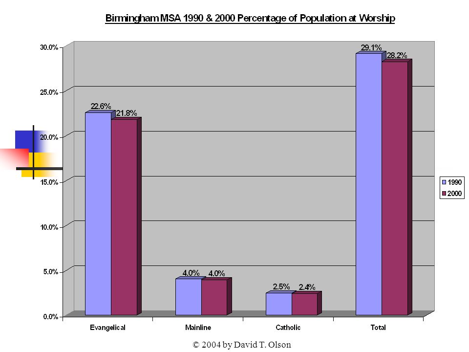
33
© 2004 by David T. Olson Sample - Not for Public Use33 The Next Graph shows the attendance numbers for the churches in the Birmingham metro in 1990 and 2000. All groups have increased numerically over the last decade. As population has grown, a more reliable standard for evaluating increasing or declining influence is the percentage of the population attending church on any given weekend, shown in the second graph. This graph shows a small overall decline in the percentage of the population attending church in Birmingham.

34
© 2004 by David T. Olson

36
© 2004 by David T. Olson Sample - Not for Public Use36 The Next Map shows the percentage of the population attending a Christian church on any given weekend in 2000 for each county in the Birmingham area.

37
© 2004 by David T. Olson Sample - Not for Public Use37 Birmingham Metro Area 2000 Percentage of the Population Attending a Christian Church on Any Given Weekend

38
© 2004 by David T. Olson Sample - Not for Public Use38 The Next Chart shows the relative strength of the 8 major denominational groups in Birmingham metro area.

39
© 2004 by David T. Olson Sample - Not for Public Use39

40
© 2004 by David T. Olson Sample - Not for Public Use40 The Next Map shows the growth or decline in the percentage of the population attending a Christian church on any given weekend from 1990 to 2000 for each county. 2 counties grew in attendance percentage, while 2 counties declined.

41
© 2004 by David T. Olson Sample - Not for Public Use41 Birmingham Metro Counties 1990 - 2000 Growth or Decline in Percentage of the Population at Worship in All Christian Churches on a Given Weekend Blue = Decline Rose = Growth

42
© 2004 by David T. Olson Sample - Not for Public Use42 The Complete Birmingham Powerpoint is 50 slides in length, and is available at http://www.theamericanchurch.org/metro/Birmingham.htm. It includes maps of church attendance in every county in the metro area, as well as denominational charts, average size charts, church planting charts, ethnicity charts and population growth information. http://www.theamericanchurch.org/metro/Birmingham.htm

43
© 2004 by David T. Olson Sample - Not for Public Use43 This Presentation is based on a nationwide study of American church attendance, as reported by churches and denominations. The database currently has average worship attendances for each of the last 10 years for over 200,000 individual churches. It also uses supplementary information (actual membership numbers correlated with accurate membership to attendance ratios) to project the attendances of all other denominational and independent churches. All told, accurate information is provided for over 300,000 orthodox Christian churches. 1 1 This presentation looks only at people attending orthodox Christian churches. Approximately 3 million people attend non-orthodox Christian churches, and perhaps 3 million attend a religious service of another religion. Those ‘houses of worship’ would add another 35,000 churches in the United States and increase the 2000 percentage to 20.5%.
 to project the attendances of all other denominational and independent churches. All told, accurate information is provided for over 300,000 orthodox Christian churches. 1 1 This presentation looks only at people attending orthodox Christian churches. Approximately 3 million people attend non-orthodox Christian churches, and perhaps 3 million attend a religious service of another religion. Those ‘houses of worship’ would add another 35,000 churches in the United States and increase the 2000 percentage to 20.5%..")
44
© 2004 by David T. Olson Sample - Not for Public Use44 For More Information... Please go to www.theamericanchurch.org for additional information on the American Church.www.theamericanchurch.org 12 Surprising Facts about the American Church is available at http://www.theamericanchurch.org/ 12supm. htm http://www.theamericanchurch.org/ 12supm. htm The complete Alabama Powerpoint presentation is available at http://www.theamericanchurch.org/state/UAL20.htm http://www.theamericanchurch.org/state/UAL20.htm The Complete Birmingham Powerpoint presentation is available at http://www.theamericanchurch.org/metro/Birmingham.htm http://www.theamericanchurch.org/metro/Birmingham.htm A Combo Pack (12 Surprising Facts, Alabama and Birmingham Powerpoints) is available at http://www.theamericanchurch.org/combo/AL0.htm http://www.theamericanchurch.org/combo/AL0.htm
 is available at")
Similar presentations