Download presentation
Presentation is loading. Please wait.

1
COMMUNICATING DATA USING GRAPHICS MIS2502 Data Analytics

2
What makes a good chart? Minard’s map of Napoleon’s campaign into Russia, 1869 Reprinted in Tufte (2009), p. 41
, p. 41.")
3
What makes a good chart? http://www.popvssoda.com/countystats/total-county.html

4
What makes a good chart? Zhang et al. (2010), “A case study of micro-blogging in the enterprise: use, value, and related issues,” Proceedings of the 28th International Conference on Human Factors in Computing Systems. This is from an academic conference paper. What are the problems with this chart? This is from an academic conference paper. What are the problems with this chart?
, A case study of micro-blogging in the enterprise: use, value, and related issues, Proceedings of the 28th International Conference on Human Factors in Computing Systems. This is from an academic conference paper. What are the problems with this chart. This is from an academic conference paper. What are the problems with this chart .")
5
Some basic principles (adapted from Tufte 2009) The chart should tell a story 1 The chart should have graphical integrity 2 The chart should minimize graphical complexity 3 Tufte’s fundamental principle: Above all else show the data
 The chart should tell a story 1 The chart should have graphical integrity 2 The chart should minimize graphical complexity 3 Tufte’s fundamental principle: Above all else show the data")
6
Principle 1: The chart should tell a story Graphics should be clear on their own The depictions should enable meaningful comparison The chart should yield insight beyond the text “If the statistics are boring, then you’ve got the wrong numbers.” (Tufte 2009)
")
7
Examples? http://www.evl.uic.edu/aej/491/week03.html http://flowingdata.com/2009/11/26/fox-news- makes-the-best-pie-chart-ever/

8
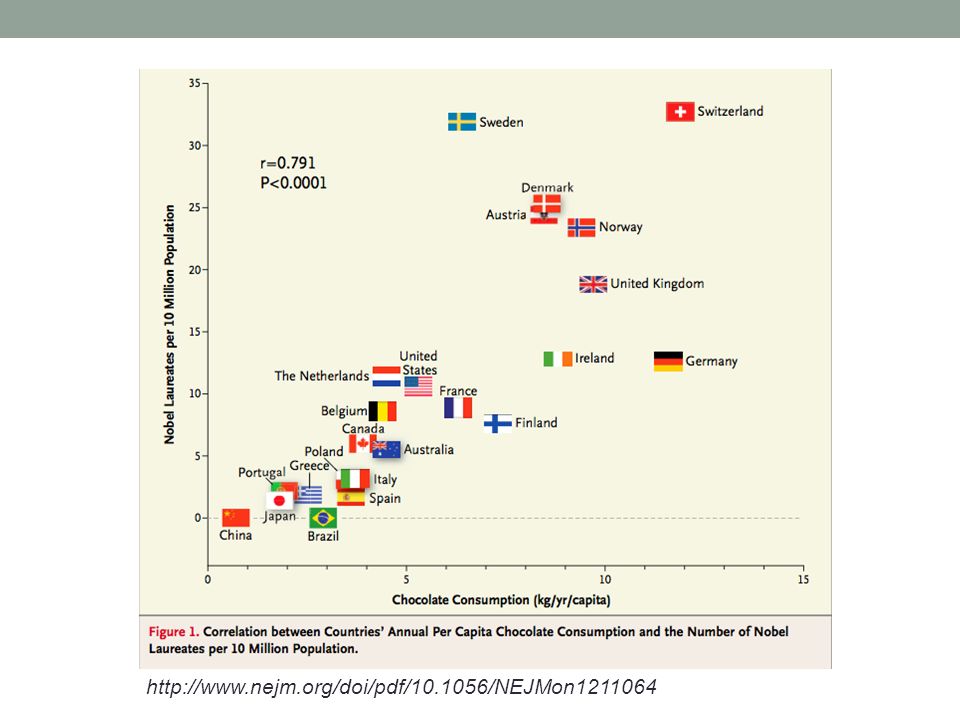
http://www.nejm.org/doi/pdf/10.1056/NEJMon1211064
9
http://www.ngoilgas.com/news/oil-spill-latest-the-cost-of-clumsiness/

10
Principle 2: The chart should have graphical integrity Basically, it should not “lie” or mislead the reader.

11
Tufte’s “Lie Factor” Should be ~ 1 < 1 = understated effect > 1 = exaggerated effect Lie Factor = Graphical (Drawn) Difference / Actual Differences
 Difference / Actual Differences")
12
Examples of the “lie factor” Reprinted from Tufte (2009), p. 57 & p. 62
, p. 57 & p. 62")
13
A more recent, basic example http://20bits.com/articles/politics-and-tuftes-lie-factor/ The original graphic from Real Clear Politics, 2008. (Look at the y-axis) The original graphic from Real Clear Politics, 2008. (Look at the y-axis) The adjusted graphic.
 The original graphic from Real Clear Politics, (Look at the y-axis) The adjusted graphic..")
14
Other tips to avoid “lying” Adjust for inflation Make sure the context is presented vs.

15
Avoid an Implied Comparison of Incomparable Values

16
Other tips to avoid “lying” or misleading Relative Values vs. Absolute? Don’t Imply An Ordering When There Isn’t One!

17
Principle 3: The chart should minimize graphical complexity Key concepts Sometimes a table is better Data-inkChartjunk Generally, the simpler the better…

18
When a table is better than a chart For a few data points, a table can do just as well… SalespersonTotal Sales Peacock$225,763.68 Leverling$201,196.27 Davolio$182,500.09 Fuller$162,503.78 Callahan$123,032.67 King$116,962.99 Dodsworth$75,048.04 Suyama$72,527.63 Buchanan$68,792.25 The table carries more information in less space and is more precise.

19
The Ultimate Table: The Box Score Large amount of information in a very small space So why does this work? Depends on the reader’s knowledge of the data

20
The Business Box Score? Applying the same concept to our salesforce example. How does this help? How could it hurt? Sales Performance – March 2011 SalespersonTSWDBDNCDOR Peacock225 3402028 Leverling201 2451827 Davolio182 5382228 Fuller162 2221620 Callahan123 1151415 King116 0.5201218 Dodsworth75 0.3121020 Suyama72 08108 Buchanan68 08812 Key: TS – total sales WD – worst day BD – best day NC – number of customers DOR – days on the road

21
Data Ink Should be ~ 1 < 1 = more non-data related ink in graphic = 1 implies all ink devoted to data Tufte’s principle: Erase ink whenever possible

22
Being conscious of data ink Lower data-ink ratio (worse) Higher data-ink ratio (better)
 Higher data-ink ratio (better)")
23
What makes a good chart? Sometimes it’s really a matter of preference. These both minimize data ink. Why isn’t a table better here? Sometimes it’s really a matter of preference. These both minimize data ink. Why isn’t a table better here?

24
3-D Charts Evaluate this from a data-ink perspective. How does it affect the clarity of the chart? Evaluate this from a data-ink perspective. How does it affect the clarity of the chart?

25
Chartjunk: Data Ink “gone wild” Unnecessary visual clutter that doesn’t provide additional insight Distraction from the story the chart is supposed to convey When the data-ink ratio is low, chartjunk is likely to be high

26
Example: Moiré effects (Tufte 2009) Creates illusion of movement Stands out, in a bad way
 Creates illusion of movement Stands out, in a bad way")
27
Example: The Grid Why are these examples of chartjunk? What could you do to remedy it?

28
Data Ink Working Against Us Evaluate this chart in terms of Data Ink. Are there better visualizations? Evaluate this chart in terms of Data Ink. Are there better visualizations?

29
Data Ink Working For Us Evaluate this chart in terms of Data Ink. Imagine this as a bar chart. As a table!! Evaluate this chart in terms of Data Ink. Imagine this as a bar chart. As a table!!

30
Stacked Bar Charts are Often Trouble Original chart from the BBC website Why is this so difficult to read? What would be a better way to visualize it? http://j-walkblog.com/index.php?/weblog/posts/bad_charts/

31
Avoid Multi-Axis Graphs

Similar presentations

>")


 The Visual Display of Quantitiative Information. 2 nd Ed. Cheshire: Graphics Press Originally published in American Education,>")


 上課投影片 3.1 Chapter Three Art and Science of Graphical Presentations.>")


