Download presentation
Presentation is loading. Please wait.

1
Data a collection of facts, such as values or measurements

2
Vocabulary SURVEY sondaggio SAMPLEcampione CENSUS censimento BIAS pregiudizio, parzialità PATTERNmodello, schema SHAPEforma RANGEgamma, serie

3
Data QUANTITATIVE Can be collected using numbers QUALITATIVE about preferences Discrete data can only take certain values Continuous data can take any value Primary data You collect yourself Secondary data: Someone else has collected

4
You collect data by doing a Survey you collect data for every member of the group (the whole "population"). you collect data just for selected members of the group. A census is accurate, but hard to do. A sample is not as accurate, but may be good enough, and is a lot easier. SAMPLE CENSUS

6
Be careful! Don’t bias your survey. If you measure something several times and all values are close, they may all be wrong if there is a "Bias“ Bias is a systematic (built-in) error which makes all measurements wrong by a certain amount.
 error which makes all measurements wrong by a certain amount..")
7
Here are five steps to a successful survey: Step one: create the questions Step two: ask the questions Step three: display the data Step four: analyse the data Step five: present the results Analyse :study in detail

8
Step three: Display the data Show the pattern and shape of the data Give a clear understanding of the data more quickly Explain and analyse your results Display: organise the data collected into tables and graphs so that the patterns can be seen and analysed

9
HOW TO SHOW DATA Bar Graph Pie Chart Pictograms Histograms

10
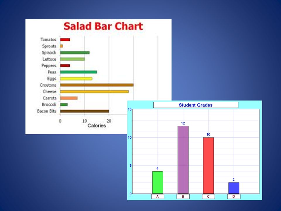
Bar Charts A Bar Chart (also called Bar Graph) is a graphical display of data using bars of different heights. For a bar chart you need: An easy scale for the axes, which you should label on the axes A title describing why you have drawn the bar chart

12
Pie Chart A special chart that uses "pie slices" to show relative sizes of data. It is the best way to show fractions or percentages for a set of data

13
How to Make a Pie Chart Yourself First add up all your values to get a total Next, divide each value by the total Now you need to figure out how many degrees for each "pie slice" A Full Circle has 360 degrees, so we do this calculation: value/total x 360 (You can also multiply (value/total) by 100 to get a percent
 by 100 to get a percent")
14
Now you are ready to start drawing! Draw a circle. Then use your protractor to measure the degrees of each sector.

15
Why do you think it is called a pie chart?

16
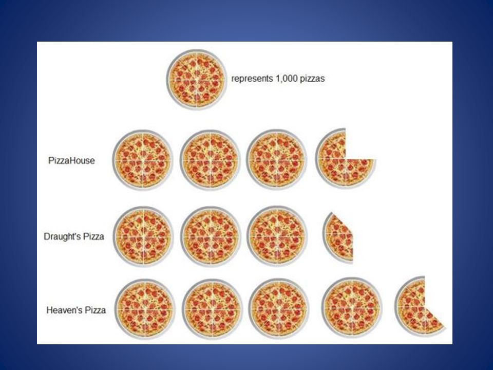
Pictograms A Pictogram is a way of showing data using images or symbols. Each image stands for a certain number of things. You need: Simple symbols that are easy to draw A key showing what each symbol stands for A title describing why you have draw the pictograms

18
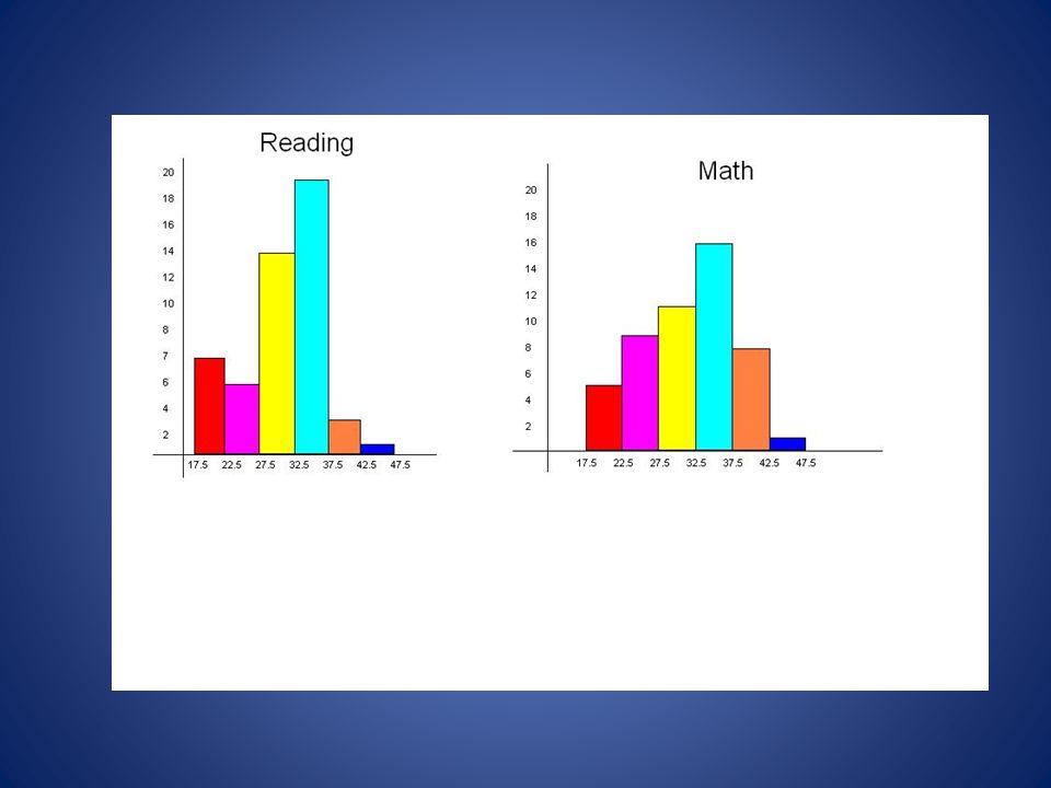
Histograms A Histogram is a graphical display of data using bars of different heights. It is similar to a Bar Chart, but a histogram groups numbers into ranges And you decide what ranges to use!

19
A histogram is different from a bar chart as the bars are joined toghether and have no gaps A histograms is used for continuous data and for grouped continuous data

Similar presentations


. Day….. 1.Misleading GraphsMisleading Graphs 2.Frequency Tables and Tally ChartsFrequency Tables and Tally Charts.>")
. Day….. 1.Circle GraphsCircle Graphs 2.SurveysSurveys 3.Bias and Unbiased SurveysBias and Unbiased Surveys 4.Population.>")


. 1) Add all the individual pieces of data together to get a whole. For example, if you were doing a pie chart on religion on.>")


