Download presentation
Presentation is loading. Please wait.

1
Information Visualization: Ten Years in Review Xia Lin Drexel University

2
Before 1990 Static graphical representation – Graphics are made, not generated – Graphics do not support interactions – Graphics illustrate the organization of information – Graphics are used to help the analysis of information structures Examples: – Maps based on citation analysis – Semantic term relationships – Semantic Net representation

3
Around 1990 Scientific data visualization Popularity of Macintosh and Windows Availability of computational power

4
Motivations For data analysis – Visual inspection of data properties – Dimensional deduction For graphical representation of large amount of data – Clustering and grouping – Discovery of hidden internal structures For visual interaction with the data – interactive online searching – browse large amount of information

5
Motivations To utilize human perception for information seeking – Human can apprehend relationships on graphics fast and sometime intuitively – Human can understand graphical relationships that otherwise difficult to represent To understand/reveal information structures – Understand information structures help online searching and retrieval – Reveal semantic structures through graphical representation

6
Around 1995 IV for IR starts to get popular before of some web applications – HotSause – SemioMap – WebCutter (Mapuciino) – AltaVista’s LiveTopic – Xerox PARC’s research prototypes
 – AltaVista’s LiveTopic – Xerox PARC’s research prototypes")
7
Expectations Most of these systems did not live up to their expectations – Limited success – No clear advantages over other approaches – Many are “for demonstration only” not practical No instant mapping and visualizing Not easy to be understood by the user

8
Lessons Applications that “Look great” do not guarantee to have users. Visualization tools should reduce, rather than adding cognitive loads to the searcher. No one feels that he/she has to use these visualization tools yet.

9
Problems Precision and Clarity – If all details are shown, the result is confusion – If only selected details are shown, it may be lack of precision needed. Graphics are often not conclusive – subject to interpretation – subject to the cognition of the viewer.

10
Problems Structures – Structures help people understand. – Structures also disorient people easily. Usefulness – For what purposes is an application created? – For what purposes do people use the application? – How usefulness can be demonstrated? No theories No experimental results No practical applications

11
A Successful Story Spotfire – Completed in 5 years from research prototypes to commercial products. – Focused on data presentation for data analysis Deterministic, rather than fuzziness Usefulness, not just pretty pictures. – Utilized simple functionalities Not the most advanced features Practical

12
A Developing Story Kohonen Mapping for Data Analysis – A banking report example – A drug treatment/development example – Marie Synnestvedt’s data

13
Baking Cabling Messages FINCEN (Financial Crimes Enforcement Network) receives thousands and thousands of messages each day from banks all over the world, which one deserves more attention? – Solution: cluster messages identify trends Interact with the data – Samples: Kohonen net input: 243 dimensions, 130 input vectors Kohonen net output: 14 by 14 Index parameters: words appear in at least four messages and no more than half of the total input.

14
Map of the Suspicious Activity Reporting (SARS) Map of the Suspicious Activity Reporting (SARS)
 Map of the Suspicious Activity Reporting (SARS)")
15
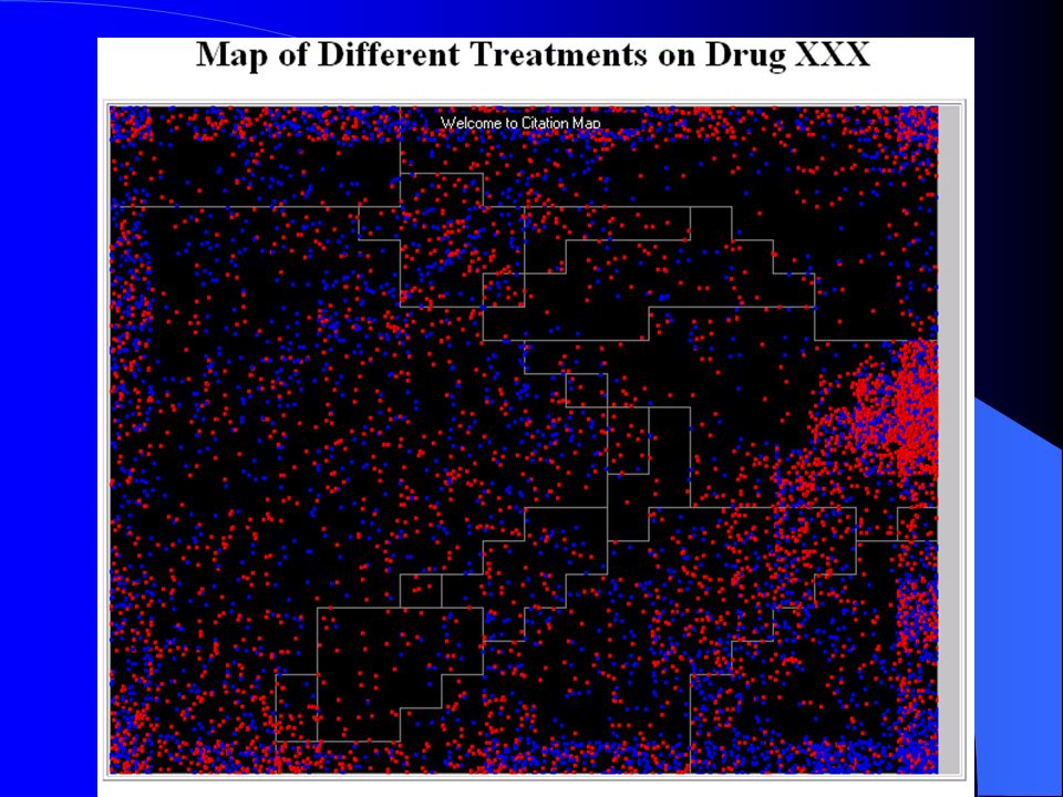
Drug Treatment Data WAR (Wyeth Ayerst Research) – Desired to have a visualization tool for data exploration on experimental dr – Complained about the limited exploration power of Spotfire. – Sent me a sample data for mapping – When the mapping was completed, the director was gone.

16
Data: – 8624 cases (patients) – 120 independent variables (treatments) – Kohonen output: 20 by 20
 – 120 independent variables (treatments) – Kohonen output: 20 by 20")
18
Marie’s Data 488 cases 12 Variables used for mapping: SiteExtrem SiteHead SiteTrunk SiteSubVol ThickGroup1 ThickGroup2 ThickGroup3 ThickGroup4 Level2s Level3 Level4 Level5

19
Level 3 Level 4 Site Trunk Thick Group1 SiteExtrem Thick Group4 Thick G2 Thick G3 SiteHead Level 5 SiteSubVol

20
Our Current Projects: AuthorLink/ConceptLink Make it practical Make it simple Make it useful The purpose of visualization is INSIGHT, not pretty pictures.

21
Design Objective 1 Develop visualization tools that work on real world data. – Working with data that have meaningful structures Thesaurus Citations Document collections with good semantic structures – Real time mapping Large databases, small visualization areas

22
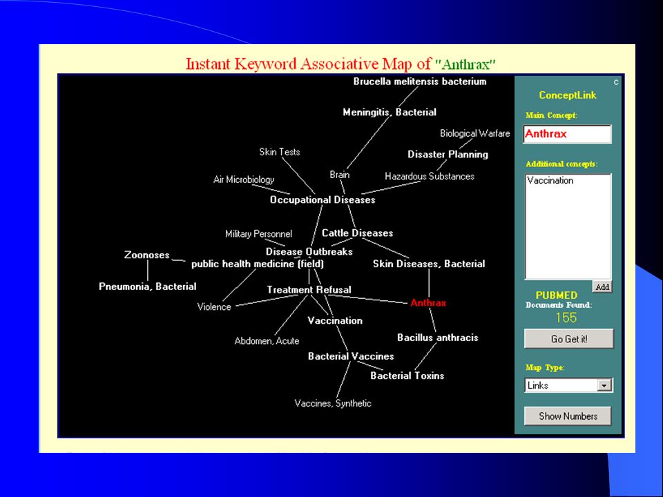
Design Objective 2 Develop tools for associative mapping – Analyze co-occurrence data Co-citation counts Co-occurrence of terms in documents – View the invisible – Reveal "the meaning of associations" Without visualization, “the meaning” could be hidden in the data.

23
Design Objective 3 Develop practical visualization interfaces for information access. – Simple and Practical Everyone can use it without much learning – Useful Connecting to good resources – Focus on contents Not pretty graphics No additional cognitive interpretations

24
Design Objective 4 Develop real time interaction for information visualization – “drag-and-drop” from visual mapping to search engines – “real-time” feed-back from search engines. – Mixed-initiative interaction The search engine responses to what the user asks for. The search engine may also conduct searches before the user asks it to to do.

25
Design Objective 5 Develop a flexible system architecture for system integration and future expansion. – Design in Java – Develop a middle solution that might be ported to other databases/search engines.

26
System Architecture

27
Concept Mapping

29
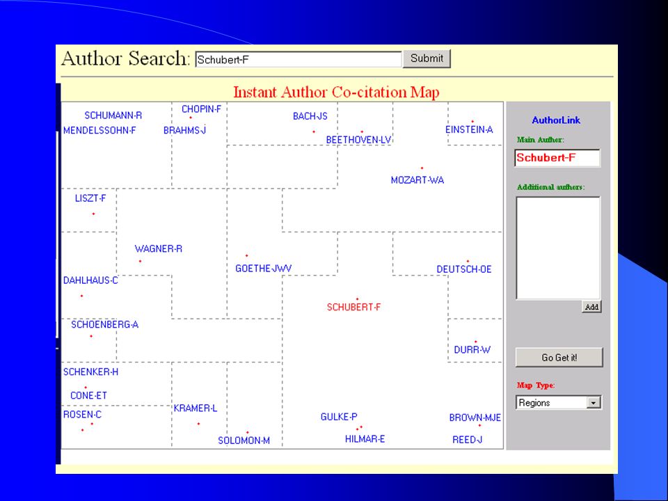
Author Mapping

31
Future Research Beyond interaction – moving from interaction to cooperation and to collaboration. Creating a culture and the environment for information visualization – user education – hardware and software improvement – Encouragement of graphical thinking

Similar presentations