Download presentation
Presentation is loading. Please wait.

1
© 2004 by David T. Olson Sample - Not for Public Use1 A Sample Presentation of The State of the Church in New York and the Albany, New York City, Nassau-Suffolk, Syracuse, Buffalo and Rochester Metro Areas 1990-2000 Dave Olson www.TheAmericanChurch.org

2
© 2004 by David T. Olson Sample - Not for Public Use2 The first 19 slides are from the “State of the Church in New York” Powerpoint. The Complete Powerpoint is 42 slides in length, and is available at http://www.theamericanchurch.org/state/UNY20.htm. It includes maps of church attendance in every county, as well as denominational charts, average size charts, church planting charts, ethnicity charts and population growth information. http://www.theamericanchurch.org/state/UNY20.htm

3
© 2004 by David T. Olson Sample - Not for Public Use3 In 1996, polls taken immediately after the Presidential election revealed that 58% of people claimed they had voted, when in reality only 49% actually did. This is called the Halo Effect. People tend to over-inflate their participation in activities that create acceptability within their social group. For many decades, pollsters such as Gallup and Barna have reported that around 45% of Americans attend church every Sunday. But there is a religious Halo Effect. Actual attendance counts have shown that the percentage of people attending church on any given weekend is much lower than was previously thought.

4
© 2004 by David T. Olson Sample - Not for Public Use4 The Intent of this presentation is to answer and then expand on two key questions: “How Many People Really Attend Church in New York Every Week?” “Is the Christian Church Going Forwards or Backwards in Influence in New York?” As the data is analyzed county by county assessing a number of factors, a comprehensive picture of the State of the Church in New York will begin to take shape.

5
© 2004 by David T. Olson Sample - Not for Public Use5 This study uses weekend church attendance as a more reliable and more immediate snapshot of Christian influence than membership. The following map shows the percentage of the population attending a Christian church on any given weekend in all 50 states in 2000. New York has an average church attendance percentage (15.5%) lower than the national average (18.7%).
 lower than the national average (18.7%)..")
6
© 2004 by David T. Olson Sample - Not for Public Use6

7
7 The Next Map shows the percentage of the population attending a Christian church on any given weekend in 2000 for each county in New York.

8
© 2004 by David T. Olson Sample - Not for Public Use8

9
9 The Next 2 Maps show the population numbers for each county in New York. The first map shows the population of each county. The second map shows the growth or decline in population for each county from 1990 - 2000. 22 counties have declined.

10
© 2004 by David T. Olson Sample - Not for Public Use10

11
© 2004 by David T. Olson Sample - Not for Public Use11

12
© 2004 by David T. Olson Sample - Not for Public Use12 The Next 2 Slides show the ethnicity of New York in 1990 and 2000. The third slide shows the growth or decline in the percentage of the population for each ethnic group.

13
© 2004 by David T. Olson Sample - Not for Public Use13

14
© 2004 by David T. Olson Sample - Not for Public Use14

15
© 2004 by David T. Olson Sample - Not for Public Use15

16
© 2004 by David T. Olson Sample - Not for Public Use16 The Next Graph shows the attendance numbers for the churches in New York in 1990 and 2000. Evangelicals have grown in attendance, Mainline and Catholics have significantly declined. As population has grown, a more reliable standard for evaluating increasing or declining influence is the percentage of the population attending church on any given weekend, shown in the second graph.

17
© 2004 by David T. Olson Sample - Not for Public Use17

18
© 2004 by David T. Olson Sample - Not for Public Use18

19
© 2004 by David T. Olson Sample - Not for Public Use19

20
© 2004 by David T. Olson Sample - Not for Public Use20 The 3 Next Charts show the relative strength of the 8 major denominational groups in New York. The first chart illustrates the huge influence of the Catholic church. The second and third charts show that except for Pentecostal churches, all other denominational families have declined.

21
© 2004 by David T. Olson Sample - Not for Public Use21

22
© 2004 by David T. Olson Sample - Not for Public Use22 The Complete New York Powerpoint is 42 slides in length, and is available at http://www.theamericanchurch.org/state/UNY20.htm. It includes maps of church attendance in every county in the metro area, as well as denominational charts, average size charts, church planting charts, ethnicity charts and population growth information. http://www.theamericanchurch.org/state/UNY20.htm

23
© 2004 by David T. Olson Sample - Not for Public Use23 The next 8 slides are from the “State of the Church in Albany” Powerpoint. The Complete Powerpoint is 45 slides in length, and is available at http://www.theamericanchurch.org/metro/Albany.htm. It includes maps of church attendance in every county in the metro area, as well as denominational charts, average size charts, church planting charts, ethnicity charts and population growth information. http://www.theamericanchurch.org/metro/Albany.htm

24
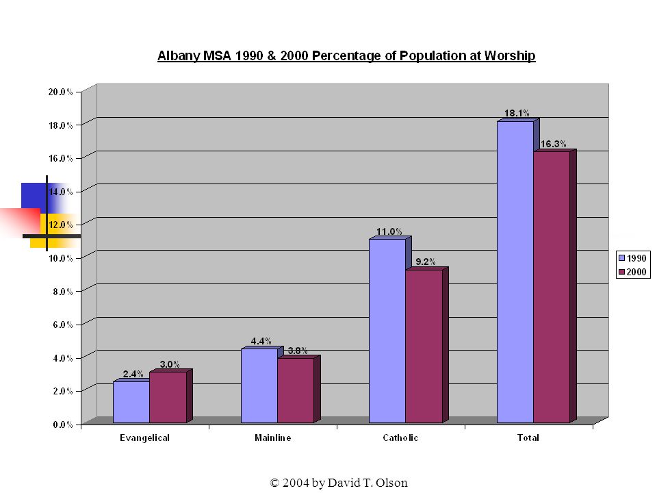
© 2004 by David T. Olson Sample - Not for Public Use24 The Next Graph shows the attendance numbers for the churches in the Albany metro in 1990 and 2000. Evangelical church attendance has grown significantly over the last decade. The Mainline, Catholic and Total numbers have declined. As population fluctuates, a more reliable standard for evaluating increasing or declining influence is the percentage of the population attending church on any given weekend, shown in the second graph.

25
© 2004 by David T. Olson

27
© 2004 by David T. Olson Sample - Not for Public Use27 The Next Map shows the percentage of the population attending a Christian church on any given weekend in 2000 for each county in the Albany area.

28
© 2004 by David T. Olson Sample - Not for Public Use28 Albany Metro Area 2000 Total Church Attendance

29
© 2004 by David T. Olson Sample - Not for Public Use29 The 2 Next Charts show the relative strength of the 8 major denominational groups in Albany metro area.

30
© 2004 by David T. Olson Sample - Not for Public Use30

31
© 2004 by David T. Olson Sample - Not for Public Use31

32
© 2004 by David T. Olson Sample - Not for Public Use32 The Complete Albany Powerpoint is 45 slides in length, and is available at http://www.theamericanchurch.org/metro/Albany.htm. It includes maps of church attendance in every county in the metro area, as well as denominational charts, average size charts, church planting charts, ethnicity charts and population growth information. http://www.theamericanchurch.org/metro/Albany.htm

33
© 2004 by David T. Olson Sample - Not for Public Use33 The next 9 slides are from the “State of the Church in New York City ” Powerpoint. The Complete Powerpoint is 45 slides in length, and is available at http://www.theamericanchurch.org/metro/NewYork.htm. It includes maps of church attendance in every county in the metro area, as well as denominational charts, average size charts, church planting charts, ethnicity charts and population growth information. http://www.theamericanchurch.org/metro/NewYork.htm

34
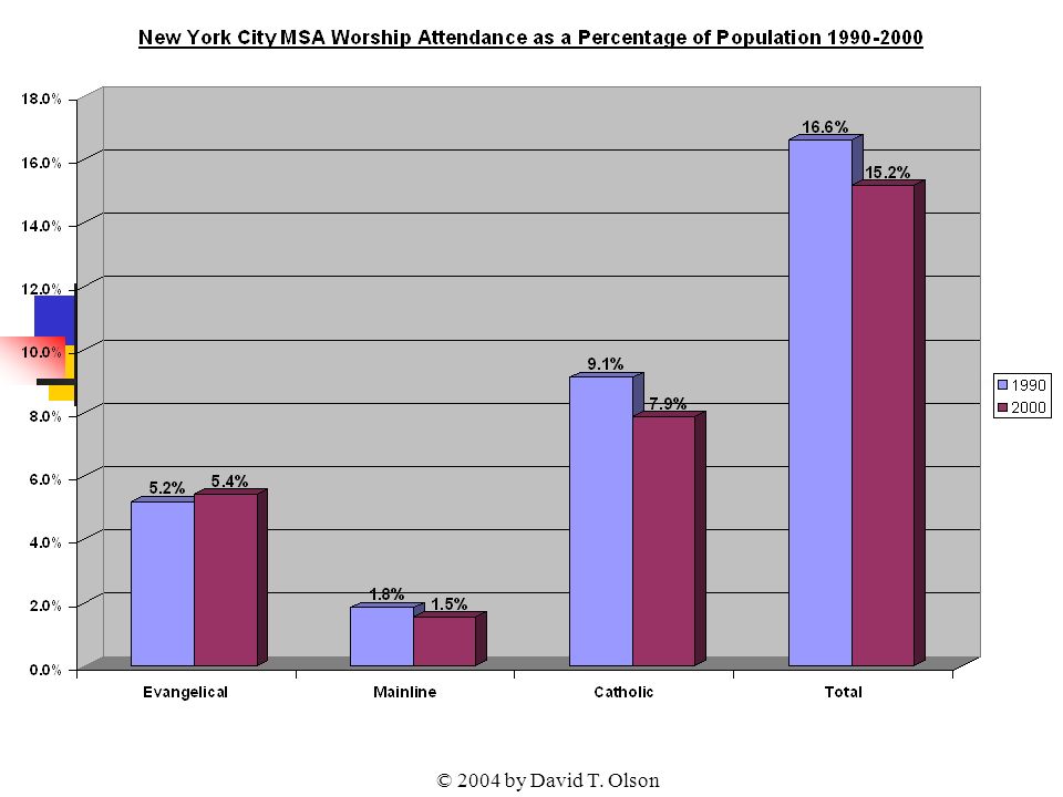
© 2004 by David T. Olson Sample - Not for Public Use34 The Next Graph shows the attendance numbers for the churches in the New York City metro in 1990 and 2000. Evangelicals grew in attendance numbers, while Catholics and Mainline groups have declined over the last decade. As population has grown however, a more reliable standard for evaluating increasing or declining influence is the percentage of the population attending church on any given weekend, shown in the second graph.

35
© 2004 by David T. Olson

37
© 2004 by David T. Olson Sample - Not for Public Use37 The Next Map shows the growth or decline in the percentage of the population attending a Christian church on any given weekend from 1990 to 2000 for each county. 2 counties in the New York City metro area grew in attendance percentage, 7 declined.

38
© 2004 by David T. Olson Sample - Not for Public Use38 New York City Metro Area 1990 – 2000 Growth or Decline in Christian Church Attendance -16.2% Queens -9.0% Rockland -8.1% Richmond -7.8% Bronx -4.0% Westchester 1.0% Kings 1.8% Putnam -13.2% Bergen -14.9% New York

39
© 2004 by David T. Olson Sample - Not for Public Use39 The Next 3 Maps show the attendance percentages for the Evangelical, Catholic and Mainline churches in each county in the New York City metro area in 2000.

40
© 2004 by David T. Olson Sample - Not for Public Use40 New York City Metro Area 2000 Evangelical Percentage 5.0% Queens -3.2% Rockland 3.1% Richmond 7.7% Bronx 4.0% Westchester 8.2% Kings 1.5% Putnam 2.3% Bergen 3.7% New York

41
© 2004 by David T. Olson Sample - Not for Public Use41 New York City Metro Area 2000 Mainline Percentage 1.0% Queens 1.2% Rockland 1.0% Richmond 1.0% Bronx 2.0% Westchester 1.5% Kings 1.6% Putnam 2.3% Bergen 2.4% New York

42
© 2004 by David T. Olson Sample - Not for Public Use42 New York City Metro Area 2000 Catholic Percentage 5.5% Queens 10.3% Rockland 11.1% Richmond 8.1% Bronx 9.5% Westchester 7.0% Kings 10.4% Putnam 13.5% Bergen 6.8% New York

43
© 2004 by David T. Olson Sample - Not for Public Use43 The Complete New York City Powerpoint is 45 slides in length, and is available at http://www.theamericanchurch.org/metro/NewYork.htm. It includes maps of church attendance in every county in the metro area, as well as denominational charts, average size charts, church planting charts, ethnicity charts and population growth information.

44
© 2004 by David T. Olson Sample - Not for Public Use44 The next 9 slides are from the “State of the Church in Nassau-Suffolk ” Powerpoint. The Complete Powerpoint is 45 slides in length, and is available at http://www.theamericanchurch.org/metro/NassauSuffolk.htm. It includes maps of church attendance in every county in the metro area, as well as denominational charts, average size charts, church planting charts, ethnicity charts and population growth information. http://www.theamericanchurch.org/metro/NassauSuffolk.htm

45
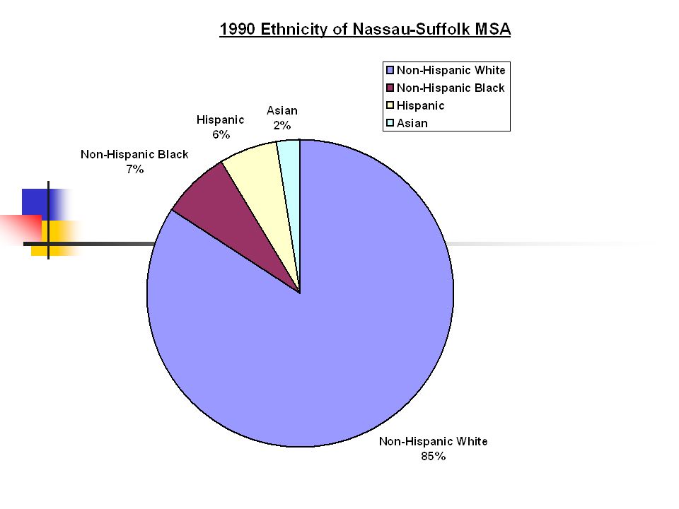
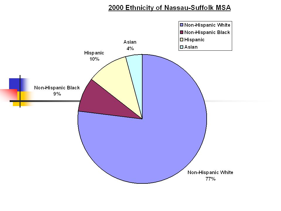
© 2004 by David T. Olson Sample - Not for Public Use45 The Next 2 Slides show the ethnicity of the Nassau-Suffolk area in 1990 and 2000. The third slide shows the growth or decline in the percentage of the population for each ethnic group.

48
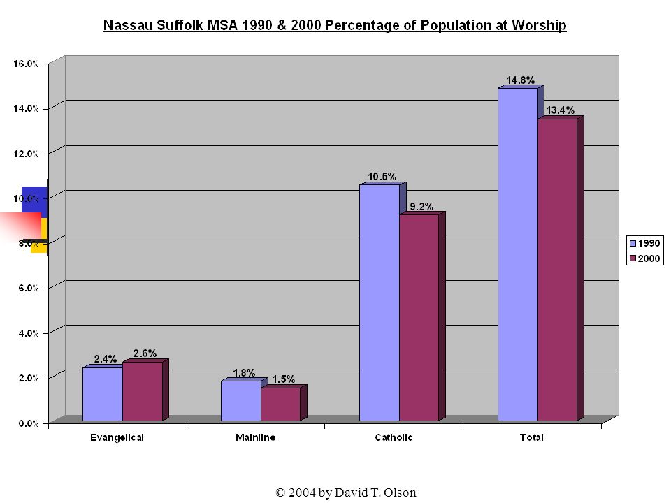
© 2004 by David T. Olson Sample - Not for Public Use48 The Next Graph shows the attendance numbers for the churches in the Nassau-Suffolk area in 1990 and 2000. Evangelicals grew in attendance numbers, while Catholics and Mainline groups have declined over the last decade. As population has grown however, a more reliable standard for evaluating increasing or declining influence is the percentage of the population attending church on any given weekend, shown in the second graph.

49
© 2004 by David T. Olson

51
© 2004 by David T. Olson Sample - Not for Public Use51 The Next Map shows the percentage of the population attending a Christian church on any given weekend in 2000 for each county in the Nassau-Suffolk area.

52
© 2004 by David T. Olson Sample - Not for Public Use52 Nassau-Suffolk Metro Area 2000 Percentage of the Population Attending a Christian Church on Any Given Weekend 13.7% Nassau 13.2% Suffolk

53
© 2004 by David T. Olson Sample - Not for Public Use53

54
© 2004 by David T. Olson Sample - Not for Public Use54 The Complete Nassau-Suffolk Powerpoint is 45 slides in length, and is available at http://www.theamericanchurch.org/metro/NassauSuffolk.htm. It includes maps of church attendance in every county in the metro area, as well as denominational charts, average size charts, church planting charts, ethnicity charts and population growth information.

55
© 2004 by David T. Olson Sample - Not for Public Use55 The next 9 slides are from the “State of the Church in Syracuse ” Powerpoint. The Complete Powerpoint is 45 slides in length, and is available at http://www.theamericanchurch.org/metro/Syracuse.htm. It includes maps of church attendance in every county in the metro area, as well as denominational charts, average size charts, church planting charts, ethnicity charts and population growth information. http://www.theamericanchurch.org/metro/Syracuse.htm

56
© 2004 by David T. Olson Sample - Not for Public Use56 The Next Map shows the percentage of the population attending a Christian church on any given weekend in 2000 for each county in the Syracuse area.

57
© 2004 by David T. Olson Sample - Not for Public Use57 Syracuse Metro Area 2000 Percentage of the Population Attending a Christian Church on Any Given Weekend 18.8% Onondaga 14.8% Cayuga 13.6% Madison 14.4% Oswego

58
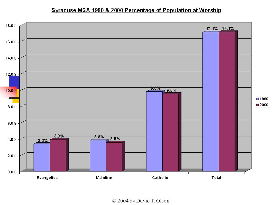
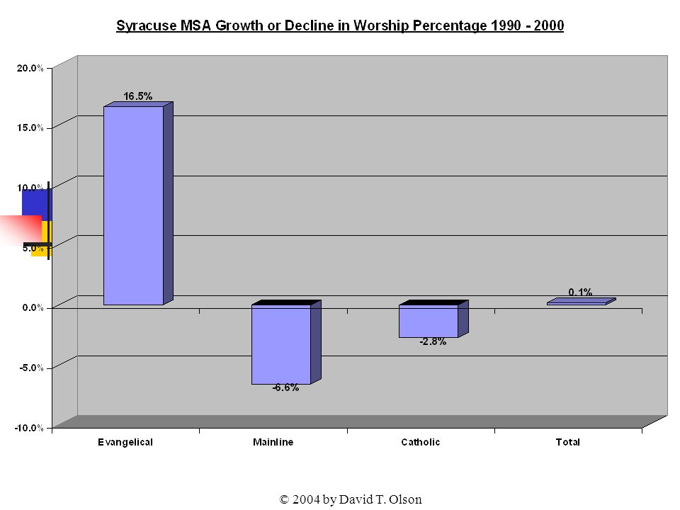
© 2004 by David T. Olson Sample - Not for Public Use58 The Next Graph shows the attendance numbers for the churches in the Syracuse metro in 1990 and 2000. Evangelical church attendance has grown numerically while Mainline and Catholics churches have declined. As population fluctuates, a more reliable standard for evaluating increasing or declining influence is the percentage of the population attending church on any given weekend, shown in the second graph.

59
© 2004 by David T. Olson

62
© 2004 by David T. Olson Sample - Not for Public Use62 The Next Chart shows the 1990 & 2000 average church attendance by group for both this metro area and the nation. The second chart shows the 1990 & 2000 population per church for this metro area and the nation. Among states, Arkansas had the lowest population per church ratio with 411 people per church. Utah had the highest ratio with 4,586 people per church.

63
© 2004 by David T. Olson Sample - Not for Public Use63

64
© 2004 by David T. Olson Sample - Not for Public Use64

65
© 2004 by David T. Olson Sample - Not for Public Use65 The Complete Syracuse Powerpoint is 45 slides in length, and is available at http://www.theamericanchurch.org/metro/Syracuse.htm. It includes maps of church attendance in every county in the metro area, as well as denominational charts, average size charts, church planting charts, ethnicity charts and population growth information.

66
© 2004 by David T. Olson Sample - Not for Public Use66 The next 7 slides are from the “State of the Church in Rochester ” Powerpoint. The Complete Powerpoint is 45 slides in length, and is available at http://www.theamericanchurch.org/metro/Rochester.htm. It includes maps of church attendance in every county in the metro area, as well as denominational charts, average size charts, church planting charts, ethnicity charts and population growth information. http://www.theamericanchurch.org/metro/Rochester.htm

67
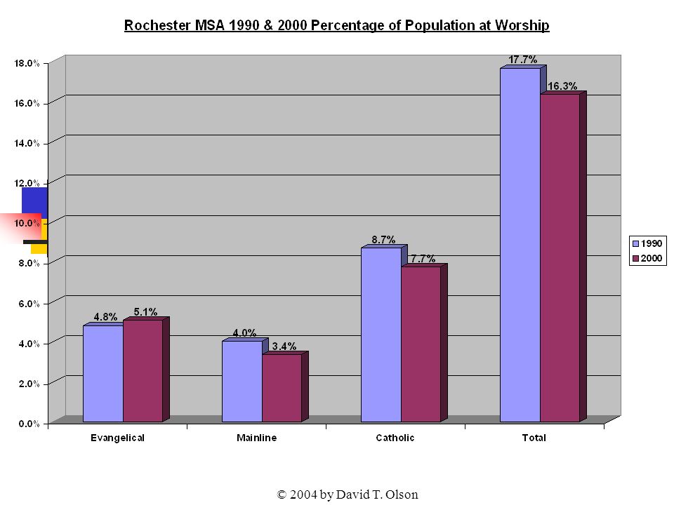
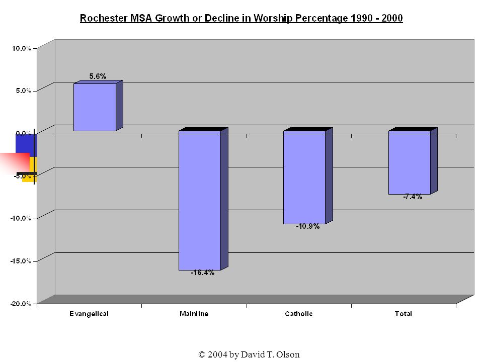
© 2004 by David T. Olson Sample - Not for Public Use67 The Next Graph shows the attendance numbers for the churches in the Rochester metro in 1990 and 2000. Evangelical church attendance has grown numerically while Mainline and Catholics churches have declined. As population fluctuates, a more reliable standard for evaluating increasing or declining influence is the percentage of the population attending church on any given weekend, shown in the second graph.

68
© 2004 by David T. Olson

71
© 2004 by David T. Olson Sample - Not for Public Use71

72
© 2004 by David T. Olson Sample - Not for Public Use72 The Next Map shows the growth or decline in the percentage of the population attending a Christian church on any given weekend from 1990 to 2000 for each county. One county in the Rochester area increased in attendance percentage, while 5 decreased.

73
© 2004 by David T. Olson Sample - Not for Public Use73 Rochester Metro Counties 1990 - 2000 Growth or Decline in Percentage of the Population at Worship in All Christian Churches on a Given Weekend Blue = Decline Rose = Growth -3.5% Genesee -11.1% Livingston -12.6% Orleans -12.0% Wayne 1.7% Ontario -7.8% Monroe

74
© 2004 by David T. Olson Sample - Not for Public Use74 The Complete Rochester Powerpoint is 45 slides in length, and is available at http://www.theamericanchurch.org/metro/Rochester.htm. It includes maps of church attendance in every county in the metro area, as well as denominational charts, average size charts, church planting charts, ethnicity charts and population growth information. http://www.theamericanchurch.org/metro/Rochester.htm

75
© 2004 by David T. Olson Sample - Not for Public Use75 The next 7 slides are from the “State of the Church in Buffalo ” Powerpoint. The Complete Powerpoint is 45 slides in length, and is available at http://www.theamericanchurch.org/metro/Buffalo.htm. It includes maps of church attendance in every county in the metro area, as well as denominational charts, average size charts, church planting charts, ethnicity charts and population growth information. http://www.theamericanchurch.org/metro/Buffalo.htm

76
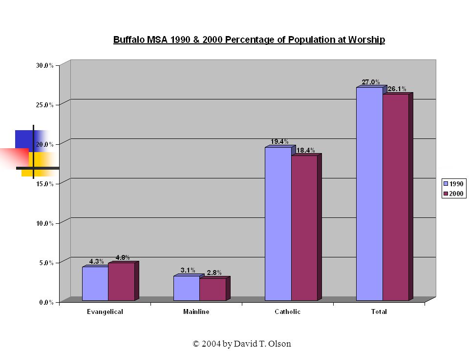
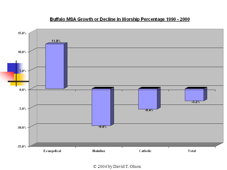
© 2004 by David T. Olson Sample - Not for Public Use76 The Next Graph shows the attendance numbers for the churches in the Buffalo metro in 1990 and 2000. Evangelical church attendance has grown numerically and as a percentage of the population over the last decade. The Mainline, Catholics and total numbers have declined. As population fluctuates, a more reliable standard for evaluating increasing or declining influence is the percentage of the population attending church on any given weekend, shown in the second graph.

77
© 2004 by David T. Olson

80
© 2004 by David T. Olson Sample - Not for Public Use80 The 2 Next Charts show the relative strength of the 8 major denominational groups in Buffalo metro area. The percentage of Catholics is one of the two highest of any metropolitan area of the nation (the other being Providence.)
.")
81
© 2004 by David T. Olson Sample - Not for Public Use81

82
© 2004 by David T. Olson Sample - Not for Public Use82

83
© 2004 by David T. Olson Sample - Not for Public Use83 The Complete Buffalo Powerpoint is 45 slides in length, and is available at http://www.theamericanchurch.org/metro/Buffalo.htm. It includes maps of church attendance in every county in the metro area, as well as denominational charts, average size charts, church planting charts, ethnicity charts and population growth information. http://www.theamericanchurch.org/metro/Buffalo.htm

84
© 2004 by David T. Olson Sample - Not for Public Use84 This Presentation is based on a nationwide study of American church attendance, as reported by churches and denominations. The database currently has average worship attendances for each of the last 10 years for over 200,000 individual churches. It also uses supplementary information (actual membership numbers correlated with accurate membership to attendance ratios) to project the attendances of all other denominational and independent churches. All told, accurate information is provided for over 300,000 orthodox Christian churches. 1 1 This presentation looks only at people attending orthodox Christian churches. Approximately 3 million people attend non-orthodox Christian churches, and perhaps 3 million attend a religious service of another religion. Those ‘houses of worship’ would add another 35,000 churches in the United States and increase the 2000 percentage to 20.5%.
 to project the attendances of all other denominational and independent churches. All told, accurate information is provided for over 300,000 orthodox Christian churches. 1 1 This presentation looks only at people attending orthodox Christian churches. Approximately 3 million people attend non-orthodox Christian churches, and perhaps 3 million attend a religious service of another religion. Those ‘houses of worship’ would add another 35,000 churches in the United States and increase the 2000 percentage to 20.5%..")
85
© 2004 by David T. Olson Sample - Not for Public Use85 For More Information... Please go to www.theamericanchurch.org for additional information on the American Church.www.theamericanchurch.org 12 Surprising Facts about the American Church is available at http://www.theamericanchurch.org/ 12supm. htm http://www.theamericanchurch.org/ 12supm. htm The complete New York Powerpoint presentation is available at http://www.theamericanchurch.org/state/UNY20.htm http://www.theamericanchurch.org/state/UNY20.htm The Complete Albany Powerpoint presentation is available at http://www.theamericanchurch.org/metro/Albany.htm http://www.theamericanchurch.org/metro/Albany.htm The Complete New York City Powerpoint presentation is available at http://www.theamericanchurch.org/metro/NewYork.htm http://www.theamericanchurch.org/metro/NewYork.htm The Complete Rochester Powerpoint presentation is available at http://www.theamericanchurch.org/metro/Rochester.htm http://www.theamericanchurch.org/metro/Rochester.htm The Complete Syracuse Powerpoint presentation is available at http://www.theamericanchurch.org/metro/Syracuse.htm http://www.theamericanchurch.org/metro/Syracuse.htm The Complete Buffalo Powerpoint presentation is available at http://www.theamericanchurch.org/metro/Buffalo.htm http://www.theamericanchurch.org/metro/Buffalo.htm The Complete Nassau-Suffolk Powerpoint presentation is available at http://www.theamericanchurch.org/metro/NassauSuffolk.htm http://www.theamericanchurch.org/metro/NassauSuffolk.htm A Combo Pack (12 Surprising Facts, New York, Albany, NYC, Nassau-Suffolk, Syracuse, Buffalo & Rochester Powerpoints) is available at http://www.theamericanchurch.org/combo/NY0.htm http://www.theamericanchurch.org/combo/NY0.htm
 is available at")
Similar presentations