Download presentation
Presentation is loading. Please wait.

1
Creating visually attractive and appealing publications

2
* The focus or focal point is the center of interest on a page or set of facing pages. * Focus is created by using elements that are large, dense, unusual, and/or surrounded by white space. * Some basic design elements used to create focus in a document are: * Titles, headlines, and subheads created in larger, bolder, and often contrasting, typefaces. * Graphic elements such as ruled lines, clip art, photographs, illustrations, logos, or images created with a draw program or scanned into the computer.

5
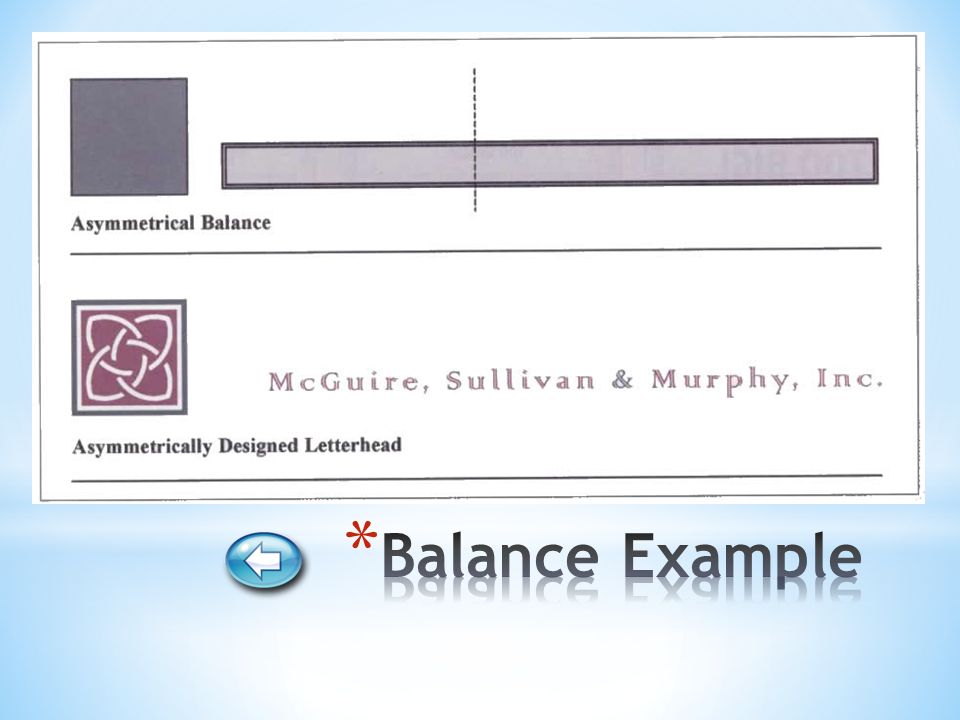
* Balance is attained by equally distributing the weight of various elements, such as blocks of text, graphic images, headings, ruled lines, and white space on the page. * Balance can be described as either symmetrical or asymmetrical: symmetrically * A symmetrically balanced design contains similar elements of equal proportion or weight on the left and right sides and top and bottom of the page. asymmetrically * An asymmetrically balanced design uses non-identical elements with varying weights and/or proportions on both sides of a centerline on the screen.

8
* When designing a document, think about all parts as they relate to the document as a whole. Readers are more likely to read a page where all elements are in proportion. * When incorporating the concept of proportion into your documents, consider the following points: * Size design elements in proportion to their relative importance to the message. * The message that you want to get across to the reader always takes top priority. * Size design elements so they are in proportion to each other.

10
* Contrast is the difference between different degrees of lightness and darkness on the page. * A high level of contrast is more visually stimulating and helps to draw your target audience. * The following elements can be used to create contrast: * Add contrast by setting headings and subheads in larger, denser type. * Make contrasting elements strong enough to be noticed. * Use bullets to organize information and add visual contrast. * Use plenty of white space to convey an open, light feeling. * Select colors that provide a pleasing contrast.

14
* Directional flow is established by organizing and positioning elements in such a way that the reader’s eyes are drawn through the text and to particular words or images. * When trying to establish directional flow in your document, you should: * Organize your information into groups of related items and then rank them in order of importance. * Decide on how to emphasize the most important information * Position related items close to each other on the page * Use left or right alignment to establish a stronger visual connection * Position elements so that the reader is drawn and directed through the document.

18
* Uniformity among specific design elements establishes a pattern of consistency in your document. * The following techniques can help when establishing consistency: * In multi-page publications such as manuals, reports, or newsletters, consistency provides the connecting element between the pages. * Consistent elements such as typefaces, color scheme, and line styles contribute to a unified appearance. * If you plan to insert a graphic image into your document, use the graphic to provide you with some ideas for consistency.

22
* Color is a powerful tool in communicating a message and portraying an image. Color on a page can help organize ideas and highlight important facts. * Consider the following when including color in any publication: * Color can be used to create focus, to add emphasis, to provide organization to the text and to serve as a consistent element throughout a document. * Color can elicit an emotional response from the reader. If you do not have a color printer, color paper can match the tone or mood you are creating in your document.

Similar presentations


>")
