Download presentation
Presentation is loading. Please wait.

1
Color Mixing and Color Theory

2
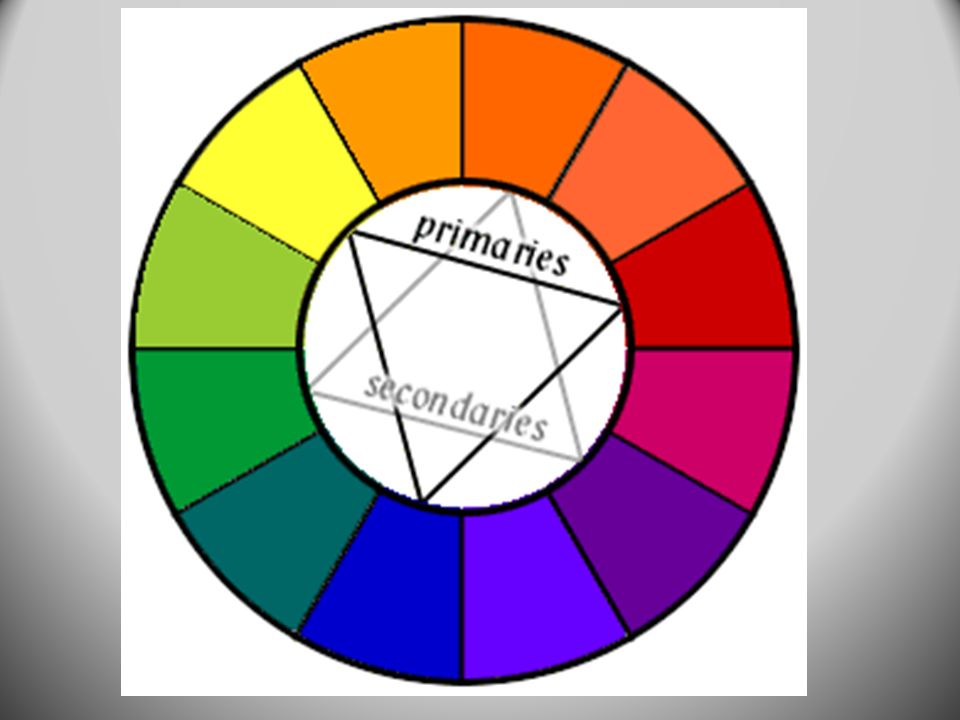
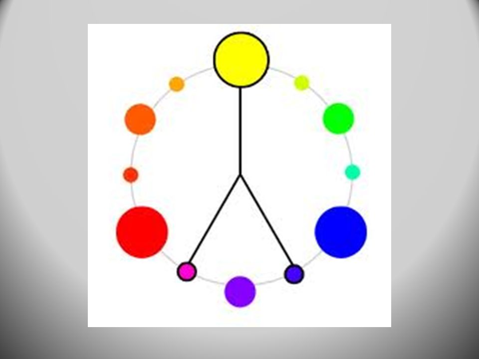
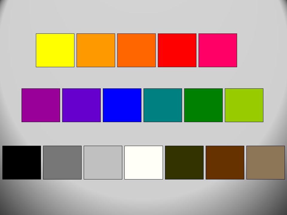
PRIMARY COLORS Primary are the three colors that cannot be mixed, but when mixed together can create any color. These colors are RED, BLUE, and YELLOW.

3
SECONDARY COLORS Secondary colors are made by mixing two primaries in the correct amounts. These colors are VIOLET, ORANGE, AND GREEN.

4
INTERMEDIATE COLORS These are mixed by combining a primary and a secondary. Some examples are Red-Orange, Blue-Green, Yellow-Green. You always say first the name Primary color which has most in common with the Intermediate color. You don’t say Orange-Red, but instead it is Red-Orange.

6
Some colors appear darker than others

7
COLOR THEORY How we use our mixed colors

8
Definitions Medium- The material used to create art, i.e.. paint, graphite, clay, crayons, metal, pen and ink, and a number of alternative materials. Contrast- Refers to a difference in value, color, texture, shape, form, space, or line (these are the 7 Elements of Art). Composition- The arrangement of the elements of art in an artwork.
. Composition- The arrangement of the elements of art in an artwork..")
9
Pigment- Powdered substance that makes up the “color” part of paint, dyes, inks, and other media. Pigments can be natural or man-made. Adhesive- The “glue” part of a medium. It is what makes the pigment stick to paper, or canvas. Some adhesives are: Water, oil, wax, and egg yolk. More Definitions

10
Color- Different wavelengths of light. Hue- The name of a color, i.e. red, red-orange. Intensity- The purity of a color. Is the hue dull or bright, or light. Yes, Even More Definitions

11
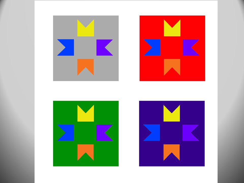
Bezold Effect Changing one color profoundly effects the perception of other colors

13
Intensity The purity of a color. If you add black, gray, white or a complement to a color it becomes less intense. When you add black or a complement to a color it is called a SHADE. When you add white to a color it is called a TINT. When you add gray it is called TONE.

14
Tint and Tone Using white to get TINTS Using gray to get TONES

15
Shades Using black for SHADE Using the complement for SHADE

16
Color Harmonies Complementary Triadic Split-Complementary Warm, Cool, Neutral Analogous Monochromatic

17
Complementary Colors Complementary colors are opposites on the color wheel. They have extremely high contrast, being that they are complete opposites, like black and white.

19
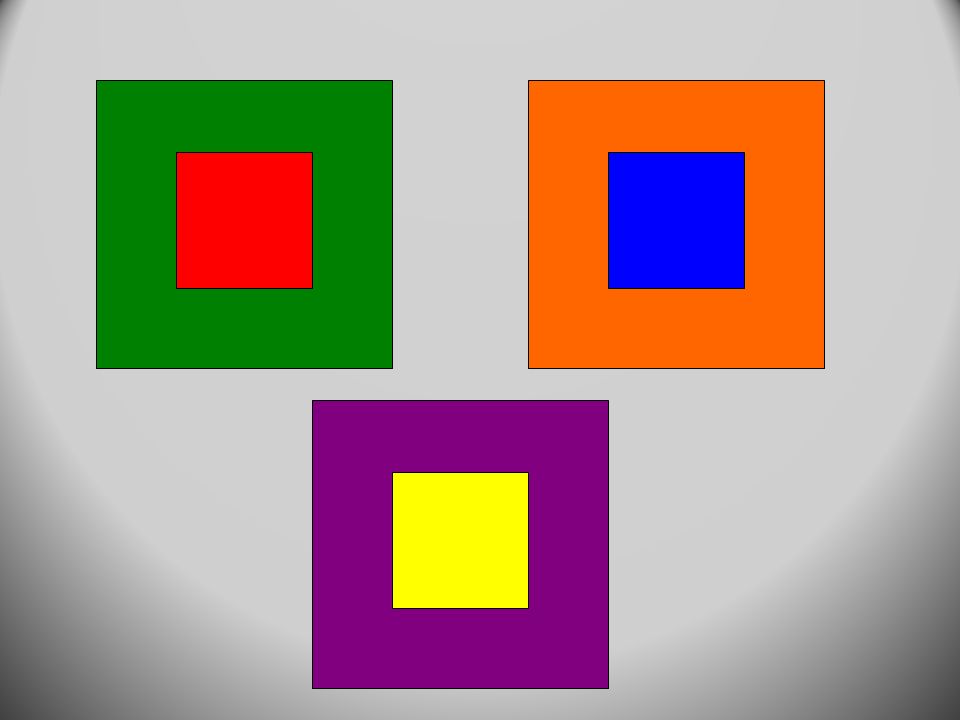
ABAB SIMULTANEOUS CONTRAST There is not as much contrast in Figure A as there is in Figure B. This is because “A” deals with ANALAGOUS colors whereas “B” deals with COMPLEMENTARY colors. The colors in “B” seem to be more INTENSE.

20
Revenge of the Goldfish, Sandy Skoglund

21
Triadic This harmony is comprised of colors that form a triangle on the color wheel. The two most prominent ones are made up of the Primaries, and one made up of the Secondaries. However, there can be Triadic color schemes using Intermediates.

23
New York City, Piet Mondrian

24
The Tiger, Franz Marc

25
Split-Complementary To find a Split-Complementary color harmony you must first choose a hue. Then, find its complement. The two hues adjacent to the complement of the initial hue as well as the initial hue make up a Split-Complementary color harmony. i.e. Red, Blue-Green, and Yellow-Green

28
Analogous Colors These are colors that are adjacent on the color wheel and have a single color in common. i.e.. Yellow-Green, Yellow, and Yellow- Orange are analogous colors.

29
House in Provence, Paul Cezanne

30
Monochromatic Harmony Monochromatic means “one color” A single hue is used in varying intensities to complete an artwork. i.e.. Light Blue, Blue, and Dark Blue

31
The Tradgedy, Pablo Picasso

32
Warm, Cool, and Neutral Warm harmonies use the colors ranging from Yellow to Red-Violet. Cool harmonies use the colors ranging from Violet to Yellow-Green. Neutral harmonies use Black, Grays, Browns, and White.

34
Number 22, Mark Rothko

35
Helpful Hints ALWAYS mix darker colors into lighter colors and not the other way around You can use your palette trash to mix other colors. For example, you can use your blue to make aqua, use the aqua to make teal, teal can be made into chartreuse, then, dull yellow or yellow ochre.

36
More Helpful Hints The colors will dry a lot lighter than they appear on your palette If a color that you have already painted looks wrong after it dries, do not paint over the wrong color. Instead, paint a new circle off to the side.

37
CARE Don’t get too much paint. Just get a little at a time. You can always get more paint, unless we waste it and run out. Don’t scrub the brush on the paper or canvas. This will ruin the bristles. Store the brushes with the bristles up. When switching colors, wash out the brush and dry on a towel.

38
CLEANING Remove excess paint from palette in trashcan. We do not want large quantities of paint going down the drains of the sinks. Rinse palette in sinks with low water pressure. Then, dry. Rinse brushes in sink until no color comes from bristles when you squeeze them.

39
MORE CLEANING Make sure that your brushes, water containers(ours are turqouise), and palettes make it back from the sink room and are replaced in their proper spot. Wash your workspace with a damp sponge and cleaning fluid until there is no paint on the table, both the table top and edges. Ensure that the sinks and the countertops in the sink room and the sink room are SPOTLESS.

Similar presentations


. INTENSITY -brightness.>")

