Download presentation
Presentation is loading. Please wait.

2
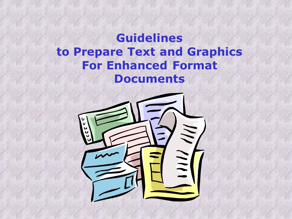
Guidelines to Prepare Text and Graphics For Enhanced Format Documents

3
by Elaine Kitchel This publication is the sole property of the American Printing House for the Blind, (APH), copying or distribution of this publication is prohibited without express, written consent of APH. © 2003

4
1. Each large print user should have access to large print that is at least 18 points in size; for testing, graphics should have their smallest graphical identity marks* at least 18 points in size. 2. Each large print user should have access to print that has x-height and t-heights of at least 1/8 inch; for testing, the smallest graphical identity markings* should be at least 1/8 inch in their primary dimension. COMMON SENSE GUIDELINES

5
3. Because they provide poor contrast, certain colors should not be used together either as graphic features, background or text: Red and green Red and black Blue and black Green and black Violet and black Dark blue and violet Two values of the same color

6
4. Shades of gray should not be used together either as graphic features, background or text Shades of gray should not be used together either as graphic features, background or text

7
5. Acceptable animation features include Fly in from left Laser from right Typewriter Wipe right Appear

8
6. Graphical identity marks would be marks used to measure, such as degrees, milliliters, fractions of inches, millimeters, etc. Other marks used to identify pictures such as the eye of a mouse, the antennae of a butterfly or the crystals of salt in a beaker would be considered smallest graphical identity markings and should be at least 1/8 in size.

9
Charts and Graphs Each hash mark, numeral, gram abbreviation and asterisk is a graphical identity mark and should be at least 1/8 inch long.

10
8. Large print users should have access to graphics that are not only enlarged, but maintain the same contrast, clarity, and access to appropriate coloration as those prepared for their sighted peers. Where coloration is added for purposes of clarity, bright, primary colors are the best choices. 7. Large print should not be used over a background design or other graphical material. In testing, graphics should not be used over other graphics or over text.

11
9. Highly graphical large print materials such as maps, graphs and charts, should adhere to type size, font and other large print guidelines. 10. When color is not possible, high-quality, black, line drawings are preferred over gray scale.

12
11. Slides should be simple with no more than 3 different blocks of information nor more than six individual lines of information per block.

13
12. Avoid putting information in columns if possible. Lines of text of 28-39 characters are preferred Bulleted lists are an exception. No more than six bulleted lines

14
13. Where bulleted lists occur side by side, text of each list should be on a different colored background to avoid confusion: zebra emu gazelle flamingo giraffe fur feathers horns legs neck

15
14. Avoid divided words at the ends of lines, because it is difficult for the person with low vision to read. I pledge allegiance to the flag of the u- nited states of America, and to the re- public for which it stands, one nation under God, indivisible with justice and lib- erty for all.

16
15. Where maps or charts are included, color is preferred over grayscale. Text on maps or charts should adhere to APH large print guidelines.

17
16. Avoid italics, if possible. Better choices are: Underscoring, enclosing in quotation marks, or bolding.

18
Whats wrong with this response grid? The student is asked to use this grid that has bubbles with numerals inside, to indicate his answers by filling-in the bubbles.

19
ANSWER Grids are difficult to navigate for the visually impaired student. The grid and numerals are too small. The gray shading makes numerals in those columns un- readable san serif font is needed

20
Gray columns have been changed to yellow. Overall size is larger. San Serif font replaces original font.

21
Whats wrong with this test item? The student is asked to identify which of these pictures shows a lunar eclipse. = 1/2 inch

22
Components are far too small to be visible. All components must be enlarged. Letters should be at least 1/8 inch high and be Verdana or APHont.The moon should be at least 1/8 inch across. The dark spot of South America on the larger circle indicates the circle is the earth. Therefore, South America should be 1/8 inch across, at least. ANSWER

23
Observe item C

24
Whats wrong with this test item? The student is asked to calculate the difference in the volume measurement after the ring is added to the beaker.

25
Hash marks on right side of beaker are not clean, give shaded appearance. Numbers and hash marks should be cleaner and darker. Ring in liquid should be very white, liquid should be colorless or lighter shade. ANSWER

26
Enlarged Cleaned up removed gray made lines heavier

27
The student is asked to determine the number of degrees from the horizon the position of the star is. Whats wrong with this test item?

28
Good Clean Line Drawing BUT compass numerals, markings, even star is too small. All must be at least 1/8 inch in height ANSWER

29
ENLARGE and DARKEN

30
The student is asked to determine the number of icebergs between specified coordinates on the map. What is wrong with this test item?

31
Land mass or water should be colored or darkened to differentiate from one another. Letters, symbols and numbers should be larger (1/8 in.) ANSWER
 ANSWER.")
32
Painted water light blue (still good contrast) Made lines heavier Made icebergs larger
 Made lines heavier Made icebergs larger")
33
Whats wrong with this test item? The student is asked to identify which of these three animals is the predator, and which is its prey. = 4 ft.

34
ANSWER Graphical identity marks on rabbit and fox are not large enough. What makes a rabbit identifiable. Ears? Tail? Feet? The smallest of these should be at least 1/8 inch in any direction. Students may not be able to identify each animal due to small size of identifiable features.

35
If labels are not applied, these animals must be enlarged so that critical graphical identity marks, such as ears, nose and eye meet the minimum size. The cow should also be enlarged in order for the animals to stay in the right proportions to one another.

36
The student is asked to determine which mailbox has a number which is less than 761 on it. What is wrong with this test item?

37
The numbers are not distinct enough to read accurately. But students are reading numbers diagonally here. Mailboxes should be straight and perpen- dicular to the viewers line of sight. ANSWER

38
The mailbox numbers were cleaned up without enlarging the size of the mailboxes. Diagonals are still a problem.

39
What is wrong with this test item? The student is asked to determine which of these would be used to find the mass of three liters of syrup.

40
ANSWER For the student with low vision, it is almost impossible to determine the differences among items b, c, d. The background is distract- ing and almost demands more attention than the test items.

41
Does the student need to see the numerals on the items to answer the question? Even enlarged, isnt item D very indistinct? Can you say for sure what it is?

42
The student is asked to determine which graph best shows how many objects are in each group. What is wrong with this test item?

43
Some numbers are unreadable. The question might be answered very differently for the student with low vision than a student with typical vision. Two of the three pictures are not identifiable. ANSWER

44
Even enlarged 30% the graphs numerals and graphic items are still indistinct. This item needs to be redrawn. Pictures need labeling.

45
The student is asked to identify labeled strata by applying information from a key. Whats wrong with this test item?

46
NOT MUCH! This is an example of an acceptable Graphic: clear lines high contrast labels good differential between strata Division lines could be bolder ANSWER

47
Whats all the fuss about Color?

48
Color can make test items much more distinct and can add layers of meaning.

49
Here is the original bar graph as it appeared on a sample test document. Whats wrong with this bar graph?

50
Nice Try: red and green should not be next to one another. They appear the same to many persons with low vision. COLOR ALTERED

51
ORIGINAL colors do not have enough contrast. Grey, lilac, and the mint green may all look alike. COLOR ALTERED

52
ORIGINAL All these colors except yellow may look exactly alike to the person with low vision. COLOR ALTERED

53
If you were trying to look through the shower curtain to decipher this pie chart, which would you rather use? Thats how it is for many students with low vision.

54
What are the best colors to use in testing if color is an option? Almost everyone with some color vision can see yellow and blue.

55
If your background color is white, your text or graphic color should be: (in order of effectiveness) black dark blue violet dark green red
 black dark blue violet dark green red")
56
If your background color is black, your text or graphic color should be: (in order of effectiveness) white yellow pink baby blue light green
 white yellow pink baby blue light green")
57
For computerized testing avoid blue screens which make the eyes do two trillion times as much work as black, yellow, or pink. Blue screens can cause glare problems, headache and photophobia in persons with low vision.

59
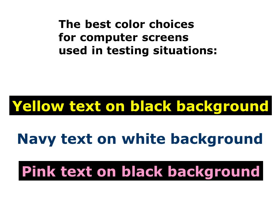
The best color choices for computer screens used in testing situations: Yellow text on black background Navy text on white background Pink text on black background

60
Make buttons and bars large and discernible, following the same guidelines as for computer screens. BAD: Click here to enter your answer. GOOD: Click here to enter your answer. BAD: Last Name GOOD: Last Name BAD: Grade Level GOOD: Grade Level

61
COLOR can say it all.

62
Sample test items for this presentation have been borrowed from various 2003 sample tests provided by individual states. Names given upon written request.

63
Brought to you by ELAINE KITCHEL Research Scientist and The American Printing House for the Blind 1839 Frankfort Avenue Louisville, KY 40206 www.aph.org/ 1-800-223-1839

Similar presentations