Download presentation
Presentation is loading. Please wait.

1
Who is the best cricketer?

2
BATTING AVERAGE IN CRICKET In cricket, a player's batting average is the total number of runs he has scored divided by the number of times he has been out.

3
STATISTICS Statistics, branch of mathematics that deals with the collection, organization, and analysis of numerical data.

4
STATISTICS Employing statistics serves two purposes, (1) description and (2) prediction. Statistics are used to describe the characteristics of groups. These characteristics are referred to as variables. Data is gathered and recorded for each variable.

5
STATISTICS It also provides tools for prediction and forecasting based on data. Prediction is based on the concept of generalizability

6
HISTORY Simple forms of statistics have been used since the beginning of civilization.

7
HISTORY The pictorial representations or other symbols were used to record numbers of people, animals, and inanimate objects on skins, slabs, sticks of wood, or the walls of caves.

8
HISTORY Before 3000 BC the Babylonians used small clay tablets to record tabulations of agricultural yields and of commodities bartered or sold.

9
HISTORY The Egyptians analysed the population and material wealth of their country before beginning to build the pyramids in the 31st century BC.

10
HISTORY The Roman Empire was the first government to gather extensive data about the population, area, and wealth of the territories that it controlled.

11
HISTORY Registration of deaths and births was begun in England in the early 16th century, and in 1662 the first noteworthy statistical study of population.

12
HISTORY At present, statistics is a reliable means of describing accurately the values of economic, political, social, psychological, biological, and physical data and serves as a tool to correlate and analyse such data.

13
HISTORY The work of the statistician is no longer confined to gathering and tabulating data, but is chiefly a process of interpreting the information.

14
STATISTICAL METHODS STEPS COLLECTION OF DATA TABULATION AND PRESENTATION OF DATA INTERPRETATION OF DATA.

15
COLLECTION OF DATA: Primary Data – When Data are collected directly it is called Primary Data. Secondary Data. If they are collected through others than it is called Secondary Data.

16
TABULATION AND PRESENTATION OF DATA The collected data are called RAW DATA

17
TABULATION AND PRESENTATION OF DATA 1.They must be arranged either ascending order or descending order. 2. They are grouped. 3. They are tabulated. 4. Construction of frequency distribution table.(Grouped / Ungrouped )
.")
18
INTERPRETATION OF DATA. (a) From graph (b) Measures Of Central Tendency (c) Measures Of Variability (d) Measures Of Variability (e) Co-relation (f) Mathematical Models
 From graph (b) Measures Of Central Tendency (c) Measures Of Variability (d) Measures Of Variability (e) Co-relation (f) Mathematical Models.")
19
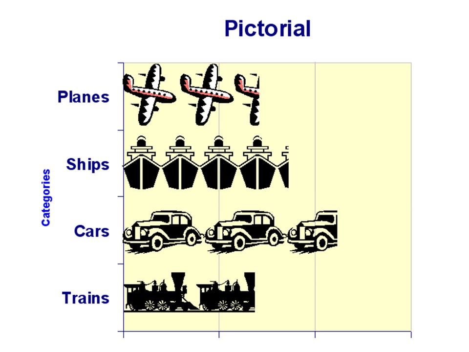
GRAPHICAL REPRESENTATION OF DATA (i) Pictorial graph (ii) Bar Graph (iii) Histogram (iv) Frequency polygon
 Pictorial graph (ii) Bar Graph (iii) Histogram (iv) Frequency polygon")
20
GRAPHS Graphs are used to display number information, or data, in a visual way that is easy to understand and interpret. They are usually drawn with two lines, called axes, which meet at a right angle like this. The line going across the page is the horizontal axis, and the line going up the page is the vertical axis. The axes are labeled to show the type of data and the value of the data being shown.

22
A BAR-LINE GRAPH

23
LINE GRAPHS Line graphs can be used to show a relationship between the data on one axis and the data on the other.

24
BLOCK GRAPHS These have a block or square to show one unit value of data.

25
PIE CHARTS These have a circle divided into parts, or sectors, of different sizes to show different amounts of data. They are called pie charts because they look like pies cut into slices.

26
BAR GRAPH

27
HISTOGRAM

28
FREQUENCY POLYGON

29
Imagine in a class test you scored 3/5. How do you react? Are you happy with your score of 3 or disappointed? How do you decide? You might calculate your percentage correct, realize it is 60%, and be appalled. But it is more likely that when deciding how to react to your performance, you will want additional information. What additional information would you like? You will immediately ask your friend, "What is your score? “What is the highest score? “What is my rank?” "How did the class do?“ In other words, the additional information you want is how your test score compares to other students' scores. You therefore understand the importance of comparing your score to the class distribution of scores. If it is the highest score then you you'll be pleased after all. On the other hand, if 3 is among the lowest scores in the class, you won't be quite so happy. ANALYSING WITH MEASURE OF CENTRAL TENDENCY

30
For comparison, prediction and making decision we need mean median mode

31
Assignment for students Search the internet, text books and in the library and find How we are Living with MeanMedianMode

Similar presentations


. Statistics graph Data recorded in surveys are displayed by a statistical graph. There are some specific.>")
. Day….. 1.Misleading GraphsMisleading Graphs 2.Frequency Tables and Tally ChartsFrequency Tables and Tally Charts.>")


 & Bivariate Statistics>")
>")


