Download presentation
Presentation is loading. Please wait.

1
HTML5 & CSS3

2
Agenda History, Vision & Feature of HTML5 Getting Started With HTML5 Structure of a Web Page Audio and Video HTML5 Canvas

3
1. History & Vision of HTML5 History of HTML5? December 1997: HTML 4.0 is published by the W3C February - March 1998: XML 1.0 is published December 1999 - January 2000: ECMAScript 3rd Edition, XHTML 1.0 (Basically HTML tags reformulated in XML) and, HTML 4.01 recommendations are published May 2001: XHTML 1.1 recommendation is published August 2002: XHTML 2.0 first working draft is released. December 2002: XHTML 2.0 second working draft published. January 2008: First W3C working draft of HTML5 is published!!
 and, HTML 4.01 recommendations are published May 2001: XHTML 1.1 recommendation is published August 2002: XHTML 2.0 first working draft is released. December 2002: XHTML 2.0 second working draft published. January 2008: First W3C working draft of HTML5 is published!!.")
4
1. History & Vision of HTML5 HTML is the predominant markup language used to describe content, or data, on the World Wide Web. HTML5 is the latest iteration of that markup language, and includes new features, improvements to existing features, and scripting-based APIs. HTML5 is a cooperation between the World Wide Web Consortium (W3C) and the Web Hypertext Application Technology Working Group (WHATWG). WHATWG was working with web forms and applications, and W3C was working with XHTML 2.0. In 2006, they decided to cooperate and create a new version of HTML. HTML5 includes all valid elements from both HTML4 and XHTML 1.0. Furthermore HTML5 includes redefinitions of existing markup elements, and new elements that allow web designers to be more expressive in the semantics of their markup. Why litter your page with divs when you can have articles, sections, headers, footers, and more?
 and the Web Hypertext Application Technology Working Group (WHATWG). WHATWG was working with web forms and applications, and W3C was working with XHTML 2.0. In 2006, they decided to cooperate and create a new version of HTML. HTML5 includes all valid elements from both HTML4 and XHTML 1.0. Furthermore HTML5 includes redefinitions of existing markup elements, and new elements that allow web designers to be more expressive in the semantics of their markup. Why litter your page with divs when you can have articles, sections, headers, footers, and more .")
6
1. History & Vision of HTML5 The term “HTML5” has additionally been used to refer to a number of other new technologies and APIs. –Some of these include drawing with the element, –offline storage, –the new and elements, –drag-and-drop functionality, –Microdata, embedded fonts, and others.

7
1. History & Vision of HTML5 Some Features inHTML5? Below is a non exhaustive list of features that tend to be labelled as "HTML5" in the medias: –New structural elements (,, and more) –Forms 2.0 and client-side validation –Native browser support for audio and video (, ) –Canvas API and SVG –Web storage –Offline applications –Geolocation –Drag & Drop –Web Workers –New communications API (Server Sent Events, Web Sockets, …)
 –Forms 2.0 and client-side validation –Native browser support for audio and video (, ) –Canvas API and SVG –Web storage –Offline applications –Geolocation –Drag & Drop –Web Workers –New communications API (Server Sent Events, Web Sockets, …).")
8
The Varied Browser Market Although HTML5 is still in development, and does present significant changes in the way content is marked up, it’s worth noting that those changes won’t cause older browsers to choke, or result in layout problems or page errors this means that you could take any of your current projects containing valid HTML4 or XHTML markup, change the doctype to HTML5 (which we’ll cover later), and the page will still validate and appear the same as it did before. The changes and additions in HTML5 have been implemented into the language in such a way so as to ensure backwards compatibility with older browsers—even IE6!

9
2. Getting started with HTML5 Wondering what it takes to get it started? Any Text editor such as Notepad++, Editplus, Textmate, Dream weaver Modern browsers such as Firefox 3.5 +, IE9, chrome, safari Prior knowledge of HTML 4

10
What is CSS3? Another separate—but no less important—part of creating web pages is Cascading Style Sheets (CSS). As you probably know, CSS is a style language that describes how HTML markup is presented or styled. CSS3 is the latest version of the CSS specification. CSS3 contains just about everything that’s included in CSS2.1 (the previous version of the spec). It also adds new features to help developers solve a number of problems without the need for non-semantic markup, complex scripting, or extra images New features in CSS3 include support for additional selectors, drop shadows, rounded corners, multiple backgrounds, animation, transparency, and much more. Note: CSS3 is separate from HTML5 and its related APIs
. As you probably know, CSS is a style language that describes how HTML markup is presented or styled. CSS3 is the latest version of the CSS specification. CSS3 contains just about everything that’s included in CSS2.1 (the previous version of the spec). It also adds new features to help developers solve a number of problems without the need for non-semantic markup, complex scripting, or extra images New features in CSS3 include support for additional selectors, drop shadows, rounded corners, multiple backgrounds, animation, transparency, and much more. Note: CSS3 is separate from HTML5 and its related APIs.")
11
HTML5: DOCTYPE The DOCTYPE which comes before the beginning tag is much simpler in HTML 5. Here are some examples of what it looks like now... http://www.w3.org/TR/html4/loose.dtd http://www.w3.org/TR/xhtml11/DTD/xhtml11.dtd Previous versions of HTML defined a lot of doctypes, and choosing the right one could be tricky. In HTML5, there is only one doctype:

12
3. Structure of Web page 3.2. First HTML5 webpage Title of the document That’s all I need to create my first HTML5 page

13
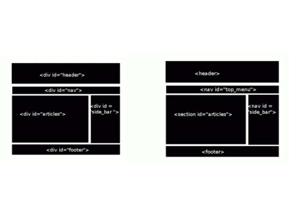
3. Structure of Web page 3.1. New and Updated HTML5 Elements HTML5 introduces 28 new elements:,,,,,,,,,,,,,,,,,,,,,,,,,, and An HTML page first starts with the DOCTYPE declaration HTML5 also update some of the previous existing elements to better reflect how they are used on the Web or to make them more useful such as: The element can now also contain flow content instead of just phrasing content The element is now representing a paragraph-level thematic break The element only represent the title of a work The element is now representing importance rather than strong emphasis

14
New Semantic Elements

15
New Media Elements The new Element

17
3. Structure of Web page 3.3. New Semantic Elements : Represents a major navigation block. It groups links to other pages or to parts of the current page. does not have to be used in every place you can find links. For instance, footers often contains links to terms of service, copyright page and such, the element would be sufficient in that case

18
3. Structure of Web page 3.3. New Semantic Elements : tag specifies a header for a document or section. However, we mustn't think that "header" is only for masthead of a website. "header" can be use as a heading of an blog entry or news article as every article has its title and published date and time

19
3. Structure of Web page 3.3. New Semantic Elements : The web today contains a ocean of news articles and blog entries. That gives W3C a good reason to define an element for article instead of. We should use article for content that we think it can be distributable. Just like news or blog entry can we can share in RSS feed "article" element can be nested in another "article" element. An article element doesn't just mean article content. You can have header andfooter element in an article. In fact, it is very common to have header as each article should have a title.headerfooterheader

20
3. Structure of Web page 3.3. New Semantic Elements : The "aside" element is a section that somehow related to main content, but it can be separate from that content

21
3. Structure of Web page 3.3. New Semantic Elements : Similarly to "header" element, "footer" element is often referred to the footer of a web page. Well, most of the time, footer can be used as what we thought. Please don't think you can only have one footer per web document, you can have a footer in every section, or every article.

22
3. Structure of Web page 3.3. New Semantic Elements : The new "progress" element appears to be very similar to the "meter" element. It is created to indicate progress of a specific task.meter The progress can be either determinate OR interderminate. Which means, you can use "progress" element to indicate a progress that you do not even know how much more work is to be done yet. Progress of Task A : 60%

23
3. Structure of Web page 3.3. New Semantic Elements : "Meter" is a new element in HTML5 which represenet value of a known range as a gauge. The keyword here is "known range". That means, you are only allowed to use it when you are clearly aware of its minimum value and maximum value. One example is score of rating. I would rate this movie 8 of 10.

24
3. Structure of Web page 3.3. New Semantic Elements : The mark element represents a run of text in one document marked or highlighted for reference purposes, due to its relevance in another context. Basically, it is used to bring the reader's attention to a part of the text that might not have been

25
3. Structure of Web page 3.3. New Semantic Elements : The tag specifies self-contained content, like illustrations, diagrams, photos, code listings, etc. While the content of the element is related to the main flow, its position is independent of the main flow, and if removed it should not affect the flow of the document

26
3. Structure of Web page 3.3. Lets put altogether

27
3. Structure of Web page 3.3. Designing blog with html5

28
HTML 5 audio & video

29
One of HTML5’s goals is to eliminate the need for browser plug-ins to provide media content and rich, interactive experiences. The thought is that open standards should provide all you need so you aren’t bound to proprietary technologies such as Adobe Flash and Microsoft Silverlight. To that end, media makes a huge leap in HTML5 with both native audio and video support. The latter is one of HTML5’s hot-ticket items. It’s also hotly debated among the browser vendors, as you’ll learn in this chapter. Regardless, the likes of YouTube and Vimeo have already jumped on board, and its momentum promises to keep growing with the release of the Apple iPad and other devices that are sans plug-ins.

30
HTML 5 audio & video 1 - Audio Embedded audio stream Syntax Attributes HTML5 Only: Global, autoplay, controls, loop, preload, src Description Use the audio element to embed an audio stream.

31
HTML 5 audio & video Until now, there has not been a standard for playing audio files on a web page. Today, most audio files are played through a plug-in (like flash). However, different browsers may have different plug-ins. HTML5 defines a new element which specifies a standard way to embed an audio file on a web page: the element.
. However, different browsers may have different plug-ins. HTML5 defines a new element which specifies a standard way to embed an audio file on a web page: the element..")
32
HTML 5 audio & video

33
HTML 5 audio & video The text inside the audio element is fallback content that displays only if the browser doesn’t support audio. You can include a message like in Example 1, or you can include code that embeds another type of audio player, such as Flash. Audio Example

34
Audio : Add Fallback to flash To be safe, we need to add the fallback to a Flash audio player, in case the browser doesn't support any of the formats we specified. For instance, Firefox 3.5 only supports the audio tag with Ogg format, but we might only have the mp3 file available

36
HTML 5 audio & video 2 - Video An embedded video Syntax Attributes HTML5 Only: autoplay, controls, height, loop, poster, preload, src, width Description Native video playback is one of HTML5’s highest-profile additions, and it’s implemented with the video element

37
HTML 5 audio & video Until now, there has not been a standard for showing a video/movie on a web page. Today, most videos are shown through a plug-in (like flash). However, different browsers may have different plug-ins. HTML5 defines a new element which specifies a standard way to embed a video/movie on a web page: the element.
. However, different browsers may have different plug-ins. HTML5 defines a new element which specifies a standard way to embed a video/movie on a web page: the element..")
38
HTML 5 audio & video

39
HTML 5 audio & video The HTML inside video is optional though highly encouraged. It displays only if the browser doesn’t support the video element. Typically, you’ll want to include an embed method for another video player format, such as Flash, or perhaps a simple message with a link directly to the video file for offline viewing Video Example

40
Multiple Media Sources with the source Element Example 2 shows how to use the source element to specify multiple media sources.

41
HTML 5 audio & video Attributes in Detail autoplay: If present, this Boolean attribute instructs the user agent to start playing the media when the page loads, rather than waiting for the user to initiate playback. Here’s an example of using it: (or simply, autoplay). controls: If present, this Boolean attribute instructs the user agent to display controls so the user can control playback. These default controls include play, pause, volume, seek, and in some instances more (browsers are supposed to provide more, but not all do). The look and feel of the default controls varies between supported browsers If you create your own controls with JavaScript, the default controls show if scripting is disabled.
. controls: If present, this Boolean attribute instructs the user agent to display controls so the user can control playback. These default controls include play, pause, volume, seek, and in some instances more (browsers are supposed to provide more, but not all do). The look and feel of the default controls varies between supported browsers If you create your own controls with JavaScript, the default controls show if scripting is disabled..")
42
HTML 5 audio & video Attributes in Detail loop: If present, this Boolean attribute instructs the user agent to play the media again when it reaches the end. poster=”url”: If present, this is the path to an image that is intended to be representative of the video, such as one of the initial frames. src=”url”: This is the path to the video.

43
HTML 5 audio & video

44
Attributes in Detail width=” number of pixels or percentage value” and height =”number of pixels or percentage value”: These define the width and height of the video. If they don’t equal the dimensions of the video’s intrinsic size, the video will shrink or stretch accordingly and may be letterboxed or pillarboxed. Note that the video will maintain its native aspect ratio regardless of whether width and height reflect that aspect ratio. If the width and height are undefined, the player typically renders at the intrinsic size of the video. You may define these with CSS instead, such as with video { width: 320px; height: 240px; }.

45
CSS3

46
Introduction to css3 Very briefly, CSS stands for ‘Cascading Style Sheets’ and is a mark- up language for altering and giving style to a website or elements within a website. The 3 represents the next generation/version of style sheet language. It is very important to learn that while it is fun to learn and play with CSS3, it is still not yet fully supported in current browsers. This means that if you are to incorporate CSS3 in a live website, it would be a good idea to make sure there is fallback code for the browsers that are struggling to support it

47
Browsers support

48
Some of Css3 features Many exciting new functions and features are being thought up for CSS3. The development of CSS3 is going to be split up into ‘modules’. The old specification was simply too large and complex to be updated as one, so it has been broken down into smaller pieces – with new ones also added. Some of these modules include:

49
Browser prefixes in rules The following prefixes used in the rules for the more popular browsers are listed below and will help ensure cross-browser support: –Web-kit is used for Chrome and Safari; syntax is -webkit- –Moz is used for Firefox and Mozilla; syntax is -moz- –Khtml is used for the KDE project and Konqueror; syntax is - khtml- –O is used for Opera; syntax is -o- –MS for IE; syntax is -ms-

50
In most cases the actual property of the rule needs to be the very last entry in the CSS style; as such, the webkit, moz, Khtml, MS, and O rules should be listed before the last property of the element of the same rule. For example purposes only, sample prefix rules are shown below in the blockquote border-radius styles:

52
1 - Borders Firstly, we’ll be taking a look at borders. Everyone who uses CSS is familiar with the border property – it’s a great way to structure content, create effects around images and improve page layout. CSS3 takes borders to a new level with the ability to use gradients, rounded corners, shadows and border images. We are going to look at each of these in a bit more detail, using examples where possible.

53
1.1 Rounded Borders Achieving rounded borders using current CSS coding can be tricky – there are numerous methods available, but none are extremely straight forward. Creating individual images for each border is often needed in addition. Using CSS3, creating a rounded border is incredibly easy. It can be applied to each corner or individual corners, and the width/colour are easily altered. The CSS code is:

54
1.2 Gradients BORDER Gradient borders can look effective if used correctly. This code is a little more complex, requiring you to define each colour of the gradient. The CSS code is:

55
1.3 Box Shadows Adding a shadow to an element is difficult at present – it is a good way to differentiate a certain area, but as with any effect, it should be used sparingly. The CSS code is:

56
1.4 Border Images Border images are one of the most useful additions –. CSS has the ability to repeat, or stretch a border image as you choose. The CSS code is similar to the following (it varies between browsers at present):
:.")
57
2- Text Effects NOW will be delving into the new text effects. Typography is, without any doubt, one of the most important aspects to get right when designing a layout. Type can draw the reader through a page, give a certain impression, provide impact, be subtle, or aid in separating content.

58
2.1 Text Shadow Text shadows sound a little tacky, but it all depends how they are executed. Shadows could definitely be put to good use in headings and titles –

59
2.2 Word Wrapping At present, if a word is too long to fit within one line of an area, it expands outside. This isn’t a very common occurrence, but does crop up from time to time. The new word wrapping ability allows you to force the text to wrap – even if it means splitting it mid-word. The code is incredibly straight forward

60
Web Fonts Whilst these are not classed as a ‘text effect’, we are going to cover them here briefly. A Web Font is simply a way to use any font in your page, being downloaded automatically by the browser. This will be a revolutionary change to web design, which previously has been limited to 10-15 widely supported fonts. However, this new feature brings bring copyright into debate as only properly licensed fonts should be used. Currently, the latest version of Safari (3.1) is the only browser supporting Web Fonts. Opera is suggested to be another which will soon be enabling support, and the others will no doubt follow at some point in the future
 is the only browser supporting Web Fonts. Opera is suggested to be another which will soon be enabling support, and the others will no doubt follow at some point in the future.")
61
Web Fonts A few examples of pages have been mocked up using this technique. The following are examples in the vein of CSS Zen Garden, created by A List Apart. The linked versions will only work on certain browsers:A List Apart

62
3- User Interface CSS3 brings some great new properties relating to resizing elements, cursors, outlining, box layout and more., however, can only be appreciated in the latest builds of various browsers:

63
3.1 Resizing The latest version of Safari has a feature which allows resizable text areas. This is a great addition and one can use it daily. CSS3 allows you to easily apply this to any element, eventually to become cross-browser compatible. The code is the resize:both; line:.ui_resizable { padding: 20px; border: 1px solid; resize: both; overflow: auto; }

64
3.2 Box Sizing The ‘box model’ CSS3 module is one of the more extensive areas. The box sizing aspect allows you to define certain elements to fit an area in a certain way. For example, if you’d like two bordered boxes side by side, it can be achieved through setting box-sizing to ‘border-box’. This forces the browser to render the box with the specified width and height, and place the border and padding inside the box. At present, additional prefixes are required to support this in all browsers – you can see the full list on the example page’s code. Here’s a basic possibility:

65
3.2 Box Sizing.area { width: 300px;border: 10px solid #ddccb5; height: 60px;}.boxes { box-sizing: border-box; width:50%; height: 60px; text-align: center;border: 5px solid #897048; padding: 2px; float:left;}

66
4- Multiple columns At present, this feature is available in Firefox and Safari 3. When the module becomes finalised in the CSS3 specification it will be adopted by other browsers and rolled into their updates. There are four properties which relate to the multiple column layout in CSS3, allowing you to set the number of columns, width, gap between each column and a border between each: –column-count –column-width –column-gap –column-rule

67
4- Multiple columns At present, a browser specific selector is also needed to identify whether Safari or Firefox should display the selector. The code to be used to create a two column layout with a 1px rule between columns would be:

68
Spanning columns It could also be the case that you would like an element to span more than one column – a heading, table or image for instance. This is facilitated in the specification through the use of: Numbers can also be used to allow the element to span a certain number of columns. At present this feature isn’t implemented in any major browsers, but should provide much needed additional flexibility when designing around this feature. It would allow you to achieve effects such as:

69
Spanning columns

70
5- Backgrounds Each box has a background layer that may be fully transparent (the default), or filled with a color and/or one or more images. The background properties specify what color (‘background-color’) and images (‘background-image’) to use, and how they are sized, positioned, tiled, etc.background-colorbackground-image The new features allow greater control of the background element and will provide designers with a whole array of new possibilities
 and images (‘background-image’) to use, and how they are sized, positioned, tiled, etc.background-colorbackground-image The new features allow greater control of the background element and will provide designers with a whole array of new possibilities.")
71
5.1. Layering Multiple Background Images The new ability to use multiple backgrounds is a great time saver, allowing you to achieve effects which previously required more than one div. Whether it will be possible to combine this with background- size will be interesting to see. CSS3 allows web designers to specify multiple background images for box elements, using nothing more than a simple comma- separated list.

72
has exactly the same effect as this set with the extra position dropped and the missing values for ‘background-origin’ and ‘background-repeat’ filled in (emphasized for clarity):background-originbackground-repeat The first image in the list is the layer closest to the user, the next one is painted behind the first, and so on. The background color, if present, is painted below all of the other layers.

73
Multiple Backgrounds Note 1 :If excess values are specified for any of the individual properties they are ignored. For example; if four values are supplied for the background- position property, but only three values are supplied for the background- image property, the fourth value in the list would not be used. Note 2 :if not enough values are supplied for any of the individual properties, the list of values for that particular property are repeated, from the first value, as many times as required. For example; if only two values are supplied for the background-position property, but three values are supplied for the background-image property, the list of values for background-position would be repeated, thus the third background image specified would have the same background-position value as the first. Note 3 :If a background color is specified, using the background-color property, this is applied as the final background layer, behind any background images.

74
5.2. Base Color: the‘ background- color ’ property This property sets the background color of an element. The color is drawn behind any background images.

75
5.3. Image Sources: the ‘background-image’ property This property sets the background image(s) of an element. Images are drawn with the first specified one on top (closest to the user) and each subsequent image behind the previous one. Where = | none A value of ‘none’ counts as an image layer but draws nothing. An image that is empty (zero width or zero height), that fails to download, or that cannot be displayed (e.g., because it is not in a supported image format) likewise counts as a layer but draws nothing.
 of an element. Images are drawn with the first specified one on top (closest to the user) and each subsequent image behind the previous one. Where = | none A value of ‘none’ counts as an image layer but draws nothing. An image that is empty (zero width or zero height), that fails to download, or that cannot be displayed (e.g., because it is not in a supported image format) likewise counts as a layer but draws nothing..")
76
5.4. Tiling Images: the ‘background- repeat’ property Specifies how background images are tiled after they have been sized and positioned. Where = repeat-x | repeat-y | [repeat | space | round | no-repeat] If a value has two keywords, the first one is for the horizontal direction, the second for the vertical one

77
5.4. Tiling Images: the ‘background- repeat’ property ‘repeat’ The image is repeated in this direction as often as needed to cover the background painting area ‘space’: The image is repeated as often as will fit within the background positioning area without being clipped and then the images are spaced out to fill the area. The first and last images touch the edges of the area. If the background painting area is larger than the background positioning area, then the pattern repeats to fill the background painting area. The value of ‘background-position’ for this direction is ignored, unless there is not enough space for two copies of the image in this direction, in which case only one image is placed and ‘background-position’ determines its position in this direction.background painting areabackground-position

78
5.4. Tiling Images: the ‘background- repeat’ property ‘‘round’’ The image is repeated as often as will fit within the background positioning area. If it doesn't fit a whole number of times, it is rescaled so that it does. See the formula under ‘background-size’. If the background painting area is larger than the background positioning area, then the pattern repeats to fill the background painting area.background-size background painting area ‘‘no-repeat’’: The image is placed once and not repeated in this direction.

79
5.4. Tiling Images: the ‘background- repeat’ property The effect of ‘repeat-y’:repeat-y One copy of the background image is centered, and other copies are put above and below it to make a vertical band behind the element.

80
5.4. Tiling Images: the ‘background- repeat’ property The effect of ‘space’: the image of a dot is tiled to cover the whole background and the images are equally spaced

81
5.5. Positioning Images: the ‘background-position’ property If background images have been specified, this property specifies their initial position (after any resizing) within their corresponding background positioning area. If only one value is specified, the second value is assumed to be ‘center’. If two values are given, a length or percentage as the first value represents the horizontal position (or offset) and a length or percentage as the second value represents the vertical position (or offset). and values here represent an offset of the top left corner of the background image from the top left corner of the background positioning area.
 within their corresponding background positioning area. If only one value is specified, the second value is assumed to be ‘center’. If two values are given, a length or percentage as the first value represents the horizontal position (or offset) and a length or percentage as the second value represents the vertical position (or offset). and values here represent an offset of the top left corner of the background image from the top left corner of the background positioning area..")
82
5.5. Positioning Images: the ‘background-position’ property If background images have been specified, this property specifies their initial position (after any resizing) within their corresponding background positioning area. If only one value is specified, the second value is assumed to be ‘center’. If two values are given, a length or percentage as the first value represents the horizontal position (or offset) and a length or percentage as the second value represents the vertical position (or offset). and values here represent an offset of the top left corner of the background image from the top left corner of the background positioning area.
 within their corresponding background positioning area. If only one value is specified, the second value is assumed to be ‘center’. If two values are given, a length or percentage as the first value represents the horizontal position (or offset) and a length or percentage as the second value represents the vertical position (or offset). and values here represent an offset of the top left corner of the background image from the top left corner of the background positioning area..")
83
5.5. Positioning Images: the ‘background-position’ property If three or four values are given, then each or represents an offset and must be preceded by a keyword, which specifies from which edge the offset is given. For example, ‘background-position: bottom 10px right 20px’ represents a ‘10px’ vertical offset up from the bottom edge and a ‘20px’ horizontal offset leftward from the right edge. If three values are given, the missing offset is assumed to be zero. http://www.w3schools.com/cssref/pr_background-position.asp

84
5.5. Positioning Images: the ‘background-position’ property For example, with a value pair of ‘0% 0%’, the upper left corner of the image is aligned with the upper left corner of, usually, the box's padding edge. A value pair of ‘100% 100%’ places the lower right corner of the image in the lower right corner of the area. With a value pair of ‘75% 50%’, the point 75% across and 50% down the image is to be placed at the point 75% across and 50% down the area. A length value gives a fixed length as the offset. For example, with a value pair of ‘2cm 1cm’, the upper left corner of the image is placed 2cm to the right and 1cm below the upper left corner of the background positioning area.

85
5.5. Positioning Images: the ‘background-position’ property ‘top’ Computes to ‘0%’ for the vertical position if one or two values are given, otherwise specifies the top edge as the origin for the next offset. ‘right’ Computes to ‘100%’ for the horizontal position if one or two values are given, otherwise specifies the right edge as the origin for the next offset. ‘ bottom’ Computes to ‘100%’ for the vertical position if one or two values are given, otherwise specifies the bottom edge as the origin for the next offset. ‘left’ Computes to ‘0%’ for the horizontal position if one or two values are given, otherwise specifies the left edge as the origin for the next offset. ‘center’ Computes to ‘50%’ (‘left 50%’) for the horizontal position if the horizontal position is not otherwise specified, or ‘50%’ (‘top 50%’) for the vertical position if it is.
 for the horizontal position if the horizontal position is not otherwise specified, or ‘50%’ (‘top 50%’) for the vertical position if it is..")
86
5.5. Positioning Images: the ‘background-position’ property The following ‘background’ shorthand declarations use keywords to set ‘background-position’ to the stated percentage values.backgroundbackground-position

87
5.6. Painting Area: the ‘background-clip’ property Determines the background painting area, which determines the area within which the background is painted. The syntax of the property is given with = border-box | padding-box | content-box Values have the following meanings: ‘border-box’ The background is painted within (clipped to) the border box.‘ padding-box’ The background is painted within (clipped to) the padding box. ‘content-box’ The background is painted within (clipped to) the content box. http://www.w3schools.com/cssref/playit.asp?filename=playcss_background-clip
 the border box.‘ padding-box’ The background is painted within (clipped to) the padding box. ‘content-box’ The background is painted within (clipped to) the content box. filename=playcss_background-clip.")
88
5.7. Sizing Images: the ‘background-size’ property Specifies the size of the background images. Where = [ | | auto ] | cover | contain ‘ contain’ Scale the image, while preserving its intrinsic aspect ratio (if any), to the largest size such that both its width and its height can fit inside the background positioning area. ‘cover’ Scale the image, while preserving its intrinsic aspect ratio (if any), to the smallest size such that both its width and its height can completely cover the background positioning area.
, to the largest size such that both its width and its height can fit inside the background positioning area. ‘cover’ Scale the image, while preserving its intrinsic aspect ratio (if any), to the smallest size such that both its width and its height can completely cover the background positioning area..")
89
5.7. Sizing Images: the ‘background-size’ property The first value gives the width of the corresponding image, the second value its height. If only one value is given the second is assumed to be ‘auto’. percentage is relative to the background positioning area. If both values are ‘auto’ then the intrinsic width and/or height of the image should be used, http://www.w3schools.com/cssref/playit.asp?filename=playcss_background-size&preval=cover

90
5.7. Sizing Images: the ‘background-size’ property Specifying the Background Size using Lengths, Percentages or ‘auto’

91
5.7. Sizing Images: the ‘background-size’ property Example A In our first example, background-size has been defined as ‘auto’ for both values, therefore the background image will be shown at it’s original dimensions; 550px (w) x 250px (h).
 x 250px (h)..")
92
5.7. Sizing Images: the ‘background-size’ property Example B For our second example, background-size is specified as 200px (w) and auto (h), therefore the background image will be shown at the following dimensions; 200px (w) x 91px (h), the width as specified and the height reduced proportionately to the width, so as to maintain the image’s original proportions/ratio.
 and auto (h), therefore the background image will be shown at the following dimensions; 200px (w) x 91px (h), the width as specified and the height reduced proportionately to the width, so as to maintain the image’s original proportions/ratio..")
93
5.7. Sizing Images: the ‘background-size’ property Example C For our third example, background-size is specified as auto (w) and 125px (h), therefore the background image will be shown at the following dimensions; 275px (w) x 125px (h), the height as specified and the width reduced proportionately to the height, so as to maintain the image’s original proportions/ratio.
 and 125px (h), therefore the background image will be shown at the following dimensions; 275px (w) x 125px (h), the height as specified and the width reduced proportionately to the height, so as to maintain the image’s original proportions/ratio..")
94
5.7. Sizing Images: the ‘background-size’ property Example D For our fourth example, background-size is specified as 200px (w) and 200px (h), therefore the background image will be shown, as defined, at the following dimensions; 200px (w) x 200px (h), even though this means the image’s original proportions/ratio will be lost.
 and 200px (h), therefore the background image will be shown, as defined, at the following dimensions; 200px (w) x 200px (h), even though this means the image’s original proportions/ratio will be lost..")
95
5.7. Sizing Images: the ‘background-size’ property Example E Our next example uses percentages to define background-size, in this case specified as 50% (w) and auto (h), therefore the background image will be shown at the following dimensions; 275px (w) x 125px (h), the width of the image is equal to 50% of the containing element’s width (in this case 550px), and the height of the image is reduced proportionately to the width, so as to maintain the image’s original proportions/ratio.
 and auto (h), therefore the background image will be shown at the following dimensions; 275px (w) x 125px (h), the width of the image is equal to 50% of the containing element’s width (in this case 550px), and the height of the image is reduced proportionately to the width, so as to maintain the image’s original proportions/ratio..")
96
5.7. Sizing Images: the ‘background-size’ property Example F This example again uses percentages to define background-size, this time auto (w) and 25% (h), therefore the background image will be shown at the following dimensions; 138px (w) x 63px (h), the height of the image is equal to 25% of the containing element’s height (in this case 275px), and the width of the image is reduced proportionately to the height, so as to maintain the image’s original proportions/ratio.
 and 25% (h), therefore the background image will be shown at the following dimensions; 138px (w) x 63px (h), the height of the image is equal to 25% of the containing element’s height (in this case 275px), and the width of the image is reduced proportionately to the height, so as to maintain the image’s original proportions/ratio..")
97
5.7. Sizing Images: the ‘background-size’ property Example G For our final example we’re going to use both lengths and percentages to define background-size, in this case 80% (w) and 125px (h), therefore the background image will be shown at the following dimensions; 440px (w) x 125px (h), the width is equal to 80% of the containing element’s width (in this case 550px), and the height is 125px as defined
 and 125px (h), therefore the background image will be shown at the following dimensions; 440px (w) x 125px (h), the width is equal to 80% of the containing element’s width (in this case 550px), and the height is 125px as defined.")
98
6- CSS3 Transforms With CSS3 transform, we can move, scale, turn, spin, and stretch elements. CSS transforms allows elements styled with CSS to be transformed in two-dimensional or three-dimensional space. This specification is the convergence of the CSS 2D transforms, CSS 3D transforms and SVG transforms specifications. Additional properties make working with transforms easier, and allow the author to control how nested three-dimensional transforms interact.

99
6- CSS3 Transforms Browser Support: Internet Explorer 9 requires the prefix -ms-. Firefox requires the prefix -moz-. Chrome and Safari requires the prefix -webkit-. Opera requires the prefix -o-.

100
CSS3 2D Transforms 2D Transforms methods : translate() rotate() scale() skew() matrix()
 rotate() scale() skew() matrix()")
101
CSS3 2D Transforms The translate() Method 2D Transforms : With the translate() method, the element moves from its current position, depending on the parameters given for the left (X-axis) and the top (Y-axis) position: The value translate(50px,100px) moves the element 50 pixels from the left, and 100 pixels from the top.
 Method 2D Transforms : With the translate() method, the element moves from its current position, depending on the parameters given for the left (X-axis) and the top (Y-axis) position: The value translate(50px,100px) moves the element 50 pixels from the left, and 100 pixels from the top.")
102
CSS3 2D Transforms The rotate() Method With the rotate() method, the element rotates clockwise at a given degree. Negative values are allowed and rotates the element counter-clockwise. The value rotate(30deg) rotates the element clockwise 30 degrees.
 rotates the element clockwise 30 degrees..")
103
CSS3 2D Transforms The scale() Method With the scale() method, the element increases or decreases the size, depending on the parameters given for the width (X-axis) and the height (Y-axis): The value scale(2,4) transforms the width to be twice its original size, and the height 4 times its original size.
 Method With the scale() method, the element increases or decreases the size, depending on the parameters given for the width (X-axis) and the height (Y-axis): The value scale(2,4) transforms the width to be twice its original size, and the height 4 times its original size.")
104
CSS3 2D Transforms The skew() Method With the skew() method, the element turns in a given angle, depending on the parameters given for the horizontal (X-axis) and the vertical (Y-axis) lines: The value skew(30deg,20deg) turns the element 30 degrees around the X-axis, and 20 degrees around the Y-axis.
 Method With the skew() method, the element turns in a given angle, depending on the parameters given for the horizontal (X-axis) and the vertical (Y-axis) lines: The value skew(30deg,20deg) turns the element 30 degrees around the X-axis, and 20 degrees around the Y-axis.")
105
CSS3 2D Transforms The matrix() Method The matrix() method combines all of the 2D transform methods into one. The matrix method take six parameters, containing mathematic functions, which allows you to: rotate, scale, move (translate), and skew elements.
, and skew elements..")
106
CSS3 2D Transforms

107
7- Animation With CSS3, we can create animations, which can replace animated images, Flash animations, and JavaScripts in many web pages. CSS3 @keyframes Rule : To create animations in CSS3, you will have to learn about the @keyframes rule. The @keyframes rule is where the animation is created. Specify a CSS style inside the @keyframes rule and the animation will gradually change from the current style to the new style. Animation : An animation is an effect that lets an element gradually change from one style to another. You can change as many styles you want, as many times you want.

108
7- Animation Browser Support: The @keyframes rule is not supported in any browsers. Firefox supports an alternative, the @-moz-keyframes rule. Opera supports an alternative, the @-o-keyframes rule. Safari and Chrome support an alternative, the @-webkit-keyframes rule. Internet Explorer does not yet support the @keyframes rule or the animation property.

109
@keyframes rule Definition and Usage With the @keyframes rule, you can create animations. The animation is created by gradually changing from one set of CSS styles to another. During the animation, you can change the set of CSS styles many times. Specify when the change will happen in percent, or the keywords "from" and "to", which is the same as 0% and 100%. 0% is the beginning of the animation, 100% is when the animation is complete. For best browser support, you should always define both the 0% and the 100% selectors. Note: Use the animation properties to control the appearance of the animation, and also to bind the animation to selectors.

110
@keyframes example : More examples: http://www.w3schools.com/cssref/css3_pr_keyframes.asp

111
@keyframes rule

112
7- Animation When the animation is created in the @keyframe, bind it to a selector, otherwise the animation will have no effect. Bind the animation to a selector by specifying at least these two CSS3 animation properties: Specify the name of the animation Specify the duration of the animation Note: You must define the name and the duration of the animation. If duration is omitted, the animation will not run, because the default value is 0. http://www.w3schools.com/css3/tryit.asp?filename=trycss3_animation1

113
7- Animation Animation Specify when the change will happen in percent, or the keywords "from" and "to", which is the same as 0% and 100%. 0% is the beginning of the animation, 100% is when the animation is complete. For best browser support, you should always define both the 0% and the 100% selectors. For example : in next slide Change the background color when the animation is 25%, 50%, and again when the animation is 100% complete:

114
Example : Change the background color when the animation is 25%, 50%, and again when the animation is 100% complete: http://www.w3schools.com/css3/tryit.asp?filename=trycss3_animation2

115
Example : Change the background color and position: http://www.w3schools.com/css3/tryit.asp?filename=trycss3_animation3

116
CSS3 Animation Properties The following table lists the @keyframes rule and all the animation properties:

117
http://www.w3schools.com/cssref/tryit.asp?filename=trycss3_animation-name

118
Animation duration Property The animation-duration property defines how many seconds or milliseconds an animation takes to complete one cycle. http://www.w3schools.com/cssref/playit.asp?filename=playcss_animation-duration Example for Animation duration Property :

119
Animation-timing-function Property The animation-timing-function specifies the speed curve of the animation. The speed curve defines the TIME an animation uses to change from one set of CSS styles to another. The speed curve is used to make the changes smoothly. The animation-timing-function uses a mathematical function, called the cubic- bezier curve, to make the speed curve. You can use your own values in this function, or use one of the pre-defined values:

120
Animation-timing-function Property http://www.w3schools.com/cssref/playit.asp?filename=playcss_animation-timing-function Example for timing-function Property :

121
Animation-timing-function Property Example : To better understand the different timing function values; Here are five different elements with five different values: http://www.w3schools.com/cssref/tryit.asp?filename=trycss3_animation-timing-function2

122
Animation-timing-function Property Example Same as the example in previous slide, but the speed curves are defined with the cubic-bezier function: http://www.w3schools.com/cssref/tryit.asp?filename=trycss3_animation-timing-function3

123
animation-delay Property The animation-delay property defines when the animation will start. The animation-delay value is defined in seconds (s) or milliseconds (ms).
 or milliseconds (ms)..")
124
animation-iteration-count Property The animation-iteration-count property defines how many times an animation should be played. http://www.w3schools.com/cssref/playit.asp?filename=playcss_animation-iteration-count

125
animation-direction Property The animation-direction property defines whether or not the animation should play in reverse on alternate cycles. If the animation-direction value is "alternate", the animation will be played as normal every odd time (1,3,5,etc..) and backwards every even time (2,4,6,etc...). Note: If the animation is set to played only once, this property will have no effect. http://www.w3schools.com/cssref/playit.asp?filename=playcss_animation-direction
 and backwards every even time (2,4,6,etc...). Note: If the animation is set to played only once, this property will have no effect. filename=playcss_animation-direction.")
126
animation-play-state Property The animation-play-state property specifies whether the animation is running or paused. Note: Use this property in a JavaScript to pause an animation in the middle of a cycle. http://www.w3schools.com/cssref/playit.asp?filename=playcss_animation-play-state&preval=paused

127
animation Property The animation property is a shorthand property for six of the animation properties: animation-name, animation-duration, animation-timing-function, animation-delay, animation-iteration-count, and animation-direction. Note: Always specify the animation-duration property, otherwise the duration is 0, http://www.w3schools.com/cssref/playit.asp?filename=playcss_animation-play-state&preval=paused

Similar presentations


 – up to CSS2.1 monolithic structure CSS level 3 – specification.>")


: How the web is styled Create Rules that specify how the content of an HTML Element should appear. CSS controls how your web.>")