Download presentation
Presentation is loading. Please wait.

1
© 2004 by David T. Olson Sample - Not for Public Use1 A Sample Presentation of The State of the Church in Georgia and the Atlanta Metro Area 1990-2000 Dave Olson www.TheAmericanChurch.org

2
© 2004 by David T. Olson Sample - Not for Public Use2 The first 19 slides are from the “State of the Church in Georgia” Powerpoint. The Complete Powerpoint is 40 slides in length, and is available at http://www.theamericanchurch.org/state/UGA20.htm. It includes maps of church attendance in every county, as well as denominational charts, average size charts, church planting charts, ethnicity charts and population growth information. http://www.theamericanchurch.org/state/UGA20.htm

3
© 2004 by David T. Olson Sample - Not for Public Use3 In 1996, polls taken immediately after the Presidential election revealed that 58% of people claimed they had voted, when in reality only 49% actually did. This is called the Halo Effect. People tend to over-inflate their participation in activities that create acceptability within their social group. For many decades, pollsters such as Gallup and Barna have reported that around 45% of Americans attend church every Sunday. But there is a religious Halo Effect. Actual attendance counts have shown that the percentage of people attending church on any given weekend is much lower than was previously thought.

4
© 2004 by David T. Olson Sample - Not for Public Use4 The Intent of this presentation is to answer and then expand on two key questions: “How Many People Really Attend Church in Georgia Every Week?” “Is the Christian Church Going Forward or Backwards in Influence in Georgia?” As the data is analyzed county by county assessing a number of factors, a comprehensive picture of the State of the Church in Georgia will begin to take shape.

5
© 2004 by David T. Olson Sample - Not for Public Use5 This study uses weekend church attendance as a more reliable and more immediate snapshot of Christian influence than membership. The following map shows the percentage of the population attending a Christian church on any given weekend in all 50 states in 2000. Georgia has an attendance percentage (23.3%) that is higher than the average for the nation (18.7%).
 that is higher than the average for the nation (18.7%)..")
6
© 2004 by David T. Olson Sample - Not for Public Use6

7
7 The Next Map shows the percentage of the population attending a Christian church on any given weekend in 2000 for each county in Georgia. The church attendance rate in northern Georgia is lower than in southern Georgia.

8
© 2004 by David T. Olson Sample - Not for Public Use8

9
9 The Next 2 Maps show the population numbers for each county in Georgia. The first map shows the population size of each county. Fourteen counties have a population of over 100,000 people. The second map shows the growth or decline in population for each county from 1990 - 2000. The blue counties declined in population. The counties around Atlanta saw incredible growth.

10
© 2004 by David T. Olson Sample - Not for Public Use10

11
© 2004 by David T. Olson Sample - Not for Public Use11

12
© 2004 by David T. Olson Sample - Not for Public Use12 The Next 2 Maps show the ethnicity of Georgia in 1990 and 2000. The third slide shows the grow of decline in the percentage of the population for each ethnic group.

13
© 2004 by David T. Olson Sample - Not for Public Use13

14
© 2004 by David T. Olson Sample - Not for Public Use14

15
© 2004 by David T. Olson Sample - Not for Public Use15

16
© 2004 by David T. Olson Sample - Not for Public Use16 The Next Graph shows the attendance numbers for the churches in Georgia in 1990 and 2000. Most noteworthy is the slight growth of Evangelical churches and the slight decline of Catholic and Mainline churches. Unfortunately, as overall worship attendance has remained quite stable, the population has grown. A more reliable standard for evaluating increasing or declining influence is the percentage of the population attending church on any given weekend, shown in the second graph.

17
© 2004 by David T. Olson Sample - Not for Public Use17

18
© 2004 by David T. Olson Sample - Not for Public Use18

19
© 2004 by David T. Olson Sample - Not for Public Use19

20
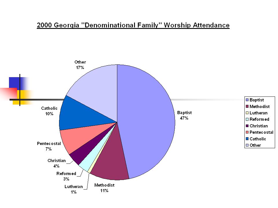
© 2004 by David T. Olson Sample - Not for Public Use20 The 3 Next Charts show the relative strength of the 8 major denominational groups in Georgia. The Pie Chart shows how much Baptists predominate in Georgia. The second and third charts show that all groups have declined with the exception of the Pentecostals and the Catholics.

22
© 2004 by David T. Olson Sample - Not for Public Use22 The Complete Georgia Powerpoint is 40 slides in length, and is available at http://www.theamericanchurch.org/state/UGA20.htm. It includes maps of church attendance in every county in the metro area, as well as denominational charts, average size charts, church planting charts, ethnicity charts and population growth information. http://www.theamericanchurch.org/state/UGA20.htm

23
© 2004 by David T. Olson Sample - Not for Public Use23 The next 10 slides are from the “State of the Church in Atlanta” Powerpoint. The Complete Powerpoint is 41 slides in length, and is available at http://www.theamericanchurch.org/metro/Atlanta.htm. It includes maps of church attendance in every county in the metro area, as well as denominational charts, average size charts, church planting charts, ethnicity charts and population growth information. http://www.theamericanchurch.org/metro/Atlanta.htm

24
© 2004 by David T. Olson Sample - Not for Public Use24 The Next Map shows the percentage of the population attending a Christian church on any given weekend in 2000 for each county in Georgia. High African American church attendance rates make Fulton and DeKalb counties the attendance leaders.

25
Atlanta Metro Counties 2000 Percentage of Population at Worship in All Christian Churches on a Given Weekend Blue = Lowest Rose = Middle Beige = Highest 15.6% Forsyth 17.3% Cherokee 18.6% Gwinnett 19.7% Douglas 20.2% Cobb 27.1% Dekalb 28.5% Fulton

26
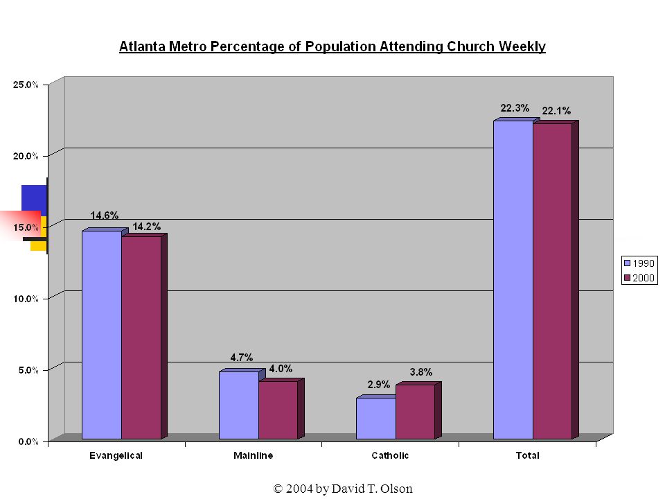
© 2004 by David T. Olson Sample - Not for Public Use26 The Next Graph shows the attendance numbers for the churches in the Atlanta metro in 1990 and 2000. Overall, there has been an strong increase over the last decade in the number of people attending church. Unfortunately, as overall worship attendance has increased, the population has grown even faster. A more reliable standard for evaluating increasing or declining influence is the percentage of the population attending church on any given weekend, shown in the second graph.

27
© 2004 by David T. Olson

29
© 2004 by David T. Olson Sample - Not for Public Use29

30
Atlanta Metro Counties 2000 Percentage of Population at Worship in All Mainline Churches on a Given Weekend Blue = Lowest Rose = Middle Beige = Highest 2.3% Forsyth 2.8% Cherokee 3.0% Gwinnett 3.8% Douglas 3.5% Cobb 2.9% Dekalb 6.5% Fulton

31
© 2004 by David T. Olson Sample - Not for Public Use31 The Next Map shows the growth or decline in the percentage of the population attending a Christian church on any given weekend from 1990 to 2000 for each county. 5 counties grew in attendance percentage, while 2 counties declined.

32
- 12.2% Forsyth 15.8% Cherokee 6.2% Gwinnett 14.3% Douglas 10.6% Cobb -8.3% Dekalb 1.6% Fulton Atlanta Metro Counties 1990 - 2000 Growth or Decline in Percentage of the Population at Worship in All Christian Churches on a Given Weekend Blue = Decline Rose = Growth

33
© 2004 by David T. Olson Sample - Not for Public Use33 The State of the Church in Atlanta... The church in Atlanta has almost been able to keep up with population growth – quite a feat in such a rapidly growing metropolitan area. The migration of African Americans to Atlanta and the growth of the Catholic church has had a significant effect on the makeup of the church. Existing mainline churches are growing faster in Atlanta than in any other metropolitan area of the country A factor in the slight decline in percentage attendance is the insufficient net gain in the number of churches in the Atlanta metro area. Three hundred and twenty-six additional churches needed to have been started in the previous decade to compensate for the slight decline in percentage attendance.

34
© 2004 by David T. Olson Sample - Not for Public Use34 The Complete Atlanta Powerpoint is 41 slides in length, and is available at http://www.theamericanchurch.org/metro/Atlanta.htm. It includes maps of church attendance in every county in the metro area, as well as denominational charts, average size charts, church planting charts, ethnicity charts and population growth information. http://www.theamericanchurch.org/metro/Atlanta.htm

35
© 2004 by David T. Olson Sample - Not for Public Use35 This Presentation is based on a nationwide study of American church attendance, as reported by churches and denominations. The database currently has average worship attendances for each of the last 10 years for over 200,000 individual churches. It also uses supplementary information (actual membership numbers correlated with accurate membership to attendance ratios) to project the attendances of all other denominational and independent churches. All told, accurate information is provided for over 300,000 orthodox Christian churches. 1 1 This presentation looks only at people attending orthodox Christian churches. Approximately 3 million people attend non-orthodox Christian churches, and perhaps 3 million attend a religious service of another religion. Those ‘houses of worship’ would add another 35,000 churches in the United States and increase the 2000 percentage to 20.5%.
 to project the attendances of all other denominational and independent churches. All told, accurate information is provided for over 300,000 orthodox Christian churches. 1 1 This presentation looks only at people attending orthodox Christian churches. Approximately 3 million people attend non-orthodox Christian churches, and perhaps 3 million attend a religious service of another religion. Those ‘houses of worship’ would add another 35,000 churches in the United States and increase the 2000 percentage to 20.5%..")
36
© 2004 by David T. Olson Sample - Not for Public Use36 For More Information... Please go to www.theamericanchurch.org for additional information on the American Church.www.theamericanchurch.org 12 Surprising Facts about the American Church is available at http://www.theamericanchurch.org/ 12supm. htm http://www.theamericanchurch.org/ 12supm. htm The complete Georgia Powerpoint presentation is available at http://www.theamericanchurch.org/state/UGA20.htm http://www.theamericanchurch.org/state/UGA20.htm The Complete Atlanta Powerpoint presentation is available at http://www.theamericanchurch.org/metro/Atlanta.htm http://www.theamericanchurch.org/metro/Atlanta.htm A Combo Pack (12 Surprising Facts, Georgia and Atlanta Powerpoints) is available at http://www.theamericanchurch.org/combo/GA0.htm http://www.theamericanchurch.org/combo/GA0.htm
 is available at")
Similar presentations