Download presentation
Presentation is loading. Please wait.

1
The Visual Display of Quantitative Information Alyssa A. Goodman Professor of Astronomy Harvard University

2
Discussion with Harvard Health Publications July 16, 2003 Alyssa A. Goodman Harvard-Smithsonian Center for Astrophysics

3
Visual Displays of Quantitative Information Maps Tables Graphs Charts Illustrations & Combinations Thereof

4
“Core” Principles for the Best Visual Displays (of Quantitative) Information 1.Clarity 2.Tailor to Audience 3.Optimize Display Design 4.Maximum Information, Minimum Mess 5.Consider Delivery Method (hardcopy, blackboard, web, PPT, movie vs. still)
.")
5
Questions to Always Ask What’s this “VDQI” for? –Data exploration –Hypothesis testing –Making a point –Illustrating/demonstrating an idea –Condensing information –>1 of the above (best answer) Does my display pass the “interocular impact test”?
 Does my display pass the interocular impact test .")
6
Data Exploration

7
Hypothesis (or “Model”) Testing
 Testing")
8
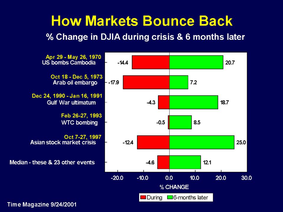
Making a Point Days “predictor” dog had a cold are marked in pink

9
Illustration Area = (a x b)/2 Perimeter=a+b+c a b c c=(a 2 + b 2 ) 1/2
/2 Perimeter=a+b+c a b c c=(a 2 + b 2 ) 1/2")
10
Illustration

11
Condensing Information

12
Questions to Always Ask What’s this “VDQI” for? –Data exploration –Hypothesis testing –Making a point –Illustrating/demonstrating an idea –Condensing information –>1 of the above (best answer) Does my display pass the “interocular impact test”?
 Does my display pass the interocular impact test .")
13
The Local Angle Travel and health Reducing your risk for altitude sickness The allure of glorious vistas, clean air, and spiritual renewal draws millions of people to the mountains every summer for hiking, backpacking, and horseback riding. But if any of your travel plans take you to an altitude of 6,000–8,000 feet or more, your vacation might also include an unpleasant bout of acute mountain sickness (AMS). Not everyone gets sick at higher altitudes, but health risks increase the higher and faster you climb, especially if you ignore early warning signs. Fortunately, you can take several precautions to reduce your chances of becoming very ill, or even dying, from serious altitude-related conditions.
. Not everyone gets sick at higher altitudes, but health risks increase the higher and faster you climb, especially if you ignore early warning signs. Fortunately, you can take several precautions to reduce your chances of becoming very ill, or even dying, from serious altitude-related conditions..")
14
Mount McKinley, Alaska Mount Whitney, California Pike’s Peak, Colorado Buck Mountain, Wyoming Vail Mountain, Colorado Brian Head, Utah Mount Tallac, Nevada Mount St. Helen’s, Washington Mount Washington, New Hampshire Elevation in Feet 20000 18000 16000 14000 12000 10000 8000 6000 Moderate Danger Supplemental Oxygen Usually Required Extreme Danger

15
2nd Half Tables More Sample Graphics Critiques PowerPoint

16
Tables

17
http://lpo.dt.navy.mil/ems/weatherman/std_tbl/?rnd=

18
Tables When is a table better than a graph or chart? How many independent quantities are listed in a table? –Are any of the entries “correlated”? Should they be? Is the numerical accuracy shown appropriate (# of “significant figures”)?
 .")
19
More Sample Graphics

20
“ Small Multiples” Galileo’s Moon

21
Data Exploration Leonardo da Vinci http://water.usgs.gov/waterwatch/

22
Data Exploration

23
http://szyzyg.arm.ac.uk/~spm/neostorm.avi

24
Questions Raised by the Movie Is the Earth in danger? –Resolution and its deception potential –What is the uncertainty in the positions? –What is the time scale? Which one is Earth in the movie? –The importance of labeling (What is the coordinate system? –How is the Solar System “viewed” from above?)
.")
25
Hypothesis Testing John Snow & the London Cholera Epidemic 1854 Reproduced from Visual and Statistical Thinking, ©E.R. Tufte 1997, based on Snow’s drawing.

26
Critiques

34
Goodman, Barranco, Wilner & Heyer 1998

35
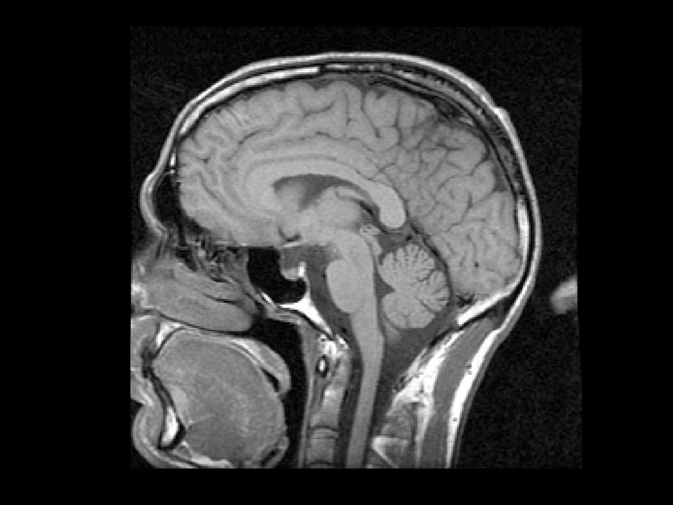
Why not use a real MRI?

36
PowerPoint for Good & Evil Good Forces good handwriting Animation/overlays Clear record of presentations Color Good graphics import Easy reorganization Evil Gratuitous Graphics--too much glitz, no substance Bulleted list after bulleted list Poor graphics import (e.g. EPS) Random access Difficult Spinning things
 Random access Difficult Spinning things.")
37
1.5 1.0 0.5 0.0 -0.5 Intensity 400350300250200150100 "Velocity" Observed Spectrum Telescope Spectrometer All thanks to Doppler Velocity from Spectroscopy

38
Radio Spectral-line Observations of Interstellar Clouds

39
1. Episodic Outflows: Steep Mass-Velocity Slopes Result from Summed Bursts Power-law Slope of Sum = -2.7 (arbitrarily >2) Slope of Each Outburst = -2 as in Matzner & McKee 2000 Arce & Goodman 2001b
 Slope of Each Outburst = -2 as in Matzner & McKee 2000 Arce & Goodman 2001b.")
40
COMPLETE Preview: Discovery of a Heated Dust Ring in Ophiuchus Goodman, Li & Schnee 2003 2 pc

41
…and the famous “1RXS J162554.5-233037” is right in the Middle !? 2 pc

42
Star Formation >>101 Bate, Bonnell & Bromm 2002 MHD turbulence gives “t=0” conditions; Jeans mass=1 M sun 50 M sun, 0.38 pc, n avg =3 x 10 5 ptcls/cc forms ~50 objects T=10 K SPH, no B or movie=1.4 free-fall times

43
“Core” Principals for the Best Visual Displays (of Quantitative) Information 1.Clarity 2.Tailor to Audience 3.Optimize Display Design 4.Maximum Information, Minimum Mess 5.Consider Delivery Method (hardcopy, blackboard, web, PPT, movie vs. still)
.")
44
So Many Graphs, So Little Time Graphs show relationships amongst more than one variable (“multivariate”) “Time” can be, but is not always, a relevant variable Most graphs are drawn in two dimensions A map can be considered as a very direct form of graph
 Time can be, but is not always, a relevant variable Most graphs are drawn in two dimensions A map can be considered as a very direct form of graph")
Similar presentations


 Dynamic View of Star Formation Alyssa A. Goodman Harvard-Smithsonian Center for Astrophysics.>")


 and Hubble Heritage Team (STScI/AURA/NASA) Stars Forming in a Dynamic Interstellar Medium.>")
>")


 and Hubble Heritage Team (STScI/AURA/NASA) A Dynamic View of Star Formation Alyssa A. Goodman.>")