Download presentation
Presentation is loading. Please wait.

1
First-Year Engineering Program 1Autumn 2008 Engineering H191 Engineering Fundamentals and Laboratory I Lecture 10 Graphing as a Communication Tool

2
First-Year Engineering Program 2Autumn 2008 It's been said that a picture is worth a thousand words… … but when displaying data, what kind of picture (graph, chart) should you use? How do you make your graph best show what you want? Graphing as a Communication Tool

3
First-Year Engineering Program 3Autumn 2008 Objectives Introduce basic chart types Basic equation types Good graphing practices Chart examples

4
First-Year Engineering Program 4Autumn 2008 Which Type of Graph? What kind of data is it? What is the message?

5
First-Year Engineering Program 5Autumn 2008 Types of Data Data values can be numeric or character (including numbers and symbols). –Numeric data (such as 2.3 or 12) are used in positioning features on the graph in a way proportional to their numeric value. –Character data (such as "1 st Quarter", the year "2004", or "Resistance, Ω") are used for information purposes.
 are used in positioning features on the graph in a way proportional to their numeric value. –Character data (such as 1 st Quarter , the year 2004 , or Resistance, Ω ) are used for information purposes..")
6
First-Year Engineering Program 6Autumn 2008 Data can be Organized by Categories Categories are groupings of data with something in common. –Categories are described by one or more character labels. –Numeric data for categories are related to the entries in each category (e.g. number of occurrences, average, sum, percent, or cumulative percent).
..")
7
First-Year Engineering Program 7Autumn 2008 Example of Categorical Data Character Character Label Label Numeric Each row of this table may be considered a category with two labels.

8
First-Year Engineering Program 8Autumn 2008 Types of Graphs Bar charts (many forms), pie charts, histograms, and line plots are several of the many ways to present categorical data. –Categories are represented on these graphs independent of any value their label may have as a number.

9
First-Year Engineering Program 9 Bar Chart 0 10 20 30 40 50 60 70 80 90 THOUSANDS OF UNITS 1st QTR2nd QTR3rd QTR4th QTR QUARTERLY SALES 2001 REGIONAL SALES EAST WEST NORTH X-Axis (abscissa) and label Y-Axis (ordinate) and label Legend
 and label Y-Axis (ordinate) and label Legend")
10
First-Year Engineering Program 10Autumn 2008 Title Data labels Pie Chart

11
First-Year Engineering Program 11Autumn 2008 Range Bar Graph Figure 4.47 - Range bar graph

12
First-Year Engineering Program 12Autumn 2008 Types of Graphs Scatter Plots and Contour Plots are used when all variables are continuous Scatter Plots are ideal for experimental data Scatter Plots place every point based on the values of each variable

13
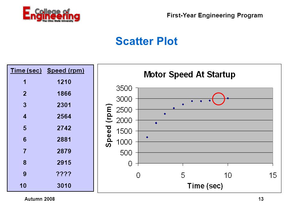
First-Year Engineering Program 13Autumn 2008 Scatter Plot Time (sec) Speed (rpm) 11210 21866 32301 42564 52742 62881 72879 82915 9???? 103010
14
First-Year Engineering Program 14Autumn 2008 0.1110100-20-15-10-505101520 Linear and Logarithmic Scaling Linear axis: Logarithmic axis:

15
First-Year Engineering Program 15Autumn 2008 Three Common Equation Forms Linear –Y = mX + B –Thermal Expansion Power –Y = bX m –Wind Force Exponential –Y = be mX –Population Growth

16
First-Year Engineering Program 16Autumn 2008 Linear: Thermal Expansion of Pipe Length, L L = (T – T o ) + L o L = ( T ) + L o (Form : Y = mX + b) TT L LoLo 1 T = Final temperature T o = Initial Temperature = Coefficient of thermal expansion L o = Initial length at temperature T o T = T - T o
 + L o L = ( T ) + L o (Form : Y = mX + b) TT L LoLo 1 T = Final temperature T o = Initial Temperature = Coefficient of thermal expansion L o = Initial length at temperature T o T = T - T o")
17
First-Year Engineering Program 17Autumn 2008 Power: Wind Force on Road Sign Wind Force on a Sign (F = P A) P = 0.0036 V 2 Where P = pressure in lb/ft 2 V = velocity in ft/sec (Form Y = bX m )
 P = V 2 Where P = pressure in lb/ft 2 V = velocity in ft/sec (Form Y = bX m )")
18
First-Year Engineering Program 18Autumn 2008 Power Relationship Y = bX m Linear Form: log Y = log b + m log X Y* = m X* + b*

19
First-Year Engineering Program 19Autumn 2008 Exponential: Population Growth Y = be mX Linear Form: ln Y = ln b + m X Y* = b* + mX

20
First-Year Engineering Program 20Autumn 2008 Good Graphing Practices Every graph must have a title and axis labels. When more than one data set is shown on the same graph, a legend is needed. Leave margins at the edges of the paper. Graphs must be neat and easily readable (e.g. size of graph, large enough font, no text on top of data or axes). Each graph must include the author and date (on the same page with the graph).
. Each graph must include the author and date (on the same page with the graph)..")
21
First-Year Engineering Program 21Autumn 2008 What could be improved? 0 6 8 10 4 12 ABCD Bar Spacing Title Axis labels Color or shade bars

22
First-Year Engineering Program 22Autumn 2008 Are there still problems? 0 4 6 8 2 10 A B CD Units produced by Divisions A – D in July Divisions Units In Thousands

23
First-Year Engineering Program 23Autumn 2008 Example Hand Graph with Data

24
First-Year Engineering Program 24Autumn 2008 What is your message? The overriding objective in making graphs, just like all forms of Engineering communication, is CLARITY Consider the number of traffic fatalities per year in Ohio (Courtesy NHTSA)
.")
25
First-Year Engineering Program 25Autumn 2008 Is your message how stable the fatality rate has been… Year Traffic Fatalities In Ohio Number Of Fatalities Note The Poor Choice of Y-Axis Increment

26
First-Year Engineering Program 26Autumn 2008 …or that fatalities seem cyclical? Note that zero has been suppressed

27
First-Year Engineering Program 27Autumn 2008 …or? Maybe you really wanted to graph traffic fatalities per 100 million miles driven to show how safe it is to drive in Ohio.

28
First-Year Engineering Program 28 Safe Driving in Ohio

29
First-Year Engineering Program 29Autumn 2008 270 college students were surveyed to find whether they had part-time jobs and how much they earned. How can we present this data graphically? College Students with Jobs

30
First-Year Engineering Program 30Autumn 2008 Monthly Earnings of College Students Pie Chart

31
First-Year Engineering Program 31Autumn 2008 Earnings Differences for Men and Women

32
First-Year Engineering Program 32Autumn 2008 Students earning less than $400 per month?

33
First-Year Engineering Program 33Autumn 2008 Hint If you're graphing data to answer a question, think about which style of graph and which scales will best show you the answer.

34
First-Year Engineering Program 34Autumn 2008 Today's Assignment TG 12.2 – graph drawn by hand A68 in course packet – graphs drawn by hand –Prepare a table with Speed, Frequency, Relative Frequency (%) and Cumulative Frequency (%) –Plot 2 graphs – one with relative frequency as the ordinate and speed as the abscissa and the second with cumulative frequency as the ordinate and speed as the abscissa. Align the graphs vertically.

Similar presentations

 Variable: Any characteristic.>")

>")


. Statistics graph Data recorded in surveys are displayed by a statistical graph. There are some specific.>")


 The first book of riddles published in English appeared.>")


