Download presentation
Presentation is loading. Please wait.

1
Visual Explanation Assessment of change, dynamics, and cause and effect are at the heart of thinking and explanation To understand is to know what cause provokes what effect, by what means, at what rate. How then is such knowledge to be represented?

2
Visual Explanation We will describe design strategies -- the proper arrangement in space and time of images, words, and numbers-- for presenting information about motion, process, mechanism, cause and effect These strategies are quite independent of the particular substantive content or technology of display

3
Visual Explanation Those who discover an explanation are often those who construct its representation Many examples suggest that clarity and excellence in thinking is very much like clarity and excellence in the display of data When principles of design replicate principles of thought, the act of arranging information becomes an act of insight

4
Visual Explanation First we will examine following:
What principles should inform our designs for showing data? Where do these principles come from? How can the integrity of quantitative descriptions be maintained in the face of complex and animated representation of data? What are the standards for evaluating visual evidence?

5
Visual Explanation What are the standards for making decisions and reaching conclusions? In the second part we will consider design strategies, often for the arrangement of images as narrative In this part the issues are more visual and lyrical than quantitative

6
Visual Explanation The idea is to make designs that enhance the richness, complexity, resolution, dimensionality, and clarity of the content We are able to extend the depth of our own knowledge and experience by extending the visual capacities of paper, video, and computer screen

7
Images and Quantities Our thinking is filled with assessment of quantity, an approximate or exact sense of number, amount, size, and scale In scientific work, both order-of-magnitude, reasoning, and precise measurements are pervasive

8
Images and Quantities How are such quantities represented in visual expressions of ideas, experience, evidence? How are moving images, photographs, diagrams, maps, and charts to be scaled and labeled? What makes images quantitatively eloquent?

9
Images and Quantities Visual techniques for depicting quantities include: direct labels-- for example, numerically labeled grids of statistical graphics, or three dimensional tripods in architectural drawings encodings-- color scales self-representing scales-- objects of known size appearing in an image

10
Auguste Choisy, L’art de bâtir
chez les romains (Paris, 1873) plate XXIII, Segeste
 plate XXIII, Segeste.")
11
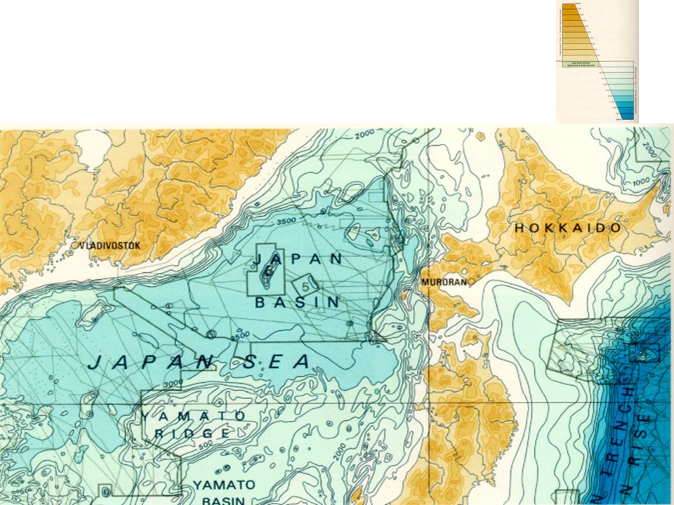
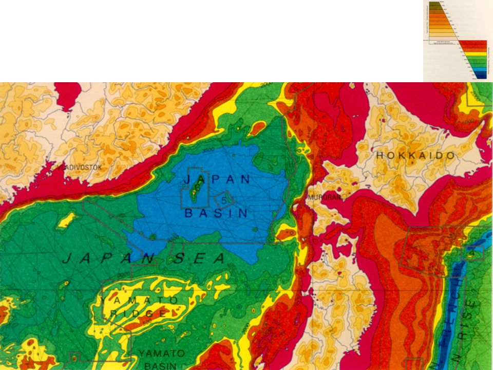
Images and Quantities Maps express quantities visually by location (two-dimensional addresses of latitude and longitude) and by areal extent (surface coverage)
 and by areal extent (surface coverage)")
13
Images and Quantities Despite their quantifying scales and grids, maps resemble miniature pictorial representation of the physical world To depict relations between any measured quantities, requires replacing the map’s natural spatial scales with abstract scales of measurement not based on geographic analogy

14
Images and Quantities To go from maps of existing scenery to graphs of newly measured and collated data was an enormous conceptual step By 1765, two-dimensional space was liberated from pictorially-based scales J. H. Lambert described a general graphical grid (no more analogies to maps) for depicting systematic relations between measured quantities
 for depicting systematic relations between measured quantities.")
15
Images and Quantities Modern scientific graphics were now in place:
the two-dimensional plane was quantified It was available for any measured data Used with fitted models, graphics could describe and characterize relations between variables--thus displaying the essential evidence necessary for establishing cause and effect

16
Images and Quantities Not a great many substantive problems are exclusively two-dimensional For centuries, central issue in depicting information has been how to represent three or more dimensions of data on the two-dimensional surface of walls, stone, canvas, paper, and recently, computer screens

17
Images and Quantities This is something that architects and painters (using perspective) and animators (using perspective and motion) have done for a long time The dequantification characteristic of art reproductions is also seen in scientific and technical imaging
 and animators (using perspective and motion) have done for a long time. The dequantification characteristic of art reproductions is also seen in scientific and technical imaging.")
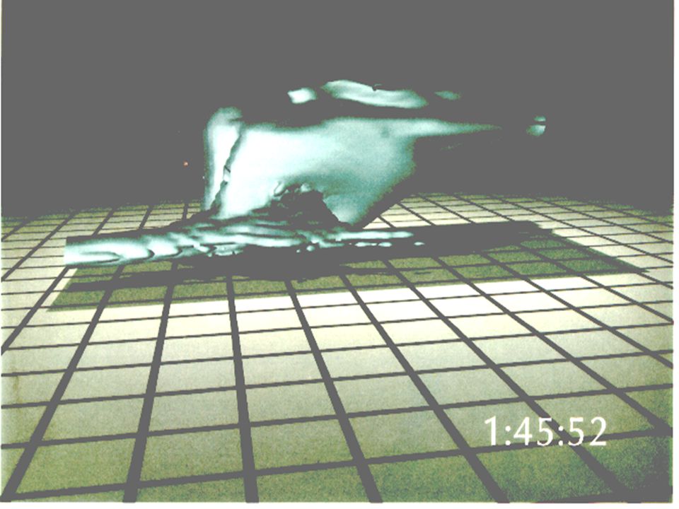
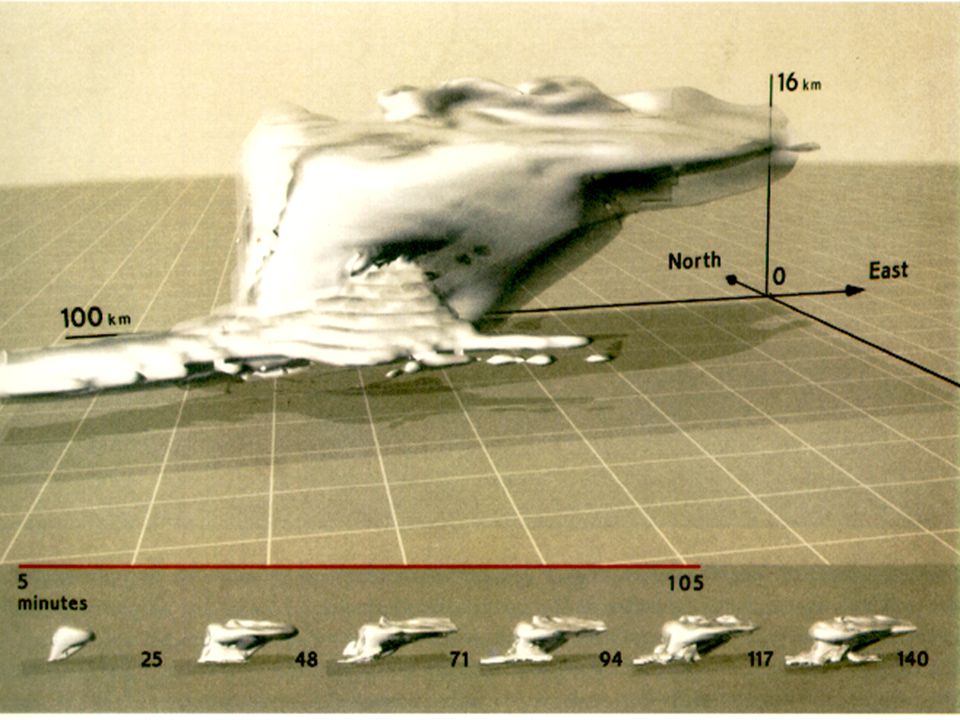
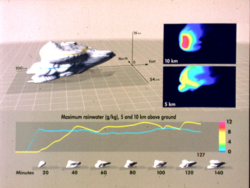
19
Images and Quantities This is classic of scientific visualization
Perhaps an excess of enthusiasm for trendy new technologies of three-dimensional display of supercomputer animations in the 1990s led to these over-exuberant tiles and grids that disrupt the unity of pictorial content Nevertheless, a redesign can improve the animation’s context, precision, and visual character

20
Images and Quantities How big is that cloud?
What direction is it moving? What are the dimensions of the grid? These fundamentals of scale, orientation, and labels, for centuries routine in maps and statistical graphics, are often missing in the colorful images emanating from computer visualization

21
Images and Quantities In one scholarly compilation (19 articles, 43 authors) of supercomputer scientific animations (134 color images): 65% of published images had no scales or labeled dimensions at all 22% had partial labels or scales 13% had complete labels and scales

24
Images and Quantities More generally, when scientific images become dequantified, the language of analysis may drift toward credulous descriptions of form, pattern, and configuration-- rather than answers to the questions: How many? How often? Where?

25
Images and Quantities How much? At what rate? Extravagant dequantification is seen in a video flyover of the planet Venus, cooked up from radar data collected during the 1992 Magellan space probe

27
Images and Quantities Enthusiasts, partisans, and liars have long tinkered with graphical evidence by dequantifying images, selecting and hyping advantageous visual effects, distorting data Recently, inexpensive computing and ingenious techniques for image processing have provided endless new opportunity for mischief

28
Images and Quantities Arbitrary, transient, one-sided, fractured, undocumented materials have become the great predicament of image making and processing How are we to assess the integrity of visual evidence? What ethical standards are to be observed in the production of such images?

29
Images and Quantities One way to enforce some standard of truth-telling is to insist that: the innocent, unprocessed, natural image be shown along with the manipulated image the manipulators and their methods be identified If images are to be credible, their source and history must be documented

30
Images and Quantities If an image is to serve as serious evidence, a more rigorous accounting should reveal the overall pool of images from which the displayed image was selected Despite the chronic dangers of misrepresentation, appropriate re-expressions or transforms of scales are among the most powerful strategies for exploring data

31
Images and Quantities In both two- and three-dimensional design, it is often useful to see images and objects at approximately an order of magnitude smaller and larger than actual size

32
Images and Quantities Although we often hear that data speak for themselves, their voices can be soft and sly Frederick Mosteller, Stephen E. Fienberg, and Robert E. K. Rourke, Beginning Statistics with Data Analysis,(Reading, Massachusetts,1983), p. 234
, p")
33
Images and Quantities Negligent speech doth not only discredit the person of the Speaker, but it discrediteth the opinion of his reason and judgment; it discrediteth the force and uniformity of the matter, and substance. Ben Jonson, Timber: or, Discoveries (London,

34
Visual and Statistical Thinking: Displays of Evidence for Making Decisions
When we reason about quantitative evidence, certain methods for displaying and analyzing data are better than other Superior methods are more likely to produce truthful, credible, and precise findings

35
Visual and Statistical Thinking: Displays of Evidence for Making Decisions
The difference between an excellent analysis and a faulty one can sometimes have momentous consequences

36
Visual and Statistical Thinking: Displays of Evidence for Making Decisions
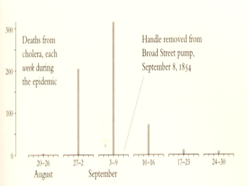
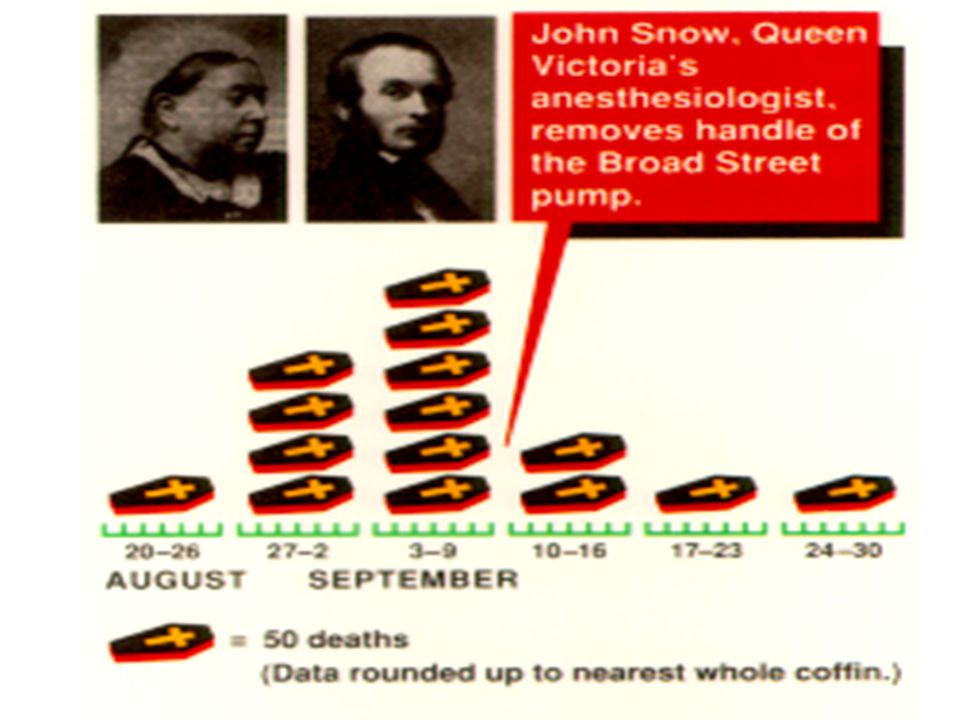
We examine the statistical and graphical reasoning used in making two life-and-death decisions: How to stop a cholera epidemic in London during September 1854 Whether to lunch the space shuttle Challenger on January 28, 1986

37
Visual and Statistical Thinking
Why was the centuries-old mystery of cholera finally solved? Snow had a good idea--a causal theory about how the disease spread This theory developed from medical analysis and empirical observation

38
Visual and Statistical Thinking
By mapping earlier epidemics, Snow detected a link between different water supplies and varying rates of cholera Along with a good idea and a timely problem, there was a good method Snow’s scientific detective work exhibits a shrewd intelligence about evidence, a clear logic of data display and analysis

39
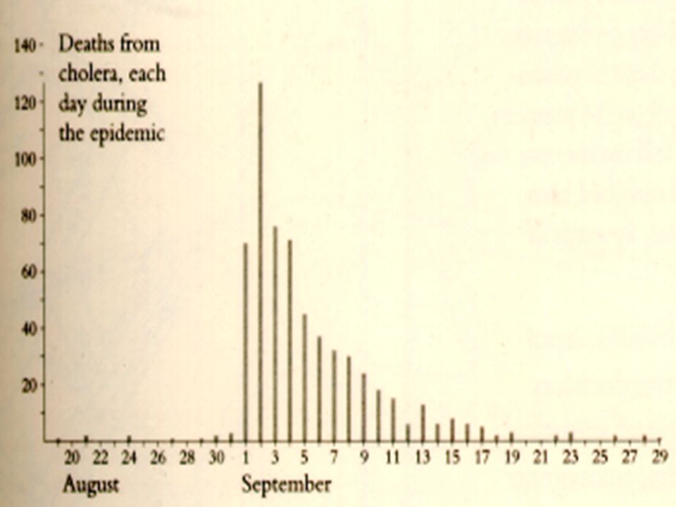
Visual and Statistical Thinking
1. Placing the data in appropriate context for assessing cause and effect The original data listed the victims’ names and described their circumstances, all in order by date of death Such a stock of death certificates naturally lends itself to time-series displays

42
Visual and Statistical Thinking
But descriptive narration is not causal explanation The passage of time is a poor explanatory variable Practically useless in discovering a strategy of how to intervene and stop the epidemics

43
Visual and Statistical Thinking
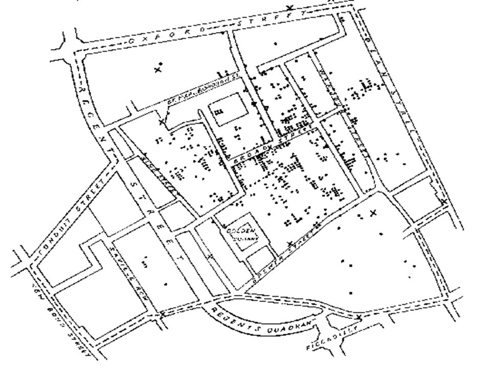
Instead of plotting a time-series which would simply report each day’s bad news, Snow constructed a graphical display that provided direct and powerful testimony about a possible cause-effect relationship He recasts the original data from their one-dimensional temporal ordering into a two-dimensional spatial comparison

45
Visual and Statistical Thinking
2. Making quantitative comparisons The deep, fundamental question in statistical analysis is: compared with what? Investigating the experiences of the victims of cholera is only part of the search for credible evidence To understand fully the cause of the epidemics also requires an analysis of those who escaped the disease

46
Visual and Statistical Thinking
With great clarity, the map presented several intriguing clues for comparisons between the living and the dead, clues strikingly visible at a brewery and a work-house Such clear, lucid reasoning may seem commonsensical, obvious, and insufficiently technical

47
Visual and Statistical Thinking
3. Considering alternative explanations and contrary cases Sometimes it can be difficult for researchers-- who both report and advocate their findings-- to face up to treats to their conclusions, such as alternative explanations and contrary cases The credibility of a report is enhanced by a careful assessment of all relevant evidence, not just the evidence that supports explanations by the report

48
Visual and Statistical Thinking
The point is: to get it right not to win the case not to sweep under the rug all assorted puzzles and inconsistencies that frequently occur in collections of data Both Snow’s map and time-sequence of death show several apparently contradictory instances, a number of deaths from cholera with no obvious link to the Broad Street pump

49
Visual and Statistical Thinking
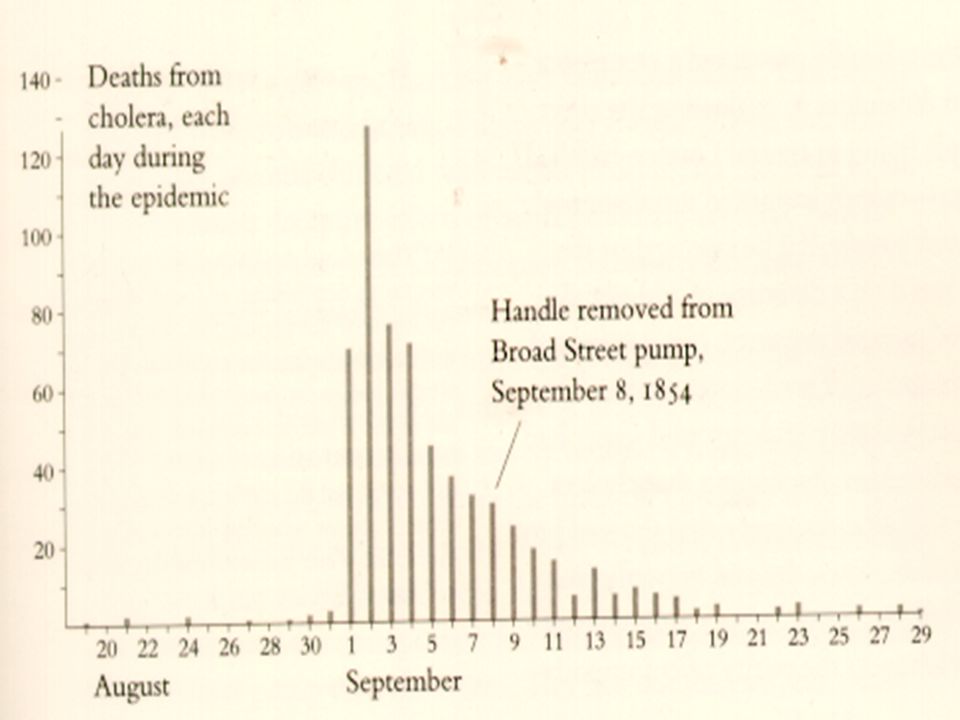
Ironically, the most famous aspect of Snow’s work is also the most uncertain part of his evidence: it is not at all clear that the removal of the handle of the Broad Street pump had much to do with ending the epidemic

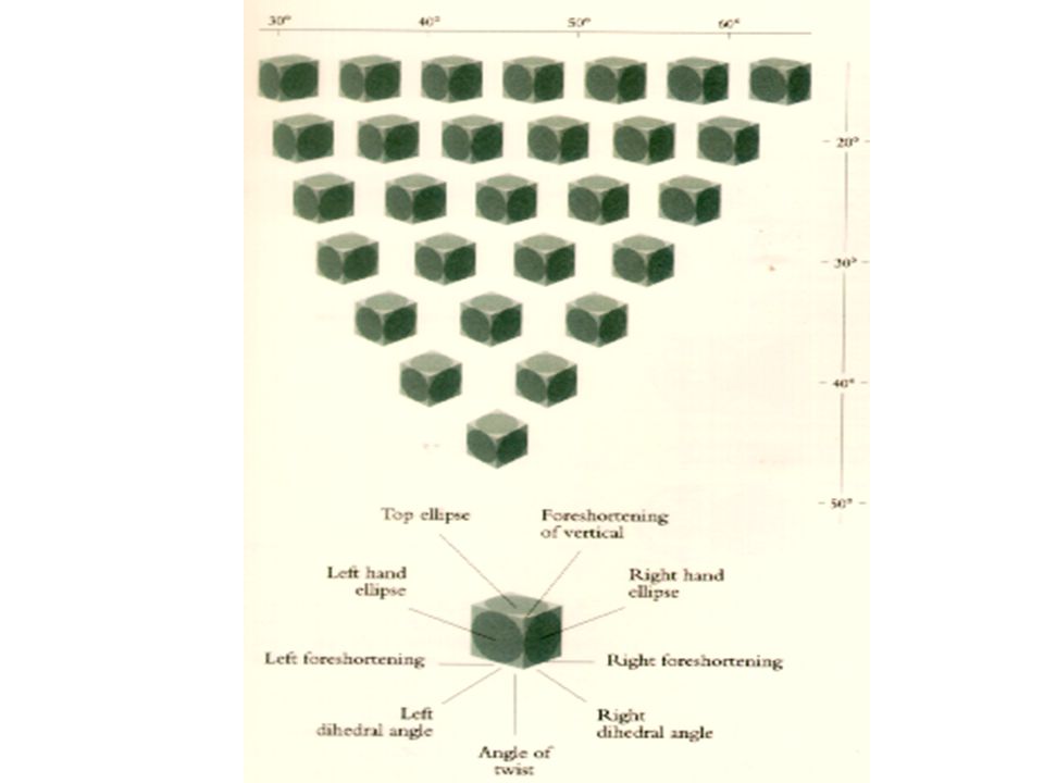
51
Visual and Statistical Thinking
4. Assessment of possible errors in the numbers reported in graphics The credibility of the cholera map grows out of supplemental details in the text-- as image, word, and number combine to present the evidence and make the argument Detailed comments on possible errors annotate both the map and the table

52
Visual and Statistical Thinking
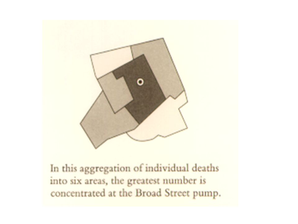
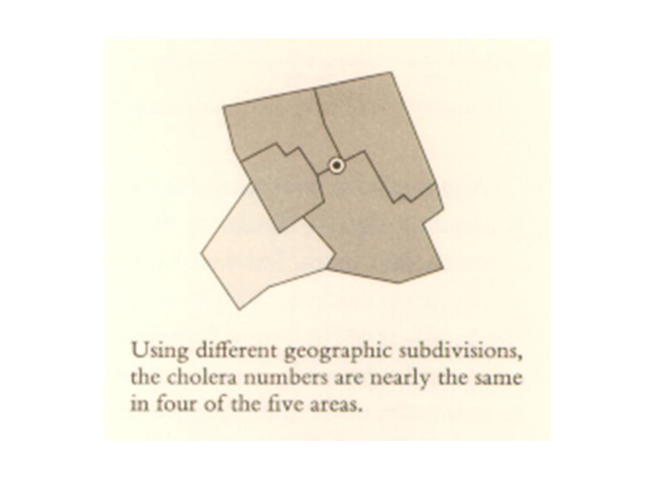
The design (dot map) has statistical costs and benefits: death rates are not shown such maps may become cluttered with excessive detail on the other hand, the sometimes deceptive effects of aggregation are avoided The big problem is that dot maps fail to take into account the number of people living in an area and at risk to get a disease
 has statistical costs and benefits: death rates are not shown. such maps may become cluttered with excessive detail. on the other hand, the sometimes deceptive effects of aggregation are avoided. The big problem is that dot maps fail to take into account the number of people living in an area and at risk to get a disease.")
53
Visual and Statistical Thinking
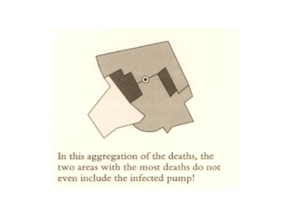
The Snow’s map does not fully answer the question compared with what? Ideally, the cholera data should be displayed on both a dot map and rate map, with population-based rates calculated for rather small and homogeneous geographic units Worrying: Aggregations by area can sometimes mask and even distort the true story of the data

57
Visual and Statistical Thinking
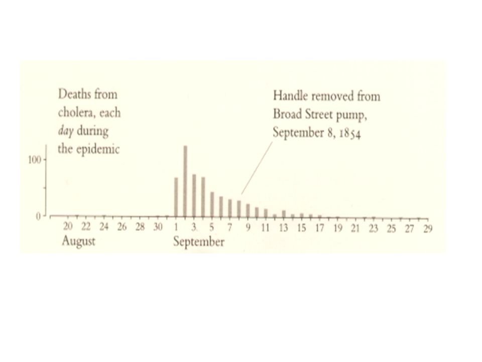
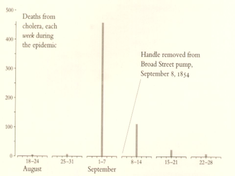
Aggregations over time may also mask relevant detail and generate misleading signals, similar to the problems of spatial aggregation

63
Visual and Statistical Thinking
Time-series are exquisitely sensitive to choice of intervals and end points Nonetheless, many aggregations are perfectly sensible, reducing the tedious redundancy and uninteresting complexity of large data files

64
Visual and Statistical Thinking
A further difficulty arises, as a result of fast computing It is easy now to sort through thousands of plausible varieties of graphical and statistical aggregations Then select for publication only those findings strongly favorable to the point of view being advocated

65
Visual and Statistical Thinking
Such searches are described as data mining, multiplicity, or specification searching So we can arrive with the rule: A prudent judge of evidence might well presume that those graphs, tables, and calculations revealed in a presentation, are the best of all possible results chosen expressly for advancing the advocate’s case

66
Visual and Statistical Thinking
Next is tragic example of the decision to launch the space shuttle Challenger on January 28, 1986

68
Visual and Statistical Thinking
In management schools, the accident serves as a case study for reflections about groupthink, technical decision-making in the face of political pressure, and bureaucratic failures to communicate

69
Visual and Statistical Thinking
For the authors of engineering textbooks and for physicist Richard Feynman, the Challenger accident simply confirmed what they already knew: awful consequences result when heroic engineers are ignored by villainous administrators

70
Visual and Statistical Thinking
In a field of statistics, the accident is evoked to demonstrate the importance of risk assessment, data graphs, fitting models to data, and requiring students of engineering to attend classes in statistics For sociologists, the accident is a symptom of structural history, bureaucracy, and conformity to organizational norms

71
Visual and Statistical Thinking
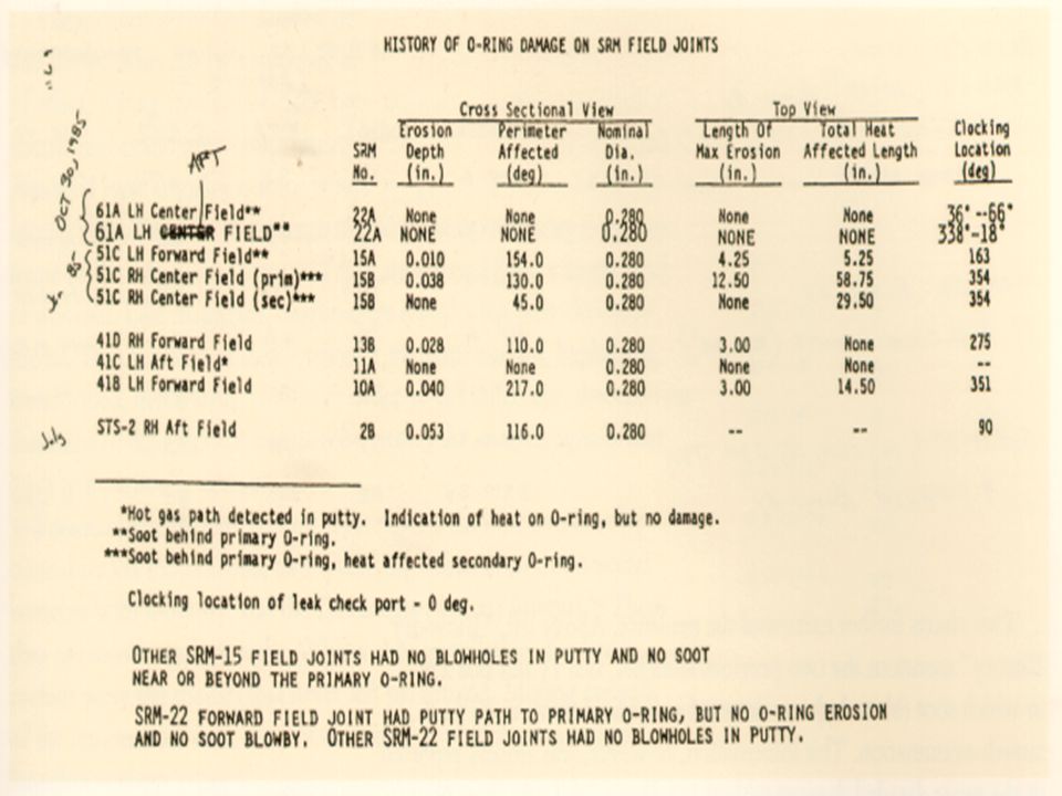
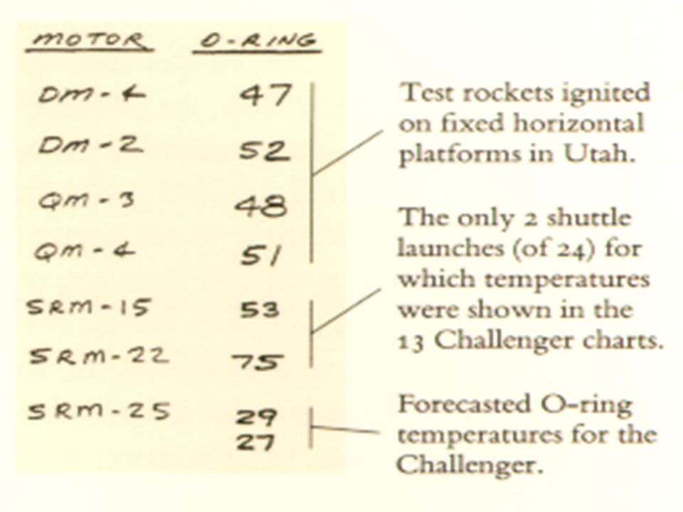
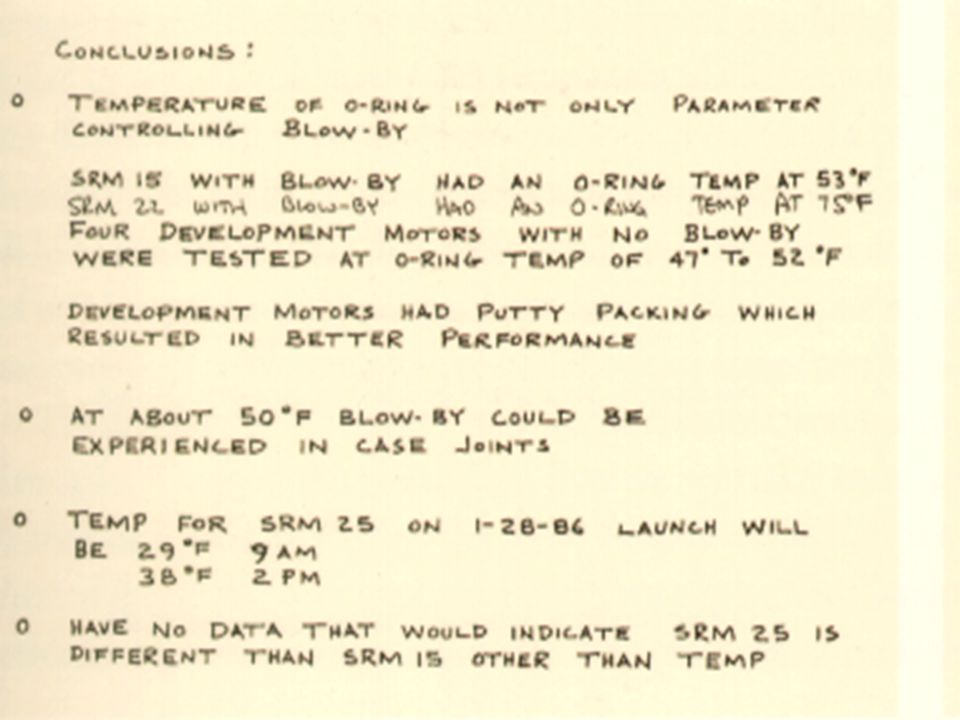
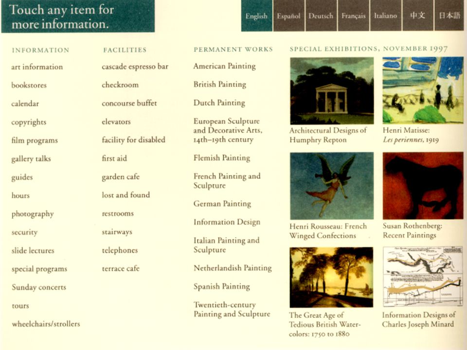
Regardless of the indirect cultural causes of the accident, there was a clear proximate cause: an inability to assess the link between cool temperature and O-ring damage on earlier flights Following charts that were drown before launch have weaknesses:

80
Visual and Statistical Thinking
These charts failed to stop the launch Yet, as it turned, out, the chart makers had reached the right conclusion They had the correct theory and they were thinking causally, but they were not displaying causally

81
Visual and Statistical Thinking
When assessing evidence, it is helpful to see a full data matrix, all observations for all variables Those private numbers from which the public displays are constructed Following scatterplot shows the experience of all 24 launches prior to the Challenger This graph reveals the serious risk of lunch at 29o

83
Visual and Statistical Thinking
In all the charts prepared for making the decision to launch, there is a scandalous discrepancy between the intellectual task at hand and the images created to serve those tasks As analytical graphics, the displays failed to reveal a risk that was in fact present

84
Visual and Statistical Thinking
As presentation graphics, the displays failed to persuade government officials that cold-weather launch might be dangerous In designing those displays, the chart makers didn’t quite know what they were doing, and they were doing a lot of it

85
Visual and Statistical Thinking
We can be thankful that most data graphics are not inherently misleading, or uncommunicative, or difficult to design correctly These two examples and many other examples suggest this conclusion: There are right ways and wrong ways to show data; there are displays that reveal the truth and displays that do not

86
Visual and Statistical Thinking
In those case studies, and also in many other instances where evidence makes a difference, the conclusion is: if displays of data are to be truthful and revealing, then the logic of the display design must reflect the logic of the analysis

87
Visual and Statistical Thinking
Visual representations of evidence should be governed by principles of reasoning about quantitative evidence. For information displays, design reasoning must correspond to scientific reasoning. Clear and precise seeing becomes as one with clear and precise thinking

88
Visual and Statistical Thinking
Display architecture recapitulates quantitative thinking; design quality grows from intellectual quality Such dual principles--both for reasoning about statistical evidence and for the design of statistical graphs include: documenting the source and characteristics of the data

89
Visual and Statistical Thinking
Insistently enforcing appropriate comparisons demonstrating mechanisms of cause and effect expressing those mechanisms quantitatively recognizing the inherently multivariate nature of analytic problems inspecting and evaluating alternative explanation

90
Visual and Statistical Thinking
As illustrated by the divergent graphical practices in cases of the epidemics and space shuttle, it also helps to have an endless commitment to finding, telling, and showing the truth

91
The Smallest Effective Difference
In the study of perception, just noticeable differences measure the very limits of human abilities to detect the faintest of differences between, say two adjacent colors almost exactly alike in a continuos spectrum of 100,000 colors This is fine for art but not for data

92
The Smallest Effective Difference
Rather than operating at such an exquisite threshold of perceptual acuity, data displays must be clear, assured, reliable, and sturdy In designing information the idea is to use: just notable differences visual elements that make a clear difference but no more contrasts that are definite, effective, and minimal

93
The Smallest Effective Difference
The idea of the smallest effective difference helps in designing the various secondary and structural elements in displays of information Secondary and structural elements are: arrows, pointer lines, dimension lines, tic marks, scales, compass roses, broken lines for incomplete elements, grids, meshes,

94
The Smallest Effective Difference
rules, underlines, frames, boxes, compartments, codes, legends, highlights, accents, bevels, shadows, and fills defining areas and surfaces Muting those secondary elements will often reduce visual clutter--and thus help to clarify the primary information

95
The Smallest Effective Difference
Minimal contrasts of the secondary elements (figure) relative to the negative space (ground) will tend to produce a visual hierarchy with: layers of inactive background calm secondary structure notable content
 relative to the negative space (ground) will tend to produce a visual hierarchy with: layers of inactive background. calm secondary structure. notable content.")
96
The Smallest Effective Difference
Conversely, when everything (background, structure, content) is emphasized, nothing is emphasized The graphical design will often be noise, clutter, and informationally flat Strong contrasts between secondary elements and the background will also visually activate the background
 is emphasized, nothing is emphasized. The graphical design will often be noise, clutter, and informationally flat. Strong contrasts between secondary elements and the background will also visually activate the background.")
102
Parallelism:Repetition and Change
For prose, parallelism helps bring about clarity, efficiency, forcefulness, rhythm, and balance Now consider information displays in two- and three-dimensional space: What are the strategies of visual parallelism? Are there visual analogs to syntactical and rhetorical principles?

103
Parallelism:Repetition and Change
Parallelism connects visual elements Connections are built among images by position, orientation, overlap, synchronization, and similarities in content Parallelism grows from a common viewpoint that relates like to like

104
Parallelism:Repetition and Change
Congruity of structure across multiple images gives the eye a context for assessing data variation Parallelism is not simply a matter of design arrangement, for the perceiving mind itself activity works to detect, and indeed, to generate links, clusters, and matches among assorted visual elements

105
Parallelism:Repetition and Change
The linking mechanism of parallel designs can be subtle and elegant, consistent with the guiding principle that good form is clear, but not a spectacle

107
Parallelism:Repetition and Change
Multiple parallel images-- a transparent, powerful, and widely used method of enforcing visual comparisons

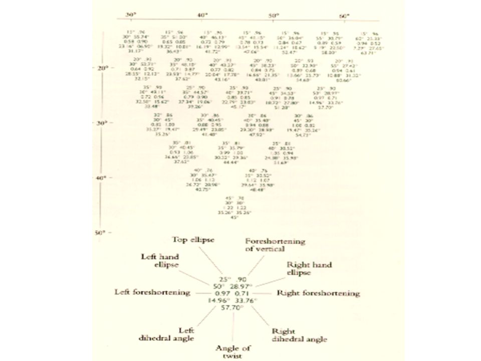
110
Parallelism:Repetition and Change
By means of multiple parallels, next drawings show the cube in tri-metric projection, a method for translating three-dimensional space objects onto paper flatland

113
Parallelism:Repetition and Change
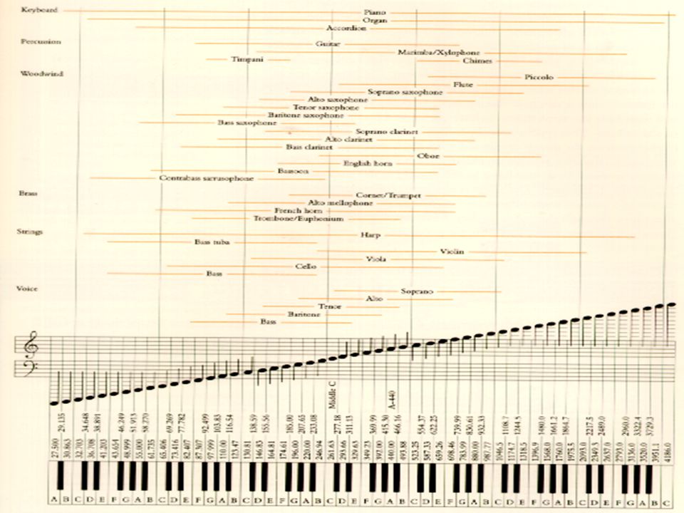
Multiple parallelism is a natural design strategy for explanations of music and sound, as repeated comparisons are made with respect to frequency and time

115
Parallelism:Repetition and Change
Embodying inherent links and connections, parallelism synchronizes multiple channels of information, draws analogies, enforces contrasts and comparisons Parallelism provides a coherent architecture for organizing and learning from images-- as well as from words and numbers

116
Parallelism:Repetition and Change
By establishing a structure of rhythms and relationships, parallelism become the poetry of visual information

117
Multiples in Space and Time
Multiple images reveal repetition and change, pattern and surprise-- the defining elements in the idea of information Multiples directly depict comparisons, the essence of statistical thinking Multiples enhance the dimensionality of the flatlands of paper and computer screen, giving depth to vision by arraying panels and slices of information

118
Multiples in Space and Time
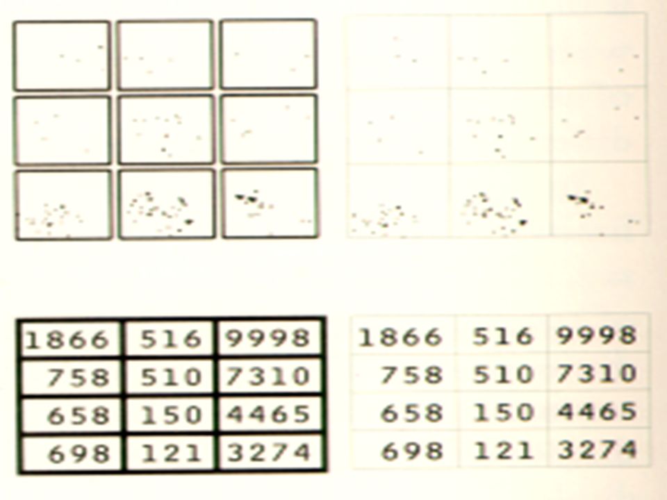
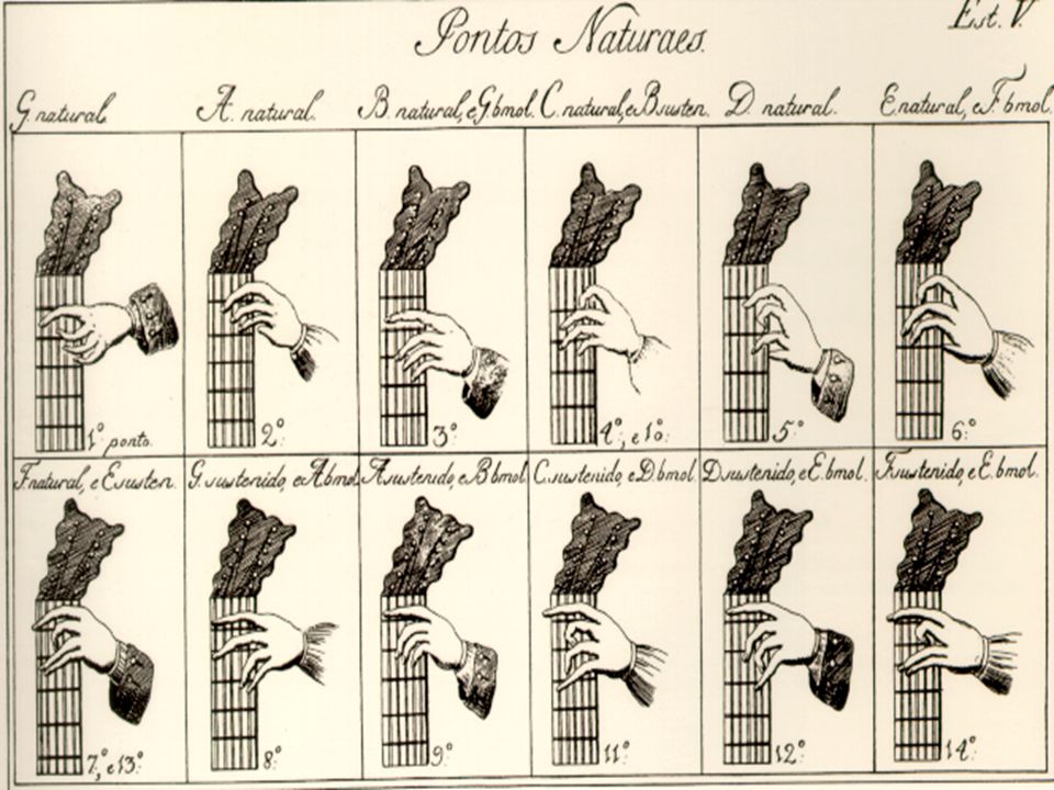
Multiples create visual lists of objects and activities, nouns and verbs, helping viewers to analyze, compare, differentiate, decide-- as we see in the following pictures with 12 hands in 12 positions for making 12 sounds

120
Multiples in Space and Time
Multiples represent and narrate sequence of motion Multiples amplify, intensify, and reinforce the meaning of images

121
Multiples in Space and Time
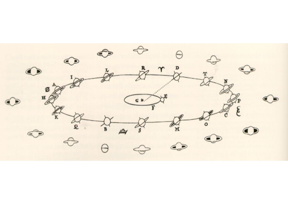
Following is the exquisite multiple from Systema Saturnium, the small inner ellipse traces Earth’s annual journey around the Sun; the larger ellipse shows Saturn in orbit as viewed from the heavens

125
Multiples in Space and Time
Multiples help to monitor and analyze multi-variable processes-- ordinary occurrences in medicine, finance, quality control, and large-scale industrial and engineering operations By providing a quick, simultaneous look at a continuing flow of different measurements, multiples help sort out the relevant substance from a flood of numbers

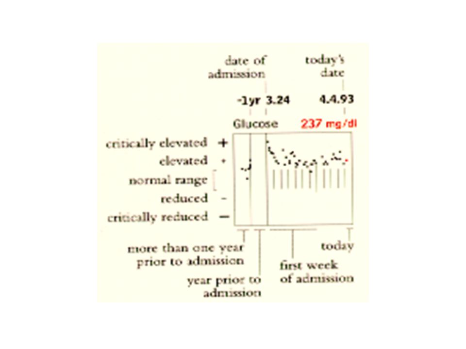
128
Multiples in Space and Time
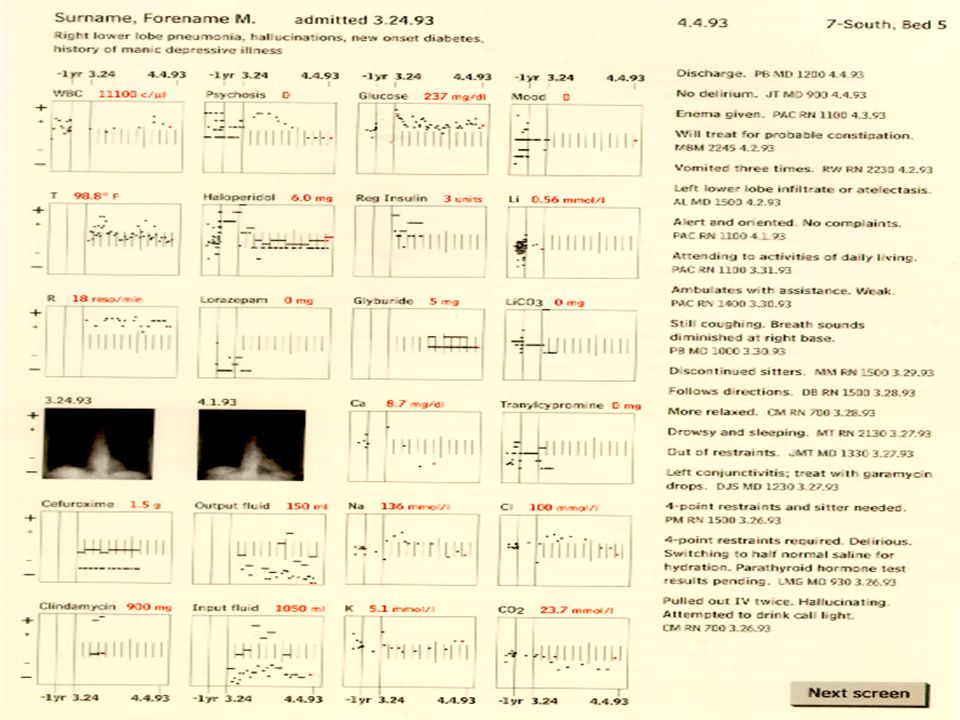
Combining overview with detail, this one page, high-resolution set of multiples makes sense of thousands of items (the spreadsheet for this display contains 11,616 cells and 1,786 values) now scattered throughout standard medical records Blending quantitative multiples, narrative text, and images--may prove useful for monitoring other data-rich processes
 now scattered throughout standard medical records. Blending quantitative multiples, narrative text, and images--may prove useful for monitoring other data-rich processes.")
129
Multiples in Space and Time
Relying on the links of parallelism, well-crafted multiples provide high-resolution views of complex material Illustrations of postage-stamp size are: indexed by a category or a label sequenced in time like the frames of a movie gathered along a fresh dimension not contained in each small element

130
Multiples in Space and Time
Since many slices of information are displayed within the eyespan, alert viewers may be able to detect contrasts and correspondence at a glance--uninterrupted visual reasoning And some multiples, like good graphics of all kinds, are worth more than a glance; careful viewing may reveal subtle differences among the elements

131
Published from 1460 to 1529

132
Multiples in Space and Time
Accidental commonalties in design can easily induce false groupings in the eyes of the viewers Viewers are often busy searching for visual hints that help to: boil down organize group make sense of multiple images

133
Multiples in Space and Time
False clusterings can result from inexperienced use of color Since multiples are distributed over time as well as space, false temporal clusters can arise as we move from image to image

135
Multiples in Space and Time
Multiples help make fine distinctions and close comparisons among similar nouns

137
Multiples in Space and Time
Good design should take into account how, when, and where the information is used Another approach is to organize multiple images by the empirical frequency of occurrence of the objects represented by the images

138
Visual Confections A confection is an assembly of many visual events, selected from various streams of story, brought together and juxtaposed on the still flatland of paper By means of a multiplicity of image-events, confections illustrate an argument, present and enforce visual comparisons, combine the real and imagined, and tell us yet another story

139
Visual Confections By sorting through immense stockpiles of text and image, computers can quickly assemble and display one-time confections designed to serve immediate, local, unique purpose

142
Visual Confections Each technology does what it is good at: the computer selects, organizes, customizes data; paper makes visible high-resolution information in portable, permanent form Information-sensitive designs are exacting and laborious, requiring a deep appreciation of the particular content at hand

143
Visual Confections More generic approaches to interface design are widespread: news-broadcast method (the information architecture mimics the hierarchical structure of the bureaucracy producing design) software decision-tree (the interface offers a sequence of binary choices and a museum-goer sequentially marches through a tedious decision tree in tiny irritating steps)
 software decision-tree (the interface offers a sequence of binary choices and a museum-goer sequentially marches through a tedious decision tree in tiny irritating steps)")
144
Visual Confections Music-television design (Another weak approach is to make the interface itself a conspicuous visual statement, with a great deal of creative effort going into styling a billboard that masks a data dump. Too many computer interfaces have suffered from television-disease: thin substance, contempt for the audience and the content, short attention span, and over-produced styling.)
")
145
Visual Confections A metaphor of the book design (with viewers flipping through electronic pages) In the next examples, the metaphor has become the interface; and only 18% of the space depicts substantive information and astonishing 82% of the screen is devoted to computer administrative debris, or to nothing at all.
 In the next examples, the metaphor has become the interface; and only 18% of the space depicts substantive information and astonishing 82% of the screen is devoted to computer administrative debris, or to nothing at all.")
147
Visual Confections These quantitative measurements of the interface indicate how much the design itself has systematically reduced the already inherently low resolution of the computer screen (a resolution approximately 5% to 10% of the printed map)
")
148
Visual Confections These measures of the information performance of the screen include: the proportion of space on the screen devoted to content, to computer administration, and to nothing at all character counts and measures of typographic density (making comparisons with printed material as well as computer interfaces)
")
149
Visual Confections The number of computer commands immediately available (more are better, if clearly but minimally displayed) Applied thoughtfully, these measures may help to restrain the spatial imperialism of operating systems and of interface metaphors--and thereby enhance the richness of content displayed

150
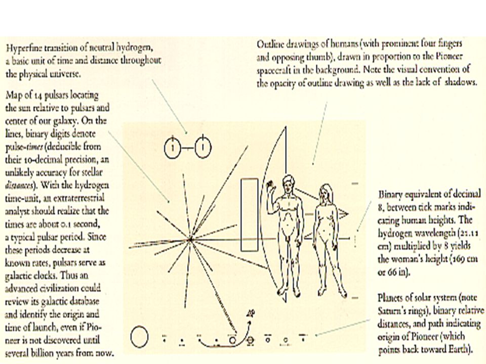
Visual Confections An eternal confection; the first confection to leave the solar system was engraved on a 15 by 23 cm gold-anodized aluminum plaque aboard the Pioneer 10 and 11 spacecraft launched in 1972 and 1973

Similar presentations


 Nevada Joint Union High School District Nevada Union High School September 23, 2013 Louise Johnson, Ed.D. Superintendent.>")


