Download presentation
Presentation is loading. Please wait.

1
DANGER!DANGER! Inappropriate use of colour can be disasterous to the application

4
Objectives By the end of the class you will be able to… Describe and explain guidelines for using text, colour, images, and sound Apply the guidelines to critique user interfaces.

8
Guidelines for Text Typeface: easier to read… –Sans-serif fonts (on screen) –Familiar fonts Size – not too big or too small –11-14 pt usually good Character Spacing – not too close or too far Line Spacing – more is better (to a point)
 –Familiar fonts Size – not too big or too small –11-14 pt usually good Character Spacing – not too close or too far Line Spacing – more is better (to a point)")
9
Which is easiest to read and why? What is the time?

10
Lightness Controls Legibility Drop Shadows Drop Shadow Larry Arend, colorusage.arc.nasa.gov Need an edge Courtesy of Maureen Stone

11
Colour guidelines #1 Red & blue together can be hard to read #2 Need lightness contrast for legibility

12
Why Should We Care? Poorly designed color is confusing –Creates visual clutter –Misdirects attention Poor design devalues the information –Visual sophistication –Evolution of document and web design “Attractive things work better” –Don Norman Courtesy of Maureen Stone

13
Perceptual Color Spaces Lightness Hue Colorfulness Saturation

14
Munsell Atlas HSV HLS

16
Colour guidelines #3 Avoid large areas of bright, saturated colour #4 To represent a numeric scale, use a range of saturation or lightness, not a rainbow (hue) - Hue order is learned, saturation & lightness are perceptual
 - Hue order is learned, saturation & lightness are perceptual")
18
What stands out?

20
0246299687402655762798638904567923276928546098 6772098908345798027907590470982790857908477290 8759082790875498709856749068975786259845690243 790472190790709811450 How many 3’s?

21
Context Normal Urgent Context Normal Urgent Context Normal Urgent Courtesy of Maureen Stone

22
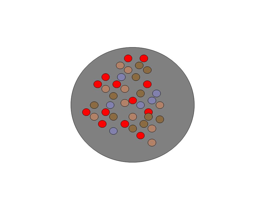
Colour guidelines #5 Use bright, saturated colours to draw attention. Contrast with dimmer colours or grey for less important items.

23
5 different colours 9 different colours

24
Colour guidelines #6 Only a few colours can be rapidly distinguished from each other.

25
Courtesy of Maureen Stone

28
Colour guidelines #7 How you perceive a colour depends on surrounding colours

30
Vischeck (www.vischeck.com) Simulates color vision deficiencies Web service or Photoshop plug-in Robert Dougherty and Alex Wade DeuteranopeProtanopeTritanope Courtesy of Maureen Stone

32
Cultural Guidelines

33
Colour guidelines #8 Beware of colour blindness (~ 8% of males, ~2% of females) #9 Beware of cultural meanings and use them appropriately
 #9 Beware of cultural meanings and use them appropriately")
38
Reasons to use images? Animation? Sound?

39
When could images, animation, or sound detract from usability?

44
SpaceTree

45
Key Points Use colour, images, animation, and sound to improve usability & aesthetics But use them sparingly and with care.

Similar presentations


 is very rare We’re usually talking.>")


 Lecture on Color for UI’s Use of Color in UI Design (not ready for distribution) laura leventhal.>")


