Download presentation
Presentation is loading. Please wait.

1
+ Visual Rhetoric Freshman Year

2
+ Why must we learn to examine visual text? Images a ubiquitous means of communication in our contemporary society. We are confronted with visual input from our everyday encounters with social media to the more subtle persuasion of the websites we visit to the overtly persuasive commercials online, in our theaters, print media and televisions. The study of visual rhetorical inquiry can include analysis of advertising, iconic or contemporary photography, film, maps, and web design.

3
+ Some questions that we might ask in examining visuals: Are pictures more emotional than words? Are words more informative than pictures? Do photographs provide more trustworthy evidence than words or other types of pictures?

4
+ What is Visual Rhetoric? It is the practice of analyzing and/or describing how images communicate meaning or advance arguments. We can apply some of the same terms that we use to analyze literary essays such as ethos, pathos, and logos. We can also look at the use of fallacies. However, we must also analyze visuals by looking at: Color – the archetypical nature of the chosen colors impacts the reader Arrangement – the organization of visual elements so that readers can see their structure Emphasis – making certain parts more prominent than others by changing its size, shape and color. Font Choice – choosing lettering styles to impact pathos Tone – tone reveals the designer’s attitude towards the subject matter Context – the context of the image impacts the reader’s relationship to the

5
+ Visual Rhetoric: 9 th Grade Focus Areas ethos, pathos, and logos fallacies color – the archetypical nature of the chosen colors impacts the reader Font choice – choosing lettering styles to impact pathos context – the context of the image impacts the reader’s relationship to the

12
+ Advertising may be described as the science of arresting the human intelligence long enough to get money from it. --Stephen Butler Leacock Advertising is legalized lying. --H.G. Wells WESTERN COLOR ARCHETYPES

13
+ RED Red is the color of fire and blood, so it is associated with energy, war, danger, strength, power, determination as well as passion, desire, and love

14
+ RED Red is a very emotionally intense color. It enhances human metabolism, increases respiration rate, and raises blood pressure. It has very high visibility, which is why stop signs, stoplights, and fire equipment are usually painted red.

15
+ RED Red brings text and images to the foreground. Use it as an accent color to stimulate people to make quick decisions; it is a perfect color for ‘Buy Now’ or ‘Click Here’ buttons on Internet banners and websites.

16
+ ORANGE Orange combines the energy of red and the happiness of yellow. It is associated with joy, sunshine, and the tropics. Orange represents enthusiasm, fascination, happiness, creativity, determination, attraction, success, encouragement, and stimulation.

17
+ ORANGE Orange increases oxygen supply to the brain, produces an invigorating effect, and stimulates mental activity. It is highly accepted among young people. As a citrus color, orange is associated with healthy food and stimulates appetite. Orange is the color of fall and harvest.

18
+ YELLOW Yellow is the color of sunshine. It’s associated with joy, happiness, intellect, and energy. Yellow produces a warming effect, arouses cheerfulness, stimulates mental activity, and generates muscle energy. Use yellow to evoke pleasant, cheerful feelings.

19
+ YELLOW Bright, pure yellow is an attention getter, which is the reason taxicabs are painted this color. When overused, yellow may have a disturbing effect; it is known that babies cry more in yellow rooms. Dull (dingy) yellow represents caution, decay, sickness, and jealousy.
 yellow represents caution, decay, sickness, and jealousy..")
20
+ GREEN Green is the color of nature. It symbolizes growth, harmony, freshness, and fertility. Green has a strong emotional correspondence with safety. Dark green is also commonly associated with money.

21
+ GREEN Green has great healing power. It is the most restful color for the human eye; it can improve vision. Green suggests stability and endurance. Use green to indicate safety when advertising drugs and medical products.

22
+ BLUE Blue is the color of the sky and sea. It is often associated with depth and stability. It symbolizes trust, loyalty, wisdom, confidence, intelligence, faith, truth, and heaven.

23
+ BLUE Blue is considered beneficial to the mind and body. It slows human metabolism and produces a calming effect. Blue is strongly associated with tranquility and calmness. Blue is a masculine color; according to studies, it is highly accepted among males. Dark blue is associated with depth, expertise, and stability; it is a preferred color for corporate America.

24
+ BLUE You can use blue to promote products and services related to cleanliness (water purification filters, cleaning liquids), air and sky (airlines, airports, air conditioners), water and sea (sea voyages, mineral water).
, air and sky (airlines, airports, air conditioners), water and sea (sea voyages, mineral water).")
25
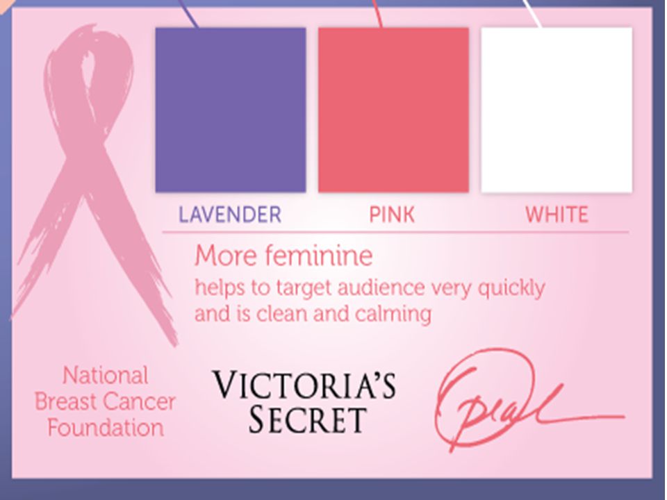
+ PURPLE Purple combines the stability of blue and the energy of red. Purple is associated with royalty. It symbolizes power, nobility, luxury, and ambition. It conveys wealth and extravagance. Purple is associated with wisdom, dignity, independence, creativity, mystery, and magic.

26
+ PURPLE According to surveys, almost 75 percent of pre- adolescent children prefer purple to all other colors. Purple is very rare in nature; some people consider it to be artificial. Light purple is a good choice for a feminine design. You can use bright purple when promoting children’s products.

27
+ WHITE White is associated with light, goodness, innocence, purity, and virginity. It is considered to be the color of perfection. White means safety, purity, and cleanliness.

28
+ WHITE In advertising, white is associated with coolness and cleanliness because it’s the color of snow. You can use white to suggest simplicity in high-tech products. White is an appropriate color for charitable organizations; angels are usually imagined wearing white clothes.

29
+ BLACK Black is associated with power, elegance, formality, death, evil, and mystery. Black is a mysterious color associated with fear and the unknown (black holes). It usually has a negative connotation (blacklist, ‘black death’).
. It usually has a negative connotation (blacklist, ‘black death’)..")
30
+ BLACK Black gives the feeling of perspective and depth, but a black background diminishes readability. A black suit or dress can make you look thinner. When designing for a gallery of art or photography, you can use black or gray background to make the other colors stand out.

31
+ Font Choice

32
+ John Maeda: How art, technology and design inform creative leaders Start at 4:40 http://www.ted.com/talks/john_maeda_how_art_technology _and_design_inform_creative_leaders.html

33
+ In a study conducted by Cornell psychologist David Dunning and New York Times writer Errol Morris, readers were asked whether they found various pieces of text believable. The differences in the texts? Only the typeface.

35
+ Context: It shapes our understandings

36
+

Similar presentations


 generally refers to patterns.>")


 in a text, perhaps a.>")


