Download presentation
Presentation is loading. Please wait.

1
How to use data visualization tools GateHouse Media News & Interactive

2
Agenda Why use interactives/graphics? When to use them How to use them Canva Piktochart Infoactive Google Fusion Table Others Google map Pie chart Timeline Creator Journalist’s Toolbox

3
Why use interactives/graphics Help your readers Sometimes text and photos aren’t the best or easiest ways for readers to digest information. Can put a focus on the facts or numbers that matter most. Helps your readers relate to the data. Puts information in context. e.g. Women’s Health graphic

4
Why use interactives/graphics There have been about 74 school shootings since Sandy Hook.

5
Why use interactives/graphics There have been about 74 school shootings since Sandy Hook.

6
When to use them You might need an interactive/graphic if: You want to show the bigger picture* You want to show relationships or patterns You want to compare something You want to show how something works You want to map something out You want to highlight a span of time *Info presented by Sara Quinn in a Poynter webinar, April 2013

7
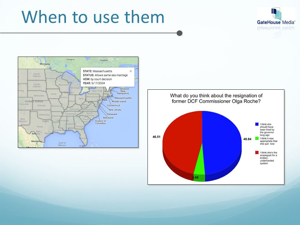
When to use them

10
When reading a budget entry or reporter’s story pitch, pay attention. These story summaries caught my eye: The RMV is increasing registration and inspection fees July 1 as part of an effort to close a MassDOT budget shortfall. Graphic that shows old fees and new fees. USED: Canva Regional project on childcare expenses in Massachusetts. Interactive showing various facts, figures USED: Piktochart

11
When to use them Story summaries that caught my eye: Baker’s raised the most, Coakley’s spent the most and Grossman has the most. Get the details on all 11 gubernatorial candidates’ campaign finances in this ASF Chart showing amount spent USED: Infoactive On May 17, it will have been 10 years since gay couples have had the right to marry in Massachusetts. Map showing same-sex marriage laws throughout USA. USED: Google Fusion Tables

12
When to use them Words that should catch your eye: Trigger words and phrases: “a link to data” “many locations” “over the years” “salaries” Some bizarre/specific item people may want basic facts on “parasitic flies” daffodils

13
How to use them RMV comparison of fees CANVA Canva.com Create a free account PROS Flexible – not locked in to a template Supportive – often emails tips and tutorials

14
How to use them RMV comparison of fees CONS You need to have a vision Blank canvas can be overwhelming Preview image may not match finished product Notice the mismatched arrows? Those looked fine in the preview. BEST FOR – Starting with a blank canvas because you have a vision.

15
How to use them Let’s try it out at canva.com …

16
How to use them Childcare expenses PIKTOCHART Piktochart.com Create a free account PROS Can select a template and plug in info as you go; spreadsheet or not. Can be used in print if no interactive info. Allows for multi-layers of info, apples and oranges.

17
How to use them Childcare expenses CONS Free themes are limited. If using a Google spreadsheet, have to “publish” it to use it. Spreadsheets need to be built in a specific way. BEST FOR – Variety of information, mix of facts, charts/images

18
How to use them Check it out on our site. Let’s try it out at piktochart.com …

19
How to use them Campaign finances INFOACTIVE Beta site. Log in: https://infoactive.co/plays/61 73/edit Sign up for an account Or contact nsimmons@wickedlocal.com to borrow hers. nsimmons@wickedlocal.com

20
How to use them Campaign finances PROS Easy to create if you have a spreadsheet built properly. E.g. 1 ANSWER PERCENT 2 Massachusetts 12 3 Connecticut 34 MUST start with a spreadsheet (either Excel csv file or Google spreadsheet) Infoactive spits out an interactive chart that you can tweak. Generates embed code and link
 Infoactive spits out an interactive chart that you can tweak. Generates embed code and link.")
21
How to use them Campaign finances CONS Spreadsheet must be set up well. Not printable May load a bit weirdly in Saxo BEST FOR – Bar charts, to show growth/change/difference

22
How to use them Let’s try it out at https://infoactive.co/plays/6173/e dit … https://infoactive.co/plays/6173/e dit File: “Test interactives spreadsheet”

23
How to use them Same-sex marriage map GOOGLE FUSION TABLES Must use with a personal gmail account; e.g. can’t be @wickedlocal.com account. Merges a spreadsheet of information with a map. Fusion help: https://support.google.com/fusiontables/answer/2571232?hl=en Fusion examples: https://sites.google.com/site/fusiontablestalks/stories

24
How to use them Same-sex marriage map PROS Produces interactive maps that are easy to navigate. Embeds well on a story page. Google offers tutorials and resources. Fusion help: https://support.google.com/fusiontables/answer/2571232?hl=en Fusion examples: https://sites.google.com/site/fusiontablestalks/stories

25
How to use them Same-sex marriage map CONS Can’t use work account. Online only feature. Need to work with “shapefiles” for the map which can be an issue if they’re not already available for what you need. Occasional bug makes info box text fall out of the box. US MAP: https://support.google.com/fusiontables/top ic/27018?hl=en

26
How to use them Let’s try it out at https://www.goo gle.com/fusionta bles/ … https://www.goo gle.com/fusionta bles/

27
How to use them Other tools “Regular” Google map Pie chart Timeline creator Journalist’s Toolbox

28
How to use them Other tools “Regular” GOOGLE MAP https://mapsengine.google.com Boundaries https://mapsengine.google.com/map/edit?mid=z2Zt5bNW3oG Y.k_vzkWhdZay0 https://mapsengine.google.com/map/edit?mid=z2Zt5bNW3oG Y.k_vzkWhdZay0 Points https://mapsengine.google.com/map/edit?mid=z2Zt5bNW3oG Y.kMzYZD7_zXvU

29
How to use them Other tools

30
How to use them Other tools PIE CHARTS http://piecolor.com Very basic Not embeddable Produces.png only http://nces.ed.gov/NCESKIDS/cr eateagraph/default.aspx Easy, intended for kids! exports in a variety of ways Can also do bar, line graphs Not embeddable

31
How to use them Other tools TIMELINE http://timeline.knightlab.com Example: http://www.milforddailynews.com/article/20140521/News/14052 9748

32
How to use them Other tools TIMELINE Fill out their spreadsheet template, providing dates, text and links to media. Follow steps on the site to make it publishable Embed on your site

33
How to use them Other tools JOURNALIST’S TOOLBOX “Date visualization, infographics and online journalism” Journaliststoolbox.org/a rchive/news-industry- sites

34
More information If you have questions or suggestions, contact New England Regional Digital Editor Nicole Simmons. nsimmons@wickedlocal.com ghnewsroom.com/blogs/nicolesimmons 508-626-3923

35
How to use data visualization tools GateHouse Media News & Interactive

Similar presentations