Download presentation
Presentation is loading. Please wait.

2
Six Fundamental Issues of Statistics in Theoretical & Methodological Context

3
1.Anecdotal accounts versus systematic evaluation of data. 2. Social construction of reality. 3. How data were collected. 4. Beware of lurking variables. 5. Variation is everywhere. 6. Conclusions are always uncertain.

4
What you’re going to know by the end of the fall semester: Descriptive statistics: how to describe the features of data you’ve collected Basics of graphs & tables Overview of sampling design Exploratory data analysis: describe the features of individual variables and the relationships between variables

5
Inferential statistics: how to draw representative samples; & how to use hypothesis tests, confidence intervals, and significance tests to estimate unknown characteristics of a population based on a sample. Basics of how to evaluate data & research.

6
What you’re going to know by the end of the spring semester:

7
Exploratory Analysis Exploring data to describe characteristics of individual variables and relationships between variables is a strength of statistical analysis.

8
OLS Regression For every additional year of education, monthly earnings increase by $76 on average, holding other variables constant. Females earn $13 less than males per month on average, holding other variables constant. That is, how to estimate the mean value of an outcome variable, based on the values of explanatory variables & in the context of hypothesis testing/inferential statistics.

9
Regression with a Categorical Dependent Variable For every higher category of educational attainment, the odds of voting Democrat instead of Republican increase by a multiple of 1.31 on average, holding other variables constant. That is, using explanatory variables to estimate the mean value of a categorical outcome variable (such as Democrat vs. Republican), in the context of hypothesis testing & inferential statistics.
, in the context of hypothesis testing & inferential statistics..")
10
But to get to those stages we’ll have to learn the basics of statistics: E.g., what are the types of variables? How are variables defined & measured? How should we collect data? How do we compute means & standard deviations, & what are their weaknesses? The five-number summary: how do we compute it, & what are its advantages? What are correlation & regression coefficients? How are they based on means & standard deviations? What are their weaknesses?

11
What is association? What is causation? What are the basic differences between experimental & observational research? What are the basic issues in probability & sampling? What are confidence intervals, & how do we compute them? What is the difference between statistical significance & practical significance?

12
What is hypothesis testing, & what are its pitfalls? What does it mean to say how one variable relates to another, ‘adjusting for other factors’? What does all of this have to do with the social construction of reality & with social research? What are the similarities & differences between quantitative & qualitative research?

13
The challenge is to use statistics to describe & analyze social relations. If a statistical procedure doesn’t contribute to describing & analyzing social relations, then— from the standpoint of the social sciences—don’t use it.

14
See this course’s slide presentation on ‘Evaluating Data Sets & Research.’ Read Babbie, The Practice of Social Research; & Ragin, Constructing Social Research. Let’s get started!!! More Preliminaries

15
At the Heart of Statistical Commonsense Utts & Heckard’s Statistical Ideas and Methods lays out ‘seven statistical stories with morals.’ Let’s peruse the stories & review their morals, because they underpin commonsense that’s easy to lose sight of when we start grappling with technical details, software, and social science perspectives.

16
1. Graph the data. 2. When discussing change in the rate/risk of something occurring, present the base rate or baseline risk. 3. A properly conducted random sample even of relatively small size can provide reasonably accurate information about a much larger population. 4. A representative sample is essential to making sound conclusions about a population’s characteristics.

17
5.Cause-effect conclusions can’t be made from observational studies. 6.Cause-effect conclusions can be made from properly conducted experiments, but the results can’t necessarily be generalized to a larger population. 7. There is a big difference between ‘statistical’ significance & ‘practical’ significance. Let’s keep these principles in mind.

18
What’s the difference between ‘descriptive’ & ‘inferential’ statistics? Descriptive statistics: summarizing the features of data. Inferential statistics: using principles of probability to make inferences from a random sample to a population. Moore/McCabe chaps. 1-2 emphasize descriptive statistics; chaps. 3-12 lead to & eventually emphasize inferential statistics.

19
Data (a plural word): observations that are put into informational context. Statistics: a set of procedures for collecting, organizing, & interpreting numerical data. Data, Statistics, Variables

20
Statistics turns objects into individuals (i.e. subjects or observations) for analysis. It analyzes the individuals (i.e. subjects or observations) as variables. Variable: any characteristic that can take different values for different individuals (i.e. different subjects or observations).
 as variables. Variable: any characteristic that can take different values for different individuals (i.e. different subjects or observations)..")
22
Two basic kinds of variables: Categorical (or qualitative) Quantitative (or measurement)
 Quantitative (or measurement)")
23
Categorical variable: assigns an individual (i.e. subject or observation) to a category or group. Two types of categorical variables: (1) Nominal: simply names—Black, Hispanic, Asian, or White. (2) Ordinal: ranks, but not according to any mathematical interval—low, middle, or high ses.
 to a category or group. Two types of categorical variables: (1) Nominal: simply names—Black, Hispanic, Asian, or White. (2) Ordinal: ranks, but not according to any mathematical interval—low, middle, or high ses..")
24
Quantitative variable: takes numerical values for which arithmetic operations such as adding or averaging make sense. Two types of quantitative variables: (1) Discrete: values only differ by fixed amounts (e.g., household size: 1, 2, … members) (2) Continuous: differences between two observations can be arbitrarily small (e.g., age: years>months> days>hours>minutes>seconds>milliseconds>…).
 Discrete: values only differ by fixed amounts (e.g., household size: 1, 2, … members) (2) Continuous: differences between two observations can be arbitrarily small (e.g., age: years>months> days>hours>minutes>seconds>milliseconds>…)..")
25
Two types of quantitative continuous variables: (1) Interval: equal intervals but no true zero point—e.g., Fahrenheit or Centigrade temperature. (2) Ratio: equal intervals with true zero point—years of age, weight, earnings (though debt may mean that ‘income’ has no true zero point).
 Ratio: equal intervals with true zero point—years of age, weight, earnings (though debt may mean that ‘income’ has no true zero point)..")
26
Why does type of variable matter? Because, as we’ll see during the year, different types of statistical procedures call for different types of variables (& vice versa).
..")
27
A variable’s frequency distribution (categorical or quantitative): tells us what values the variable takes & how often it takes these values. As we’ll see this year, specific statistical procedures are appropriate only for specific kinds of distributions. A Variable’s Frequency Distribution

28
Recall, in addition, that specific kinds of variables call for specific kinds of statistical procedures (& vice versa). So, in terms of applied statistics, we need to know (1) the type of variable and (2) the characteristics of its frequency distribution.
 the type of variable and (2) the characteristics of its frequency distribution..")
29
From the standpoint of social & policy sciences, moreover, a variable’s frequency distribution is a point of departure for examining social relations. E.g., what comments and questions might the distribution of income provoke?

30
Exploratory data analysis: how to describe frequency distributions of variables and relationships between these distributions. Examine each variable by itself (univariate analysis). Then examine the relationships between the variables (bivariate or multivariate analysis). Whether the analysis is univariate or bivariate/multivariate, begin by using graphs to describe patterns. Why?
. Then examine the relationships between the variables (bivariate or multivariate analysis). Whether the analysis is univariate or bivariate/multivariate, begin by using graphs to describe patterns. Why .")
31
We’ll begin by focusing on univariate exploratory analysis. In univariate analysis: Begin by examining each variable with graphs. If the overall graphic pattern is sufficiently regular, then use numerical summaries to describe it. We’ll start with univariate analysis of categorical variables. Then we’ll do univariate analysis of quantitative variables.

32
The ‘values’ of a categorical variable are simply labels (i.e. groupings): Black, Hispanic, Asian, White, Other Female, Male Protestant, Catholic, Jewish, Other
: Black, Hispanic, Asian, White, Other Female, Male Protestant, Catholic, Jewish, Other.")
33
What are the most basic questions we have to ask about such groupings?

34
How to describe a categorical variable: Frequency table (which is roughly equivalent to a graphic description) Bar graph Pie chart
 Bar graph Pie chart")
35
Frequency table Education: % of Persons Aged 25-34 Education % Less than high school12.00 High school30.00 Some college28.00 Bachelor’s22.00 Advanced 8.00 ___________________________ Total100.00 N=723

38
A frequency table, bar graph, or pie chart lists a categorical variable’s categories (‘values’) & gives either the count or percent of individuals (i.e subjects or observations) that fall in each category.
 & gives either the count or percent of individuals (i.e subjects or observations) that fall in each category.")
39
Frequency table Education: % of Persons Aged 25-34 Education % Less than high school12.00 High school30.00 Some college28.00 Bachelor’s22.00 Advanced 8.00 ___________________________ Total100.00 N=723

42
How to do it in Stata

43
. use hsb2, clear [to display the hsb2 data set]. tabulate race Freq. Percent Cum. hispanic 2412.00 12.00 african- 2010.00 22.00 asian 11 5.50 27.50 white 14572.50 100.00 Total 200100.00
![use hsb2, clear [to display the hsb2 data set]. tabulate race Freq.](http://images.slideplayer.com/13/3870075/slides/slide_43.jpg "Percent Cum. hispanic african asian white Total")
44
. tab race, plot hispanic, black, asian, whiteFreq. hispanic24********* african-20******* asian 11**** white 145********************************** Total200

45
. histogram race, discrete fraction gap(10) addlabel
 addlabel")
46
. tab race, generate(raced). graph pie raced*
. graph pie raced*")
47
Graphic options to describe a quantitative variable: stemplot: for small data sets (N<200 or so) dotplot boxplot histogram kdensity normal quantile plot
 dotplot boxplot histogram kdensity normal quantile plot")
50
How to do it in Stata

51
. stem math. dotplot math. gr box math. hist math, norm. kdensity math, norm. qnorm math, grid

52
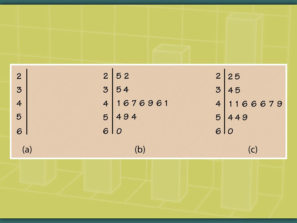
Stem-and-leaf plot for math 3t 3 3f 5 3s 7 3. 88999999 4* 00000000001111111 4t 22222223333333 4f 444455555555 4s 66666666777 4. 888889999999999 5* 000000011111111 5t 2222223333333 5f 444444444455555 5s 66666667777777777777 5. 88888899 6* 000001111111 6t 222233333 6f 44444555 6s 666677 6. 899 7* 01111 7t 2223 7f 55

53
. dotplot math

54
. gr box math

55
. hist math, norm

56
. kdensity, math norm

57
. qnorm math

58
It takes more than one kind of graph to explore a quantitative variable’s distribution. E.g., a histogram or a kdensity graph displays overall contour but may not clearly reveal potential outliers. E.g., a boxplot identifies outliers and key points of a distribution but does not capture its fine grain.

59
Another step toward bivariate analysis: how are the values of a quantitative variable distributed according to a categorical variable? E.g., the distribution of math test scores by female or male.

60
In Stata, here’s how to examine quantitative distributions by a categorical variable:. bys female: summarize math. bys female: summarize math, detail. bys female: stem math. graph box math, over(female, total) marker(1, mlabel(id)). dotplot math, by(female). tabulate female, su(math) Boxplots are generally the best way to examine quantitative frequency distributions by a categorical variable.
 marker(1, mlabel(id)). dotplot math, by(female). tabulate female, su(math) Boxplots are generally the best way to examine quantitative frequency distributions by a categorical variable..")
61
. gr box math, over(female, total)
")
62
How graphically to describe a quantitative variable’s frequency distribution: Look for overall pattern & striking deviations. Describe the overall pattern by its shape, center & spread. An outlier is an important kind of deviation.

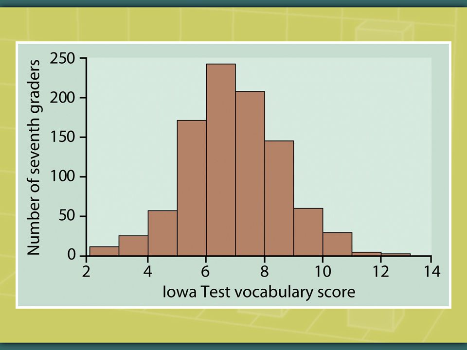
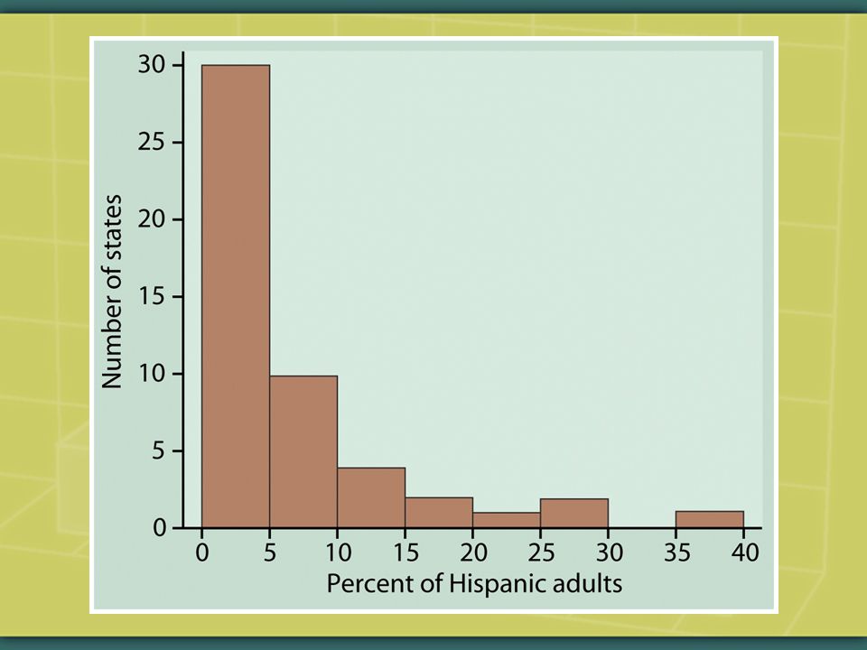
63
Shape: Does the distribution have one or more major peaks, called modes? Is it approximately symmetric, or is it skewed to the right (right or positive skew) or skewed to the left (left or negative skew)?
 or skewed to the left (left or negative skew) .")
66
Graphic descriptions lay the foundation for sound data analysis. But they don’t crisply summarize a distribution’s tendencies of shape, center, & spread. For this we need numerical summaries.

67
For a quantitative variable, if the graphic descriptions show that the distribution is more or less consistent in form (i.e., without pronounced skewness & outliers), then use appropriate numerical summaries to describe its shape, center, & spread.
, then use appropriate numerical summaries to describe its shape, center, & spread.")
68
Center: What values converge at the center? The mean: one way of summarizing the values that converge at the center for a quantitative variable.

69
The principal problem with the mean: it’s highly sensitive to a few (or more) extreme observations. That is, the mean is pulled strongly by skewness & outliers. Hence, the mean is not a resistant measure of a distribution’s center.

70
The principal alternative to the mean as a way of summarizing a quantitative variable’s distribution’s center is the median. The median: the midpoint of the distribution (50 th percentile), such that half the observations are smaller & the other half are larger.
, such that half the observations are smaller & the other half are larger..")
71
How to locate the median: list the observations from lowest to highest value; find the location of (n+1)/2. If the number of observations is even, the median is the mean of the two center values. Alternative method: list the observations from lowest to highest value; successively remove the lowest & highest value observations until you are left with a center value (or with two center values to average). Advantage of the median: it’s resistant to extreme observations, i.e. to skewness & outliers.
. Advantage of the median: it’s resistant to extreme observations, i.e. to skewness & outliers..")
72
Examples: Median Locate the median for each of the following. (i)1, 5, 7 (ii) 1, 2, 5, 7 (iii) 1, 2, 2, 7, 8 (iv) 8, -3, 5, 0, 1, 4, -1
1, 5, 7 (ii) 1, 2, 5, 7 (iii) 1, 2, 2, 7, 8 (iv) 8, -3, 5, 0, 1, 4, -1.")
73
For students registered at U.S. universities, which is larger: mean age or median age? Why?

74
In the following histograms, estimate the locations of the mean & the median. How close to each other or far apart are they, & why?

77
The mean, median, & mode (the value with the most frequent observations) are three kinds of averages (i.e. three measures of central tendency).
..")
78
Returning to mean and median, what does neither of them convey about a quantitative variable’s distribution?

79
Spread: dispersion around the center. Four basic measures of spread: Standard deviation: more on this later. Quartiles: 25 th & 75 th percentiles; more on these later. Minimum & maximum (i.e. range) Outliers: striking deviations from the overall pattern.
 Outliers: striking deviations from the overall pattern..")
80
Measures of spread: recall that univariate graphs reveal not only the center but also the shape and spread of a frequency distribution.

81
Spread, then, refers to dispersion around the center. Spread includes outliers, but a distribution’s minimum & maximum values are not necessarily outliers.

86
Recall that graphs such as histograms & kdensity are not the best at detecting outliers. Stemplots (for small numbers of observations) and boxplots are particularly good for detecting outliers.
 and boxplots are particularly good for detecting outliers..")
87
Definition of Outlier "Outliers are sample values that cause surprise in relation to the majority of the sample” (W.N. Venables and B.D. Ripley, Modern Applied Statistics with S, 119).
..")
88
Questions to ask about outliers: 1.Do they represent data errors? If so, correct or delete them. 2.Do they represent some group, phenomenon, or entity that is distinctive from the one you’re trying to examine? If so, perhaps delete them (or perhaps do another study to examine them). 3.Do they represent some divergent, insightful aspect of the relationship you’re studying? If so, keep them (but perhaps temper their influence).
. 3.Do they represent some divergent, insightful aspect of the relationship you’re studying. If so, keep them (but perhaps temper their influence)..")
89
Always examine the data both with & without the outliers. Consider reporting the results both with & without the outliers. Remember: if they don’t represent errors, outliers can yield important insights into the group, phenomenon, or entity that you’re studying.

90
Shape, center & spread: the five- number summary is the most resistant numerical summary of a variable’s distribution (i.e. most resistant to influence of skewness & outliers). Median: 50 th percentile Quartiles: low (25 th percentile) & high (75 th percentile) Range: minimum, maximum
. Median: 50 th percentile Quartiles: low (25 th percentile) & high (75 th percentile) Range: minimum, maximum.")
91
Inter-quartile range (IQR) is the 5-number summary’s substitute for standard deviation as a measure of spread around the center. IQR = upper quartile – lower quartile

92
Five-number summary includes a procedure for identifying outliers: Outliers = IQR x 1.5 The boxplot—which graphs the 5-number summary—is ideal for graphically displaying outliers as defined by IQR x 1.5.

93
The minimum & maximum are not necessarily outliers. They, as well as other observations that fall near them, are outliers only if they represent striking deviations from the overall pattern (defined by the five-number summary as IQR x 1.5).
..")
94
How to do it in Stata. summarize math, detail

95
math score Percentiles Smallest 1% 36 33 5% 3935 10% 4037Obs 200 25% 45 38Sum of Wgt.200 50% 52 Mean 52.645 Largest Std. Dev. 9.368448 75% 59 72 90% 65.573Variance87.76781 95% 70.575Skewness.2844115 99% 74 75 Kurtosis 2.337319

96
The downloadable ‘univar’ is a useful alternative way of summarizing a quantitative variable:. univar math -------------- Quantiles -------------- Variable n Mean S.D. Min.25 Mdn.75 Max --------------------------------------------------------------------------------------------- math 200 52.65 9.37 33.00 45.00 52.00 59.00 75.00

97
. tabstat math, stats(min p25 median p75 max) variable | min p25 p50 p75 max ---------+------------------------------------------------- math | 33 45 52 59 75 ‘q’, instead of p25 p50 p75, also displays quartiles. ‘iqr’ displays inter-quartile range. ‘tabstat’ is another useful alternative:

98
Boxplot: Graphic description of five- number summary Useful in general to compare distributions of two or more quantitative variables Does not display the fine-grain features of a distribution, but is ideal for displaying outliers as defined by IQR x 1.5.

100
. graph box math, marker(1, mlabel(id))
)")
101
. gr box read write math, marker(1, mlab(id))
)")
102
How to graph boxplots by a categorical variable. gr box math, over(female, total) marker(1, mlab(id))
 marker(1, mlab(id)).")
103
The five-number summary is the most resistant numerical description of a quantitative variable’s distribution. Why, then, is it not the most commonly used numerical description?

104
Because the mean & its associated measure of spread—the standard deviation—describe the shape, center & spread of an important type of distribution: the normal distribution. Another, related reason: they form the basis for computing two important statistics: correlation coefficients & regression coefficients. Let’s consider the standard deviation. Then we’ll consider linear transformations & the normal distribution.

105
Standard deviation: measures the average spread of the observations around a variable’s mean. 1. Compute the quantitative variable’s mean. 2. Subtract each observation’s value from the mean & square the result. 3. Add the results & divide by n – 1 (the figure obtained being the ‘variance’).* 4. Take the square root of the variance to obtain the standard deviation. * n – 1: ‘degrees of freedom,’ a measure of the available amount of statistical information. The more, the better.
.* 4. Take the square root of the variance to obtain the standard deviation. * n – 1: ‘degrees of freedom,’ a measure of the available amount of statistical information. The more, the better..")
106
Variance: Standard deviation:

107
Remember: there’s more to spread than just the range. There’s also standard deviation or inter-quartile range: measures of dispersion around a distribution’s center.

108
Two distributions have the same mean, but one has a larger standard deviation. How do their shapes differ? Can the standard deviation ever be zero?

109
Can the standard deviation ever be negative? For a set of positive numbers, can the standard deviation ever be larger than the mean?

110
The standard deviation cannot be negative, but it can be zero. If the standard deviation is larger than the mean, there are extreme values & possibly skewness. Ideally the standard deviation is about half the value of the mean. Answers See Freedman et al., Statistics.

111
Variance: Standard deviation:

112
Why do we use the standard deviation rather than the variance? Squaring the deviations makes them more tightly linked to the mean (i.e. the center). Squaring the deviations makes them correspond to the spread of the normal distribution. Squaring the deviations measures dispersion around the mean in the variable’s original scale (e.g., dollars, kilograms, SAT scores).
. Squaring the deviations makes them correspond to the spread of the normal distribution. Squaring the deviations measures dispersion around the mean in the variable’s original scale (e.g., dollars, kilograms, SAT scores)..")
113
Problem: the standard deviation, like the mean, is highly vulnerable to outliers, and its value is misleading if there’s notable skewness. Use the mean & standard deviation only when a quantitative variable’s frequency distribution is relatively symmetric & free of outliers. Otherwise it may be possible to apply remedial actions (e.g., transforming or removing outliers).
..")
114
For Future Reference: Coefficient of Variation This is not covered in Moore/McCabe/ Craig but is used when comparing the distributions of two or more sets of observations with differing measurement scales. It measures variation without reference to a data set’s measurement scale.

115
CV = standard deviation/mean How to do it in Stata. use hsb2, clear. tabstat math, stats(cv) variable | cv -------------------------- math |.1779551 --------------------------
 variable | cv math |")
116
‘tabstat’ is a flexible command for summarizing statistics—e.g., to summarize stats by a categorical variable:. tabstat math, stats(mean median sd min max) by(female) female meanp50 sdminmax male 52.94505529.6647843575 female 52.3945539.1510153372 Total 52.645529.3684483375
 by(female) female meanp50 sdminmax male female Total")
117
Summary 1.Graphically describe a frequency distribution’s overall pattern & striking deviations: its shape, center & spread (including outliers). 2.Among numerical descriptions, the five- number summary—median, quartiles & minimum/maximum—is the most resistant to extreme observations (i.e. to skewness & outliers).
..")
118
3. Use the mean & standard deviation only if the distribution is relatively symmetric & free of outliers (or possibly take remedial action to make it so). 4. If they don’t represent errors, outliers may yield important insights. 5. What are the implications of a variable’s distribution for understanding social relations & public policies?
. 4. If they don’t represent errors, outliers may yield important insights. 5. What are the implications of a variable’s distribution for understanding social relations & public policies .")
119
Next let’s consider linear transformations.

120
Linear Transformations The governor proposes to give all state employees a flat raise of $100 a month. What would this do to the average monthly salary of state employees, & to the standard deviation? What would a 5% increase in the salaries, across the board, do to the average monthly salary, & to the standard deviation? Let’s figure out how to answer these questions.

121
Linear transformations: change the original variable x into a new variable. The value of the transformed variable is given by the equation xnew=a + bx. a: constant b: slope

122
Adding the constant a (positive or negative) shifts all values of x upward or downward by the same amount but does not change measures of spread. That is, if you add the same number to every observation, that number just gets added to the average; the standard deviation, IQR, & range do not change.

123
Multiplying each by the positive a changes the size of all units of x’s measurement. That is, if you multiply every entry on a list by the same positive number, the average & the standard deviation get multiplied by that number.

124
How to do linear transformations in Stata? Let’s find out & look at an example of the principals we just introduced:. u hsb2, clear. su math. gen mathp10=math + 10. gen mathX10=math*10. dotplot math mathp10 mathX10. su math mathp10 mathX10

126
Variable | Obs Mean Std. Dev. Min Max ------------------------------------------------------------------------ math | 200 52.645 9.368448 33 75 mathp10 | 200 62.645 9.368448 43 85 mathX10 | 200 526.45 93.68448 330 750

127
Let’s next turn our attention to a tool whose purpose, like that of graphs & numerical summaries, is to help us grasp the main features of a distribution.

128
Density curve: an idealized, smooth curve that is always on or above the horizontal axis & has area exactly 1 underneath it.

131
Density curves may be symmetrical or asymmetrical, and in each case there are countless possible shapes. Density curves are idealized, smooth curves that help us look beyond the ragged details of a distribution to grasp its overall pattern. kdensity read, norm

133
A symmetrical, unimodal, & bell-shaped density curve is called a normal curve. This, however, is just one kind of density curve.

136
Here are the main features of density curves: The curve is always on or above the horizontal axis & has area exactly 1 underneath it. Median: divides the area under the density curve in half; it is the midpoint. Mean: the balance point of the density curve. The median & the mean are the same for a symmetric density curve, but not for a skewed density curve.

139
Any area under a density curve represents a proportion of a variable’s total number of observations. The Greek letter refers to the mean & the Greek letter refers to the standard deviation of a density curve.

140
Before we inspect some examples: Recall that, in a density curve, the median divides the area under the density curve in half while the mean is the ‘balance point.’ Recall, too, that the median & mean are located in the same place in a symmetrical density curve, but not in an asymmetrical density curve.

141
Let’s see how these features work in skewed density curves. In each of the following skewed density curves, which line represents the mean, which line represents the median, & which line is irrelevant? Why?

143
Answers (a) Mean is C; median is B (b) Mean & median are A (c) Mean is A; median is B
 Mean is C; median is B (b) Mean & median are A (c) Mean is A; median is B")
145
Next, let’s look at a normal distribution: a symmetrical, unimodal, bell-shaped density curve. Where is the mean & the median, & why?

148
Normal distributions: symmetrical, unimodal, & bell-shaped density curves, which, although their details may vary, always have the same overall shape. Is any symmetrical density curve a normal distribution? Draw three symmetrical distributions that aren’t normal curves.

149
Normal distributions—which are idealized forms—are accurately described by their mean & their standard deviation.

152
The previous two curves have different shapes. Why? Why, nonetheless, are they both normal curves?

155
Remember that any given area under a density curve represents a proportion of all a variable’s observations. Such an area of a density curve is relative to its total area, which equals 1.

156
Let’s look at such areas in a normal density curve.

159
In reality, no variable’s frequency distribution will be nearly as smooth as a density curve. That’s because a density curve is a conceptual tool: like graphs & numerical summaries, a density curve is a way of summarizing the overall pattern of a distribution.

160
Whether ‘normal’ or not, density curves stand with graphs & numerical summaries as ways of distinguishing a variable’s forest from its trees.

161
This brings us to the 68 – 95 – 99.7 Rule.

162
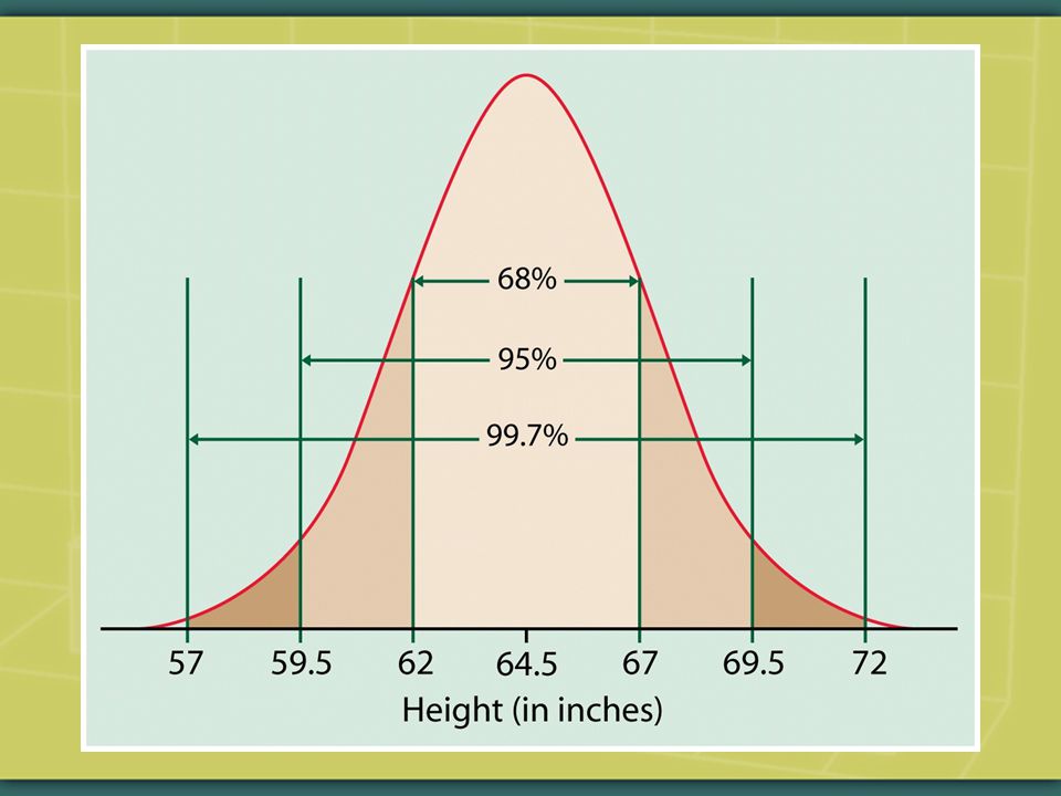
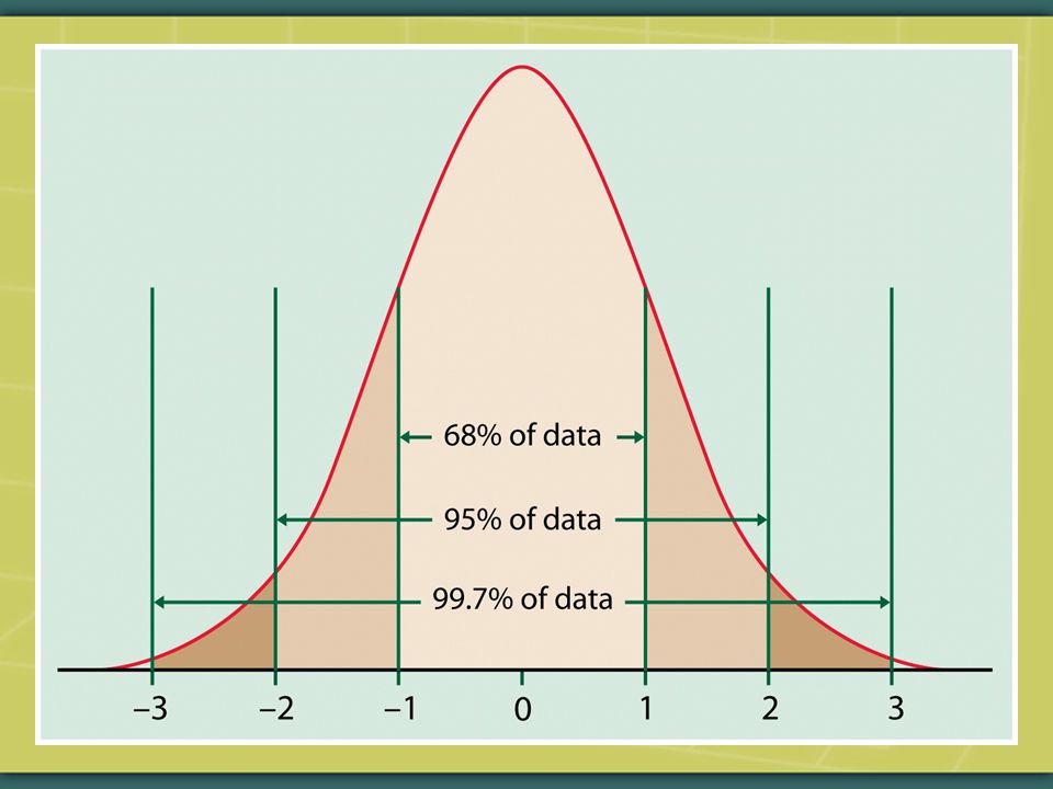
The 68 – 95 – 99.7 Rule About 68% of the observations of a normal curve fall within one standard deviation of the mean. About 95% of the observations of a normal curve fall within two standard deviations of the mean. About 99.7% of the observations of a normal curve fall within three standard deviations of the mean.

165
How does the 68 – 95 - 99.7 Rule pertain to the features of a density curve? And to what kind of density curve in particular does the rule pertain?

166
The Rule pertains to areas under a density curve, whose total area equals 1. Each area represents a proportion of the total number of observations. The Rule pertains specifically to one kind of density curve, the normal distribution.

167
For real-world data, the 68 – 95 – 99.7 Rule never truly characterizes a distribution. For real-world data it’s an approximation, but as we’ll see in future weeks, with enough observations the Rule commonly comes close enough to be used.

168
Here is a commonly utilized way of using proportions of the area under the normal distribution. E.g., you take your six-month old child to the pediatrician for a routine check-up. You are told that the child’s weight ranks at the 42 nd percentile of the weights of the population of children her age. E.g., you take the GRE. The results indicate that you scored at the 87 th percentile of the population of GRE-takers.

169
What do such percentiles mean? What do they have to do with density curves—in particular, with the normal distribution?

170
Answer: they are pegged to the standard normal distribution.

171
Here we’ll see in fact how approximations to the normal distribution are commonly used. We always need to verify empirically, though, that a real-world frequency distribution indeed approximates a normal curve.

172
Later on today we’ll see how one kind of graph—the normal quantile plot—is used to assess this approximation.

173
The standard normal distribution (or curve): it is the normal distribution with mean 0 & standard deviation 1. That is: N(0,1). The standard normal distribution is symmetric around the mean 0. Standardizing a variable: transforming the variable’s original unit of measurement (say, the baby’s weight, or your GRE score) to the mean & standard deviation of the standard normal distribution N(0,1).
. The standard normal distribution is symmetric around the mean 0. Standardizing a variable: transforming the variable’s original unit of measurement (say, the baby’s weight, or your GRE score) to the mean & standard deviation of the standard normal distribution N(0,1)..")
175
Another way of putting it: standardizing a value means transforming the original x- value (again, the baby’s weight, or your GRE score) to standard units to show how many standard deviations the original x- value is above or below the mean of the standard normal distribution N(0,1).
 to standard units to show how many standard deviations the original x- value is above or below the mean of the standard normal distribution N(0,1).")
176
That is, a standard score tells us how many standard deviation the original observation falls away from the mean of the standard normal distribution, & in what direction. How many standard deviations away from the mean of the standard normal distribution, & in what direction, does the baby’s weight fall? What about your GRE score?

177
Standardized scores enable us to compare the values of two or more variables measured in differing units (e.g., pounds versus inches) relative to their respective means.
 relative to their respective means.")
178
E.g., how does your baby’s weight compare to her height among the population of babies of that age? E.g., an SAT score of 543 versus an ACT score of 22?

179
The standardized values for any distribution always have mean 0 & standard deviation 1: that is, N(0,1). Observations larger than the mean are positive when standardized, & observations smaller than the mean are negative.

181
A standardized value is called a z- score. Transform an x-value (e.g., the baby’s weight or your GRE score) into a z-score as follows:
 into a z-score as follows:.")
182
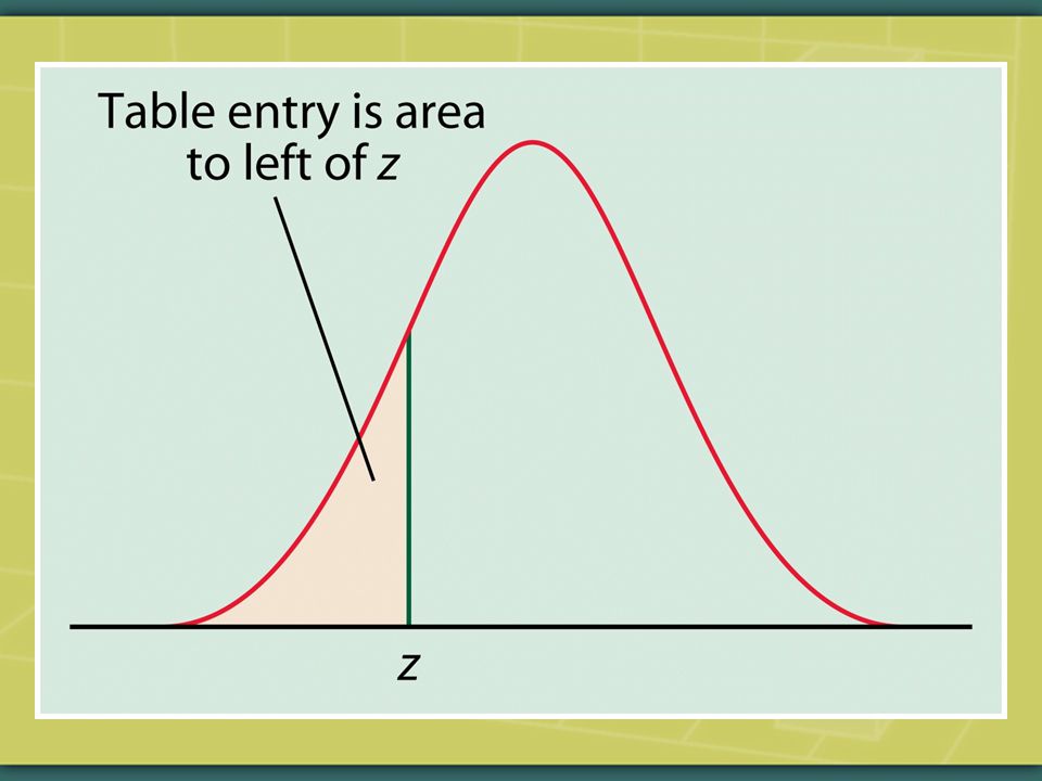
Then either consult the Standard Normal Table (Table A)—the old way of doing things—or, better, do a software computation to locate the z-score on the standard normal curve. The table entry or software output for each z-score gives the area under the standard normal curve to the left of the z-score.

184
In other words, your baby’s weight is converted into a z-score—a point on the horizontal axis relative to the mean of the standard normal distribution. The Standard Normal Table, or software computation, indicates that your baby weighs more than 42% of the population of babies of the same age: the area to the left of the z-score represents the 42% of the population of babies that weigh less than your baby.

185
Your GRE score is converted into a z- score—a point on the horizontal axis relative to the mean of the standard normal distribution. The Standard Normal table, or software computation, indicates that you scored higher than 87% of the population that takes the GRE: i.e. the area to the left of your z-score represents the 87% of the population that scored below you on the GRE.

188
Going in the opposite direction: how to transform a z-score back into the original x-value? = + (z-score* ) That is, how to convert the baby’s z- score back into her weight, & your z-score back into your GRE score?
 That is, how to convert the baby’s z- score back into her weight, & your z-score back into your GRE score .")
189
Examples: Standardization You give an exam to the large group of students in your course ‘The Metaphysics of Flathead Worms.’ The mean score is 50 & the standard deviation is 10. (i)Convert each of the following test scores to standard units: 60, 45, 75. (ii) Find the original-scale test scores that in standard units are: 0, 1.5, -2.8.
Convert each of the following test scores to standard units: 60, 45, 75. (ii) Find the original-scale test scores that in standard units are: 0, 1.5,")
190
Fill in the blanks: (a) The area between +/- ______ under the normal curve equals 68% of the total. (b) The area between +/- ______ under the normal curve equals 95% of the total. (c) The area between +/- ______ under the normal curve equals 99.7% of the total.
 The area between +/- ______ under the normal curve equals 95% of the total. (c) The area between +/- ______ under the normal curve equals 99.7% of the total..")
192
How to do it with Stata’s calculator

193
=50, =10 = 60. What is the z-score?. display (60 - 50)/10 1 So, z-score = 1.
/10 1 So, z-score = 1.")
194
What percentage of students on the standard normal distribution have z- scores lower than 1?. display norm(1).84134475 The answer =.8413 (i.e. 84.13% of the students have scores lower than z-score = 1)
 The answer =.8413 (i.e % of the students have scores lower than z-score = 1).")
195
What if you already know the score’s relative location on the standard normal distribution but you want to work backward to find the z-score?. di invnorm(.84134475) 1 (i.e. z-score = 1)
 1 (i.e. z-score = 1).")
196
A Standard-Normal Way to Assess Outliers For quantitative variables, here’s an alternative to the 5-number summary way of assessing outliers: (1) Standardize the distribution’s values. (2) If n 80, then +-3.0 might be considered an outlier.
 If n 80, then might be considered an outlier..")
197
How to do it in Stata. egen zmath=std(math). su math zmath. gr box zmath, marker(1, mlab(id)). list zmath if abs(zmath)>=3.0
). list zmath if abs(zmath)>=3.0.")
198
Some Questions about Distributions True or false? All density curves are symmetric. All symmetrical density curves are normal curves. All normal curves are standard normal distributions. All distributions of real data can appropriately be expressed as standard normal distributions.

199
Concerning Distributions in General Analyzing a frequency distribution’s shape, center & spread (including outliers) contextualizes each individual observation as part of an overall pattern (such as greater or lesser inequality, specific features of inequality). What are implications of such contextualization for understanding social relations & public policies?

200
Always graph a distribution before computing any statistic that is sensitive to skewness & outliers. E.g., always use graph a distribution to check for skewness & outliers before computing a variable’s mean or standard deviation.

201
A good practice is routinely to use more than one kind of graph (e.g., histogram & boxplot). One kind of graph may do better at displaying certain features of a distribution’s shape, center, and spread (e.g., histogram or kdensity) while another may do better at displaying potential outliers (e.g., boxplot).
 while another may do better at displaying potential outliers (e.g., boxplot)..")
202
How to do it in Stata. qnorm read, grid

203
. kdensity read, norm

204
. histogram read, norm

205
. dotplot read

206
. stem read 2. | 8 3* | 1 3t | 3f | 4444445 3s | 66677 3. | 99999999 4* | 11 4t | 222222222222233 4f | 444444444444455 4s | 6777777777777777777777777777 4. | 8 5* | 000000000000000000 5t | 222222222222223 5f | 45555555555555 5s | 77777777777777 5. | 6* | 0000000001 6t | 3333333333333333 6f | 555555555 6s | 6 6. | 88888888888 7* | 11 7t | 33333 7f | 7s | 66 Stemplots are useful for relatively small amounts of data.

207
. gr read box

208
1.How do we examine a frequency distribution for a quantitative variable? 2. What’s a density curve? What’s its purpose? 3. What’s a normal curve? 4. Are all symmetrical curves normal? Summary

209
5. What’s the relation of the mean & median in a normal curve? 6. What’s the 68-95-99.7 Rule for a normal distribution? 7. What’s a standard normal distribution? 8. What does it mean to standardize a value or a variable, & how do we do it?

210
9. What does standardization enable us to do for two or more variables that are measured in differing units? 10. What does it mean to unstandardize a value, & how do we do it? 11. Why should we first graph a distribution, & why should we commonly use more than one kind of graph?

211
12. How should we treat outliers? 13. What are the implications of a variable’s distribution for (a) applied statistics and (b) understanding social relations & public policies?
 applied statistics and (b) understanding social relations & public policies .")
212
Some Stata tips relevant to the Moore/McCabe homework problems To list the observed values of a dataset: list To list the observed values of a variable: list math To list the observed values of a variable in order from low to high: sort math list math To list the observed values from high to low: gsort -math

213
To see a data set in the spreadsheet: browse To see a variable in the spreadsheet: br math To graph, e.g., writing score by math score: scatter write math || qfit write math To graph write & math by a categorical variable: scatter write math, (by female) || qfit write math
 || qfit write math")
214
If a categorical variable won’t display graphically (because it’s coded as a ‘string’ [i.e. text] variable), do the following to create a new, ‘destringed’ variable to use in the calculations: encode gender, generate(gend) tabulate gend
, do the following to create a new, ‘destringed’ variable to use in the calculations: encode gender, generate(gend) tabulate gend.")
215
How to create a standard normal distribution of random data from scratch & then summarize, list, & graph the data:. clear. set obs 100 [# desired observations]. set seed 123 [to replicate the data]. generate newvar = uniform(). summarize newvar. list newvar
. summarize newvar. list newvar.")
216
. stem newvar. gr box newvar. dotplot newvar. kdensity newvar, norm. histogram newvar, norm. qnorm newvar, grid

217
Line graph:. twoway line pasadena year To set a graph’s y & x scales: twoway line pasadena year, ylabel(0(25)100) xlabel(1950(25)2000)
100) xlabel(1950(25)2000).")
218
Remember First graphically then—if the distribution is sufficiently regular—numerically describe a quantitative variable’s frequency distribution. If the shape is quite skewed, use the five- number summary as the numerical description. Describe the distribution in terms of shape, center, & spread, including outliers.

219
There’s more to spread than minimum & maximum. The minimum & maximum aren’t necessarily outliers.

Similar presentations


>")
 Variable: Characteristic of an individual. It can take.>")
: Analysing data.>")


