Download presentation
Presentation is loading. Please wait.

1
In this demo the following features in LatentiX will be demonstrated addition of variables from external files via the clipboard renaming variables deleting variables handling category variables colouring plots by variables and sets creating calibration- and validation-sets (using “Set composer”) creating object- and variable sets (using “Create sets”) variable selection (Principal Variables) making predictions plotting the prediction results transferring results (tables and plots) to reports and more... The demodata is avaible from the internet:

2
The original paper See also: http://home.ccr.cancer.gov/ncifdaproteomics/ppatterns.asp

3
Comments to the paper There might be some problems with the experimental design...

4
Respons to comments

5
From: http://www.mathworks.com/products/bioinfo/demos.html?file=/products/demos/shipping/bioinfo/mspreprodemo.htmlhttp://www.mathworks.com/products/bioinfo/demos.html?file=/products/demos/shipping/bioinfo/mspreprodemo.html With the MATLAB® Bioinformatics Toolbox® the data are pre-processed: Let’s look at the data in LatentiX:

6
Load the dataset from the “Demo datasets” menu. Note: the number of available datasets can vary

7
The dataset consist of 216 objects and 4000 measured variables. The category variable is found in a separate Excel-file, and is added to the instrumental data.

8
Open the Excel-file, mark the range and select CopyReturn to LatentiX and select “Add variables from clipboard...” Open the Excel-file: Ovarian_cancer.xls

9
Change the numeric value corresponding to “Normal” to “0” (zero) Because some of the imported data are non-numeric, you can automatically create a category variable
 Because some of the imported data are non-numeric, you can automatically create a category variable")
11
Give the variable a better name:

12
NOTE: Due to a bug in LatentiX, you have to import at least two variables, and then delete the unnecessary variable afterwards. Delete the variable “obj. no.”:

13
We now have 216 objects and 4001 variables, the last one being the category variable “Cancer”. It’s a good time to save the data on the disk – here the data is saved in the folder “C:\temp\My Latentix files”

14
De-select the variable “Cancer” by holding the Ctlr-button down while clicking on its name in the variable list box. Next autoscale the instrumental variables.

15
The plot is immediately updated

16
Select PLS as model type

17
Click on “Y”

18
Select “Cancer” as the Y-variable

19
Click “Calculate” Choose CV: Random (repeated) as validation method
 as validation method")
20
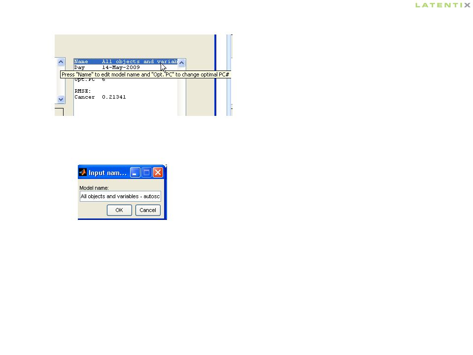
Give the model a good name: click on “Name”

22
Let’s have a look on the scores-plot It’s a good idea to take a note!

23
There seems to be some discriminating power in the 4000 variables We now create two object sets “Healthy” and “Sick” Select “Color according to” “Continous” and select “Cancer”

24
Go to the workbench and select Objects, Create sets (shortcut: ALT+O, C) :
 :")
25
In “Criteria 1” select “Where Cancer == 0” click “Create sets” and give the set a name “Cancer == 0” is suggested, but change it e.g. to “Healthy” and click OK

26
In “Criteria 1” now select “Where Cancer == 1” and follow the same procedure...

27
We look at the scores again now colouring by the two sets:

28
We get - of cause - the exact same plot, but the legends are more meaningful We have used all 216 objects and all 4000 variables until now. To avoid over-fitting when selecting “good” subsets of variables, we will split the objects into a calibration- and a validation set. For that purpose, we use the “Set composer...” Select “Color according to” “Sets” and select the two new sets “Healthy” and “Sick”

29
Go to the workbench and select Objects, Set composer (shortcut: ALT+O, O) :
 :")
30
Sort by “Data value”

31
Select “Cancer” Right-click in “Search result” NOTE: You might have to selected “Sort method: Alphabetic” once and then again “Sort method: Data value” to get the shown picture

33
Click “Exit”

34
Calculate the Principal Variables. It is very important, that this is based on the calibration set only – beware of over fit! Select matrix X to enable the menu “Principal Variables” (only available in the full version)
.")
35
Select the 16 variables, which are most descriptive for “Cancer”. These 16 variables describe 90% of the total variation. Click “Select in workbench” and close the window

36
When the “Principal variables” window is closed, the 16 important variables are highlighted in the variables box. It is convenient to define a set of these variables. Select:Variables, Define set... in the workbench and write a name, e.g. “PV-16”

37
Select “Color by Cancer”

38
Calculate a new PLS-model using only the calibration set “CAL” (162 objects) and only the 16 principal variables “PV-16”. Use the same settings (validation method etc.) as before and give the model a good name. Choose Plot, Scores to see the scores plot
 as before and give the model a good name. Choose Plot, Scores to see the scores plot.")
39
The subset of 16 principal variables gives a better discrimination between sick and healthy people than did the 4000 original variables. A lot of noisy and irrelevant variables have been removed. We will now test the model on the independent objects. I.e. objects that have not participated in the selection of variables nor in the PLS-model. Go to the workbench and make a prediction of the set “VAL” using the PLS-model based on the set “CAL”: Select “Options, Lines on selected sets” to emphasise the grouping

40
12345

42
A clear distinction between sick and healthy is also seen among the independent validation objects. Thus, the selected variables are interesting and could maybe be worth a closer study. You might want to make plots of loadings or regression coefficients and copy it to the Windows clipboard or directly to PowerPoint – see the next slides:

43
Make a Loadings plot and select “Tables, Current plot” (ALT+T, C). Paste into Excel. Select “Plots, Copy plot to PowerPoint” (ALT+P, O) or “Plots, Copy plot to Clipboard” (ALT+P, D)
 or Plots, Copy plot to Clipboard (ALT+P, D).")
44
You could also look at the regression coefficients (the plot is pasted into Excel from the clipboard):
:")
45
THE END Note, that the group Healthy is measured at day #1, whereas the group Sick is measured at day #2 and #3. Thus, we can not be tell, whether the revealed effects are due to human disease or to changes in the instrument - this is a problem. The principles shown in this demo are, however, valid.

Similar presentations


 3.5 Pre-Defined & Ad hoc Reports November 2009 ITCSO Training Academy.>")

![Quick guide to PCA Use [Alt-Tab] to go to LatentiX (if running) Press [Page Down] or [Enter] to continue Press [ESC] to end the show.](/15/4512434/big_thumb.jpg "Quick guide to PCA Use [Alt-Tab] to go to LatentiX (if running) Press [Page Down] or [Enter] to continue Press [ESC] to end the show.>")


>")


