Download presentation
Presentation is loading. Please wait.

1
Advanced FRED: Doing more with the data Katrina Stierholz June 7, 2010

2
Using the scenarios… You’ve learned how to ◦ Add a series ◦ Change units ◦ Set dates ◦ View and download data ◦ Save as pdf, capture the link Now we’ll go deeper ◦ Review/repeat some from first session ◦ Find data series with different data types ◦ Transform series ◦ Set up user accounts ◦ And, practice working with FRED

3
FRED data http://research.stlouisfed.org One nifty feature: if you are ever unsure of the measure to use for data, this FRED At a Glance will give you the generally accepted way of presenting data. E.g., for CPI, it indicates that the measure is % change from year ago. That can come in handy at times.

4
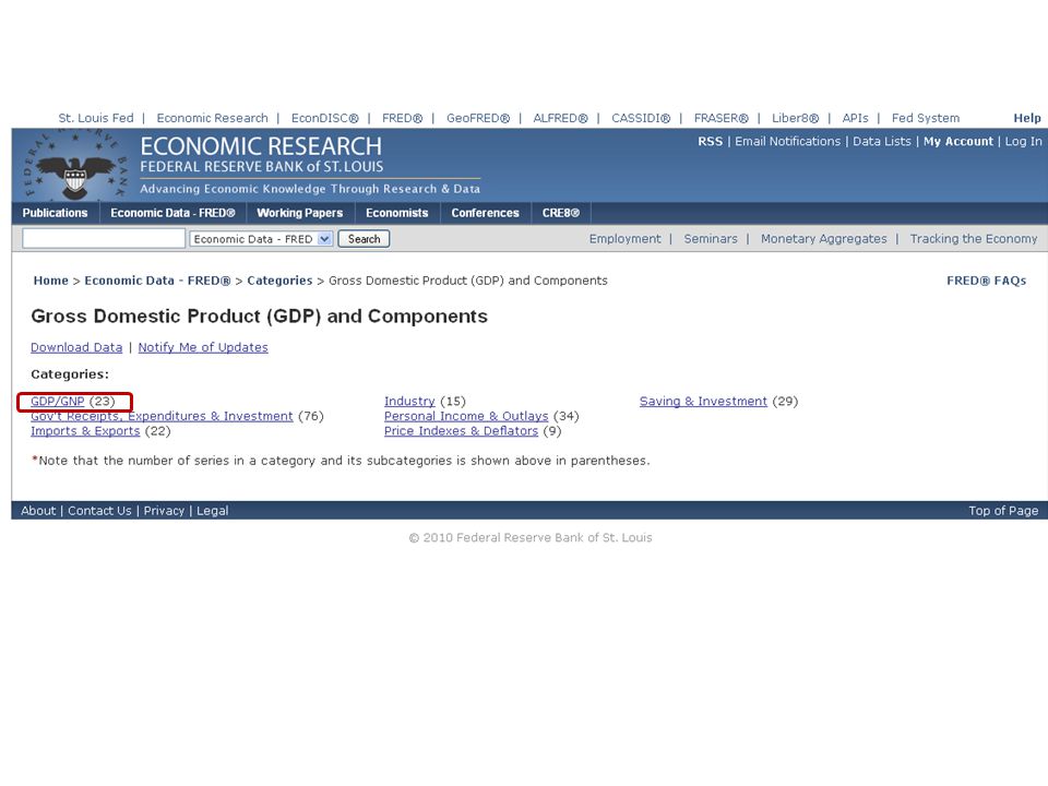
Regional data has its own category Check updates Search for data by category Discover popular series On FRED, users can:

5
Practice FRED I want to understand inflation a little better Many economists use CPI (Consumer Price Index) to evaluate inflation There are two ways of looking at inflation: ◦ Headline (that’s everything) ◦ Core (takes out food and energy) So, let’s use FRED to compare the two Please do this on your computer with me
 to evaluate inflation There are two ways of looking at inflation: ◦ Headline (that’s everything) ◦ Core (takes out food and energy) So, let’s use FRED to compare the two Please do this on your computer with me")
6
FYI—PPI is the price index for wholesale prices.

8
This is the “headline” CPI graph, as an index. To make changes, click on “Edit” Graph

9
To put the “core CPI” on this graph, we add a data series

10
You can either type in significant words, or use the Browse feature to find data.

11
We have both index numbers on the graph, but I’d like to see the percent inflation, year over year.

12
This is where we change the units displayed to percent change from a year ago.

13
Must be changed on both lines, and then click on Redraw Graph

14
Core CPI and Headline CPI. You can see how much more volatile the Headline CPI is, compared to the Core CPI (but that they also move in tandem).
..")
15
This one on your own First, find Real GDP ◦ What is GDP, you ask? The most commonly used measure of our national economy ◦ What are the elements that measure GDP? personal consumption expenditures; private domestic investment (investment by companies and households in big things, like factories or houses); net exports (exports minus imports); government spending ◦ What’s “Real” about it? (See Economic Snapshot from Inside the Vault).
; net exports (exports minus imports); government spending ◦ What’s Real about it. (See Economic Snapshot from Inside the Vault)..")
16
The news release from BEA

17
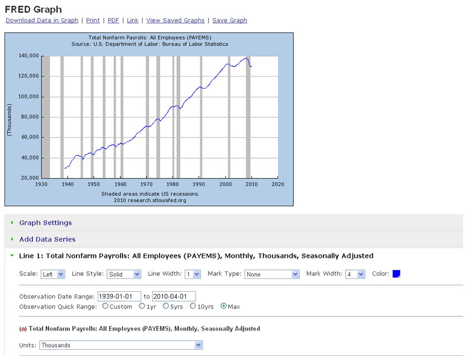
Once you’ve found real GDP… We’ll look at Real personal consumption expenditures and add it to the graph Then we’ll do a little work to show how to put them on the same line, one as a percent of the other.

18
Using the data category option

22
Basic options for graphs

23
Information about the data

24
Clicking on any of the options here will bring up the graph in its edit form (so you don’t have to just pick “Edit”)
")
25
Once you’ve found real GDP… Add Real personal consumption expenditures Click on “Add a Data Series” ◦ Add it to Line 1 Then we’ll do a little work to show how to put them on the same line, one as a percent of the other.

27
Clearly, personal consumption is a large part of our GDP. Hmmm… how large?

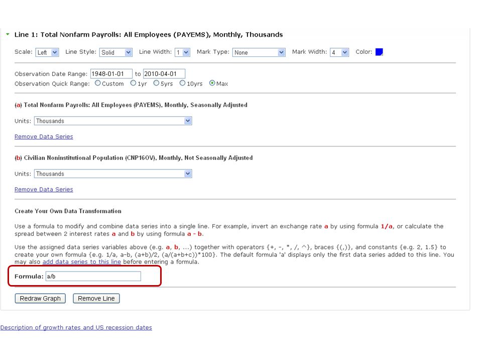
28
Here’s where we do a transformation First, we actually have to remove the consumption line Then, we add the consumption data to the gdp line (I’ll show you) Then, we do the math.
 Then, we do the math.")
29
Now that we know about it, we need to remove it as a separate line and put it on the same line as GDP.

30
Click on Add Data Series, and Choose to put it on Line 1. Once you indicate that, it will only allow a series with the same frequency

31
Series choices are now limited to quarterly series.

32
FRED immediately bounces you down to the bottom, so you can fill in the formula, which is based on the “a” and “b” designation above.

33
So, I’m dividing real PCE/GDP to show the percent of our GDP that consists of consumption.

34
Real Personal Consumption Expenditures as a percent of Real GDP

35
More transformations What percent of the population that is over 16 is employed? What’s the percent of unemployed persons who’ve been unemployed for a long time?

36
Basic payroll employment data

37
Some changes to help improve readability

42
Percent of our civilian >16 population that is employed.

43
To save your work, use the “save” feature on nearly any screen. This will save what you’ve done so you only have to do it once.

46
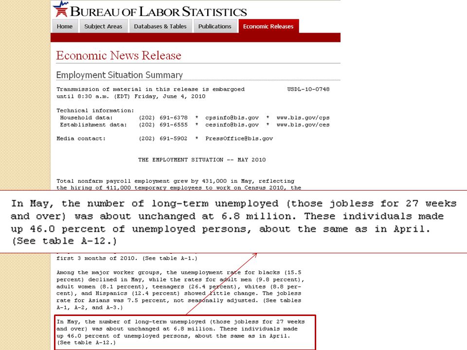
Now, a transformation to look at the long-term unemployed

49
I have peeked, and know that the series we want are in the household survey section. We could have used the search feature… but this works, too

50
This one will require adding together all of the unemployed, and then figuring out the proportion over 27 weeks.

51
I’m starting with the most recently unemployed. I think that will be easier for me to add the others in order (I can be forgetful). To get started, I click Edit
. To get started, I click Edit.")
52
And, then I just kept adding the series for the various weeks unemployed to Line 1

53
Now I have them all, so I need to scroll down to do the transformation.

55
So, we can now see how many long term unemployed there are as a percent of all unemployed (over 40%, and way more than we’ve seen in past recessions).
.")
56
Data download This is the information, downloaded from the FRED page Notice that I have downloaded the data in the graph (not the original data, but the transformation)
")
57
One issue: you can’t have different time periods or frequencies Great article, great idea But… even though we have annual GDP and federal debt data, the federal debt data is fiscal year and GDP is calendar year These would need to be downloaded in Excel and then transformed there

58
Powerpoint To capture screen shots ◦ For now, use print screen ◦ Good news! According to web reports, there will be a screen capture for powerpoint and MS Word in their 2010 versions.

59
Practice more transformations GDP per capita (use nominal GDP and divide by population) ◦ Compare that to some states’ GDP per capita (those numbers are already in FRED). Percent of population in the labor force that has been unemployed more than 26 weeks (UEMP27OV / CLF16OV) ◦ You could add some other durations (so compare that to the percent that have been unemployed less than 5 weeks)
 ◦ You could add some other durations (so compare that to the percent that have been unemployed less than 5 weeks).")
60
Keep on… We’d like you to continue practicing with FRED First, if you can (have access to your email), set up a user account and save your work. Then, here are some possibilities (if you are looking for ideas) ◦ Compare unemployment across a couple (or more) regions ◦ Compare short-term unemployed (less than 5 weeks) to long-term unemployed (more than 27 weeks) ◦ Compare overall retail sales with e-commerce sales (this can’t be transformed… they are two different frequencies) ◦ Or, check out the St. Louis Fed Stress Index—a new measure of the stress on financial markets.
 ◦ Compare unemployment across a couple (or more) regions ◦ Compare short-term unemployed (less than 5 weeks) to long-term unemployed (more than 27 weeks) ◦ Compare overall retail sales with e-commerce sales (this can’t be transformed… they are two different frequencies) ◦ Or, check out the St. Louis Fed Stress Index—a new measure of the stress on financial markets..")
Similar presentations


 = $11,814.9B (5.5%) Q2: GDP = $2,914.38.>")


