Download presentation
Presentation is loading. Please wait.

1
Improving Data, Improving Outcomes New Orleans, LA August 16, 2016
See what I mean? Creating engaging and effective data products, presentations, and reports Kerry Belodoff, DaSy Center Taletha Derrington, DaSy Center & NCSI Kellen Reid, DaSy Center Alice Ridgway, Connecticut Birth to Three System Improving Data, Improving Outcomes New Orleans, LA August 16, 2016

2
Session Outline Welcome & Introduction
Principles of Presenting Data Effectively Tour of DaSy-NCSI Data Visualization Toolkit State Data Visualization in CT Roll Up Your Sleeves Hands-on Activity

3
Who’s in the Room? To participate in the poll: 1) Text DASY to 22333
Or 2) Log on to Pollev.com/dasy
 Log on to Pollev.com/dasy.")
4
Poll Question 1 What is your role? State Part C Coordinator
State Part C Data Manager State 619 Coordinator State Part B/619 Data Manager Other State-Level Program Staff TA Provider Other

5
Poll Question 2 How often do you produce data products in your role?
Almost Never Occasionally All the Time

6
Poll Question 3 How would you describe your data visualization skills in one word?

7
Data Visualization & the DaSy Framework
Quality Indicator DU3: Part C/619 state and local staff or representatives prepare data products to promote understanding of the data and inform decision-making.

8
What is Data Visualization?
The representation and presentation of data or information to facilitate understanding.

9
What is Data Visualization?
The representation and presentation of data or information to facilitate understanding.

10
What is Data Visualization?

11
Good Data Visualization…
Portrays data accurately & clearly Facilitates understanding Is engaging and attractive Is accessible Promotes data use

12
Share Out What have been your greatest challenges in creating data visualizations? What have been your greatest successes in creating data visualizations?

13
Portray Data Accurately
"Many a statistic is false on its face. It gets by only because the magic of numbers brings about a suspension of common sense,“ Good visualization is trustworthy

14
Portray Data Accurately (not-so) Gee-Whiz Graph
 Gee-Whiz Graph")
15
Portray Data Accurately Gee-Whiz Graph

16
Portray Data Clearly Bad Example

17
(not so) Engaging & Attractive
 Engaging & Attractive")
18
Engaging & Attractive

19
Facilitate Understanding

20
Facilitate Understanding
Nap Hours per Day. While other companies experience TGIF syndrome, our team is almost three times more alert on Fridays than Mondays

21
Is Accessible See accessibility tips in each section of toolkit
Visualizations are by their very nature images Use the principles of data visualization to create your “alt text” description Visit the Color tab in the toolkit for ideas on color Use a color contrast checker Consider how the data visualization will be presented With your audience in mind, consider the need for multiple formats beyond “alt text”

22
Promotes Data-Based Action
Bad Example

23
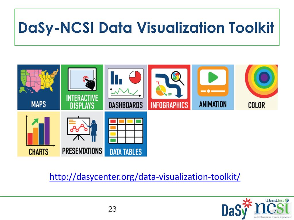
DaSy-NCSI Data Visualization Toolkit
24
Connecticut Example

25
Children with IFSPs on the First of each Month since FY10
Jul 4797 4648 4540 4507 4500 4721 4749 Aug 4773 4605 4490 4495 4516 4722 4702 Sep 4714 4573 4513 4463 4499 4649 4681 Oct 4685 4524 4417 4435 4624 4680 Nov 4671 4503 4409 4432 4442 4662 4700 Dec 4717 4474 4425 4415 4689 4770 Jan 4659 4446 4396 4354 4480 4665 4724 Feb 4654 4405 4399 4335 4469 4629 4684 Mar 4603 4397 4470 4343 4517 4715 Apr 4651 4449 4482 4393 4620 4668 4764 May 4726 4498 4538 4424 4753 4803 Jun 4679 4553 4561 4481 4698 4763 4855

26
Children with IFSPs on the First of each Month since FY10
Jul 4797 4648 4540 4507 4500 4721 4749 Aug 4773 4605 4490 4495 4516 4722 4702 Sep 4714 4573 4513 4463 4499 4649 4681 Oct 4685 4524 4417 4435 4624 4680 Nov 4671 4503 4409 4432 4442 4662 4700 Dec 4717 4474 4425 4415 4689 4770 Jan 4659 4446 4396 4354 4480 4665 4724 Feb 4654 4405 4399 4335 4469 4629 4684 Mar 4603 4397 4470 4343 4517 4715 Apr 4651 4449 4482 4393 4620 4668 4764 May 4726 4498 4538 4424 4753 4803 Jun 4679 4553 4561 4481 4698 4763 4855

27
Children with IFSPs on the First of each Month since FY10

28
Children with IFSPs on the First of each Month since FY10

29
Children with IFSPs on the First of each Month Area Chart

30
Children with IFSPs on the First of Each Month

31
Children with IFSPs on the First of Each Month

32
Children with IFSPs on the First of Each Month

33
Families Supported by Contracted Programs & Early Connections

34
Service to Children with Autism Insured by Medicaid

35
Roll Up Your Sleeves Infographics Animation Maps Charts
Interactive Displays

36
Entering Your Topic Room
Infographics (Breakout 1) Animation (Breakout 2) Maps (Breakout 3) Charts (Breakout 4) Interactive Displays (Breakout 5)
 Animation (Breakout 2) Maps (Breakout 3) Charts (Breakout 4) Interactive Displays (Breakout 5)")
37
Reactions & Questions

38
Want to Learn More about DaSy & NCSI?
Visit the DaSy website at: Follow DaSy on Like DaSy on Facebook: Visit the NCSI website at: Follow NCSI on

39
The contents of this presentation were developed under grants from the U.S. Department of Education, # H373Z and H326R However, those contents do not necessarily represent the policy of the U.S. Department of Education, and you should not assume endorsement by the Federal Government. DaSy Center Project Officers: Meredith Miceli and Richelle Davis. NCSI Project Officers: Perry Williams and Shedeh Hajghassemali.

Similar presentations


? Missy Cochenour (DaSy.>")


![Equity, Inclusion, and Opportunity: Getting Results by Addressing Success Gaps [PRESENTATION 2-4: ADD DATE]](/42/11443391/big_thumb.jpg "Equity, Inclusion, and Opportunity: Getting Results by Addressing Success Gaps [PRESENTATION 2-4: ADD DATE]>")


 Process Professional Development Tools>")
 CLASS 68>")
