Download presentation
Presentation is loading. Please wait.

1
Designing with a Grid The key to good layout design

2
The Grid A one column grid is very simple. It is one column that contains both text and images Often used in novels The single column is contained within the margins on either side of the column A one column grid is very simple. It is one column that contains both text and images Often used in novels The single column is contained within the margins on either side of the column

3
The Single Grid Here is a single column grid with increased spacing in the margin. The column width is more inviting to read The adequate margin/white space makes the type less overwhelming Here is a single column grid with increased spacing in the margin. The column width is more inviting to read The adequate margin/white space makes the type less overwhelming

4
Two and Three Column Grids Multiple column grids allow for more flexibility and creative use of space. Most magazines and illustrated books use 2+ columns in their design Text and images may occupy one or more columns Illustrations may even run off the page. This is called a bleed Multiple column grids allow for more flexibility and creative use of space. Most magazines and illustrated books use 2+ columns in their design Text and images may occupy one or more columns Illustrations may even run off the page. This is called a bleed

5
Two and Three Column Grids The columns that make up a grid can vary in width. There has to be a set margin between columns that is consistent throughout the design

6
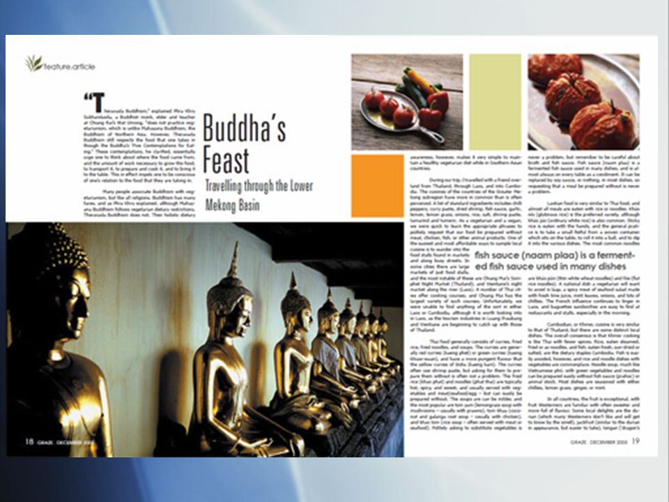
Two and Three Column Grids Here is a three column grid design Ample space is left at the top of the page for chapter heads 2 columns are used for text and illustrations The narrow column is used for captions Here is a three column grid design Ample space is left at the top of the page for chapter heads 2 columns are used for text and illustrations The narrow column is used for captions

7
Two and Three Column Grids Some publications use more than one grid. However, certain margins are shared in these formats to provide visual consistency

8
Components of a Print Design Display Type: the type used to attract attention, usually above 14 points in size Text Type: Main Body type usually 14 points are smaller Captions: Explanatory text accompanying illustrations or other images Folios: Page number Illustrations: General term for any form of a drawing, diagram, photographs, or colored images that serve to enhance a printed piece Display Type: the type used to attract attention, usually above 14 points in size Text Type: Main Body type usually 14 points are smaller Captions: Explanatory text accompanying illustrations or other images Folios: Page number Illustrations: General term for any form of a drawing, diagram, photographs, or colored images that serve to enhance a printed piece

9
Two Page Spread A two-page spread is a printing convention that represents leading and trailing pages in a bound or folded project such as a book, booklet, newsletter, or greeting card. Often, the pages in a two-page spread mirror one another.

Similar presentations