Download presentation
Presentation is loading. Please wait.

1
AWT AWT stands for Abstract Windowing Toolkit. It contains all classes to write the program that interface between the user and different windowing toolkits. You can use the AWT package to develop user interface objects like buttons, checkboxes, radio buttons and menus etc. AWT also contains the standard controls and layout managers defined by Java. The AWT classes are contained in the java.awt package. It is one of Java's largest packages The AWT defines windows according to a class hierarchy that adds functionality and specificity with each level. The two most common windows are those derived from Panel, which is used by applets, and those derived from Frame, which creates a standard window. Much of the functionality of these windows is derived from their parent classes

2
AWT Contains…. Controls are components that allow a user to interact with your application in various ways—for example, a commonly used control is the push button. A layout manager automatically positions components within a container. The appearance of a window is determined by a combination of the controls that it contains and the layout manager used to position them. In addition to the controls, a frame window can also include a standard-style menu bar. Each entry in a menu bar activates a drop-down menu of options from which the user can choose. A menu bar is always positioned at the top of a window. Although different in appearance, menu bars are handled in much the same way as are the other controls

3
AWT Class structure

4
Control Fundamentals The AWT supports the following types of controls: Labels Push buttons Check boxes Choice lists Lists Scroll bars Text editing These controls are subclasses of Component Component is an abstract superclass for various AWT components.

5
Adding Controls To include a control in a window, you must add it to the window. For this, first create an instance of the desired control and then add it to a window by calling add() add() is defined by Container. The add( ) method has several forms. : Component add(Component compObj) Here, compObj is an instance of the control that you want to add. A reference to compObj is returned. Once a control has been added, it will automatically be visible whenever its parent window is displayed.
 add() is defined by Container. The add( ) method has several forms. : Component add(Component compObj) Here, compObj is an instance of the control that you want to add. A reference to compObj is returned. Once a control has been added, it will automatically be visible whenever its parent window is displayed..")
6
Removing Controls Sometimes you will want to remove a control from a window when the control is no longer needed. To do this, call remove(). This method is also defined by Container. It has this general form: void remove(Component obj) Here, obj is a reference to the control you want to remove. You can remove all controls by calling removeAll().
. This method is also defined by Container. It has this general form: void remove(Component obj) Here, obj is a reference to the control you want to remove. You can remove all controls by calling removeAll()..")
7
Responding to Controls Except for labels, which are passive controls, all controls generate events when they are accessed by the user. For example, when the user clicks on a push button, an event is sent that identifies the push button. In general, your program simply implements the appropriate interface and then registers an event listener for each control that you need to monitor. Once a listener has been registered, events are automatically sent to it.

8
Labels The easiest control to use is a label. A label is an object of type Label, and it contains a string, which it displays. Labels are passive controls that do not support any interaction with the user. Label defines the following constructors: Label( ) Label(String str) Label(String str, int how) The first version creates a blank label. The second version creates a label that contains the string specified by str. This string is left-justified. The third version creates a label that contains the string specified by str using the alignment specified by how. The value of how must be one of these three constants: Label.LEFT, Label.RIGHT, or Label.CENTER.
 Label(String str) Label(String str, int how) The first version creates a blank label. The second version creates a label that contains the string specified by str. This string is left-justified. The third version creates a label that contains the string specified by str using the alignment specified by how. The value of how must be one of these three constants: Label.LEFT, Label.RIGHT, or Label.CENTER..")
9
Label Program import java.applet.Applet; import java.awt.Label; public class LabelDemo extends Applet { public void init() { Label one = new Label("One"); Label two = new Label("Two"); Label three = new Label("Three"); // add labels to applet window add(one); add(two); add(three); }
 { Label one = new Label( One ); Label two = new Label( Two ); Label three = new Label( Three ); // add labels to applet window add(one); add(two); add(three); }")
10
Label in window

11
Buttons The most widely used control is the push button. A push button is a component that contains a label and that generates an event when it is pressed. Push buttons are objects of type Button. Button defines these two constructors: Button( ) Button(String str) The first version creates an empty button. The second creates a button that contains str as a label. After a button has been created, you can set its label by calling setLabel() Retrieve its label by calling getLabel() These methods are as follows: void setLabel(String str) String getLabel( ) Here, str becomes the new label for the button.
 Button(String str) The first version creates an empty button. The second creates a button that contains str as a label. After a button has been created, you can set its label by calling setLabel() Retrieve its label by calling getLabel() These methods are as follows: void setLabel(String str) String getLabel( ) Here, str becomes the new label for the button..")
12
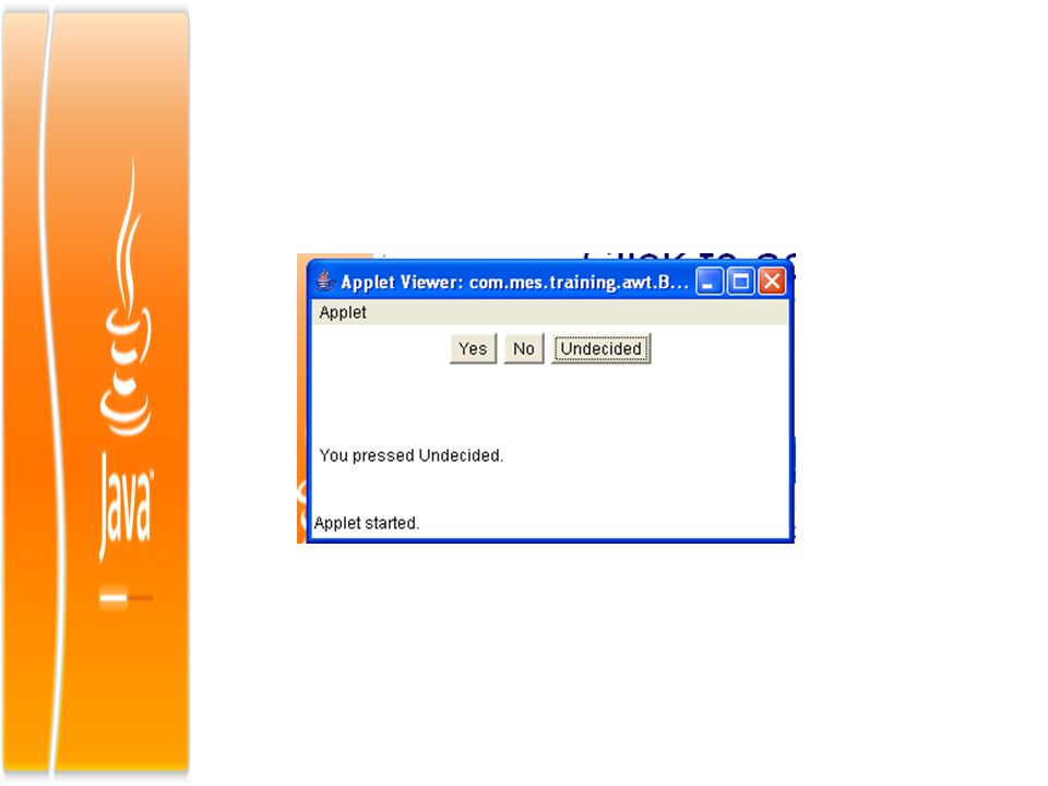
Buttons… Each time a button is pressed, an action event is generated. This is sent to any listeners that previously registered an interest in receiving action event notifications from that component. Each listener implements the ActionListener interface. That interface defines the actionPerformed() method, which is called when an event occurs. An ActionEvent object is supplied as the argument to this method. It contains both a reference to the button that generated the event and a reference to the string that is the label of the button
 method, which is called when an event occurs. An ActionEvent object is supplied as the argument to this method. It contains both a reference to the button that generated the event and a reference to the string that is the label of the button.")
14
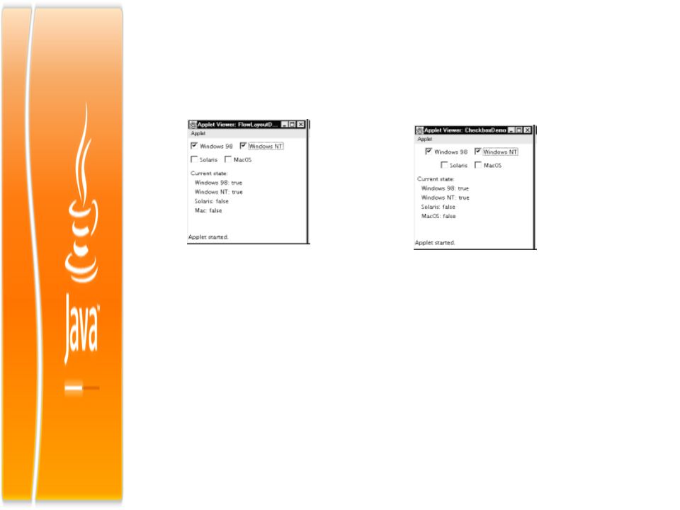
Check Boxes A check box is a control that is used to turn an option on or off. It consists of a small box that can either contain a check mark or not. There is a label associated with each check box that describes what option the box represents. You change the state of a check box by clicking on it. Check boxes can be used individually or as part of a group. Check boxes are objects of the Checkbox class. Checkbox supports these constructors: Checkbox() Creates check box whose label is initially blank. The state of the check box is unchecked
 Creates check box whose label is initially blank. The state of the check box is unchecked.")
15
Check Boxes… Checkbox(String str) Creates a check box whose label is specified by str. The state of the check box is unchecked. Checkbox(String str, boolean on) Set the initial state of the check box. If on is true, the check box is initially checked; otherwise, it is cleared. Checkbox(String str,boolean on,CheckboxGroup cbGroup) Create a check box whose label is specified by str and whose group is specified by cbGroup. If this check box is not part of a group, then cbGroup must be null Checkbox(String str,CheckboxGroup cbGroup, boolean on)
 Set the initial state of the check box. If on is true, the check box is initially checked; otherwise, it is cleared. Checkbox(String str,boolean on,CheckboxGroup cbGroup) Create a check box whose label is specified by str and whose group is specified by cbGroup. If this check box is not part of a group, then cbGroup must be null Checkbox(String str,CheckboxGroup cbGroup, boolean on).")
16
Handling Check box Each time a check box is selected or deselected, an item event is generated. This is sent to any listeners that previously registered an interest in receiving item event notifications from that component. Each listener implements the ItemListener interface. That interface defines the itemStateChanged() method. An ItemEvent object is supplied as the argument to this method. It contains information about the event
 method. An ItemEvent object is supplied as the argument to this method. It contains information about the event.")
17
CheckboxGroup It is possible to create a set of mutually exclusive check boxes in which one and only one check box in the group can be checked at any one time. These check boxes are often called radio buttons, because they act like the station selector on a car radio—only one station can be selected at any one time. To create a set of mutually exclusive check boxes, you must first define the group to which they will belong and then specify that group when you construct the check boxes. Check box groups are objects of type CheckboxGroup. Only the default constructor is defined, which creates an empty group. You can determine which check box in a group is currently selected by calling getSelectedCheckbox(). You can set a check box by calling setSelectedCheckbox().
. You can set a check box by calling setSelectedCheckbox()..")
18
Scroll Bars Scrollbars are used to select continuous values between a specified minimum and maximum. Scroll bars may be oriented horizontally or vertically. A scroll bar is actually a composite of several individual parts. Each end has an arrow that you can click to move the current value of the scroll bar one unit in the direction of the arrow. The current value of the scroll bar relative to its minimum and maximum values is indicated by the slider box (or thumb) for the scroll bar. The slider box can be dragged by the user to a new position. The scroll bar will then reflect this value. In the background space on either side of the thumb, the user can click to cause the thumb to jump in that direction by some increment larger than 1. Typically, this action translates into some form of page up and page down. Scroll bars are encapsulated by the Scrollbar class
 for the scroll bar. The slider box can be dragged by the user to a new position. The scroll bar will then reflect this value. In the background space on either side of the thumb, the user can click to cause the thumb to jump in that direction by some increment larger than 1. Typically, this action translates into some form of page up and page down. Scroll bars are encapsulated by the Scrollbar class.")
19
Scroll….. Scrollbar defines the following constructors: Scrollbar() creates a vertical scroll bar Scrollbar(int style) Allows you to specify the orientation of the scroll bar. If style is Scrollbar.VERTICAL, a vertical scroll bar is created. If style is Scrollbar.HORIZONTAL, the scroll bar is horizontal Scrollbar(int style, int initialValue, int thumbSize, int min, int max) The initial value of the scroll bar is passed in initialValue. The number of units represented by the height of the thumb is passed in thumbSize. The minimum and maximum values for the scroll bar are specified by min and max.
 creates a vertical scroll bar Scrollbar(int style) Allows you to specify the orientation of the scroll bar. If style is Scrollbar.VERTICAL, a vertical scroll bar is created. If style is Scrollbar.HORIZONTAL, the scroll bar is horizontal Scrollbar(int style, int initialValue, int thumbSize, int min, int max) The initial value of the scroll bar is passed in initialValue. The number of units represented by the height of the thumb is passed in thumbSize. The minimum and maximum values for the scroll bar are specified by min and max..")
20
Scroll….. To process scroll bar events, you need to implement the AdjustmentListener interface. Each time a user interacts with a scroll bar, an AdjustmentEvent object is generated. Its getAdjustmentType() method can be used to determine the type of the adjustment
 method can be used to determine the type of the adjustment.")
21
TextField The TextField class implements a single-line text-entry area, usually called an edit control. Text fields allow the user to enter strings and to edit the text using the arrow keys, cut and paste keys, and mouse selections. TextField is a subclass of TextComponent. TextField defines the following constructors: TextField() creates a default text field. TextField(int numChars) creates a text field that is numChars characters wide TextField(String str) The third form initializes the text field with the string contained in str. TextField(String str, int numChars) Initializes a text field and sets its width.
 creates a default text field. TextField(int numChars) creates a text field that is numChars characters wide TextField(String str) The third form initializes the text field with the string contained in str. TextField(String str, int numChars) Initializes a text field and sets its width..")
22
Text You can control whether the contents of a text field may be modified by the user by calling setEditable(). You can determine editability by calling isEditable() isEditable() returns true if the text may be changed and false if not. In setEditable(), if canEdit is true, the text may be changed. If it is false, the text cannot be altered. There may be times when you will want the user to enter text that is not displayed, such as a password. You can disable the echoing of the characters as they are typed by calling setEchoChar( ). This method specifies a single character that the TextField will display when characters are entered (thus, the actual characters typed will not be shown).
 isEditable() returns true if the text may be changed and false if not. In setEditable(), if canEdit is true, the text may be changed. If it is false, the text cannot be altered. There may be times when you will want the user to enter text that is not displayed, such as a password. You can disable the echoing of the characters as they are typed by calling setEchoChar( ). This method specifies a single character that the TextField will display when characters are entered (thus, the actual characters typed will not be shown)..")
23
TextArea TextArea is simple multiline editor Constructors for TextArea: TextArea( ) TextArea(int numLines, int numChars) TextArea(String str) TextArea(String str, int numLines, int numChars) TextArea(String str, int numLines, int numChars, int sBars) numLines specifies the height, in lines, of the text area, and numChars specifies its width, in characters. Initial text can be specified by str. In the fifth form you can specify the scroll bars that you want the control to have. sBars must be one of these values: SCROLLBARS_BOTH SCROLLBARS_NONE SCROLLBARS_HORIZONTAL_ONLY SCROLLBARS_VERTICAL_ONLY

24
Texting….. TextArea is a subclass of TextComponent. It supports the getText(), setText(), getSelectedText(), select(),isEditable(), and setEditable() methods TextArea adds the following methods: void append(String str) void insert(String str, int index) void replaceRange(String str, int startIndex, int endIndex) append():- method appends the string specified by str to the end of the current text. insert():- inserts the string passed in str at the specified index. replaceRange():- replaces the characters from startIndex to endIndex–1, with the replacement text passed in str.
, setText(), getSelectedText(), select(),isEditable(), and setEditable() methods TextArea adds the following methods: void append(String str) void insert(String str, int index) void replaceRange(String str, int startIndex, int endIndex) append():- method appends the string specified by str to the end of the current text. insert():- inserts the string passed in str at the specified index. replaceRange():- replaces the characters from startIndex to endIndex–1, with the replacement text passed in str..")
25
Layout Managers All of the components that we have shown so far have been positioned by the default layout manager A layout manager automatically arranges your controls within a window by using some type of algorithm. Each Container object has a layout manager associated with it. A layout manager is an instance of any class that implements the LayoutManager interface. The layout manager is set by the setLayout() method. If no call to setLayout() is made, then the default layout manager is used. Whenever a container is resized (or sized for the first time), the layout manager is used to position each of the components within it.
 method. If no call to setLayout() is made, then the default layout manager is used. Whenever a container is resized (or sized for the first time), the layout manager is used to position each of the components within it..")
26
Layout void setLayout(LayoutManager layoutObj) Here, layoutObj is a reference to the desired layout manager. If you wish to disable the layout manager and position components manually, pass null for layoutObj. If you do this, you will need to determine the shape and position of each component manually, using the setBounds() method defined by Component. Normally, you will want to use a layout manager. Java has several predefined LayoutManager classes We can use the layout manager that best fits our application.
 method defined by Component. Normally, you will want to use a layout manager. Java has several predefined LayoutManager classes We can use the layout manager that best fits our application..")
27
FlowLayout FlowLayout is the default layout manager. FlowLayout implements a simple layout style, which is similar to how words flow in a text editor. Components are laid out from the upper-left corner, left to right and top to bottom. When no more components fit on a line, the next one appears on the next line. A small space is left between each component, above and below, as well as left and right. Here are the constructors for FlowLayout: FlowLayout( ) creates the default layout, which centers components and leaves five pixels of space between each component
 creates the default layout, which centers components and leaves five pixels of space between each component.")
28
FlowLayout FlowLayout(int how) lets you specify how each line is aligned. FlowLayout.LEFT FlowLayout.CENTER FlowLayout.RIGHT FlowLayout(int how, int horz, int vert) Allows you to specify the horizontal and vertical space left between components in horz and vert, respectively. setLayout(new FlowLayout(FlowLayout.LEFT));
 Allows you to specify the horizontal and vertical space left between components in horz and vert, respectively. setLayout(new FlowLayout(FlowLayout.LEFT));.")
30
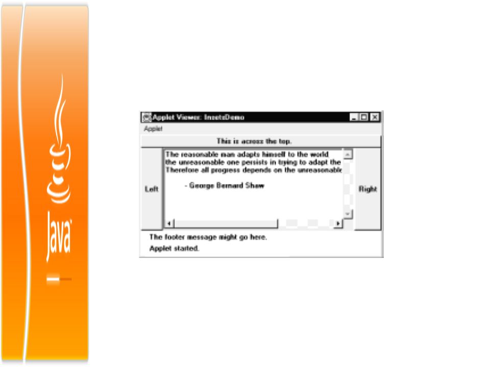
BorderLayout The BorderLayout class implements a common layout style for top-level windows. It has four narrow, fixed-width components at the edges and one large area in the center. The four sides are referred to as north, south, east, and west. The middle area is called the center. Here are the constructors defined by BorderLayout: BorderLayout() creates a default border layout BorderLayout(int horz, int vert) Allows you to specify the horizontal and vertical space left between components in horz and vert, respectively.
 creates a default border layout BorderLayout(int horz, int vert) Allows you to specify the horizontal and vertical space left between components in horz and vert, respectively..")
32
GridLayout GridLayout lays out components in a two-dimensional grid. When you instantiate a GridLayout, you define the number of rows and columns. The constructors supported by GridLayout are GridLayout() creates a single-column grid layout. GridLayout(int numRows, int numColumns ) creates a grid layout with the specified number of rows and columns GridLayout(int numRows, int numColumns, int horz, int vert) form allows you to specify the horizontal and vertical space left between components in horz and vert, respectively.
 creates a single-column grid layout. GridLayout(int numRows, int numColumns ) creates a grid layout with the specified number of rows and columns GridLayout(int numRows, int numColumns, int horz, int vert) form allows you to specify the horizontal and vertical space left between components in horz and vert, respectively..")
33
Grid..

34
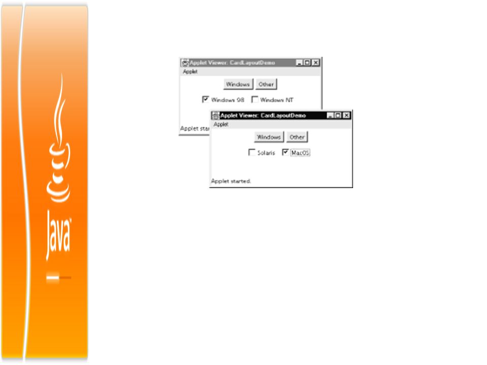
Card Layout The CardLayout class is unique among the other layout managers in that it stores several different layouts. Each layout can be thought of as being on a separate index card in a deck that can be shuffled so that any card is on top at a given time. This can be useful for user interfaces with optional components that can be dynamically enabled and disabled upon user input. You can prepare the other layouts and have them hidden, ready to be activated when needed. CardLayout provides these two constructors: CardLayout() creates a default card layout CardLayout(int horz, int vert) allows you to specify the horizontal and vertical space left between components in horz and vert, respectively
 creates a default card layout CardLayout(int horz, int vert) allows you to specify the horizontal and vertical space left between components in horz and vert, respectively.")
36
Menu Assignment.. Submit all assignments before EOD October 15

Similar presentations
 Present in all Java implementations Described in (almost) every Java textbook Adequate for.>")


 Copyright © 2008 Xiaoyan Li.>")


