Download presentation
Presentation is loading. Please wait.

1
Graphs

2
Drawing graphs E.g. if you were investigating carbon emissions, you could: Investigate the carbon dioxide emissions in different parts of the world. We would use a bar chart you have a categoric variable.

3
Drawing graphs E.g. if you were investigating carbon emissions, you could: Investigate the change in carbon dioxide concentration over time We would use a line graph here as both of these variables are continuous.

5
Drawing line graphs Choose sensible scales for the axes. (you should use more than half the available squares along each axis).
..")
6
Drawing line graphs Label the axes with the variable and units - e.g. time (s)
")
7
Drawing line graphs Mark all the points neatly and accurately with a sharp pencil:

8
If…then… …the points are close to being a line or a smooth curve …draw the ‘best fit’ straight line or smooth curve. …the theory suggests that the change is smooth …draw the ‘best fit’ straight line or smooth curve. …there is a point that is obviously long… …ignore it. Indicate that you did so. Drawing line graphs

9
Interpreting line graphs

10
When you are reading off values from a graph make sure that you do the following: Check the scales on the axes so thatyou know what each small square on the grid represents. Remember to quote the units in your answer.

11
Interpreting line graphs Be as precise and accurate as you can – in the graph if asked to discuss the trends and patterns between 0 and 3 minutes say the temperature decreases steadily rather than decreases. when specifying key points quote numbers e.g. there is no temperature change in liquid 2 between 4 and 7 minutes is better than saying the temperature stayed the same for 3 minutes. when making comparisons discuss both e.g. Liquid 2 became a solid at 49 º C whereas liquid 1 became a liquid at 55 º C is better than saying liquid 2 became solid at a lower temperature than liquid 1

12
Identifying patterns in data Your graphs are designed to show the relationship between your two chosen variables. You need to consider what the relationship means for your conclusion. There are three possible links between variables: They can be… CAUSAL DUE TO ASSOCIATION or DUE TO CHANCE.

13
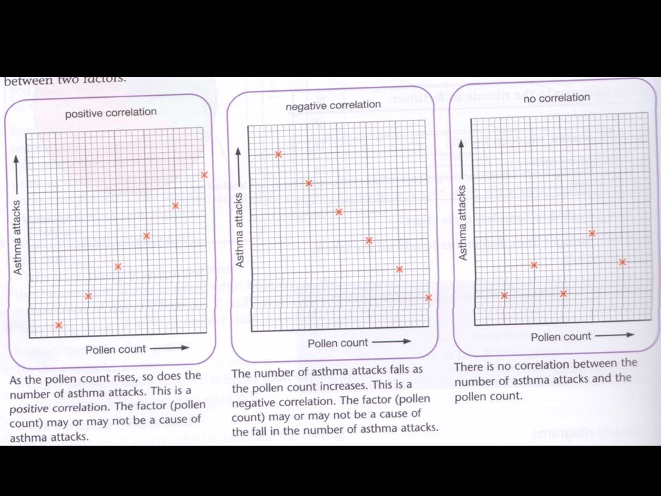
Conclusion When investigating Asthma attacks and pollen count You could get the following graphs…

15
To figure out the relationship D I As the I goes………, the D goes ……….

16
For graph 1 - conclusion As the pollen count increases, the number of asthma attacks increase. We can say that asthma attacks are directly proportional to pollen count.

17
Looking at the first graph… Pollen could be a cause of asthma attacks because it can irritate the lining of the nose and bronchiole tubes. This could cause narrowing of the tubes and as a result, the breathing difficulties of an asthma attack. However other investigations have shown that factors such as air pollution and stress affect the rate of asthma attacks. So, you cannot say that pollen is the only cause of asthma cause.

18
If there is a correlation between two factors, then this suggests that one may be the cause of the other. But to say that one causes the other, you need: –Further evidence –Some backing from theory to show how the factor could cause the other.

Similar presentations


. How could you improve this graph?>")
? Do Now: Copy the following: Line Graph - A graph that is used to display data that shows how one variable.>")