Download presentation
Presentation is loading. Please wait.

1
Graph Sketches (pg. 34)
")
2
Bar Graph Compares measurements Used to display categorical data

3
Histogram Uses vertical columns to show frequency Groups numbers into ranges.

4
Frequency Distribution Represents the frequency of the outcomes in a sample

5
Line Graph Represents data that is connected and changes continuously over time

6
Scatter Plot Graph It shows the correlation between 2 sets of data.

7
Pie Chart A circle is divided into sectors which represent a proportion of a the whole.

8
What are the best ways to display data based on the way I have collected information? The best way to display data is choosing appropriate graph based on the information being displayed. -Bar Graph: compares categorical data -Histogram: compares data (groups numbers into ranges. -Line Graph: Shows change over time -Frequency: shows frequency of the outcome in a sample -Scatter Plot: shows correlation in data

9
What is the difference between a bar graph and histogram? Bar Graph Histogram - groups numbers - Groups numbers into into categories. Ranges. - bars are not - Bars are connected connected.

10
What type of graph would I use to show how much rain has fallen throughout a day? Line Graph Your Question: Which type of graph shows correlation between two data? Scatter Plot

12
Creating Graphs Favorite color # of students Favorite color at Sterling

13
Rate of ice cube melting Time (Sec) Volume Melted (mL)
 Volume Melted (mL)")
14
Weight of Students at Park View High School It should be a histogram with the bars connected but the bars are not connected in this. Its More like a bar graph instead of a histogram.

15
Determining if Age effect Height Age (years) Height (cm)
 Height (cm)")
16
Unit Vocabulary Theory: Explains hypothesis and observation that have been supported by testing. Law: It tells you how things work; summary of many experimental observations and experiments. Precise: How well experimental values agree with each other. -almost accurate Accurate: agreement between experimental data and a known value (exact measurement)
.")
18
Model: A representation of an object or a system. Scientific Method: A series of steps that scientists use to answer questions and solve problems. Hypothesis: Educated guess; possible explanation or answer to a question Independent Variable (IV): Variables changed/manipulated by the experimenter. Dependent Variable (DV): data collected/ results
: Variables changed/manipulated by the experimenter. Dependent Variable (DV): data collected/ results.")
19
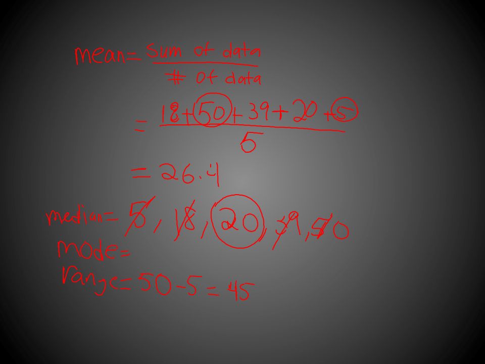
Constant: Conditions that stay the same in an experiment. Controlled Experiment: an experiment that isolates the effect of one variable on a system by holding constant all variables except the one under investigation. Control Group: The opposite of what you are trying to prove. Mean: the average Median: The middle number in a set of data, when the numbers are put in order from lowest to highest.

20
Range: the difference between the smallest number and the biggest number. Bar Graph: Graphical display of data using bars of different height. Histogram: Graphical display of data using bars of different height. Frequency distribution: Table that displays the frequency of various outcomes in a sample. Line Graph: Graph that shows information that is connected in some way. (ie. Change over time)
.")
21
Scatter Plot: Values of two variables are plotted along 2 axes, the “pattern” of the resulting point reveal a correlation (positive or negative) Line of best fit: A line on a graph showing the general direction that a group of points seem to be heading. Scientific notation: International system for measurement. Scientific Notation: Used to express really big or really small numbers.

Similar presentations


>")
