Download presentation
Presentation is loading. Please wait.

1
MATH 2311 Section 1.5

2
Graphs and Describing Distributions Lets start with an example: Height measurements for a group of people were taken. The results are recorded below (in inches): 66, 68, 63, 71, 68, 69, 65, 70, 73, 67, 62, 59, 63, 68, 71, 63, 63, 60, 64, 66, 58 We will organize this data using different graphs:
: 66, 68, 63, 71, 68, 69, 65, 70, 73, 67, 62, 59, 63, 68, 71, 63, 63, 60, 64, 66, 58 We will organize this data using different graphs:.")
3
A bar graph is created by listing the categorical data along the x-axis and the frequencies along the y-axis. Bars are drawn above each data value.

4
A dot plot is made simply by putting dots above the values listed on a number line.

5
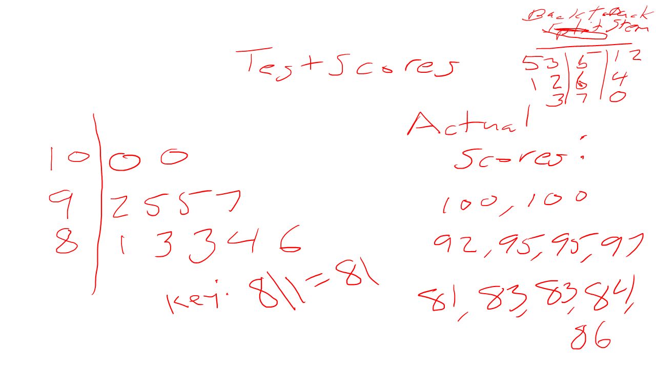
A stem and leaf plot, the data is arranged by values. The digits in the largest place are referred to as the stem and the digits in the smallest place are referred to as the leaf (leaves). The leaves are displayed to the right of the stem. A split stemplot divides up the stems into equal groups. Back-to-back stempots can be used when comparing two sets of data.
. The leaves are displayed to the right of the stem. A split stemplot divides up the stems into equal groups. Back-to-back stempots can be used when comparing two sets of data..")
7
Histograms are created by first dividing the data into classes, or bins, of equal width. Next, count the number of observations in each class. The horizontal axis will represent the variable values and the vertical axis will represent your frequency or your relative frequency.

8
Boxplots not only help identify features about our data quickly (such as spread and location of center) but can be very helpful when comparing data sets.
 but can be very helpful when comparing data sets.")
9
How to make a box plot: 1.Order the values in the data set in ascending order (least to greatest). 2.Find and label the median. 3.Of the lower half (less than the median—do not include), find and label Q1. 4.Of the upper half (greater than the median—do not include), find and label Q3. 5.Label the minimum and maximum. 6.Draw and label the scale on an axis. 7.Plot the five number summary. 8.Sketch a box starting at Q1 to Q3. 9.Sketch a segment within the box to represent the median. 10.Connect the min and max to the box with line segments.
, find and label Q1. 4.Of the upper half (greater than the median—do not include), find and label Q3. 5.Label the minimum and maximum. 6.Draw and label the scale on an axis. 7.Plot the five number summary. 8.Sketch a box starting at Q1 to Q3. 9.Sketch a segment within the box to represent the median. 10.Connect the min and max to the box with line segments..")
10
Note: If data contains outliers, a box and whiskers plot can be used instead to display the data. In a box and whiskers plot, the outliers are displayed with dots above the value and the segments begin (or end) at the next data value within the outlier interval.
 at the next data value within the outlier interval..")
11
A pie chart is a circular chart, divided into sectors, indicating the proportion of each data value compared to the entire set of values. Pie charts are good for categorical data.

12
A cumulative frequency plot of the percentages (also called an ogive) can be used to view the total number of events that occurred up to a certain value. Example: Here is an ogive for Hudson Auto Repair’s cost of parts sold: Example: Hudson Auto Repair

13
Patterns and shapes: Uniform graphs Symmetric graphs Some other features Bell Shaped Skewed right Skewed left

Similar presentations


 techniques requires gaining.>")


