Download presentation
Presentation is loading. Please wait.

1
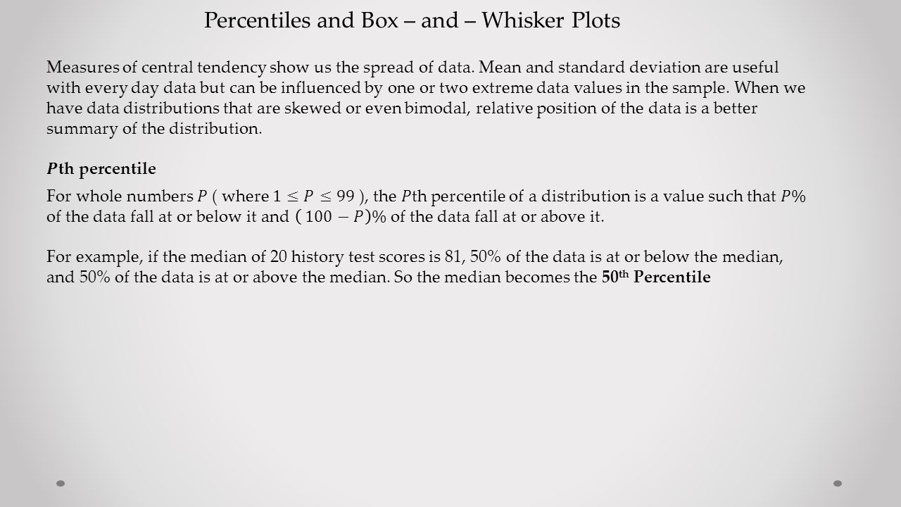
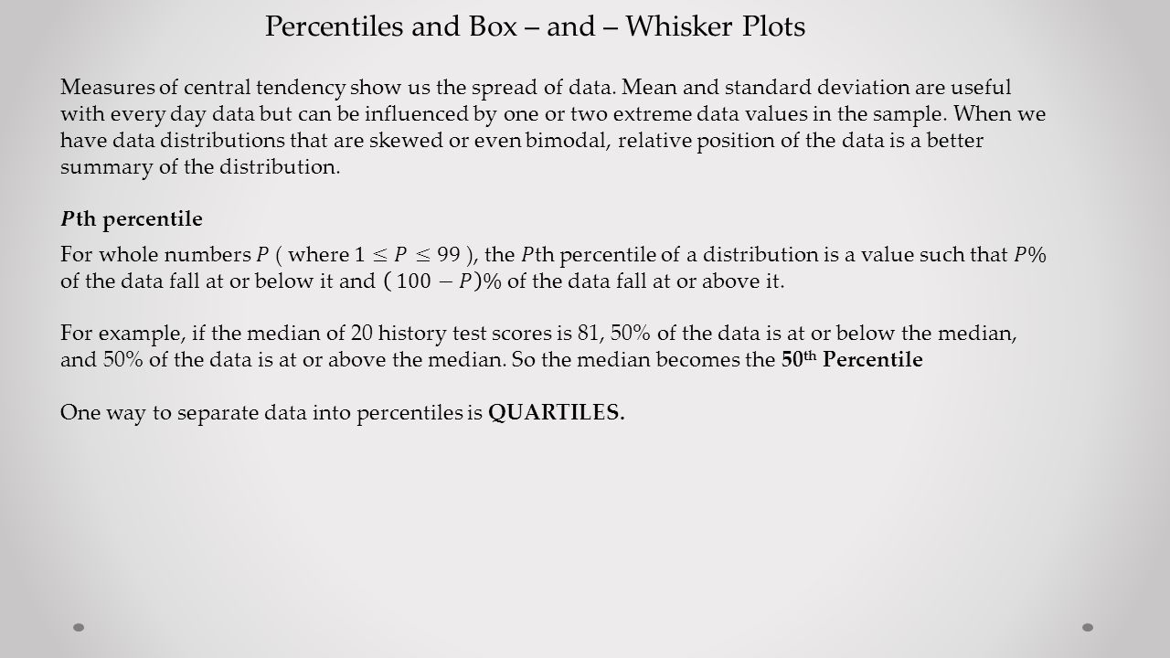
Percentiles and Box – and – Whisker Plots Measures of central tendency show us the spread of data. Mean and standard deviation are useful with every day data but can be influenced by one or two extreme data values in the sample. When we have data distributions that are skewed or even bimodal, relative position of the data is a better summary of the distribution.

2
Percentiles and Box – and – Whisker Plots

5
Quartiles split the data into fourths : LowestQ1Q2Q3HighestDataValue Median 50 th percentile 25 th percentile 75 th percentile

6
Percentiles and Box – and – Whisker Plots Quartiles split the data into fourths : LowestQ1Q2Q3HighestDataValue Median 50 th percentile 25 th percentile 75 th percentile COMPUTING QUARTILES : 1. Order the data from smallest to largest. 2. Find the median ( this becomes Q2 ) 3. Q1 becomes the median of the lower half of the data ( below Q2 ) 4. Q3 becomes the median of the upper half of the data ( above Q2) 5. Interquartile range = Q3 – Q1 ** of course if there are two middle values, sum them and divide by 2
 3. Q1 becomes the median of the lower half of the data ( below Q2 ) 4. Q3 becomes the median of the upper half of the data ( above Q2) 5. Interquartile range = Q3 – Q1 ** of course if there are two middle values, sum them and divide by 2.")
7
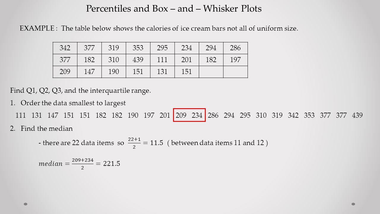
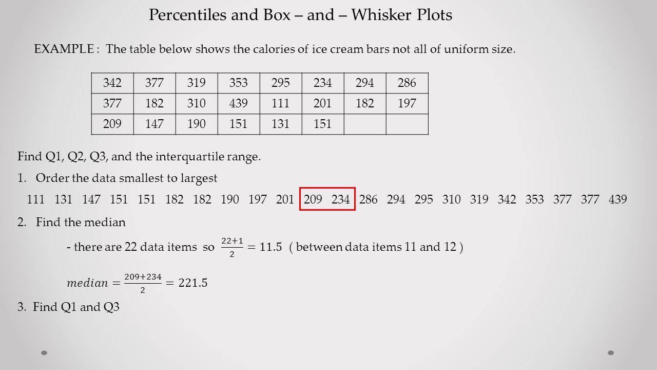
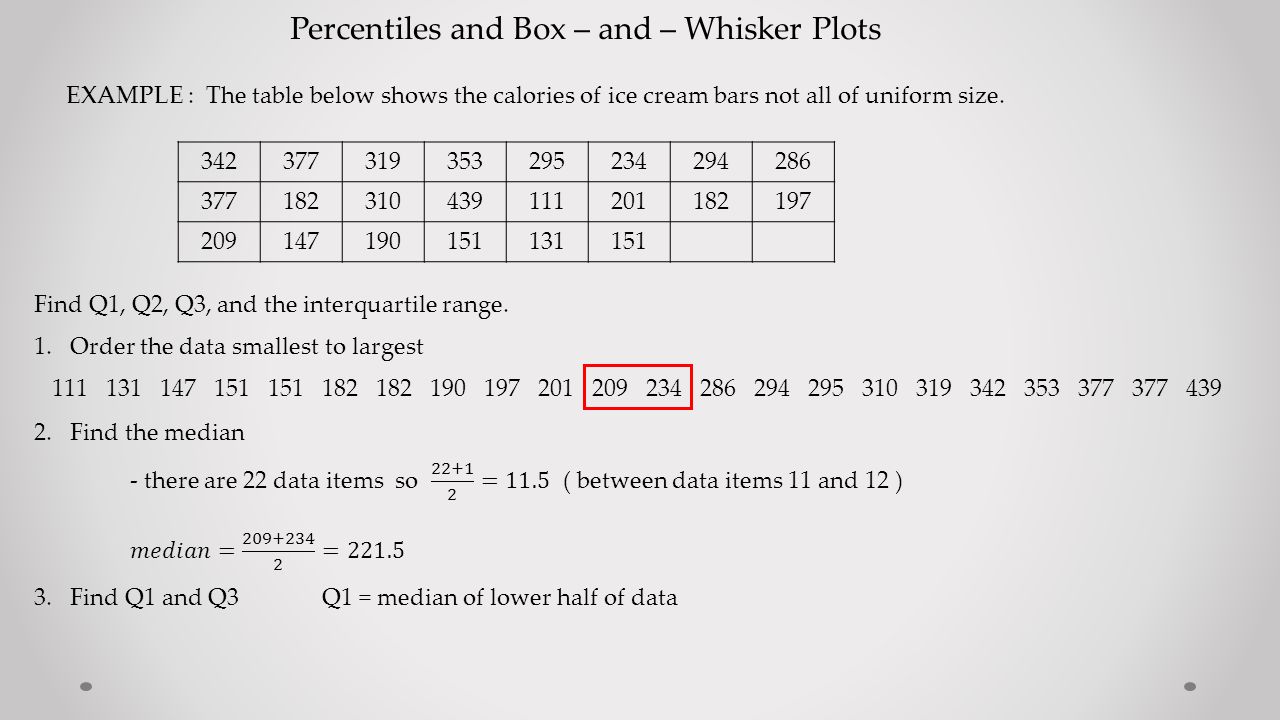
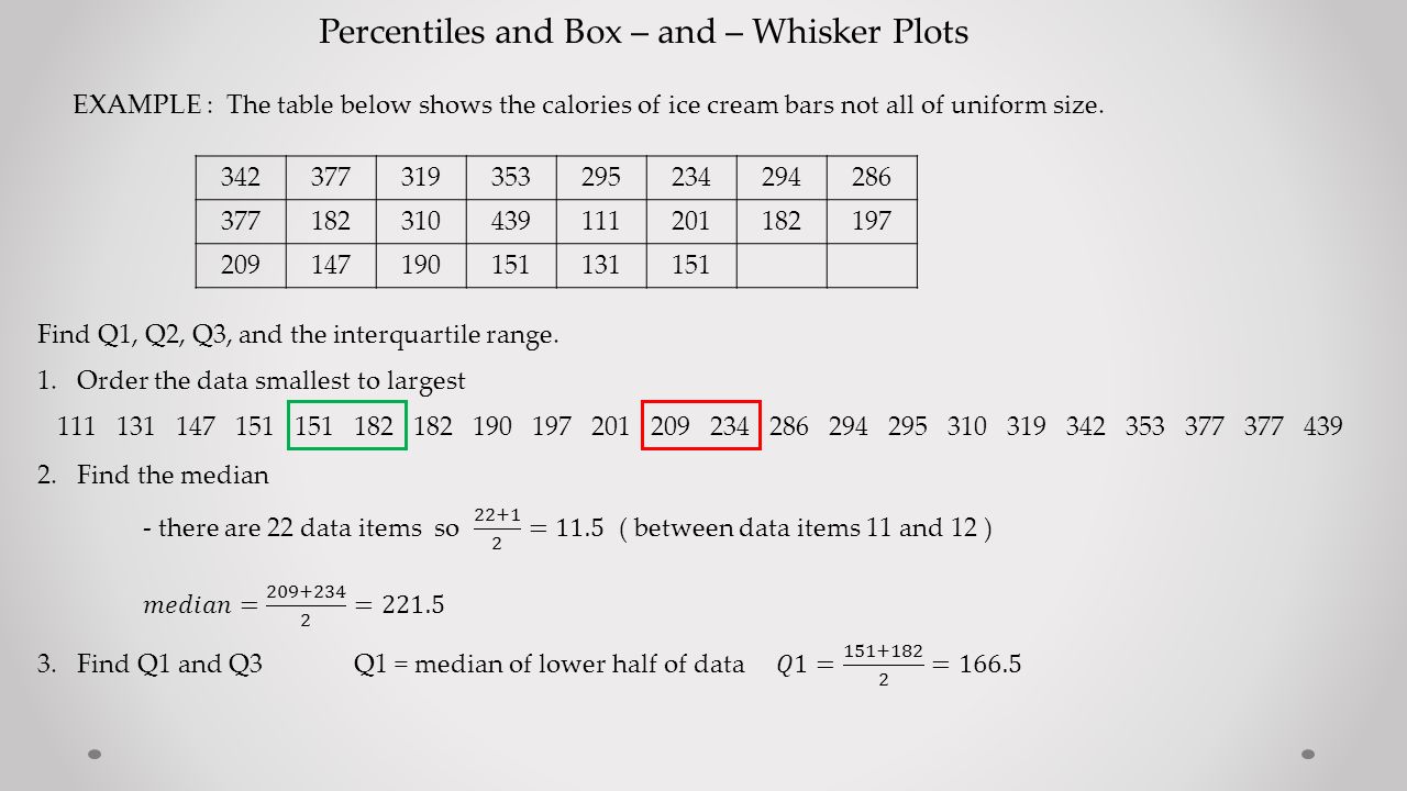
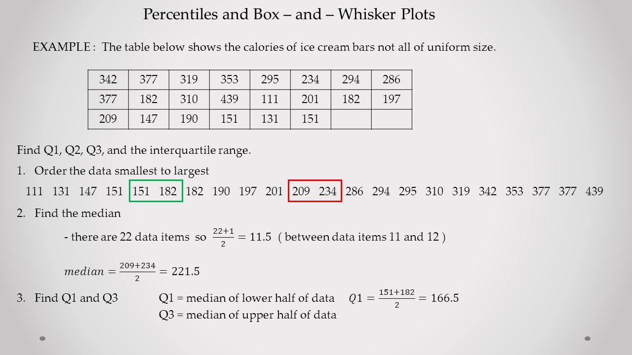
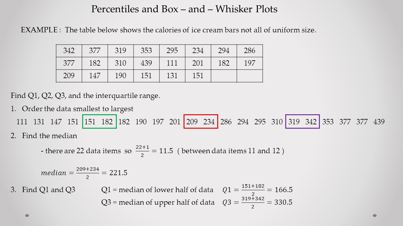
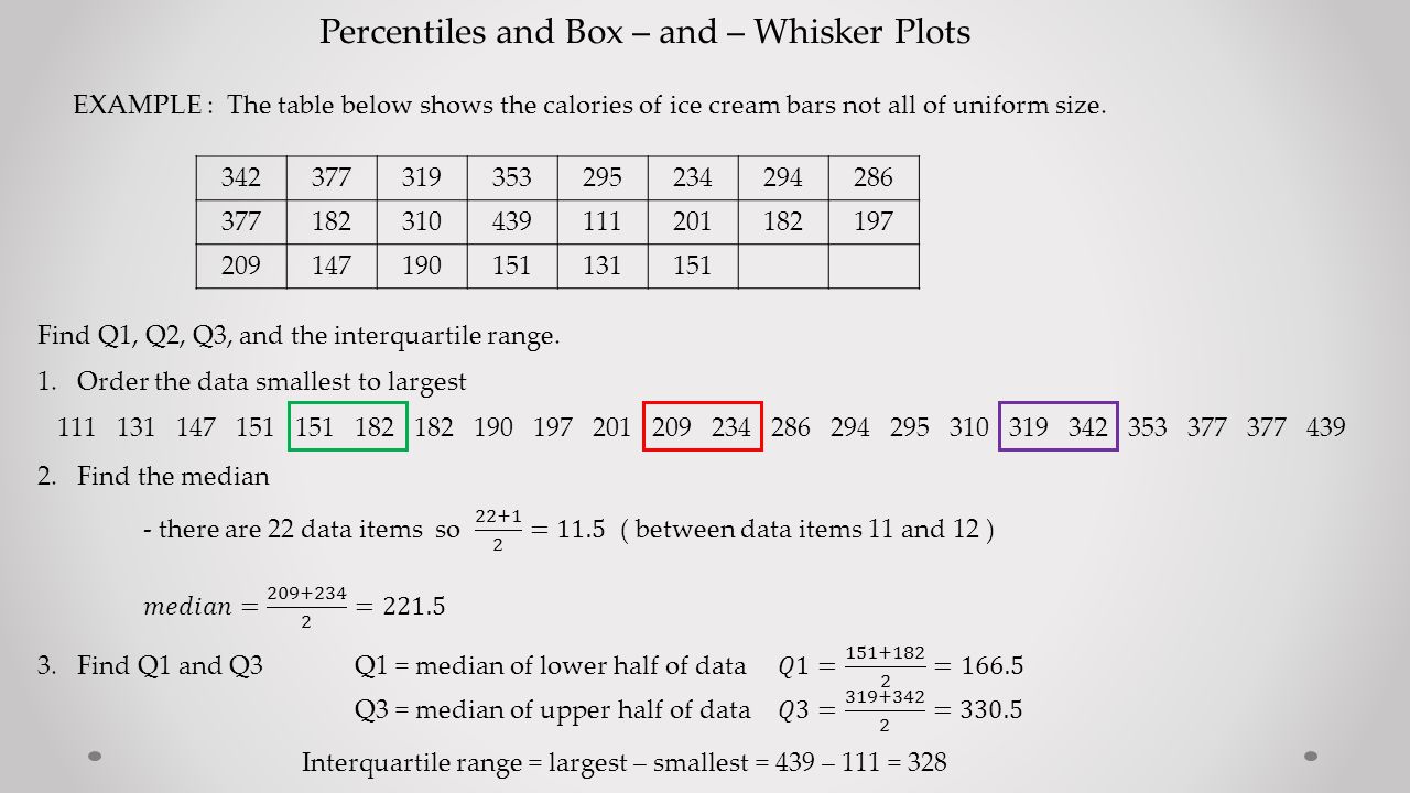
Percentiles and Box – and – Whisker Plots EXAMPLE : The table below shows the calories of ice cream bars not all of uniform size. 342377319353295234294286 377182310439111201182197 209147190151131151 Find Q1, Q2, Q3, and the interquartile range.

8
Percentiles and Box – and – Whisker Plots EXAMPLE : The table below shows the calories of ice cream bars not all of uniform size. 342377319353295234294286 377182310439111201182197 209147190151131151 Find Q1, Q2, Q3, and the interquartile range. 1.Order the data smallest to largest 111 131 147 151 151 182 182 190 197 201 209 234 286 294 295 310 319 342 353 377 377 439

9
Percentiles and Box – and – Whisker Plots EXAMPLE : The table below shows the calories of ice cream bars not all of uniform size. 342377319353295234294286 377182310439111201182197 209147190151131151 Find Q1, Q2, Q3, and the interquartile range. 1.Order the data smallest to largest 111 131 147 151 151 182 182 190 197 201 209 234 286 294 295 310 319 342 353 377 377 439 2. Find the median

10
Percentiles and Box – and – Whisker Plots EXAMPLE : The table below shows the calories of ice cream bars not all of uniform size. 342377319353295234294286 377182310439111201182197 209147190151131151

11
Percentiles and Box – and – Whisker Plots EXAMPLE : The table below shows the calories of ice cream bars not all of uniform size. 342377319353295234294286 377182310439111201182197 209147190151131151
12
Percentiles and Box – and – Whisker Plots EXAMPLE : The table below shows the calories of ice cream bars not all of uniform size. 342377319353295234294286 377182310439111201182197 209147190151131151
13
Percentiles and Box – and – Whisker Plots EXAMPLE : The table below shows the calories of ice cream bars not all of uniform size. 342377319353295234294286 377182310439111201182197 209147190151131151
14
Percentiles and Box – and – Whisker Plots EXAMPLE : The table below shows the calories of ice cream bars not all of uniform size. 342377319353295234294286 377182310439111201182197 209147190151131151
15
Percentiles and Box – and – Whisker Plots EXAMPLE : The table below shows the calories of ice cream bars not all of uniform size. 342377319353295234294286 377182310439111201182197 209147190151131151
16
Percentiles and Box – and – Whisker Plots EXAMPLE : The table below shows the calories of ice cream bars not all of uniform size. 342377319353295234294286 377182310439111201182197 209147190151131151
17
Percentiles and Box – and – Whisker Plots EXAMPLE : The table below shows the calories of ice cream bars not all of uniform size. 342377319353295234294286 377182310439111201182197 209147190151131151
18
Percentiles and Box – and – Whisker Plots Box and Whisker Plots give us a five – number summary of the data. They are created with the values gotten by our quartiles. Lowest value, Q1, Q2, Q3, Highest value

19
Percentiles and Box – and – Whisker Plots Box and Whisker Plots give us a five – number summary of the data. They are created with the values gotten by our quartiles. Lowest value, Q1, Q2, Q3, Highest value We will represent these values with a sketch.

20
Percentiles and Box – and – Whisker Plots Box and Whisker Plots give us a five – number summary of the data. They are created with the values gotten by our quartiles. Lowest value, Q1, Q2, Q3, Highest value We will represent these values with a sketch. Let’s use the results from the ice cream bar calories example.

21
Percentiles and Box – and – Whisker Plots Box and Whisker Plots give us a five – number summary of the data. They are created with the values gotten by our quartiles. Lowest value, Q1, Q2, Q3, Highest value We will represent these values with a sketch. Let’s use the results from the ice cream bar calories example. lowest = 111 Q1 = 166.5 Q2 = 221.5 Q3 = 330.5 highest = 439

22
Percentiles and Box – and – Whisker Plots Box and Whisker Plots give us a five – number summary of the data. They are created with the values gotten by our quartiles. Lowest value, Q1, Q2, Q3, Highest value We will represent these values with a sketch. Let’s use the results from the ice cream bar calories example. 1.Create a vertical axis that includes the lowest and highest values lowest = 111 Q1 = 166.5 Q2 = 221.5 Q3 = 330.5 highest = 439 100 450 400 350 300 250 200 150

23
Percentiles and Box – and – Whisker Plots Box and Whisker Plots give us a five – number summary of the data. They are created with the values gotten by our quartiles. Lowest value, Q1, Q2, Q3, Highest value We will represent these values with a sketch. Let’s use the results from the ice cream bar calories example. 1.Create a vertical axis that includes the lowest and highest values 2. Graph the smallest and largest values lowest = 111 Q1 = 166.5 Q2 = 221.5 Q3 = 330.5 highest = 439 100 450 400 350 300 250 200 150 439 111

24
Percentiles and Box – and – Whisker Plots Box and Whisker Plots give us a five – number summary of the data. They are created with the values gotten by our quartiles. Lowest value, Q1, Q2, Q3, Highest value We will represent these values with a sketch. Let’s use the results from the ice cream bar calories example. 1.Create a vertical axis that includes the lowest and highest values 2.Graph the smallest and largest values 3.Graph Q1, Q2, Q3 ( use a larger line ) lowest = 111 Q1 = 166.5 Q2 = 221.5 Q3 = 330.5 highest = 439 100 450 400 350 300 250 200 150 439 111 330.5 221.5 166.5
 lowest = 111 Q1 = Q2 = Q3 = highest =")
25
Percentiles and Box – and – Whisker Plots Box and Whisker Plots give us a five – number summary of the data. They are created with the values gotten by our quartiles. Lowest value, Q1, Q2, Q3, Highest value We will represent these values with a sketch. Let’s use the results from the ice cream bar calories example. 1.Create a vertical axis that includes the lowest and highest values 2.Graph the smallest and largest values 3.Graph Q1, Q2, Q3 ( use a larger line ) 4.Make boxes with the larger lines lowest = 111 Q1 = 166.5 Q2 = 221.5 Q3 = 330.5 highest = 439 100 450 400 350 300 250 200 150 439 111 330.5 221.5 166.5
 4.Make boxes with the larger lines lowest = 111 Q1 = Q2 = Q3 = highest =")
26
Percentiles and Box – and – Whisker Plots Box and Whisker Plots give us a five – number summary of the data. They are created with the values gotten by our quartiles. Lowest value, Q1, Q2, Q3, Highest value We will represent these values with a sketch. Let’s use the results from the ice cream bar calories example. 1.Create a vertical axis that includes the lowest and highest values 2.Graph the smallest and largest values 3.Graph Q1, Q2, Q3 ( use a larger line ) 4.Make boxes with the larger lines 5.Connect the boxes with the short lines lowest = 111 Q1 = 166.5 Q2 = 221.5 Q3 = 330.5 highest = 439 100 450 400 350 300 250 200 150 439 111 330.5 221.5 166.5
 4.Make boxes with the larger lines 5.Connect the boxes with the short lines lowest = 111 Q1 = Q2 = Q3 = highest =")
27
Percentiles and Box – and – Whisker Plots Box and whisker plots can also be created on a horizontal axis. Here is what our last example would look like as a horizontal graph : 450 100 150 200 250 300350400 439 111 330.5 221.5 166.5

Similar presentations


>")


 Lower Extreme Lower Quartile Median Upper Quartile Upper Extreme Back.>")


 2002 Houghton Mifflin Company. All rights reserved. 1 CHEBYSHEV'S THEOREM For any set of data and for any number k, greater than one, the.>")

, the Pth percentile of a distribution is a value such that P% of the data fall at or below it. The.>")

