Download presentation
Presentation is loading. Please wait.

2
the rhetorical situation audience purpose context design principles arrangement emphasis contrast repetition alignment proximity (some) variables
 variables")
3
margins blank space paragraph spacing paragraph length line spacing line length justification type sizes and typefaces (fonts) type features (e.g., bold, italics, strikethrough) letter case highlighting color graphics, images, icons, symbols tables, charts, diagrams columns headings headers and footers page numbers document design includes The use of all of which should be guided by: arrangement emphasis contrast repetition alignment proximity
 type features (e.g., bold, italics, strikethrough) letter case highlighting color graphics, images, icons, symbols tables, charts, diagrams columns headings headers and footers page numbers document design includes The use of all of which should be guided by: arrangement emphasis contrast repetition alignment proximity")
4
“The intelligent and informed management of white space will do more to improve your visual communication than any other design decision.” (Alex W. White)
.")
5
CRAP contrast repetition alignment proximity

6
contrast contrast aids in the organization of information and creates hierarchy contrast can add clarity contrast can make the page/screen look more interesting

7
if two items are different, make them really different; avoid doing wimpy contrast—make contrast strong

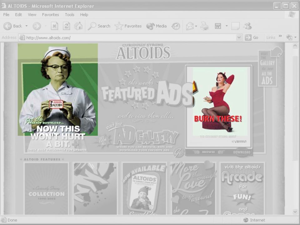
9
bold, bright pinks conservative, traditional black and gray

10
sloppy, handwritten font face elegant, cursive-style font face

11
square, linear shape wild, twisted shape

12
drab, flat gray bright, vibrant orange

13
bold, bright, simple blocks richly detailed, lively photos conservative, serious, black and white

14
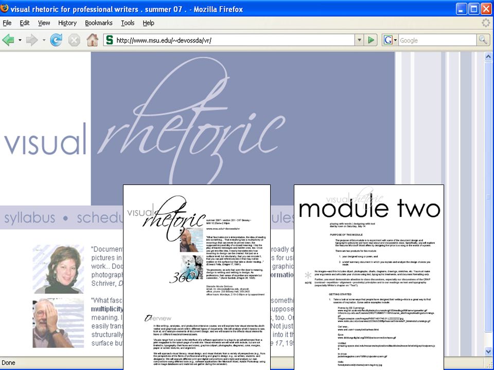
black and white (strongest visual contrast) strong contrast between curve of icon and smooth, simple, lowercase, sans serif font face
 strong contrast between curve of icon and smooth, simple, lowercase, sans serif font face")
15
repetition repetition unifies elements throughout a document repetition adds visual interest repetition develops organization and creates consistency

16
repeat some aspect of a design (e.g., horizontal rule, a certain type of bullet, a type of font) throughout an entire page or site avoid repeating an element so much that it becomes annoying or overwhelming
 throughout an entire page or site avoid repeating an element so much that it becomes annoying or overwhelming")
18
* *

20
running header Including author/ organization and graphic line running footer including page number and graphic line

21
tip icon appears throughout instructions to mark key information

22
level 1 heading level 2 heading

23
alignment alignment unifies and organizes the page alignment helps create visual connections

24
nothing should be placed on a page arbitrarily avoid using more than two text alignments on a page balance image and text alignment carefully center alignment and full alignment are more difficult to read than right alignment

25
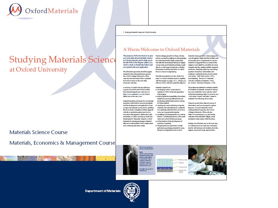
images are center aligned, vertically arranged image arranged centered and left of text text is left aligned or left justified; headings flush left

26
all bulleted items are aligned with hanging indent

27
2003 appears out of alignment with rest of title

28
images aligned flush left in each paragraph in which they appear; text aligned square around images

29
body text generously indented on page; left aligned with ragged right margin heading level 1 flush left, no indent

30
multiple, visually competing alignments create interesting look and feel

31
proximity proximity helps to organize elements, imply relationships proximity helps with use of blank space proximity reduces clutter

32
create visual relationships with elements that belong together avoid too many separate elements on one page don’t stick things in the corners and in the middle of the page

33
search features appear in close proximity main navigation in close proximity

34
organizations’ logos appear in close proximity

35
institute’s name and contact info in close proximity individual’s name and contact info in close proximity

36
images organized on page in close proximity

37
chunks of relatedinformation in close proximity

Similar presentations