Download presentation
Presentation is loading. Please wait.

1
Too Big, Too Small, Just Right!
Scale & Proportion Too Big, Too Small, Just Right!

2
PROPORTION The ratio of the parts to the whole and the surrounding areas. The most effective proportions have an uneven ration. Draping a throw over the corner of the chair is more pleasing than over the entire chair. Square is the least pleasing shape. Rectangles are most pleasing. HGTV

3
Too Little. Too much space between objects makes the candlesticks and the too-small frame look lonely, the bare wall yawning above.

4
Too Much. There’s no time to pause to consider any single object, since they are all stepping on one another’s toes in a jostle for space.

5
Just Right. The weight now shifted to the left side, fewer items are needed there for balance.

6
Too Tall. Used as an end table, this wood pedestal towers over the sofa, making the sofa appear small and the pairing awkward.

7
Too Short. The lamp would need to be fully stretched to offer good illumination from this low point.

8
Just Right. The perfect pairing, visually and physically, is a tabletop that is a couple of inches shorter than the sofa arm.

10
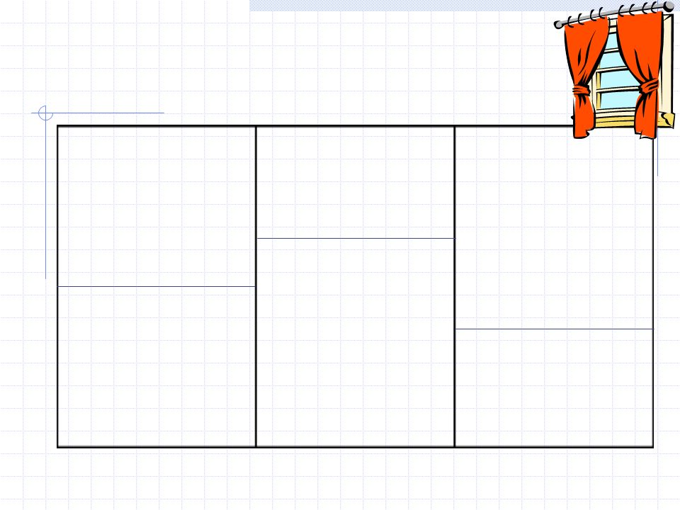
THE GOLDEN MEAN 2:3 If you divide a line at just the right point, between ½ and 1/3 from the end, the ratio of the larger segment to the smaller segment will equal the whole. 2:3 is most effective (3:5, 4:7, 5:8) Tie backs on a drapery – not half-way between the top and the bottom of the window, but at the point of golden mean, between the ½ and 1/3 point. Chair rails Draw on the board
 Tie backs on a drapery – not half-way between the top and the bottom of the window, but at the point of golden mean, between the ½ and 1/3 point. Chair rails. Draw on the board.")
12
The Golden Mean, discovered by the ancient Greeks, is also known as the Golden Section, Golden Ratio and Divine Proportion. It is a ratio or proportion defined by the number Phi (Φ = ) : 1.618 1.618 The golden mean divides any line or form at “just the right point”, somewhere between one-third and one-half the distance from one end. It is considered the most visually pleasing division. 1 The Golden Rectangle: not too long; not too skinny; most pleasing to the eye

13
The Golden Mean The golden mean is the division of a line anyplace between one-half and one-third of its total length. The curtains to the right are tied back at the golden mean for this window. 1/3 1/2 1/3 The draperies to the left each illustrate a way of using tie-backs at the golden mean… one higher and one lower.

14
The golden mean has many applications in interior design.
An afghan has been thrown over the back and arm of this chair in a casual manner for accent. It covers far too much of the chair to be visually pleasing however. Like the bottom picture depicts, it would be more attractive if it was laying between the 1/3 and ½ point of the chair back. The focal point of the wall arrangement falls exactly at the golden mean… a place between one-half and one-third of the total furniture arrangement.

15
Placing the plant directly in the center of the shelf?
The designer wants to place this plant on a shelf. According to the golden mean, which placement is more pleasing to the eye?... Placing the plant slightly to the left of the center; between 1/3 and ½ of the distance from the end? Placing the plant directly in the center of the shelf? OR The asymmetry of the golden mean is usually more pleasing to the eye, so you would want to place the plant off-center.

16
According to the golden mean, which coffee table length is the most pleasing?
A coffee table that is the same length as the sofa? A coffee table that is2/3 the length of the sofa? A coffee table that is half the length of the sofa?

17
The mantel is not in the center of the wall.
The wall board goes above the center The book shelves?

18
Two-Thirds Rule… The even placement of 3 plants on this ladder is symmetrical… and boring. Where would you place 3 plants on this ladder, using the two-thirds rule? Related to the Golden Mean is the 'Two Thirds Rule' within art and design. It involves creating a place of emphasis or focus within the composition. The point of emphasis is found by dividing the painting into three parts vertically and then horizontally; where the dividing lines meet (there are four points) are supposedly aesthetically pleasing places to put the focus of the composition. It is not natural to have objects perfectly centered and symmetrical.
 are supposedly aesthetically pleasing places to put the focus of the composition. It is not natural to have objects perfectly centered and symmetrical.")
19
Scale The relative size of an object in relation to the height and width of the area, space, or user in which the object is placed. Item may be in proportion to itself, but furniture and accessories must be in scale to the room or the user.

20
Consider These Scales:
Size of the human body in scale to the item in use. Adult in a child's chair Furniture and accessories to the room or space Amount of furnishings in the space. Size of furnishings to the scale of the room. Small rooms do not use large furniture or a large amount of furnishings. A large floor lamp next to a delicate loveseat would be incorrect, but a slender floor lamp would work.

21
Evaluate the scale of the two chairs in this arrangement?

22
Because homes and furniture are built for humans, it is important to use the human figure in evaluating their scale. Rooms and furnishings should be designed or selected for the people who will use them. Although humans find miniatures intriguing and massive scale awesome, neither is a “comfortable” long-term response.

23
Too Big. Picture in proportion to the space.
There’s no breathing room in this area-to-sofa match.

24
Too Little. Picture in proportion to the space.
This picture is tall enough, roughly matching the height of the sofa. But it ends up looking leggy and lost because it’s too skinny in proportion to the sofa’s width.

25
Just Right. Proportional picture
To size a single picture, choose one that’s nearly the same height as the sofa and between half and two-thirds its width.

26
Too Big. Coffee table is over-scaled for the sofa.

27
Too Small. Table not only looks out of proportion, it functions poorly as well.

28
Just Right. The table is substantial enough to anchor the furniture grouping, yet it leaves room for traffic flow around both ends.

29
Too Big. This rug covers too much of the floor beyond the conversation area to define it as a discrete space.

30
Too Small. Instead of creating intimacy, the rug only increases the appearance of isolation.

31
Just Right. Choose an area rug that’s about as long and wide as the furnishings in the space.

32
Too Big. This tall lamp towers above the nearby sofa and chair. It is also several inches taller than the table it rests on, throwing the balance off there as well.

33
Too Small. This lamp is overwhelmed by the high-back sofa and stocky chair that surround it.

34
Just Right. For the best fit, an end-table lamp should be tall enough to clear the top of the sofa with a little room to spare, yet not so tall that it dwarfs the table it rests on.

35
Too Big. This 5-foot-wide double pendant chandelier overpowers the table.

36
Too Small. The fixture is too small to adequately light the table.

37
Just Right. In general, a chandelier’s width or diameter should be at least 2 feet narrower than the table length.

38
A sculpture defined: Proportion: If I did a sculpture of say a cat, I would want the proportions of the cat to be right. So that the legs were not too long, or the head was too big for the body. You need to get this right overall. Parts in relation to the whole piece it is attached to , on, or with Big bed with small pillows or Table with short legs Scale: If you wanted to do two sculptures, one bigger than the other. You wanted to do a small sculpture to put in the house. Then you wanted to do a much bigger sculpture, say for a public park - being a life size sculpture. The whole in relation to its surrounding space, area, or user Small vase on a big table or Small bed in a large room

39
Proportion and Scale assignments
#2 Table lamp This small table and flower arrangement is in the foyer of a home. The client wants a lamp on the table. Cut out a picture or design, draw, and color a lamp with an appropriate lampshade that would be in correct proportion and scale with the table, the space, and the flower arrangement. Explain how you arrived at your lamp design based upon rules of scale and proportion. #3 Floor lamp and framed picture In the picture below, cut out a picture of or design, draw, and color both a framed picture placed above the couch and a floor lamp placed in between the couch and the chair. Pay particular attention to making the frame and floor lamp proportionately correct for the scale of other furnishings. Remember to follow the “rule of two-thirds” guideline for the frame’s placement. Explain how you arrived at your framed picture and floor lamp design based upon rules of scale and proportion.

40
Proportion and Scale assignments
Poor Proportion and Scale Divide a paper in half and label 1 side Poor Proportion and the other side Poor Scale. Poor Proportion Either create a sketch or find a picture of a basic interior item (chair, lamp, table, etc.). Draw or glue on, new parts to the basic piece. Ie: add longer legs to a table, a larger shade on the lamp Poor scale Either create a sketch or find a picture of a basic interior item (chair, lamp, table, etc.) Place the item next to something that is out of scale. Ie: or a smaller chair to the table, large flowers in a vase
. Draw or glue on, new parts to the basic piece. Ie: add longer legs to a table, a larger shade on the lamp. Poor scale Either create a sketch or find a picture of a basic interior item (chair, lamp, table, etc.) Place the item next to something that is out of scale. Ie: or a smaller chair to the table, large flowers in a vase.")
41
POOR PROPORTION

Similar presentations