Download presentation
Presentation is loading. Please wait.

1
Bar Graphs Powerpoint hosted on www.worldofteaching.comwww.worldofteaching.com Please visit for 100s more free powerpoints

2
What do you know about bar graph? bar graph? double bar graph? double bar graph?

3
Bar Graph A bar graph can be used to display and compare data The scale should include all the data values and be easily divided into equal intervals.

4
How to interpret a Bar Graph? How many of Mrs. Laings students are band members? How many of Mrs. Laings students are band members? How many of Mrs. Laings students are not band members? How many of Mrs. Laings students are not band members? The bar graph shows Mrs. Laings students by gender and band membership.

5
Double Bar Graph Can be used to compare two related sets of data Can be used to compare two related sets of data

6
How to make a Double-Bar Graph? Choose a scale and interval for the vertical axis (y axis). Choose a scale and interval for the vertical axis (y axis). Draw a pair of bars for each countrys data. Use different colors to show males and females. Draw a pair of bars for each countrys data. Use different colors to show males and females. Label both the vertical axis (y axis) and horizontal axis (x axis) and give the graph a title. Label both the vertical axis (y axis) and horizontal axis (x axis) and give the graph a title. Make a key to show what each bar represents. Make a key to show what each bar represents.
. Draw a pair of bars for each countrys data. Use different colors to show males and females. Draw a pair of bars for each countrys data. Use different colors to show males and females. Label both the vertical axis (y axis) and horizontal axis (x axis) and give the graph a title. Label both the vertical axis (y axis) and horizontal axis (x axis) and give the graph a title. Make a key to show what each bar represents. Make a key to show what each bar represents..")
7
The table shows the highway speed limits on interstate roads within three states RuralUrbanState 70 mi/h 65mi/hFlorida Texas 65 mi/h 55mi/hVermont

8
Step 1 Choose a scale and interval for the vertical axis. Choose a scale and interval for the vertical axis.RuralUrbanState 70 mi/h 65mi/hFlorida Texas 65 mi/h 55mi/hVermont

9
Step 2 Draw a pair of bars for each states data. Use different colors to show urban and rural. Draw a pair of bars for each states data. Use different colors to show urban and rural.RuralUrbanState 70 mi/h 65mi/hFlorida Texas 65 mi/h 55mi/hVermont

10
Step 3 and 4 Label the axes and give the graph a title. Label the axes and give the graph a title. Make a key to show what each bar represents Make a key to show what each bar represents Speed Limit (mi/h) Urban Rural Speed Limit on Interstate Roads
 Urban Rural Speed Limit on Interstate Roads.")
11
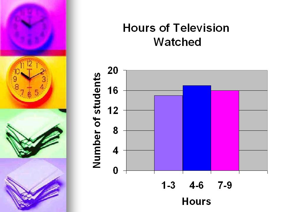
Step 1 Make a frequency table of the data. Be sure to use equal intervals Make a frequency table of the data. Be sure to use equal intervals Number of hours of TV III6II1 IIII - IIII 7IIII2 III8 3 IIII9 IIII - I IIII - I4 IIII - III IIII - III5 Frequency Number of hours of TV 151-3 174-6 167-9

12
Step 2 Frequency Number of hours of TV 151-3 174-6 167-9 Choose an appropriate scale and interval for the vertical axis. The greatest value on the scale should be at least as great as the greatest frequency. Choose an appropriate scale and interval for the vertical axis. The greatest value on the scale should be at least as great as the greatest frequency.

13
Step 3 Draw a bar for each interval. The height of the bar is the frequency for that interval. Draw a bar for each interval. The height of the bar is the frequency for that interval. Label the y axis and the x axis. Then give the graph title Label the y axis and the x axis. Then give the graph titleFrequency Number of hours of TV 151-3 174-6 167-9

15
The end

Similar presentations


 Statistics Displaying Categorical Data Stemplots Frequency Tables Histograms Time Plots … and why Graphical displays.>")


 Main Idea and Vocabulary Example 1:Display Data Using a Bar Graph Example 2:Display Data.>")


